Thursday, May 13, 2010

Orange Tang

Happy Thursday Everyone--Am busy today getting my paintings packed up for the Harvard Gulch Spring Artisan Show this Saturday, May 15 from 9A-2P.  Be sure to stop by if you are in the area! This is my first time participating and I'm looking forward to it. I love these small shows for selling my smaller works and of course it's fun to shop at the other art and craft booths as well.

Have also been busy playing with my new iPad (which I got for my birthday this week--yes I'm older and wiser now...) Am looking forward to trying some of the iPad painting and drawing apps like Brushes.  I also received Quang Ho's Still Life painting DVD and I can't wait to watch it. As some of you may recall, I received his "Nuts & Bolts" DVD for the holidays and while I loved it, am really looking forward to a longer demo.

A real quick thanks to my new Monday painting group at the Curtice Studio in Littleton--it's been great to get to know all of you, see what you are working on, and I look forward to lots of great painting projects this summer. There are still a few tables available for the Monday open studio painting so please email me if you'd like to join.

Finally, here's a quick oil painting study I did of a small bronze Tang horse that I found many years ago at a tag sale. The symbol in the corner is my interpretation of "horse" in Chinese calligraphy.  OK, better get back to my show prep. Thanks for stopping in and have a great rest of your day!

P.S. Did you see Cheap Joe's art catalog has Free Shipping this week? Use code CJ24 until Sat. at checkout. 

Thursday, May 6, 2010

What's on your palette??

Since Thursday is usually my watermedia day I decided to do a abstract bird painting (Thorn Bird) with a watercolor triad including both opaque and transparent pigments, here I used Quin Gold, Cad Red Light, and a dark blue I rarely use, Indathrene (or sometimes Indathrone) Blue (PB 60).

According to Handprint (my go to site for paint pigment info) Indathrone is:  "Usually an inessential pigment, PB60 mixes muted violets or maroons with quinacridone carmine, and is an effective portrait or figure shadow color in tints, but its darks and shadows can appear grayish or obtrusive."

Uh oh, with info like that I feel my left brain kicking in...Seriously, though, I feel very strongly that artists should know what pigments they are painting with. I love the sound of painting with "Moonglow" too and yes I confess I own a tube of this lovely Daniel Smith paint, but what the heck is it? (BTW, it's a melange of  Ultramarine, Viridian, and Alizarin Crimson.)
Can you imagine cooking with mystery spices? It just doesn't make sense. Most tube paints (oil, acrylic, and oil) are labeled with a pigment code starting with "P"--The Pigment Codes used are fairly straight forward:

    * PB = Pigment Blue
    * PBk = Pigment Black
    * PBr = Pigment Brown
    * PG = Pigment Green
    * PO = Pigment Orange
    * PR = Pigment Red
    * PV = Pigment Violet
    * PW = Pigment White
    * PY = Pigment Yellow

A number then follows to indicate the exact pigment. For example some common blues are:  PB29 Ultramarine Blue, PB15 Pthalocyanine, PB28 Cobalt, PB35 Cerulean, etc. If your paint tube label says, for example, Cobalt Blue Hue but has no PB28 it is likely a manufactured substitute mixture from other pigments including often white.

Why does all this matter? Well for one thing, I feel that the more I know my pigments and their tendencies the more confident painter I am in any media--especially when I am mixing colors. For another, like many artists I own at least a dozen brands of paint, so for me the Pigment Code helps me work across brands more easily.

And, as many of you may have noticed, paint color names (what is Dragon's Blood or Renaissance Green??) can vary from brand to brand so I always check the pigment code  to be sure I'm getting what I'm looking (and paying) for.

Yes, the same pigments can vary from manufacturer but at least we know we are "in the ballpark" with PB29 no matter what the tempting paint name (French Ultramarine just sounds better doesn't it?).  For more info regarding pigments check out the Handprint website as I mentioned above or Michael Wilcox's excellence reference books on pigments.   

Whew--that was more than a brief side note, but as you can tell I'm passionate about color and in the end, when we paint, color is pigment. For more info about my classes or open studio Monday workshop please email me. Have a colorful week!

Monday, May 3, 2010

Monday Morning Chickens

Well, today is "the big day"--I'm just about to pack up to head off to my new group class at the Curtice Street Art Studio in Littleton.  As much as I love teaching in my home studio one on one most of the week, I'm really looking forward to to teaching a new group.

For those of you who've been lucky enough to be in a painting, art, or creative group you know it can be a great place to find new ideas, support, and personal growth. I can't recommend it enough. At first you may feel a bit "exposed" painting in a group (I sure did) but I quickly got used to it and in fact came to love the instant comments and feedback from other artists. Painting with dozens of artists each week also gave me the opportunity to learn a wide variety of techniques that would have taken me years to learn otherwise. Or have never tried on my own.


This is one of my favorite watercolors (it's a collection of one my watercolor mentor's wooden chickens) from that time. Like many artists, I've often struggled with keeping the act of creating art enjoyable with my desire to excel at and grow my craft.  So this painting also reminds me not to take art too seriously and to have no fear.  Plus, it's always a fun challenge to paint a collection of things. I'm certain viewers and buyers sense too when you've enjoyed yourself during the painting process.  

So on that note, whatever you paint this week, be be bold, be yourself, be creative, and have fun! See you in the studio...P.S. I'll be sparticipating in the Harvard Gulch Community Center Art Festival on Saturday, May 15. There will be about 30-40 local Denver artists selling affordable arts and crafts from 9AM to 2PM. Be sure to check it out if you are in the area!

Wednesday, April 28, 2010

April Sparrow


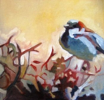
April Sparrow, 8x8, oil painting on canvas panel.

I had such a fantastic time painting a sparrow yesterday that I'd thought I'd do another but this time challenging myself to change the composition (to a square), keep a higher and warmer key, use Gamblin's "environmentally friendly" Torrit Gray, and switch to a new (and better) brush cleaning method (baby wipes as recommended by oil painter Kevin MacPherson.)  I thought that was enough for one afternoon.

I did a much more careful drawing (I think of it more as a design or organization of shapes) than I normally would, but I find that helps for then in turn having more freedom with the colors. As I tell my students, when you paint think values, shapes, then color--even if that's what really inspired you in the first place.

Next week I'm hoping to branch out (no pun intended) to some other birds. I'm determined to take as many of my own photo references as possible to work on this series, so I'm planning to head up to Barr Lake State Park in Brighton where hopefully I'll find some willing feathered models.  I see the Barr Lake Bird List is quite extensive! And I also see where our Denver Zoo has some special days where you can arrive early just to take photos. 

While I'm not a very strong photographer, I think this would be great way to get some wildlife photo references, which is never easy living in the city as I do. Also, if you enjoy animal oil paintings be sure to check out Maryland artist Mark Adams work. His cats are wonderful and I love his oysters too!

As always, thanks for visiting! Please don't hesitate to email me if you have any questions about my art, private classes, or Monday group workshop which starts on Monday, May 3.

Tuesday, April 27, 2010

Firethorn Sparrow

Bon jour everyone! I hope everyone is having a great spring week! As many of you know I've always painted (for better or for worse) in a variety of styles, but if I could paint in just one style for the rest of my life it would be abstracted nature. The other day I was struck by the interesting pattern of this little fluffed up sparrow perched on my thorny and unruly pyracantha (fire thorn) bush and took a quick reference photo out the window.

The small birds love it but it has taken over our side yard and I fear it may be it's last spring as we look to do some fresh landscaping. I knew it would be an interesting challenge to paint the red and greens as well as the abstract pattern of the leaves in shadow and sunlight.

I almost always mix my greens, oranges, and violets but here I decided to add a green to my palette for additional color mixing challenge. I chose Gamblin's Viridian--a beautiful cool (bluish) green a more controllable than Pthalo Green. I had a wonderful mixing a range of cool and warm greens here.

Before I go, quick welcome to all my summer students--it's great to have you and I look forward to painting with you throughout in my favorite season. For more information about my summer painting classes and "Colorful Connection" Monday group workshop please visit my Classes & Workshop Page. 

Tuesday, April 20, 2010

Call Me Tuesday


I started out early this morning painting on a small representational oil bird study (After my cardinal the other day, I've decided to paint my way through all the state birds this year. Next Alabama, which I believe is the Yellowhammer.)

Anyway, while I was painting the beautiful Eastern Bluebird (the state bird of Missouri and New York) I was enjoying one of all time favorite studio albums, Abbey Road. The intriguing and imaginative lyrics never cease to amaze and entertain. So when I took a short break from my bluebird painting (so I would not overwork him), I decided to start an abstract. For me, I an occasional creative break from representational work really helps to fortify my brushwork, design eye, etc. 

Getting back to Lennon and McCartney, one of my favorites lines on Abbey Road has always been "Sunday's on the phone with Monday, Tuesday's on the phone with me."  (The next time you are looking for abstract inspiration consider a visual interpretation of one of your favorite songs.)

In addition to listening to the Beatles, I had spotted my vintage Remington typewriter in the corner of my office this morning. It's become a giant dust collector and I keep thinking I should donate it, but I've always been drawn to the graphic design of the simple san serif black letter forms against the yellowed keys...

And so in this piece, I decided to combine the two as my inspiration. Here I started, as I often do, with an very quick gestural drawing in oil pastel on the primed (gessoed) Masonite. And then I start layering with some earthy, warm transparent acrylics and moved on to some nice rich, yet relatively transparent Ivory Black oil paint.  I rarely use tube black in my representational work so it's a special treat to have in an abstract like this. As with most of my abstracts, I'll continue to work on this some more but I wanted to post what I had so far.

As always thanks for stopping by. For more information about my Curtice Street Monday painting group which starts on May 3, please email me. All levels and subject matter are welcome. Have a wonderfully creative week!

Sunday, April 18, 2010

Inking Big


Happy weekend everyone! A few weeks ago I saw that local Colorado watercolorist Peggy Stenmark was doing a demo of her amazing watercolor ink resist method at Meiningers Art Supply (the "mega" art store in Denver) over the weekend.  Many years ago when I took a break from working full-time to concentrate on painting,  I was lucky enough to paint almost every week with an extremely diverse, supportive, and talented group of watermedia painters at Foothills Art Center in Golden. CO.  

Peggy was one of the many amazing painters in that group and she was kind enough to share her white tempera/waterproof India ink resist technique with us at the time. If you visit her website, you'll see has won many awards and is truly a master of this unique watermedia resist application.

I remember how much I loved the organic wood cut look and the graphic black lines, which give you an instant dark value to work from. I also recall trying the technique and that it took a bit of planning, patience, and practice. Seeing Peggy demo the technique again inspired me (and my watercolor student) to give it another try.

Here, I probably overdid the detail in the iris and quite frankly my student's simpler boat is more successful.  I'll explain the technique in detail in another posting, but basically imagine that the white (so it does not stain your watercolor paper) tempera paint works like a masking fluid around all the dark lines (so you paint up to the line on both sides) and then let that dry completely. Note that Peggy suggests mixing the tempera from powder to the consistency of "pancake batter" so that it covers the paper well and is also easily brushed on. (My nearest store was out of the powder so I did try a very thick brand and it seemed to work OK in a pinch.)

The next step is to sponge brush black waterproof India ink completely over your surface and again allow the ink to seep into the paper. The tempera protects the paper when you rinse it off with water. Yes, this process could get messy, so I used my garden hose in the backyard.  This results in a beautiful rich black design or outline on your watercolor paper as you can see here. The best part is now you can paint with bold, rich colors if you want because of the black--which works wonderfully for shadows, backgrounds, or "black value" details.

I know Peggy prefers Quiller paper and paints, here though I used Arches 140lb CP and a variety of watercolor brands. Because you can't quite control what you'll get from the tempera/ink combo it's a very exciting technique that I look forward to trying again later this week. 

For more information about my classes or new Monday workshop, please email me. Have a great week all and happy spring painting!