Thursday, November 18, 2010

Drawing Conclusions

Recently, while demoing mixed media painting (watercolor and oil pastel), it occurred to me that I've never really used oil pastels on their own merit. At least not since I was very young. And perhaps that's why we may tend to think of oil pastels as a really fancy crayons for less sophisticated art projects. Something we might have used at an arts and crafts camp.  

Clearly though in skilled hands, as some of may know first hand, oil pastels can be a beautiful and unique medium. FYI for this painting, I used a "vintage" set here by Grumbacher (who I believe no longer produces pastels) but I've also used high quality brands like Sennelier, I particularly love their gorgeous iridescent oil pastels.

Given their nice blending qualities, I found oil pastels to be a perfect choice for some quick abstract oil painting planning. Here's a helpful Oil Pastel 101 article about how oil pastels can be a convenient, affordable, colorful medium to add to our artist tool box. I found the Oil Pastel Society also has lots of interesting tips and info. 

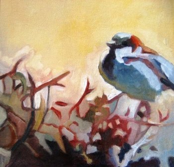
In these quick (less than 30 minutes) paintings I approached the overall work much as I would paint with a brush in oil or acrylics: I begin loosely (which means only left handed drawing for me) with broad, gestural lines to help define spaces and larger shapes. As I begin to layer in strokes of color, layering along the way, I focused on mind my primary painting composition goal: Variety. 

While these are not refined works, I have to give a big multi-hued thumbs up for oil pastels. (In fact, I think it's that "fancy crayon" feeling that makes them kind of a comfort media.). So next time you are looking for a fresh perspective, try a new medium or revisit one you gave up on long ago. You might just discover a new BFF or rekindle a long lost love! Enjoy!

Wednesday, November 17, 2010

Portrait of Moi (the Artist)

I haven't done a self portrait in at least several years since I was assigned one in an oil figure class, one 2010 goal was to paint a self-portrait.  So far, I've yet to tackle this but I've been at least thinking about it.

Today, I'm cheating a bit with this post as this "portrait' of yours truly painted by a fellow artist Terrey, who I shared a workshop with several years ago. She created this with Sharpie, yupo (one of my favorite surfaces) and watercolor. I've always loved paintings of artists at work and so I'm thrilled that Terrey captured me hard at work.   

If you paint or draw, I think painting a something that you'll find both enjoyable and challenging. Here's a short article I found called 6 Reasons to Paint a Self Portrait

If you are in the Denver area, I wanted to give a quick shout out for First Friday Art Walks. These fun, informal walks are a great way to spend a Friday night out with family or friends. While the Santa Fe Arts District is probably the best known art walk in Denver there are more "intimate" neighborhood art walks such as Old South Pearl Street.  I'm happy to say I have a few small paintings (as well as some of my friends and students) hanging at the always lively and bohemian Stella's Coffehaus so be sure to stop by if you are in the area.

Also, although I'm proud to say I've been in shows since I was a teen, receptions never get old so I'm greatly 
ooking forward to the Littleton Own An Original Show opening reception tomorrow night. Congratulations to my fellow artists in the show, I look forward to seeing you there! 

Monday, November 15, 2010

Lismore Lillies


Happy Monday everyone! As I've mentioned before, I love sketching quickly and freely with a contour line using a fine tip Sharpie (or other waterproof black felt tip pen) on watercolor paper (cold or hot press, I think, works best). Then adding bold washes using a limited palette such as Winsor Blue (Thalo), Permanent Rose, and Lemon Yellow. Here's a more detailed view:

You can find some relatively affordable seasonal bouquets that a really quite nice nowadays at your local grocery store. I was drawn to the purple/red/oranges of the lilies, daisies, and carnations (as well as their varied shapes and sizes) balanced with dark warm greens of the leaves and cooler blue green eucalyptus.  Plus, I find it really uplifting to paint bright, colorful flowers on some of these gloomier autumn days.

To add more pattern to the painting, I chose my clear Lismore pattern Waterford vase which has a big chip in the rim. Which brings me to why I don't paint more florals. Because my handsome gray tabby Dashiell  boldly attacks any type of botanical matter. It's really only his bad habit. Since he's an otherwise excellent studio muse, I find I have to paint fresh flowers very quickly. Otherwise, it only seems to take an instant before all the flowers are shredded and the vase is rolling away on the floor...Anyway, I still enjoyed working on a watercolor that has so many colors and shape varieties.

It's a cool, dreary Monday here so before I get back to painting, I also need to start my big pot of Alton Brown's lentil soup--if you like lentil soup I highly recommend it.  As always, if you have any painting questions, would like a quick online critique, or want info about my classes, please email me. Enjoy the rest of your week! P.S. Mom if you're reading this, I'm saving this one for you! :)

Saturday, November 13, 2010

Juicy Trio

Happy fall Saturday everyone! First, thanks again to the Denver Art Club who invited me to demo this morning. It was an honor to meet all of you and I had a wonderful time sharing some watercolor tips. For those of you who've tried to paint and talk at the same time you know that can be a bit tricky, especially after a grande Starbucks mocha, but I hope I did OK. Thank you again for the warm welcome!  

Earlier this week, inspired by the Van Gogh master copy, I decided to paint a quick, relatively high key, impasto oil study of three green sunlit apples. (If you take a lot of photos like I try to, but don't necessarily find the perfect painting subjects, try adjusting the value key considerably up or down, you may be much happier with the result.) 


On another note, I just received my my first "front load" frames from King of Frame and am very pleased with the quality and value. I love the warm antiqued black finish with the metallic liner. (FYI, I could not easily locate the "front load" frames on the website but just asked for them on the phone.)  I can see why so many artists use them--they're the perfect match for the 6 by 6 oil on panel paintings.

Finally, for all my fellow Colorado artists, did you see this online ranking of Who collects art? If someone had asked me I probably would have guessed New York, L.A. or maybe San Francisco. But am thrilled to see Denver was the top market, followed by the Springs/Pueblo, with Portland, San Francisco, and Atlanta rounding out the top 5.  Now, the study doesn't include a lot of details, but as an artist I think it's great to see any good art news about your town. So on that positive note, I'm heading back to studio. Enjoy your weekend and happy painting!   

Tuesday, November 9, 2010

Ode to the Original Daily Painter

In the last 70 days of his life, it's believed Vincent Van Gogh painted every day, despite his declining mental and physical condition. Thanks to my talented painting mother/daughter duo Anita and Amber for bringing me this wonderful painting inspiration this week.  Van Gogh painted this Mulberry Tree near St. Remy in the fall of 1889, less than a year before his death in the summer of 1890.

As I've mentioned before, master copies (even loose interpretations) are a tried and true learning tool for learn new painting techniques. I promise they will also give you a new appreciate for their work, color sense, and vision.

This painting was no exception. Following in Vincent's brush steps, so to speak, I was constantly reminded to change the direction of my brush strokes and keep my thick, impasto oil colors clean and high energy at every turn. I also took note his use of signature dark lines and mastery of complementary colors. Every time I take the time to examine a Van Gogh at length, I can't help but feel he's left them behind as some kind of urgent yet timeless message to all the painters who dare follow him. 

Before painting, I considered some of the 19th century pigments (many of course now considered fugitive or poisonous or both) Vincent would have had on his little wooden palette such as emerald or Paris green, lamp black, yellow ochre, lead white, chrome yellow, Prussian blue, etc. 

For color history geeks like me, here's an  interesting article regarding master painter palettes.  For this little 9 x 12 oil study (the original is approx. 21 x 25),  I chose a more contemporary palette of Ultramarine, Thalo Blue, Burnt Sienna, Indian Yellow, Lemon Yellow, Cad. Red Light, and Permalba White--which I thought was a fantastic autumn palette. I also used relatively small brushes to help imitate the undulating texture.

Thanks again to all my students (and Vincent!) who continue to inspire me with their work! See you in the studio!

Saturday, November 6, 2010

Celebrating Denver Arts Week!

The best time about this year in Denver is that the arts are thriving and events are everywhere! First, am happy to report that I had 2 small oil paintings accepted into the 45th Annual Own an Original Show in Littleton judged this year by landscape painter Susie Hyer. It's always an enjoyable show at the Littleton Museum Fine Arts Gallery and usually features a great mix of media and subject matter from local fine artists. The show runs from November 19 through January 16. (Quick shout out to my neighbor Mark for letting me borrow his much nicer camera for the entry photos.)

Second, I'm doing a demo, which is always flattering and exciting, for the Denver Art Club up in the Highlands Neighborhood next Saturday. While I'm still deciding exactly what to do, I'm leaning toward a large (full sheet of CP Lana here) nature inspired watercolor like the canna flower garden painting I've been working on this week. As I've mentioned in the past, natural subjects in watercolor are one of my all time favorite painting challenges.

I'm also honored be a part of the 7th Annual Art for Love Art Auction Fundraiser tonight in downtown Denver. I think buying art, which is often quite affordable at these events, is a wonderful way to support a local non profit in your area this time of year.

Finally, am looking forward to checking out a variety of events that take place this week in association with Denver Arts Week, I'm grateful to work and live a metro area that supports our creative business culture. As always if you have questions or would like more information about my classes please visit me on TeachStreet (just click on button on right) or email me. Have a great art filled weekend!    


Thursday, October 28, 2010

Autumn (in Progress)

Happy Thursday! Keep telling myself that autumn is a favorite time for many artists and I'm doing my best to embrace the changes and let summer go, but it's never easy...Here's an autumn inspired abstract in progress that's almost done, but not quite. I thought a longer, tall format would be a challenge...

I also created "living" stamps from the leaves in my yard which often end up looking like colorful, layered flora fossils. Another busy week, getting a show submission ready and meeting some great new fall students. Don't want to jinx the show entry so I'll let you know later if I get in.

One of the best aspects about teaching and being an online artist is that I'm always discovering new painters  that I would have likely never found on my own. For those of you who enjoy unusual landscapes, one of my students who hails from the South lent me a gorgeous book called Marsh Mission that features dramatic, colorful marsh and bayou paintings by artist Rhea Gary.

If you're like me, I'm always looking for art related TV shows. So I was thrilled (not an exaggeration) to discover that our Denver cable now has the Create TV Channel. It's kind of a "best of" art, cooking, crafts, travel, etc. PBS channel that we now have in Denver. I'm really looking forward to watching Passport & Palette which starts in a few weeks.

Questions about painting? Please feel free to email me. Also, in November, I'm offering just for fun a FREE short (and friendly) critique for anyone who would like to send me a painting. Thanks and enjoy the rest of your day! 

Tuesday, October 19, 2010

Three Pair

Happy Tuesday everyone! In preparation for some upcoming fall shows, I'm working on some small oil paintings this week such as this 8x10 colorful study of pears. I really wanted do paint something with a bold light and shadow separation. In my kitchen I have a large wooden bowl on my counter under one of my windows and the light patterns are always interesting. Here, you can see some of the window pane shadow falling on the pears. I was particularly drawn to the unexpected silver of turquoise reflected light behind the pear on the right. 

The title of this piece is a nod to one of my greatest passions outside the art world: Poker. This time every year, I watch every hand of the WSOP Main Event coverage each Tuesday night on ESPN. I'm not sure if it's my Scandinavian heritage or growing up in the snowbound Midwest (euchre anyone??), but I've always loved playing cards. If I had unlimited funds my days would probably become an amalgam of poker and paint (which for those of you who know poker lingo is also a good thing). In the meantime though better get back to reality and the studio.

I hope to have some info soon on shows, demos, and other events so stayed tuned. Thanks for stopping by--I'm off to the tables.      

Friday, October 15, 2010

Late Bloomer

Happy Fall Friday everyone! Before I forget a quick thanks again to my students who endured my month long master suite renovation. Particularly shaky moments like tub no. 1 not fitting, running out of paint (Mythic brand Misty Windowpane FYI), and the brief but nonetheless troubling power outage. Anyway, I'm happy to say it's over now. (If I get brave enough, I'll post the makeover but the "before" is rather scary. Maybe closer to Halloween!)

When someone asks me about the benefits of painting with watercolor, for me I say it's the most relaxing and zen like media, despite it's willful tendencies. Add flowers as a subject matter and it's one of my favorite, go to art recipes. Not only is each species of flower unique, but flowers naturally embody a wealth of design elements such repetition, gradation, dominance, etc. And of course floral subjects are the perfect excuse to use some of those really intense pigments. As much as I love red obviously, pink roses from almost silver pale to deep magenta are my favorite so that's what I decided to paint this week and also in honor of October.

For more fall paintings, visit the October painting challenge on the Artists Helping Artists Blog. I sent my community garden green tomato painting post from yesterday. Thanks again Leslie and Dreama for hosting this! Your weekly Blog Talk Radio show helps keep me motivated in the studio every week. I'm really looking forward to the Kevin MacPherson interview next week. Have a great weekend everyone, happy fall painting!

Thursday, October 14, 2010

Go Green! Go White!

Busy week, but I've had a great time painting this oil study of late season green tomatoes that I spotted in a community garden last weekend up in Golden, Colorado in honor of my beloved MSU Spartans who had a fantastic game on Saturday.  I'm not exactly a huge football fan but I will always love all things Spartan. (Sorry Wolverine friends and family--maybe next time!)

On a sports related color note, I also attended a wonderful  high school back in Michigan, but we had very challenging team colors: Brown and Gold. Wait it gets worse. It was always in plaid. Yes, plaid. Now there are some lovely tartans out there--this is not one of them. It simply doesn't look good on anyone especially as a tennis skirt or swimsuit. Not slimming, trust me. So I was quick to embrace the emerald green and white we wore so proudly each day especially in fall along the beautiful banks of the Red Cedar River.

Well enough collegiate nostalgia, better back to the studio. First, a very proud shout out to my acrylic painting students Lisa and Andy. Both were accepted into this week's Gone to the Dogs fundraising show at the Knoll Gallery. Awesome job ladies! I can't wait to see your pieces at the opening on Friday.

My other inspiration for working on this piece was taking Jonathan Aller's new online painting course. While I'm typically a looser more impressionistic painter, I learned several valuable tips, particularly to slow way down when I paint. I truly believe painting is at least 50 percent observation followed by accurate recording. . As always if you are interested in classes, a workshop, or friendly art critique please drop me a line--I'd love to hear from you. Thanks for stopping by and go Spartans!
 

Thursday, September 30, 2010

Kimono Thursday

Taking a brief break from my daily apples to post this fun Japanese kimono watercolor I painted in this week's Monday group class. I was inspired to paint a colorful kimono with a dark background for a variety of reasons.

First, at the gym a few weeks ago (note this is my excuse for watching daytime TV) I saw an interview on Oprah about the "secret world" of the geisha. I was surprised to hear that a high quality formal kimono can exceed $20,000. So I started thinking a kimono would be a fun painting subject. A few days later I was reading about was reading about the Japanese design concept of  notan which involves the interplay of dark and light shapes or what we likely think of as the relationship of positive and negative space.

For reference for this watercolor/Sharpie piece, I used a vintage Japanese print that I found online and then gave it my own "over the top"color flair using a full spectrum of hues.. I wanted a nice matte black background so I simply used black acrylic paint rather than watercolor. The support is Arches 140lb CP paper.  

Thanks for stopping by--please feel free to drop me a note or comment if you have any painting questions or would like more info about my watercolor, oil, or acrylic painting classes. Domo arigato!

Tuesday, September 21, 2010

Bite of Red: Apple #2

6x6
Oil on panel


Here's apple study #2. A bitten red delicious as you can see. I read there are more than 50 varieties of this type of apple. I'll be honest, I'm a Macintosh gal from way back, but the red delicious still makes a nice shiny, angular model with lovely cool and warm reds. And it's flesh is a really interesting almost white-yellow-green before it begins it's golden rusty oxidation.

My favorite apple painting story, which I think I'm remembering correctly, was one that the late Helen VanWyk (the wonderful PBS oil painter from many years ago) would share about her mentor. Ms. VanWyk's books are some of the first oil painting books I purchased years ago and they remain some of my favorites.

I'm likely paraphrasing here, but it has always stuck with me. As a young painter, Helen was tasked with a painting a bowl of apples and not until every single apple could be identified individually could she move on. In other words, painting is really observing carefully and recording accurately--which is really for me what these little live studies are really about each day.

Tomorrow, I'm looking forward to running up to our local Cherry Creek Farmer's Market before teaching my first class to find some more inspirational apple/model options. Quick thanks this week to all my home studio  students who are graciously putting up some remodel noise along with me--the end is near! In the meantime, I greatly appreciate your patience and sympathy.    

Sunday, September 19, 2010

An Apple a Day?

"Darker at the Core"
8 x 8 oil on linen panel
Price posted when dry! :)

As many of you know, I typically tend toward overall high key paintings, but ever since I painted an almost black plum last week I've been thinking about balancing darker colors. Here, for the background and foreground I've mixed what I like to call "bright black" meaning a very dark value comprised of saturated relatively darker pigments like Thalo Blue, French Ultramarine Blue, Alizarin, Cad Red Light, etc.

Also I had not painted a knife painting a while, so I wanted to work with that as well. For added sparks of color and interest, I also toned the linen canvas panel with a thin but bright wash of Golden Acrylic Pyrrole Red. I noticed on another painter's blog a beautiful series of 31 daily plum paintings which I found very inspiring so perhaps I'll do the same with apples. Not only are apples an appropriate daily subject for September, I think they will be an extra challenge.  We see apples almost everyday and there are many fine paintings of them so how do we make them more intriguing on canvas?  We'll have to wait and see...

In the meantime, I hope everyone is enjoying a beautiful, sunny fall weekend. See you in the studio!

Thursday, September 16, 2010

Hot off the Presses!


Today I've got a short but exciting post. I finally had some extra time this week and finished my little art portfolio book on Blurb. The book is a collection of my favorite paintings (many of which I've posted here) from the past decade or so.

As many of you know, it's both odd and exciting to review a collection of your creative efforts "living" all in one place. It's also a bit like having that "one woman show" I've always dreamed but on paper. I can't wait to receive it in the mail in the next few days.

What's great about Blurb is that it's so relatively affordable that I can always make some small changes and/or additions after I see the book. But I also like the idea that moving forward in my art life, I'll be working toward filling the pages of the sequel! I did make the books (which are a little longer than the preview above) available for purchase if anyone wants one--they are about $20 on Blurb with the "fancier" paper.

Quick reminder that I have space available for the rest of September and October for our Monday open studio painting group at the Curtice Street Studio in downtown Littleton so please email me if you are interested in joining us. All levels and painting media welcome!

Sunday, September 12, 2010

Even Moore Inspiration

Normally, I'd be posting a painting. But last week, I finally had a chance to check off one of my "summer art must dos" that was a visit to the Henry Moore sculpture exhibit at our Denver Botanic Gardens and I just had to post a couple of pics from my visit.  

This unique art exhibit (which runs through January 2011) includes 20 bronze and marble sculptures at both the downtown Denver and suburban Chatfield locations.  As an artist, I'm always considering proportion and scale, so it was fascinating to experience three dimensional creations that tower over 10 feet tall and weigh more than a ton particularly outside a more conventional museum setting. 

As many of you may know, Moore was a highly-acclaimed British sculpture born in the late 1800s and known for his large scale curvilinear abstracted works some figural, some less so. To me the massive sculptures seemed completely at peace even along side the most delicate flora. I think Mr. Moore would have been quite pleased with the setting. Above you can see one of my favorites--a wonderful turquoise sculpture rising out of the lily ponds like a stretching water beast of some sort.
I also love circles and spirals so another one of my Moore favorites was this "Figure 8" shaped dark bronze piece that created a wonderful organic frame for a more formal area. While I didn't have time to sketch, I did take many photos and am planning to integrate many of the shapes into a future abstract work. Simply by  taking photos of the sculptures, I was reminded of just how much we can learn from art forms outside our creative comfort zones.

Before I go, quick welcome and thanks to some new students: Kathleen, Monique, and John. I've enjoyed working with all of you and look forward to more fall painting projects. For class info, please write to me, click on the class link on the upper right, or search for Scarlet Owl in TeachStreet. Thanks for checking in an and have a wonderfully creative week!    

Wednesday, September 8, 2010

Vampire's Delight

12 x 12 oil on panel
SOLD
Happy September everyone! Is it me or does time just seem to fly this time of year? I also find it's a time of year when I tend to start a lot of different painting projects, which is exciting, but it also means that it's taking me longer to complete any one piece. (That was excuse no. 1 for those of you keeping track).

Painting excuse no. 2? For those of you who've done any home renovation you know how time consuming and distracting that can be. Exciting, but distracting so that's one of my excuses for not posting more in the past week. But bathroom reno means there's a new heated whirlpool bathtub in my future to help soothe the aches and pains of hours at the easel, so I know it will be worth it!

This is also the time of year when I start to prepare for my annual winter panic. To help the transition go more smoothly, I try to concentrate on things that I do enjoy about this season and one of those, as I've mentioned before is cooking. Particularly I love making soup and I always use a ton of garlic when I do. So I'm posting  this oil painting study of garlic that I did a while back. It's one of my favorite "food" paintings.  

I've got 2 quick tips today. For my fellow oil painters who want a less toxic medium you might want to try M.Graham Walnut Alkyd medium. I tried it today for about an hour and so far, so good, which for me means no headache or itchy eyes.

For my watermedia painters/pet parents, I'm always looking for "pet proof" water container (pigments can be very toxic) and after looking around the house I realized I could use large dishwasher tab containers. (I rinsed them thoroughly before using.) Not only are they roomy, but most importantly, the lid clicks firmly shut so I don't have to worry about monitoring my water bucket ever time I turn around. Right Mr.Dash??

As always, if you have any questions about my work or classes, please drop me a line, I'd love to hear from you. Have a wonderful and colorful week!

Friday, August 27, 2010

Scandalous Daisies


First quick "Happy Birthday" shout out to my younger brother, Bryan this week! This quick watercolor sketch was inspired by my re-read this week of Charles Reid's Painting Flowers in Watercolor as well as some "Denver daisies" (a cheerful flower that had a bit of controversy here in Denver, thus my title!) given to me by my student, Louise. Thanks again Louise!

As an artist it's always a personal luxury to paint just for you. Whether it's your most beloved colors, a favorite subject, most comfortable method, etc. In this painting, I wanted to honor my the beginnings of my "art career" many moons ago in a small town in Michigan. Where, while still underage, I was hired "illegally" as the official illustrator/calligrapher for at our library (the matriarch librarian told me to lie on the application when she saw my sketchbook and so I did.)

After class, I spent many wonderful hours in the library basement getting paid to draw brochures, posters, calendars, etc. in pen and ink. The only down side was endless hours shaking and cleaning out those super fine Rapidiograph pens--those of you who've used them know what I mean...Which makes using a super fine Sharpie as I've done here all the more enjoyable!    

Finally, warm welcome and thanks to my three new artist students this week--Mike, Shelley, and Stacey! It was great to meet all you and I look forward to lots of great fall painting. Quick reminder, if you are looking for a casual, creative open studio class on Mondays, we've still got space in September/October for watercolor, acrylic, or oil--Beginners are always welcome!   

Sunday, August 22, 2010

Passport to Pink

 "Passport to Pink
24 x 24
Mixed Media Collage on Panel
Price: $495 Framed
Hope everyone is enjoying a great summer weekend. I'm getting ready this morning to drop off my very rosy mixed media collage to Core New Art Space (a great contemporary co-op gallery located in the Art District on Santa Fe here in Denver) for their PINK show which starts on September 9 where a portion of the proceeds will go our local Susan G. Komen For the Cure chapter.  Inspired by passports and travel, this particular piece includes old text (both Western & Eastern), stamps (both postage and painted), and words in French and English.    

Core New Art Space holds a special place in my heart because it was one of my first major sales and I've also won an award there as well. So if you are in the Denver metro area, and especially if you like pink and want to support a wonderful non-profit please be sure to check out the show. I'm really looking forward myself to seeing how other artists interpret the pink theme.

This week I've also been working on a larger piece (about 3ft x 4ft) on an older stretched canvas I came across at a local tag sale. As much as I love painting small daily studies, working on a more expansive scale can be very rewarding and has really inspired me to continue paint some larger pieces in late summer/early fall. So be looking for those...

Finally, quick kudos to all my ongoing students this season for all your hard work! I do have a few slots open for fall students so please drop me a note if you want to join the Monday painting group in Littleton or take a private/semi-private session in Denver. My fall class special is 20% discount for any new students who sign up for a minimum of 4 sessions.

Friday, August 13, 2010

Sunflower Power

"Sunflower Power"
Transparent Watercolor on Arches 140 CP
12 x 12 

Is it really Friday already? While I paint mostly in oils now, particularly since I joined the daily painting movement, I still like to splatter colors, layer rich glazes, and "wipe out" out interesting shapes. Push pull, push pull...And it's also a glorious way to wind down from a busy week.


Last weekend, I was reading several watercolor books including artists Jane Hofstetter's excellent 7 Keys to Great Painting. One of her 7 keys is "Pattern" so I was really pushing myself during this painting to focus first and foremost on the BIG light and dark patterns (letting your  midtones find their own way). I think this is especially important with complex florals and/or nature scenes.

This reminds me of one of my favorite studio tips (which originated from one of my favorite watercolor teachers--Ms. Jackie McFarland) and those are red colored glasses.  You can also use a sheet of red acetate of course, but red glasses are usually easy to find online and any style will do. Anyway, pop on a pair and you can instantly see and compare your values. 

Finally, thanks to my eBay painting collector for your purchase! Here's this week's eBay painting--an 8x8 original oil Daily Painting of a pear. I'll be donating one of my larger mixed media collage pieces (which I'll post soon) to the Core New Art Space "PINK" show in Denver where a portion of the proceeds will go to the local Susan G. Komen Foundation.  The show runs September 9-26, 2010.

Thursday, August 12, 2010

Slice of Summer

 "Summer Slice" 
8x8 Oil on Linen Panel
Price: $40 + $5 shipping 


Hi All, first, I thought it was time for a refresh of my blog look and feel and while I personally like a dark rich look, I know they can be hard on the eyes so I'm trying out a lighter template.

I don't know about you, but it's about this time of year I start to get a little (a lot actually) panicky about summer's end lurking around the corner. With that in mind, I was looking around this morning for something to paint that would be a little "slice of summer" and the seedless baby watermelon seemed an obvious subject fit. Also, the watermelon is a great example of natures brilliant hue combination of a red/green complement that can be so exciting to paint.

As a foodie, I also think it's kind of cool that watermelons seem to be one of those polarizing foods/flavors that people seem to really like or dislike. For example, I love watermelon but cantaloupe or honeydew, while beautiful to look at, not so much with the flavor for me.

Also had a great time while painting today listening to all the helpful "studio secrets" on the Artists Helping Artists BlogTalkRadio show. It was interesting to discover that a few of my own "studio must haves" such as walnut oil and/or Murphy's Oil Soap for brush cleaning, bungee cord for paper towel roll on easel, the small canvas holder (which I blogged about recently), were other painters' favorites as well. But there were many new tips/tricks that I look forward to researching further such as "photo cubes" for taking pics of my art. 

Quick note, we have extra space available in our Monday Open Studio Class from 10A to 2P  in downtown Littleton so please let me know if you'd like to join or pass the word along to a fellow artist--oil, acrylic, and watercolor all welcome since our focus is color!

Wednesday, August 11, 2010

Clementine, Darling?

"Clementine, Darling?"
6x6 oil on linen panel
Price: $60 + shipping

After teaching a morning oil class (great job Bob!), I was in the grocery store looking around the produce section for some daily painting inspiration (and healthy snacks!) when I spotted a big bag of Florida clementines. The warm orange hue was so vibrant and juicy I had to get them as models. 

This was also my first painting on my new RayMar linen museum quality panels and they are a really lovely painting surface--a little tooth but not too much. To use a cooking term, I'll say the panels were al dente! In this particular case, I toned the canvas first with a nice rich quin gold.

For fellow painters, my tip today is next time you want to lighten an area, try the "friendly neighbor" --a lighter hue on the color wheel before using our "go to" white, so yellow-green for a green subject, red-violet for a dark violet subject, etc. You may even want to take white off your palette altogether for a while as an experiment in maintaining bolder, cleaner colors.

For more information about my work or classes, please feel free to email me anytime or visit me on TeachStreet. Thank you!

Friday, August 6, 2010

Friday Sale: Horse Code

"Horse Code" 
8x8 oil on panel equine abstract painting
SOLD

Thanks again to the Artists Helping Artists for their fantastic blog tips show yesterday. Based on Leslie and Dreama's helpful comments, starting today in my blog, I'm going to try to have at least Friday as a featured Daily Painting sale day for all my blog readers.Also, starting this week I'll be selling a few of my older (but still good!) Daily Paintings on eBay all starting at under $50.

Finally, welcome to all my new summer students this week and next, I look forward to painting some masterpieces with all you! Have a great weekend!

Thursday, August 5, 2010

French Lipstick

Happy Thursday everyone, as always thanks for stopping by! For my quick 6 x 6 Daily Painting this morning, I wanted to paint a reflective object. So I choose this lipstick tube (which also had a funky tapered shape) with shiny black and golden surfaces. As a painter, I'm always interested to see how other artists render different (and sometimes challenging) textures and surfaces such as glass, metal, fur, leather, wood, etc.

That being said, even though I have a more "painterly" approach, my goal is still to accurately record the shape, value, and color. The key, I find, is to have faith and confidence that by doing this you will achieve a happy result in the end.

Today's Studio Tip: The more thickly I paint in oils (which I'm really beginning to enjoy in these little paintings) the more I use my handy and affordable Kemper wipe out tool to help with correcting areas that get a bit too heavy. I think this tool was designed originally for ceramics, but it works great canvas and Masonite  panels.  

Speaking of supplies, like many oil painters, I love to paint on linen but it can be expensive and hard to find. So am really looking forward to receiving my new linen panels from RayMarArt. I've noticed that they are the "panel of choice" for many daily painters and conveniently are available in the 6 x 6 "daily" size.  


Looking for texture painting examples? I can't help but admire contemporary Colorado realism painters Daniel Sprick and Scott Fraser for their amazing mastery of textures and reflections. For more interesting examples of textures, visit the Daily Painters site and type in the search box terms like gold, silver, glass, etc.

And since it's Thursday, I'm also looking forward to listening later to the Artist Helping Artists show where artists Leslie and Dreama (and often a guest) share helpful information and tips. Next week's show "Studio Secrets" sounds particularly intriguing--I can't wait!

OK, back to the studio for some more practice...have a great day!

Sunday, August 1, 2010

Little Green Apple Holder

On Daily Painter Carol Marine's website she generously and openly shares a lot of info in her FAQ section that I don't always see artists willing to share--particularly what I call the mechanics of painting. Type of brush, panel, easel, paint, lighting issues, etc. For those of us who paint frequently, it's these kind of tips that can really make a difference.

For those of you who paint on small canvases (such as the 6x6 or 8x8 sizes that are now so commonly seen for Daily Painters) you'll likely understand that I was particularly interested to see how she, er, wrangled them.  Online I've seen a variety of methods for handling these little gems (which tend to be unstable on big wooden easel), but thankfully she shared an example of her little panel holder which you can order through her site. Basically it's a square with top and then a wedge piece that you can slide in from the bottom to hold the panel in place.

I was going to order the one from her site but I realized I had lots of extra Masonite in the garage to first give it a try on my own. I spray painted mine a flat black because I thought it would be helpful to have that value judgment as well.  A dark gray would work well too I think, but I happened to have a nice flat black spray on hand.  


What I really love about this "method" is that the panel holder acts as seamless frame so you can easily brush off the sides and edges of the canvas panel and not have your brush stroke interrupted. Anyway, here you can see my 30 minute "quick paint" test of half a Granny Smith apple where I'm playing with primary colors around the yellow-green apple. (I was also testing out a new Liquitex flat synthetic brush which was, for me, a bit too soft and floppy for oil, so I'll just save it for acrylic.)  A big thumbs up though on the panel holder, though, so again my thanks to Ms. Marine for sharing.

Speaking of thumbs up, earlier today I watched the documentary Art of the Steal, about the controversy surrounding the incredible Barnes Foundation, an unsurpassed collection of post-impressionistic paintings, many iconic, now worth billions. If you're interested in art history and the politics of art, I highly recommend it. The award-winning film raises compelling questions about private collections, museums, and the role art plays in our overall society, as well as our economy. 

To all my students, I look forward to seeing you in the studio this week! In the meantime, enjoy your easel time!

Thursday, July 29, 2010

Yesterday's Apple & Blurbing

Happy Thursday everyone! I've spent almost all day working on my new art book from Blurb--a site where you can create your own book of text, photos, imagery whatever you. I noticed several other artists were using Blurb on the web and I so I've had creating a book on my art "to do" list for a while now.

It's also been insightful and emotional to sift through almost a decade of folders of past paintings--some hits, some misses. Some I barely remember. And of course, I'm already mourning a few pieces that I just can't find an image for and have long lost the buyer's name (note to self!).  I'm pleased to say that many of the paintings were sold years ago though  so a quick thanks to all my collectors over the years for your support!

There's something very cathartic about bringing all your art together in one place. Though trying to decide what to put on the cover is much tougher than I thought it would be. Abstract? Landscape? Animal? I don't think I'll able to choose just one. 

While I'm creating the book (working title Colorful Connections, of course) mostly for myself and family, I plan to have a link where you can purchase the book if you like through Blurb

When I ordered Carol Marine's Blurb book last week, in addition to looking forward to seeing 100 of her beautiful, jewel-like daily oil paintings, I was eager to see the quality. And I was very pleased given the reasonable price for a 4-color 100 page book. Blurb also has a Blurb bookstore where you can search for other artists or art topics such as daily painting. Another attractive daily painting book I spotted Clair Hartmann's Yesterday's Paintings--isn't that a fantastic cover??

I also spent just a few minutes this morning checking out an oil painting instructional DVD I ordered from another busy Daily Painter and Teacher, Hall Groat II.  He has a wide variety of DVDs, but as a foodie and a painter, I couldn't resist Painting Desserts DVD. Though I may need to pick up a few "pastry models" at my favorite French bakery (Trompeau if you are ever in the Denver area) in order to practice tomorrow. OK. Better get back to my book.

Bon soir everyone and thanks for stopping by.

Tuesday, July 27, 2010

Squeeze Me


Aren't lemons great? They have a sunny hue and an interesting boxy but tapered shape. I particularly enjoy painting lemons very high key with lots of white mixed with violets, oranges, yellows, and greens. The more I read other artists blogs or read artist interviews, the more I feel compelled and inspired to practice my small "daily" oil painting studies from life. So a quick thanks to all the other daily painters out there.

Here, my goal was to play with a "yellow shape" on top of a yellow background (in this case a yellow file folder). Tomorrow, I might try a plum on a purple or violet background and possibly have some more dramatic lighting so I can play with the light and shadow more.

Speaking of light and shadow, last Friday, I went to see Quang Ho's very interesting slide presentation and talk in Greenwood Village. And while Quang is certainly well known, I was pleasantly surprised to see a standing room only turnout for an artist presentation. Quang was the judge for this year's All Colorado Art Show which runs through August 6 at the Curtis Arts Center. FYI, best of show went to a lively, colorful oil still life (reminiscent of one of my all time personal favorites Janet Fish) by artist Sharon Holsapple.
     
Finally, my title today is also a nod to my favorite "in the studio" music band, Squeeze, the brilliant (IMHO) British pop band. The guys are touring the US this summer and I was beyond thrilled to see them over the weekend in both Aspen and Denver (yes, I saw the same band in less than 24 hours.)  And I'm not ashamed to say I wish I was in Vegas tonight to see them again.

Those of you who paint and listen to music know how uplifting, comforting, and entertaining audio inspiration can be in an otherwise lonely studio. So thanks and cheers Chris & Glenn for helping me out in the studio for so many years! I'll be the first in line to buy your Spot the Difference CD next Tuesday.

Friday, July 23, 2010

The Trip to Bountiful

Usually, I tell my students that you can't go too wrong if you keep things simple while painting. And normally, I try to adhere to my own advice but once in a while I don't get that message. This multi-layered oil painting on panel took me a few weeks from start to finish. It contains a kitchen sink of techniques--some new and some tried and true.

Just a few include painting the first layer with Golden Acrylics an old gift card (Victoria Secret BTW for those of you who like details) and scraping the paint over the gessoed Masonite board (18 x 18). (This idea came from an online demo I saw a while ago of an artist creating an entire painting with plastic cards as brushes.)

I also built up additional texture with a thick gesso using a variety of tools such as palette knife, stamping, and some stencils. Lately, I've been really drawn to waxy encaustic paintings and so I glazed some of the shapes back with milky opaque colors. This piece started out as a purely abstract color study demo for one of my abstract students with reds and golds. When a figure and face began to emerge I decided to work with that imagery. I added the dream catcher at the bottom just for "good luck" and because I love circles.

Quick thanks to all my students who continue to work hard and paint during the summer--I know it's a season with many other temptations. I love seeing each week what you are working on from dogs to pheasants, from florals to seascapes to aspens. Speaking of aspens, this weekend I'm off to Aspen and can't wait to take some photos up there. Have a great weekend everyone!

Thursday, July 22, 2010

Yupo Nalu

Nalu, as some of you may know, means wave in Hawaiian. One of my younger students, this week painted this gorgeous frothy wave on Yupo with Golden Fluid Acrylics. We had a great time working with the wave pattern and texture with spraying both rubbing alcohol and water directly into the wet acrylics which tend to hover on the Yupo surface until dry.

We also added some freshly ground sea salt into the Quin Gold for the sandy texture beneath the wave.  For the wave colors we used Thalo Blue, Turquoise, some Quin Magenta, as well as a touch of Hansa Medium and Crimson.

It's been a joy to be back this week painting in the studio and I'll be posting 2 new pieces soon, one oil abstract figure and one acrylic abstract horse. While working, I've also been busy listening to some very inspirational and informative Blog Talk Radio shows called Artists Helping Artists.

I loved their recent interview with well-known daily painter Carol Marine about daily painting and what it's meant to her and her career. I hope I can get to one of her workshops at some point, if I can find one that's not full! But in the meantime, I really looking forward to her book 100 Small Paintings which I ordered earlier this week. Mahalo everyone & happy painting!

Wednesday, July 14, 2010

Summer Break & Inspiration

Greetings Everyone from the Studio!
I hope you all enjoying your summer. I'm back from a bit of a creative hiatus but hope to be in full swing now. Many thanks to all of you who were kind enough to check in with me! The summer has been unusually busy. I was out of town for a while as well as working on some non art projects, but I'm back and in the studio this week and very excited to work on a new series of projects in the next few weeks.

First, a quick welcome to all my new summer students! I think it's wonderful how many people I meet every week who are willing to take the time out of their busy lives to explore their creative side. 

Last week I was lucky enough to be up in the Vail/Edwards part of Colorado and went to an intimate but  very nice outdoor art festival in Edwards where I spotted this larger than life paint encrusted palette that I just had to photograph for inspiration. In between painting, I always try to keep looking for inspiration when I can.

At the Vail International Gallery, for example, I came across the amazing landscape paintings of Colorado artist John Taft. While his colors are more muted than my own palette, I was really drawn to his atmosphere and composition. As Colorado painter, I've seen many mountain and aspen paintings in my time, so it's always interesting when this subject matter catches my eye in a new way.

And I always find some ideas and inspiration at our Cherry Creek Art Festival which featured over 230 exhibitors from around the country. It was great to see some new artists that I caught my eye as well as some old favorites return. For example, I've always enjoyed Phyllis Stapler's colorful and contemporary animal paintings.

While I'm not usually drawn to really tight realism, I loved Richard Hall's stunning oil still lifes with natural elements. I just had to stop and compliment his rendering of tricky textures and he and his wife could not have been nicer. Speaking of still lifes, I also enjoyed the brush work and subtle color harmonies in Kelley Somer's work. Another artist that I've really come to enjoy this summer is Mark Adams--as many of you know I love animals and food (but not in that combination!) so I really look forward to his blog postings. 

OK, no lack of inspiration. Time to get to back in the art saddle so I can post some paintings this week. Have a great week and as always feel free to write to me about my art, classes, or any other art topics you may have a question about. Namaste!

Thursday, May 13, 2010

Orange Tang

Happy Thursday Everyone--Am busy today getting my paintings packed up for the Harvard Gulch Spring Artisan Show this Saturday, May 15 from 9A-2P.  Be sure to stop by if you are in the area! This is my first time participating and I'm looking forward to it. I love these small shows for selling my smaller works and of course it's fun to shop at the other art and craft booths as well.

Have also been busy playing with my new iPad (which I got for my birthday this week--yes I'm older and wiser now...) Am looking forward to trying some of the iPad painting and drawing apps like Brushes.  I also received Quang Ho's Still Life painting DVD and I can't wait to watch it. As some of you may recall, I received his "Nuts & Bolts" DVD for the holidays and while I loved it, am really looking forward to a longer demo.

A real quick thanks to my new Monday painting group at the Curtice Studio in Littleton--it's been great to get to know all of you, see what you are working on, and I look forward to lots of great painting projects this summer. There are still a few tables available for the Monday open studio painting so please email me if you'd like to join.

Finally, here's a quick oil painting study I did of a small bronze Tang horse that I found many years ago at a tag sale. The symbol in the corner is my interpretation of "horse" in Chinese calligraphy.  OK, better get back to my show prep. Thanks for stopping in and have a great rest of your day!

P.S. Did you see Cheap Joe's art catalog has Free Shipping this week? Use code CJ24 until Sat. at checkout. 

Thursday, May 6, 2010

What's on your palette??

Since Thursday is usually my watermedia day I decided to do a abstract bird painting (Thorn Bird) with a watercolor triad including both opaque and transparent pigments, here I used Quin Gold, Cad Red Light, and a dark blue I rarely use, Indathrene (or sometimes Indathrone) Blue (PB 60).

According to Handprint (my go to site for paint pigment info) Indathrone is:  "Usually an inessential pigment, PB60 mixes muted violets or maroons with quinacridone carmine, and is an effective portrait or figure shadow color in tints, but its darks and shadows can appear grayish or obtrusive."

Uh oh, with info like that I feel my left brain kicking in...Seriously, though, I feel very strongly that artists should know what pigments they are painting with. I love the sound of painting with "Moonglow" too and yes I confess I own a tube of this lovely Daniel Smith paint, but what the heck is it? (BTW, it's a melange of  Ultramarine, Viridian, and Alizarin Crimson.)
Can you imagine cooking with mystery spices? It just doesn't make sense. Most tube paints (oil, acrylic, and oil) are labeled with a pigment code starting with "P"--The Pigment Codes used are fairly straight forward:

    * PB = Pigment Blue
    * PBk = Pigment Black
    * PBr = Pigment Brown
    * PG = Pigment Green
    * PO = Pigment Orange
    * PR = Pigment Red
    * PV = Pigment Violet
    * PW = Pigment White
    * PY = Pigment Yellow

A number then follows to indicate the exact pigment. For example some common blues are:  PB29 Ultramarine Blue, PB15 Pthalocyanine, PB28 Cobalt, PB35 Cerulean, etc. If your paint tube label says, for example, Cobalt Blue Hue but has no PB28 it is likely a manufactured substitute mixture from other pigments including often white.

Why does all this matter? Well for one thing, I feel that the more I know my pigments and their tendencies the more confident painter I am in any media--especially when I am mixing colors. For another, like many artists I own at least a dozen brands of paint, so for me the Pigment Code helps me work across brands more easily.

And, as many of you may have noticed, paint color names (what is Dragon's Blood or Renaissance Green??) can vary from brand to brand so I always check the pigment code  to be sure I'm getting what I'm looking (and paying) for.

Yes, the same pigments can vary from manufacturer but at least we know we are "in the ballpark" with PB29 no matter what the tempting paint name (French Ultramarine just sounds better doesn't it?).  For more info regarding pigments check out the Handprint website as I mentioned above or Michael Wilcox's excellence reference books on pigments.   

Whew--that was more than a brief side note, but as you can tell I'm passionate about color and in the end, when we paint, color is pigment. For more info about my classes or open studio Monday workshop please email me. Have a colorful week!

Monday, May 3, 2010

Monday Morning Chickens

Well, today is "the big day"--I'm just about to pack up to head off to my new group class at the Curtice Street Art Studio in Littleton.  As much as I love teaching in my home studio one on one most of the week, I'm really looking forward to to teaching a new group.

For those of you who've been lucky enough to be in a painting, art, or creative group you know it can be a great place to find new ideas, support, and personal growth. I can't recommend it enough. At first you may feel a bit "exposed" painting in a group (I sure did) but I quickly got used to it and in fact came to love the instant comments and feedback from other artists. Painting with dozens of artists each week also gave me the opportunity to learn a wide variety of techniques that would have taken me years to learn otherwise. Or have never tried on my own.


This is one of my favorite watercolors (it's a collection of one my watercolor mentor's wooden chickens) from that time. Like many artists, I've often struggled with keeping the act of creating art enjoyable with my desire to excel at and grow my craft.  So this painting also reminds me not to take art too seriously and to have no fear.  Plus, it's always a fun challenge to paint a collection of things. I'm certain viewers and buyers sense too when you've enjoyed yourself during the painting process.  

So on that note, whatever you paint this week, be be bold, be yourself, be creative, and have fun! See you in the studio...P.S. I'll be sparticipating in the Harvard Gulch Community Center Art Festival on Saturday, May 15. There will be about 30-40 local Denver artists selling affordable arts and crafts from 9AM to 2PM. Be sure to check it out if you are in the area!

Wednesday, April 28, 2010

April Sparrow


April Sparrow, 8x8, oil painting on canvas panel.

I had such a fantastic time painting a sparrow yesterday that I'd thought I'd do another but this time challenging myself to change the composition (to a square), keep a higher and warmer key, use Gamblin's "environmentally friendly" Torrit Gray, and switch to a new (and better) brush cleaning method (baby wipes as recommended by oil painter Kevin MacPherson.)  I thought that was enough for one afternoon.

I did a much more careful drawing (I think of it more as a design or organization of shapes) than I normally would, but I find that helps for then in turn having more freedom with the colors. As I tell my students, when you paint think values, shapes, then color--even if that's what really inspired you in the first place.

Next week I'm hoping to branch out (no pun intended) to some other birds. I'm determined to take as many of my own photo references as possible to work on this series, so I'm planning to head up to Barr Lake State Park in Brighton where hopefully I'll find some willing feathered models.  I see the Barr Lake Bird List is quite extensive! And I also see where our Denver Zoo has some special days where you can arrive early just to take photos. 

While I'm not a very strong photographer, I think this would be great way to get some wildlife photo references, which is never easy living in the city as I do. Also, if you enjoy animal oil paintings be sure to check out Maryland artist Mark Adams work. His cats are wonderful and I love his oysters too!

As always, thanks for visiting! Please don't hesitate to email me if you have any questions about my art, private classes, or Monday group workshop which starts on Monday, May 3.

Tuesday, April 27, 2010

Firethorn Sparrow

Bon jour everyone! I hope everyone is having a great spring week! As many of you know I've always painted (for better or for worse) in a variety of styles, but if I could paint in just one style for the rest of my life it would be abstracted nature. The other day I was struck by the interesting pattern of this little fluffed up sparrow perched on my thorny and unruly pyracantha (fire thorn) bush and took a quick reference photo out the window.

The small birds love it but it has taken over our side yard and I fear it may be it's last spring as we look to do some fresh landscaping. I knew it would be an interesting challenge to paint the red and greens as well as the abstract pattern of the leaves in shadow and sunlight.

I almost always mix my greens, oranges, and violets but here I decided to add a green to my palette for additional color mixing challenge. I chose Gamblin's Viridian--a beautiful cool (bluish) green a more controllable than Pthalo Green. I had a wonderful mixing a range of cool and warm greens here.

Before I go, quick welcome to all my summer students--it's great to have you and I look forward to painting with you throughout in my favorite season. For more information about my summer painting classes and "Colorful Connection" Monday group workshop please visit my Classes & Workshop Page. 

Tuesday, April 20, 2010

Call Me Tuesday


I started out early this morning painting on a small representational oil bird study (After my cardinal the other day, I've decided to paint my way through all the state birds this year. Next Alabama, which I believe is the Yellowhammer.)

Anyway, while I was painting the beautiful Eastern Bluebird (the state bird of Missouri and New York) I was enjoying one of all time favorite studio albums, Abbey Road. The intriguing and imaginative lyrics never cease to amaze and entertain. So when I took a short break from my bluebird painting (so I would not overwork him), I decided to start an abstract. For me, I an occasional creative break from representational work really helps to fortify my brushwork, design eye, etc. 

Getting back to Lennon and McCartney, one of my favorites lines on Abbey Road has always been "Sunday's on the phone with Monday, Tuesday's on the phone with me."  (The next time you are looking for abstract inspiration consider a visual interpretation of one of your favorite songs.)

In addition to listening to the Beatles, I had spotted my vintage Remington typewriter in the corner of my office this morning. It's become a giant dust collector and I keep thinking I should donate it, but I've always been drawn to the graphic design of the simple san serif black letter forms against the yellowed keys...

And so in this piece, I decided to combine the two as my inspiration. Here I started, as I often do, with an very quick gestural drawing in oil pastel on the primed (gessoed) Masonite. And then I start layering with some earthy, warm transparent acrylics and moved on to some nice rich, yet relatively transparent Ivory Black oil paint.  I rarely use tube black in my representational work so it's a special treat to have in an abstract like this. As with most of my abstracts, I'll continue to work on this some more but I wanted to post what I had so far.

As always thanks for stopping by. For more information about my Curtice Street Monday painting group which starts on May 3, please email me. All levels and subject matter are welcome. Have a wonderfully creative week!

Sunday, April 18, 2010

Inking Big


Happy weekend everyone! A few weeks ago I saw that local Colorado watercolorist Peggy Stenmark was doing a demo of her amazing watercolor ink resist method at Meiningers Art Supply (the "mega" art store in Denver) over the weekend.  Many years ago when I took a break from working full-time to concentrate on painting,  I was lucky enough to paint almost every week with an extremely diverse, supportive, and talented group of watermedia painters at Foothills Art Center in Golden. CO.  

Peggy was one of the many amazing painters in that group and she was kind enough to share her white tempera/waterproof India ink resist technique with us at the time. If you visit her website, you'll see has won many awards and is truly a master of this unique watermedia resist application.

I remember how much I loved the organic wood cut look and the graphic black lines, which give you an instant dark value to work from. I also recall trying the technique and that it took a bit of planning, patience, and practice. Seeing Peggy demo the technique again inspired me (and my watercolor student) to give it another try.

Here, I probably overdid the detail in the iris and quite frankly my student's simpler boat is more successful.  I'll explain the technique in detail in another posting, but basically imagine that the white (so it does not stain your watercolor paper) tempera paint works like a masking fluid around all the dark lines (so you paint up to the line on both sides) and then let that dry completely. Note that Peggy suggests mixing the tempera from powder to the consistency of "pancake batter" so that it covers the paper well and is also easily brushed on. (My nearest store was out of the powder so I did try a very thick brand and it seemed to work OK in a pinch.)

The next step is to sponge brush black waterproof India ink completely over your surface and again allow the ink to seep into the paper. The tempera protects the paper when you rinse it off with water. Yes, this process could get messy, so I used my garden hose in the backyard.  This results in a beautiful rich black design or outline on your watercolor paper as you can see here. The best part is now you can paint with bold, rich colors if you want because of the black--which works wonderfully for shadows, backgrounds, or "black value" details.

I know Peggy prefers Quiller paper and paints, here though I used Arches 140lb CP and a variety of watercolor brands. Because you can't quite control what you'll get from the tempera/ink combo it's a very exciting technique that I look forward to trying again later this week. 

For more information about my classes or new Monday workshop, please email me. Have a great week all and happy spring painting!


Thursday, April 15, 2010

Red Bird Wednesday

It's a beautiful sunny spring day in Denver so a wintery cardinal study might be a bit of an odd choice for a painting today. But I really wanted to paint something bright red and I had the studio doors open to the backyard and could hear the vociferous songbirds (cardinals have about 12 songs, I read). 

And while owls (obviously!) are my personal favorite bird, my grandmother always loved cardinals and red, as I do, so that was additional inspiration for this little 8x10 cardinal oil painting study.  Did you know seven states have cardinals as the state bird? And this is a male of course because of the showy plumage.

I also knew it would be fun to play with the green complement as well as the red hue temperatures--balancing the warm and cool reds in this case. This study was painted with a limited oil palette of: Titanium White, Ultra Blue, Cerulean Blue (which I don't often use but thought I would use for my cool blue today since Thalo is sooo strong), Cad Red Light, Permanent Rose, and some Cad Yellow Medium.

To soften the edges I used a flat sable brush (rather than a stiffer oil bristle brush) which I don't always use either because I tend to loose some of my edges, but it's the perfect tool for for feathers and fur.

For more information about my classes and NEW Colorful Connections workshop please click on the Classes link on the top right. Have a wonderfully creative day!

Wednesday, April 14, 2010

New Monday Painting Workhop for the Summer!

Van Gogh once said: 
You can't be at the pole and the equator at the same time. You must choose your own line, as I hope to do, and it will probably be color.

And on that note I'm very happy to announce that starting in May I will be teaching a Monday painting workshop in Downtown Littleton focused on color--since that's my driving passion as a artist and has been since I opened the lid of the Crayola 64 pack way back when...Ahh magenta, periwinkle, chartreuse, copper..Just some of my favorites!

Anyway, my plan is to have an "open studio" group class where we have an assignment but also enjoy painting with each other, sharing ideas, etc. If any of you have had the opportunity to be part of an ongoing group like this you know it's a fantastic way to grow as an artist.

For more information about my New Colorful Connections Workshop or Magenta Mondays (as I may call it) please email me ASAP if you are interested.. The room is wonderful and will hold about 8-10 painters  comfortably, but these groups tend to fill up fast. Also, I welcome all levels, if you are more advanced I hope you will enjoy the weekly assignments and if you are beginner I think you will enjoy learning in a relaxed and supportive environment.

Also, I'm proud to say that this morning I "graduated" from this year's CBCA Leadership Arts Class--for any of you in the Denver metro area interested in learning more about how you (or your business) can get involved in the Denver non-profit arts community it's a wonderful and unique program. 

Happy Painting Everyone!

Saturday, April 10, 2010

Art Springs Eternal

Good Morning Everyone--First I want to welcome my new students (three this week!) and any prospective students from TeachStreet. I'm happy to say that this week I'm a Featured Denver teacher. So thank you all for stopping by.

Also, I'm featured in the Creative Coupon Book produced as part of our Create Denver Week and am looking forward to attending the Creative Denver Expo downtown this afternoon (as you'll likely see me Twitter.)  As an artist, I feel very lucky to be in a city where the "Creative Class" is recognized as a growing and integral part of our economy.

Also, I'm hoping to announce as soon as tomorrow my new Colorful Connection Painting Workshop which will be a fun group workshop focused on color but for all media (watercolor, oil, and acrylic) one day a week. So please stay tuned for more info about that.  If you haven't painted in a group setting before it's a great way to meet new artists and learn from them as well.

Finally, I unfortunately was a bit pressed for time this week teaching and planning the workshop, but I was able to practice some watercolor and tried this quick negative painting of spring trees taken from an exercise by painter Linda Kemp.

For more information about my classes or new group workshop please email me--I'm looking forward as I hope you are to a fantastic season of color, art, painting, and creativity! Namaste!

Sunday, April 4, 2010

Bon Painting!

As I may have mentioned before, in addition to painting, I love to cook and try new recipes for relaxation. I've always admired small, fresh still life oil paintings of fruits, vegetables, desserts, etc. There are some amazing daily painters out there who do marvelous things with simple, edible subjects.

Inspired by these painters, I was planning to set up a small scene of wine and cheese in my studio. But I decided I wanted to paint a much larger piece of Swiss cheese (I really wanted to paint the holes) than I had on hand. Quite frankly, I thought a photo would have less caloric impact as well and summer is just around the corner... 

So I'll confess here that I reluctantly used an online photo reference for this study. I try to "borrow" as little as possible and certainly I would never do so for any art competition. But there are times when I really want to paint  a particular subject matter that I just don't have easy access to such as a charging African elephant, a spewing Fiji volcano, or the Helsinki skyline.

Let's face it, most artists today are busy multi-taskers and I'll take some help where I can get it especially if it saves me time. While I do utilize online photos as learning and teaching tool, I do feel strongly about indicating when I'm NOT using my own photo, set up, etc.

And when I do work from these helpful reference photos I also prefer to print them out in black and white so I'm at least applying my own color sense. In this particular case, I immediately knew I wanted to work with a lively, mostly high key yellow green/red violet complementary palette--one of my favorites. I have to say though while this piece is not quite complete, I loved playing with the colors and textures (i.e. glass vs. grapes vs. cheese).

Call it artistic karma, but I also can't help but notice without my own reference material, as much as I enjoy the process these paintings always lack a certain spark and charm. Still any dedicated painting time in the studio is a pure luxury and learning experience.

This week I'm looking forward to several new students (Welcome all!) as well as hopefully taking some time to take a painting class myself. 

I'm also working on an abstract for the annual WOW (which stands for Wide Open Whatever--and trust me, they mean it) Art Show at Core New Art Space. The show has a special place in my heart because it was one of my first large oil painting sales almost 20 years ago.  I'll never forget when the collector invited me to her home to help her decide where to hang it in her home. And on that very positive art note, I'll wish everyone a creative and happy week!