Wednesday, January 30, 2013

Painting Sunlight Warms the Studio


"Parking Lot Pumpkin" 16 x 16 oil on canvas panel (work in progress)

 “Where there is much light, the shadow is deep”
 Johann Wolfgang von Goethe

As we wrap up the first month of 2013, I want to thank all my students who started the year off with me--can't wait to paint with you in 2013! 

Many thanks too to all my national collectors on Daily Paintworks—I’ll be posting several of my paintings up for bid from my recent winter gallery show in the next few weeks.  (These paintings will be at a significant savings off the gallery price since they are direct from my studio.)

My yearlong master oil painting class with  Denver painter Kevin Weckbach will be wrapping up next month and so I’m really trying to concentrate on these few final assignments.  For the light and shadow painting assignment I chose this sunlit farmer’s market pumpkin from last October. It’s not quite complete, but so far I’m very happy with it.  Like the classical painters from centuries past, I love the drama of  the light and shadow approach--it's not vague or wishy washy.  Your subject is either in the light or it's not. Plus it's always a joy to paint sunlight in the middle of winter. 

My New Favorite Art App and Studio Tool
As I mentioned in a previous post I've recently switched from printed photos (as a reference) to my iPad. I also use a application called AccuView. This app not only grids your photo (as you can see below) but also allows you to quickly check your gray scale--I absolutely love it. 

Also the metal holder that you see is a Ori iPad holder from Joby--it holds up my iPad to make painting off it even easier. (Am not sure if they still make them but you may be able to find them on eBay.)

Thanks again for stopping by—wishing you a creative and colorful week!

Thursday, January 24, 2013

10 Postcards from Southwest Florida

No. 10: Crescent Beach Shells--I never get tired of shells!
Have you ever noticed if you paint how you start to crave and seek out color? So this time of year at home, like many artists, I’m often drawn to beachy or tropical destinations when I do leave the studio. Looking for sunny workshop? At ArtShow.com you can search for workshops by locale.
No. 9: Early AM skimmer parade on Crescent Beach--love the 2 color beaks!
No. 8 A Rainbow Sherbert Array of Boats at the Rose Marina
Near water you’ll find a full spectrum of subject matter : Sunsets, boats, waves, shoreline, fish, reflections, umbrellas, lighthouses, beach goers, etc. Given that here are my Top 10 favorite pics from trip last week to the Naples, Marco Island, and Key West in Southwest Florida. I can't wait to start working on some Florida inspired paintings in the meantime...Wish you were there!

No.7: My first manatee (near Goodland)--not easy to find and photo but so exciting!
No. 6: Everglades gator--taken with my zoom of course.
No.5: One of the famous (and sleepy) 6 toed Hemingway cats on Key West

Boats are also a rare site in a land locked state where I live so harbors are one of my favorite places to take pictures on trips. It's no wonder so many artists love to paint boats and their reflections.
No. 4: Gorgeous red yacht in Marco Island Marina 
No pink flamingos but I did see many striking shore and seabirds including this great blue heron and a white ibis.

No. 3: Boldly plumed heron in the Everglades


No: 2: Wonderful bright red bill and fee on this pretty white ibis on Marco Island

Burrowing owls are endangered here in Colorado and I've never seen one. Since owls are my favorite bird it was a special treat to spot a few in an open lot (in a roped off protected area) on Marco Island. Unlike most owls burrowing owls are active during the day. Which of course is great for photo opportunities.
No. 1: Florida Burrowing Owl--love the intense yellow eyes. 


Monday, January 21, 2013

Back from the Beach


"Sunny Dreams" 8x8 oil on linen (collection artist)
How I Spent My Winter Break
Have just returned (reluctantly) from my Dreama Tolle Perry oil painting workshop on sunny Marco Island where I happily traded my boots for sandals.  The beautiful Marco Island Art Center was the perfect place to begin a creative and color filled 2013. 

I don't travel that often out of state for workshops but I just had to take another Dream workshop. (Quick travel painting tip: I mailed most of my heavy and expensive supplies in an insured USPS "fits ships" box to myself and they were there waiting when I arrived.) Not to mention Florida in January was just too tempting. In fact, the day I left Denver it was about 60 degrees warmer there. 

Dreama is one of those artists that you could watch paint everyday. It's no wonder her workshops fill up so quickly. It’s mesmerizing watching her paint alla prima in her opaque over transparent oils method. It’s one of those magical painting approaches where the painting just seems to suddenly appear—and it’s gorgeous—full of luscious glowing color and flying brushstrokes.  It’s a painting method that I plan to continue to practice and incorporate into my own work. Here's a quick recap of the three days--which goes by much too fast...
Dreama starts with a loose energetic paint sketch in transparent oils
Dreama continues to cover her panel with clean transparent oils.

Dream's final painting--a pleasure to watch from start to finish.
Day 1 : Dreama demoed a sunlit sunflower and tulip still life (12x12) painting in three stages. I really enjoyed painting this painting (posted above) since I love florals so much, particularly sunflowers as many of you know. 
Day 2: Today's painting was a more complex shady French garden. This one was a bit trickier—lots going on but I enjoyed the “editing” and “simplification” challenge particularly since I was using an 8x8 linen panel.
Day 3: The morning brought the infamous “musical easel” exercise where all the artists rotate work stations and paint on many paintings in less than an hour. It’s both freeing and terrifying at the same time! Finally, we had the chance to work with our own photo reference.  Just like last year, I enjoyed every minute of it and the time just flies by. It’s also the type of workshop where you can’t wait to paint when you get home.
"Musical Easel" exercise painting 6x6 oil on panel
My thanks again to Dreama and all the talented ladies I met (a few who were also "repeat offenders" from last year as Dreama calls us) for helping to make my winter break so energizing, fun, and memorable. In my next post I’ll share some Florida photos including my first trip to Key West to see the famous 6-toed Hemingway cats and my first manatee sighting!

Saturday, January 5, 2013

Finding the Perfect Title for Your Next Painting

"The River Knows" oil on canvas 20x20 Collection of the Artist
I’m often asked about titling artwork or more specifically how did I come up with a certain title for a painting. Some artists see titles as just another challenging (and fun) creative outlet and others dread it.  And of course some artists (for a variety of reasons) choose to forgo titles all together.   

Personally, though I prefer paintings with titles (and I think many gallery owners would agree)-- particularly non-representational abstract works. While we don’t have to blatantly explain all the nuances of our art, I do think a strong art title may offer valuable insight into our creative thought process and inspiration. A title reinforces our inspiration and creative vision.

Obviously I write a blog and enjoy writing (in fact I hold a B.A. in English with French minor) so I enjoy brainstorming painting titles--though it’s not always easy. Once in a while you have to “live with” a piece for a while before the right title comes to bear. In the meantime, here are a few ideas that might help you the next time you need that perfect creative title for your masterpiece.

Literature: From Poetry to Novels to Quotations
This could be anything from Shakespeare, Robert Frost, to modern literature (named an abstract Clockwork Orange for example). With over 100 million books in the world there are almost endless possibilities. Just type a key word like “Apples” into the search engine of a book database like Amazon or your local library to find titles. 

Note that other languages and cultures are also a good place to look for titles. For example a red delicious apple watercolor entitled “La Pomme Rouge” (at least in the US) just sounds more arty and exotic than “Red Apple.” Another Tip: Imagine your painting as a shining new book jacket. What’s the title of the book??
 
Song Titles and Song Lyrics
Again don’t be afraid to “borrow” from other creative worlds. If you read my blog you’ll see this is one of my “go to” inspirations for paintings from all music genres.( In fact today’s painting title is courtesy of The Doors.) If your painting was a song what would it sound like it? Is it screaming rock and roll, a haunting baroque melody, or a smoky Parisian jazz ensemble? What did you listen to while creating the work? Opera? Country? Jazz? Just Google “Top Jazz Tunes” or “Best Disco” or “One Hit Wonders” and you’ll usually get someone’s hit list to peruse.  

Evocative or Emotional Titles:
What were you feeling as you created the piece? How does the piece make you feel now? What’s the mood of the piece? Ask friends, family, other artists for their reaction to your painting. 
For example, I have a sunflower painting that I titled “Look on the Bright Side”.  It’s a bright, upbeat, sunny painting so I wanted the title to reflect the spirit of the work. Also I love painting sunflowers and have painted dozens if not more sunflowers so a painting title “Sunflower No. Five”just wouldn’t be unique enough. If they made film about the making of your painting what would it be called?

Descriptive But Unique 
Imagine if you had to describe your painting in an ad or an auction catalog without a picture of it. What style is it painted in? Is it warm or cool? Is it detailed or loose? Write a free from list of as many words that you can think of that describe your painting. Nouns. Verbs. Adjectives. Combine these in interesting ways. Borrow from poetic writing best practices and “catchy” copy writing by using alliterative (repeating sound), rhymes, or play on words: “Blissful Bluebells” or “Think Pink.” One of my favorite (but silly) titles of a large garden squash was: Gordgeous. Get it? That one still amuses me.
 
Color: From puce to periwinkle.
While I would consider this a “descriptive” title we can still be imaginative and take advantage of all the wonderful color synonyms.  A painted titled “Yellow Truck” for example isn’t terrible (and may be quite accurate) but you’re an artist. Here's your chance to share your knowledge and joy of color with the world: Ochre, lemon, canary, champagne, citrine, golden, flaxen, curry, topaz, mustard, saffron—you get the idea. A title like “Champagne Tires” just tells a better story. 

Tuesday, January 1, 2013

Art Gets a Fresh Start: Happy 2013!

"Discovery Chains" oil on canvas in progress 36x36
Happy New Year everyone!  I’m excited (and proud) to announce that today also happens to be my 250th blog post! In honor of that landmark I thought I’d leap into the year by posting my first “painting in progress” video. I look forward to creating more of these paintings in action videos (and fine tuning them) in the future.

Thank you to all my blog followers, art friends, and international visitors. It’s truly an honor to share my art each with all of you each week. For my first painting of the new year, I chose a large square (36 x36) oil abstract roughly inspired by the limited “Zorn” palette.  Anders Zorn (1860 to 1920) was a Swedish painter whose beautiful brushwork is often compared to Sorolla and Sargent. 

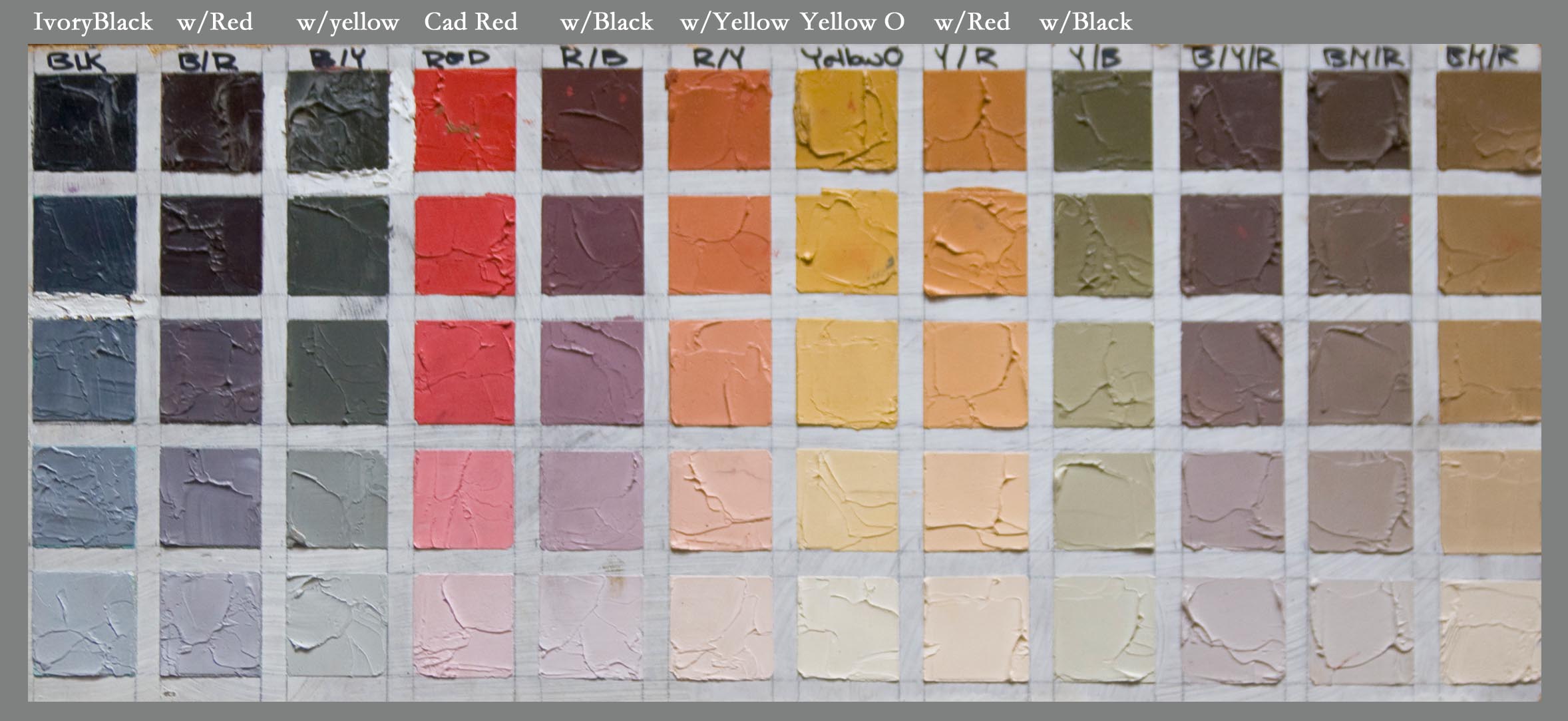
Zorn’s limited oil paint primary palette was: Black, White, Yellow Ochre and a warm red such as Vermillion or Cadmium Red.  There’s some doubt that he used these 4 pigments exclusively but in many cases his paintings (particularly his figures and portraits like the one above) appear to be “limited” to this range.

Example of Zorn Palette--from Westerberg Fine Art
I say “limited” because if you chart these colors out you’ll find these four pigments mix to create a lovely muted secondary color range. You'll also achieve a full value range obviously given the white and black as you can see from the above chart (Aaron Westerberg fyi is one of my favorite oil painting discoveries this year be sure to check out his stunning work.)  For this particular painting I wanted brighter cleaner violets so I chose ultramarine blue instead of ivory black though I definitely want to try another abstract using the black. 

For the red I used Grumbacher Red--napthol pigment is a nice substitute if you don’t want to use cadmiums.
I’ll be working on this painting more today so stay tuned for the finished painting. Speaking of color, last year I posted an abstract painting inspired by the Pantone Color of the Year (Tangerine Tango in 2012).  For 2013 the color of the year is Emerald (my birthstone) so that’s next on my abstract “to do” list. In the meantime I want to wish everyone a productive and creative year filled with color and painting joy!

P.S. For more info about my painting classes in 2013 please write to me or visit my painting class page. Thanks!