Monday, March 30, 2015

March Monday Magenta Madness

"Alphabet Rooster" 16x16 mixed media on canvas panel
I am seeking.
I am striving.
I am in it with all my heart.
Vincent van Gogh

Happy Monday (and van Gogh's birthday) everyone! My trip around the color wheel continues with red violet (or magenta) as my color inspiration this morning.

At first I thought the red-violet color (magenta was my favorite childhood Crayola crayon) would work well as a spring floral subject such as tulips but pretty quickly this colorful rooster emerged. 
They say if you like red-violet that you are balanced (it’s a cool and warm) and like to surround yourself with creative stimulation.

Every time I paint a rooster or chicken for an art show or festival they are good sellers too. So I always paint one for good luck. Painting the tail is my favorite part!

FYI, typically for my oil paintings I prefer linen canvas. But for mixed media paintings I recommend working on a harder flat panel especially if you don’t need a really large stretched canvas.  I think it’s much easier to “attack” with collage, layer, glaze, stamp, stencil, draw, scrape, spray, drip, splatter, etc.

If this process sounds hands on and physical—it is. It’s one of reasons I still enjoy working with mixed media from time to time —it’s a very energizing painting work out!  (P.S. I often stand for hours so an anti-fatigue mats really helps the feet, back, etc. You can find just about any size mat at Uline.)

On a supply note, I’ve been using flat canvas panels (such as a Fredrix) but a gesso panel (such as Ampersand) or heavy illustration board with a few coats of gesso would work great too. And thank you Vincent for your continued color inspiration!

Friday, March 27, 2015

Mixing it up in the Studio

"Love Nest" 16 x 16 acrylic mixed media (on hold for Summer Art Market)
There are colors which cause each other to shine brilliantly, which form a couple which complete each other like man and woman. Vincent van Gogh

Van Gogh's birthday is this upcoming Monday (March 30) so that was my quote choice today. (Did you know you can read (or search) all of Van Gogh's letters archived online in this wonderful resource?)

Given his love of color, I think Vincent would approve of my painting goal this week. Which is 12 paintings each with a dominant color working around the color wheel. My initial plan was to go in chroma order but as you know a painting often takes you by surprise and so I let the main color emerge as I worked on it.
"Dream Tree" 16x16 acrylic mixed media (on hold for Summer Art Market)
"Bloom to Grow" 16x16 acrylic mixed media (on hold for Summer Art Market)
 My previous post was Green and Blue Green. Today I'm posting Yellow Orange (one that I really ended up loving), Violet, and Red (a strong hue so that was a challenge.)

Mixed media/acrylic paintings are perfect for this “exercise” because they dry quickly and are easy to change on the fly. It’s probably my favorite aspect of working with acrylics. FYI, most of my paintings from now until June will be available at the Summer Art Market: June 13 & 14. I like to have lots of inventory for SAM collectors who are so loyal to this wonderful event.

For more info about my Denver art classes or upcoming painting workshops please visit the Scarlet Owl Studio website.   Thanks and have a colorful spring week!

Tuesday, March 24, 2015

Colors by the Dozen

"Lucky Me" 12x12 acrylic and mixed media on canvas panel

“Gather the best you have to offer and create a heartfelt, prosperous life full of purpose.”
Gail McMeekin

Happy first week of spring everyone! I was thinking about my upcoming color workshop this week and decided to try a series of 12 mixed media/abstract paintings that feature each hue on the standard color wheel. 

In honor of St. Patrick’s Day last week I began with green and green-blue. For more interest and challenge I also sprinkled in in some complementary colors and “spice” colors (as mixed media artist Robert Burridge calls them) rather than painting purely monochromatic.
"Look at Me" mixed media and acrylic on canvas panel
One hears all the time that you need a “play day” or if you have time “play week” in the studio. That sounds awesome but I often think I just can’t afford that kind of luxury...

But by working on a collection or themed body of work I stay focused and motivated from start to finish. And in the end actually have a lot of work to show for my time. I’m already looking forward to working my next set of colors (maybe orange or violet??) today.
I love audio books in the studio--nice purple too!
Coincidentally, while painting I was listening on audio book to 12 Secrets of Successful Women by Gail McMeekin (hence my quote choice today) a popular creativity coach. It was the perfect combination on a day devoted to color exploration. I've discovered listening to podcasts, audio books, etc. like this helps keep my busy left brain occupied while I work on more abstract paintings. Wishing you a prosperous week full of purpose!

P.S. As an artist I can’t image what it would be like to be color blind like many of the men in my life tell me they are. Have you seen these new EnChroma glasses designed to help the colorblind see colors they’ve never seen before? Check these out.

Monday, March 16, 2015

Painting the Spirit of Nature


“Don’t believe what your eyes are telling you. All they show is limitation. Look with your understanding. Find out what you already know and you will see the way to fly.”
― Richard Bach, Jonathan Livingston Seagull

Happy Monday everyone! Yesterday, it felt like summer. I finally turned off the studio heat, opened all the windows and enjoyed an iced coffee instead of a winter cappuccino. Not quite spring break in Cabo but still pretty relaxing for mid March.

Prior to this weekend though, I’ve been getting more than a little anxious waiting for spring. But of course, as many winter plein air painters know nature is still all around us. You just might have to look a little more closely (and be willing to brave the cold.) 
"Crow on Ice" 8x10 oil on linen
As I’ve noted before I get my daily winter nature fix at my nearby park where several large ponds attract plenty of usual aviary suspects even on the coldest days such as crows, gulls, geese, starlings, pigeons, flickers and ducks. .  
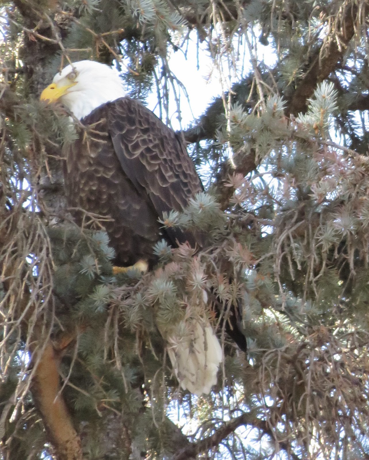
Washington Park bald eagle (hanging out in evergreens)
This year we also had some eagle and hawk sightings (as you can see) which was exciting but truthfully I enjoy painting the “everyday” birds like my high key gull and snowbound crow today. It was a happy coincidence that a recent  DPW weekly painting challenge a couple of weeks ago was bird themed. The challenge inspired by this wonderful Robert Henri (his book The Art Spirit is one of my favorites) quote:

Paint the flying SPIRIT of the bird 
rather than its FEATHERS.

It's another gorgeous day so time to get back to the easel and find out what I already know....Have a colorful week! P.S. For more info about my upcoming spring and summer workshops please visit my website.

Thursday, March 12, 2015

The Art of Painting a Zorse

Zorn Palette Oil Painting Horse Study 8x10 on linen
Simplicity is the ultimate sophistication. Da Vinci

Happy March everyone! First, you may be wondering: What's a zorse? I'll get to that in just a bit...

Are you ready for spring? I sure am. In May I’m teaching a six week Confident Color oil painting workshop (where I’ll be sharing my thoughts to strengthen skills like color mixing, harmonizing, dominance, etc.). 

I’m always researching, reading, and thinking about color...I've been thinking a lot about color exercises that have helped me over the years. And of my favorites is exploring a modest limited palette—such as three primary colors (technically pigments) and white.  We juggle so much as painters—shape, design, edges, values---So using a limited palette helps at least simplify your color choices.
"Mosey Mare" 8x10 oil on linen
For today’s small equine oil studies on linen I chose the “Anders Zorn” primary palette—Basically an opaque warm red ( cad. Red light or napthol), a dull light yellow (yellow ochre),  and black and white (I used Utrecht Titanium which is oddly a mix of Titanium and Zinc when you look closely on the back but I still like it.)  Typically, I might have used this Zorn palette for a figure or fall landscape but I thought it would be good match for horses. I love the violets it creates...Anyway I’m calling these Zorn horses—or just zorses for fun. (Can you tell I’m a product namer on the side?)

I don’t know about you but I’m really looking forward to spring painting this year. Thanks for stopping by and have a wonderful spring’s right around the corner week!