Thursday, July 28, 2011

Inspiration Swedish Style

Getting close...
About eight years. That's how long I'd been waiting (along with many other IKEA fans in Colorado). That's when I first heard buzz that an  IKEA might open here. So yesterday, when I would normally be in the studio in the early morning, I found myself (along with a cast of thousands) in a cavernous parking garage waiting in line for the Grand Opening of the Denver IKEA store in a sea of cadmium yellow medium and cobalt blue.

500 seat restaurant--love the snowball lights!
Shopping Snack--Yum!
Thankfully the opening seemed well-organized and while I did win a sofa or chair, I only waited about an hour. While I've browsed the IKEA website many times, I've never visited an actual store. I was immediately struck by the massive scale--imagine an airport with towels,candles, rugs, and cool mugs. One of the staff told me the Denver store was now the largest IKEA in North America. I think it will likely take a few visits to really get a good sense of the place. Tip: Wear comfy shoes--it was also a great walking workout.

As a foodie with a Scandinavian heritage, I was particularly looking forward to the cafe and the Swedish Food Market. They did not disappoint. I had very tasty pancake with ligonberry preserves and bought some dark chocolate bars and in the market. Eventually I had get back to the studio, but I had enough time to pick up these fun Mala felt tip stamping markers. I also had my eye on this interesting paper roll holder and drawing paper that I thought would be great for casual sketching. (Both were in the kid's department where I thought the prices were super affordable.)

Colors, shapes, and textures in every direction! 


I'm back in the studio painting and teaching today, but I have to admit, I've got a touch of  IKEA fever so if there are days I'm not posting in the next few weeks, you'll know where to find me...Welcome to Denver, IKEA!

Monday, July 25, 2011

Painting Colorado's Most Iconic Subject

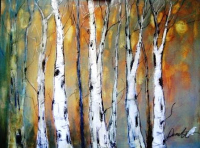
"Ancient Roots" Mixed Media on Canvas 36 x 48
Now, I've not conducted an official poll but I've been a Colorado based artist for almost my entire adult life. In that time, I've conservatively assert that I've proudly attended hundreds of art shows, festivals, workshops, etc. so I feel that I'm a fairly good judge of popular and beloved subject matter.

Now you might think it would be our Rocky Mountains--in particular snowy capped peaks. Yes, I've seen many versions of mountainscapes so that's a possible landscape favorite but even more than mountains, I'm going to go out on a limb (pun intended) and say that Colorado artists have an undying passion for shimmery, quaking aspen trees. In all seasons, forms, shapes, and sizes. How can you resist a tree with patterns?

I've painting aspens before of course but it's been a while and I this time I wanted to paint on a relatively large canvas help express the scale of a towering pale forest. In this painting on stretched canvas, I used many layers of acrylics, molding paste (for bark texture) and oil pastels for line work and details (personally my favorite  part). 

I recently read that aspen trees grow as large stands of genetically identical trees (technically, stems) connected by a single root system. The largest known fully connected aspen is a grove in Utah nicknamed Pando. Some experts believe this aspen grove to be the heaviest organism in the world.

I really loved working on this and can't wait to paint another with I think a warmer background next time. But I may need to taking a painting break later this  week for the new Ikea Grand Opening! Don't think I'm going to camp out, but I have been waiting for years for the store to arrive in Denver. I'm certain I'll be able to find an interesting and colorful studio accessory--if I can get into the parking lot. Wish me luck and in the meantime enjoy all your creative endeavors!  

Sunday, July 24, 2011

Summer Temptations

Happy Very Warm Summer Everyone! Thanks for your patience as summer has lured me out of the studio for the past week or so. While I've been teaching (thanks again summer students for all your hard work), I've also been distracted to several summer activities that have (unfortunately) not involved painting. But I promise to be back to the easel soon.

One of my favorite places to find a colorful inspiration are farmer's markets. Here are a few photos from the South Pearl Street Farmer's Market here in Denver, Colorado. One of my favorite things to buy are the amazing High Desert Peppers (hot of course!) and the Front Range Basil Tomatoes from the MMLocal booth. I love the colors of the rainbow beets as well.


For those of you who have been patiently following my Still Life 101 tips, here's Step 3 or How to Get Your Sketch onto the Canvas after you've toned your canvas. I feel there two basic rough in options, one is a bit more "devil may care" while the other your left brain will love.

Option 1:  Assuming I warmed up with a planning sketch (as described in previous post) I "just do it." I lightly sketch my subject (from careful observation) directly onto the canvas. Focus on the big shapes again using a dry brush. (I usually use a round or small filbert.) Just enough paint to see the lines on a toned canvas. I prefer a brush rather than pencil or charcoal which I find smudgy. 

This next part is very important because I think the key to success for moving from your simple big shapes to painting is creating believable 3D objects. On the Compose it Grid tool I was using big, simple flat shapes—more of an outline to get started. But when I switch to the canvas I’m now adding dimension to the shapes. For example the onion that was a rough circle becomes a sphere, the stems become slender cylinders, the table top a giant cube, etc. 

Tone on tone sketch in using Option 2 (lines not visible in photo)
Option 2: Left brain spoiler alert! Sometimes, it's helpful to ensure that your overall shapes and proportions are relatively accurate. Otherwise you’ll find you need to correct later while painting. This means lots of scraping, etc. which in turn breaks your rhythm. So I’d rather move objects now rather than later.

Therefore a more careful way to transfer your composition what is often called the grid transfer method. This classic method can get quite complicated (I’ve seen some artists use hundreds of transfer squares) depending on your subject, size of canvas, and level of detail. But especially for smaller paintings (under 12x16 or so), I find I only need a simple “4 box” grid. I create this by marking the half way point on each side of the canvas.

For example, for my onions on a 9x12 vertical canvas I marked 4.5 inches (top and bottom) and 6 inches on the sides. With a very light pencil line I then draw a connecting line to create 4 quadrants (in this case 4 rectangles). Next, make a corresponding grid over your planning sketch or reference photo with pen or pencil. If you have a color printer photo you may want to print out a low res black/white version to grid. Or if you used a tool like a Compose It Grid obviously the space is already divided for you.

Another benefit from locating these “north/south” and “east/west” dividing lines is you can improve your composition greatly by avoiding the placement of any strong lines or shapes directly on them. Hopefully one of those 2 methods will work for you and help get you going. If we can make that an almost ritual like habit daily painting becomes that much easier.

P.S Quick thanks to Cindy and the nice folks at Compose It Grid for the blog link on their Reviews Page. I promise I have no affiliation with them--I just really, really love these easy to use grids.

Monday, July 11, 2011

High Chroma Canyon

Acrylic and Pastel on canvas-20x30
Today’s Painting:
I posted this mixed media painting (inspired by the colors and textures of the southwest landscape) a while ago in progress, but recently we completed painting. This was a collaboration with a student and while it took us a while (lots of glazing layers) we had a fantastic time. And learned a lot in the process as well. We particularly enjoyed working with the oil pastel under and over the acrylic glazes.  

So the next time you’re looking for a painting project (particularly on a larger surface) consider working on a collaboration painting with fellow artist. Most likely you each have different creative strengths you can bring to the canvas. 

Speaking of you next painting project, if you prefer smaller scale paintings, I’m continuing from my previous post regarding tips about how to get started on your daily painting. In this case, the oil still life.

Step 2: Tone it Down
The sooner we make our mark on the canvas the better. Toning your support also makes judging your values so much easier. Before I sketch onto my canvas, I usually tone my canvas with warm wash of acrylic paint for quick drying.

Color wise, I prefer golds, oranges, corals, pinks, or sienna. For the onions, I used Transparent Red Oxide. For a ease and speed, I use a rag, paper towel, or a big old house painting brush. If it’s acrylic, it should be dry within a few minutes.

There are times you may want tone your canvas boldly with red, violet, magenta, yellow, or even black as daily painter Karen Jurick so skillfully does. Note that if you tone with a dark color, you can use a light colored pencil for your sketch.) In the next post I’ll chat in detail about what do after you’ve toned your support.

Thursday, July 7, 2011

Getting Off on the Right Start

"Sweet Reds" onion oil painting on canvas 9x12
As a painting teacher, I’m often asked: What’s the best way to start a painting? I bet if you asked 10 advanced oil painters who’ve honed their craft they give slightly different answers. But as an almost daily painter, I’m always trying to make the craft of painting as easy and predictable as possible.

So I thought I’d share my "no fail" process for starting a simple oil daily still life painting, such as a 12x12 or smaller since these typically are not a huge time commitment.

By the way, I have nothing against working from my own photos references. I do this all the time, particularly when I work in watercolor. That being said, I think painting from life improves my overall observation skills and for me at least, there’s no substitute for it.

Step One: Organize your shapes.
Trust me, I’m all for an enthusiastic, fearless painting approach. I pour, splatter, smush (that's a technical term), etc. all the time as a starting point. But if you haven’t had your morning mocha (that’s me) or your drawing skills are a tad rusty, I recommend you take a few minutes to plan your still life composition OFF the canvas.

The key is to plan on same ratio as your selected canvas size. For example here’s my sketch of the baby sweet red onions on a Compose It Grid (3:4 proportions to match my 9x12 canvas choice) with a dry erase pen which wipes off easily. If your canvas is a square, plan in a square, etc. Seems obvious, but I see other artists plan in different shapes all the time.  

If you don’t have a Compose it Grid (or similar tool), you can also easily trace the outline of your canvas onto a big sketchpad or make a smaller (but same ratio) sketch often called a thumbnail. For example, a 9x12 canvas thumbnail sketch could be 4.5 x 6, 2.75 x 3, etc.

Keep your sketch (and composition) relatively simple. No value or details yet, just shapes. I prefer a black marker rather than a pencil or charcoal.  We don’t need any shading. Look for big positive shapes. Try a few different compositions before moving over to the canvas. Personally, I prefer a still life that takes up at least 75 percent of the canvas so keep your subjects close at hand. Remember, backgrounds, foregrounds, and shadows are shapes. This is also the time to consider a variety of vertical and horizontal layout options.

In my next post I’ll talk about the next steps such how we get the sketch on the canvas and what I always do before I sketch on the canvas to make judging values much easier. Thanks for stopping by and happy summer painting!

Tuesday, July 5, 2011

Millefiore: Contemporary Floral Abstract

"Millefiore" Acrylic on canvas 18x 24
Today's Painting: 1000 Flowers
For this poured acrylic painting (which is basically a two part process) I used successive poured layers of Hansa Yellow, then Quin Magenta, and finally Thalo Blue (green shade). To keep the paint as fluid as possible (and easy to move around the canvas),  I mix diluted fluid acrylics into old plastic cups. I then tilt the canvas with each pour.  Note the Thalo will make a fairly dark line as you can see.

The acrylic pours stain the canvas leaving organic patterns of shape, color, and line. I then take some time to look at the canvas from a variety of angles before shapes start to emerge. Here, I kept seeing floral shapes and a vase so that's what I decided to work with. 

The final stage is to paint directly "alla prima" into and around the shapes suggested by the poured paint. Here I used the Golden Open Acrylics working with my "double primary" palette: 2 yellows, 2 reds, 2 blues and titanium white. As I  painted I kept thinking about the Italian glasswork Millefiore (e.g., 1000 flowers) and decided that I wanted to mimic that look within the flower shapes. At the end I felt the painting needed 3 key fixes:
  1. Another small dark shape for balance (I choose a small bird silhouette)
  2. Interesting texture. I'm not exactly sure what to call these but if you paint with acrylic you may see those skins that form around the top of your flip top tubes. Since this paint skins are flat donut shape, I thought they'd be perfect for the flower centers. And a great way to recycle dried paint!
  3. Some "quiet areas" of color fields since pours can get very busy. Note these color fields don't have to be pale color, just less detailed. 
Thanks for stopping by--as always have a colorful week!

Friday, July 1, 2011

Just Desserts

Just Desserts-9x12 Acrylic on Canvas
Today's Painting
Happy July 1 everyone! This is the third painting in my trio of "sweet treat" paintings. Here, I included a cappuccino since that's usually the time I crave a sweet. Again, these were painted with Golden Open Acrylics for easier blending.

Free Style Brushes
Speaking of new acrylic painting tools, here's an interesting new line of brushes and knives from Liquitex (who also has a great new website focused on art inspiration) called Free Style. Recently a student brought a brush just made for splattering! Super cool and much bigger than an old toothbrush! Check out a short Free Style Brush demo video above. 

Pouring Away
I always seem to get a lot of interest in my poured paintings and so am posting (in my student gallery above) a wonderful new example created by one of my younger students. I love pouring both watercolor and acrylics. It's one my favorite techniques to "KO" that big white canvas. Here we poured Hansa Lemon, Quin Rose, and Thalo Blue thinned down acrylics from old plastic cups--letting each pour dry for a bit in the sun between layers.

Then the student painted with similar colors and white to create a contemporary landscape. For extra detail and bling at the end we added some gold lines to emphasize the tree leaves. Thanks for stopping by and have a happy and safe holiday weekend!