Saturday, February 19, 2011

Springy Sparrow

Happy Weekend everyone! Last last April I posted a small oil painting of a sparrow from a photo that I took out my kitchen window. It was one of my personal favorite oils so I thought I'd work another one this week but work in a different color family.

Speaking of birds, I saw that it's also "Great Backyard Bird Count" this weekend. This is an annual bird watching event that allows anyone to be an ornithologist and record their local birds. Unfortunately this week, I've only had three at the feeder outside my studio this week: a sparrow, chickadee, and a house finch.

Back to my painting, for this 8 x10 oil study my "self assignment" was three fold: 
  1. Pay attention to (and accurately record) smaller shifts in color and temperature 
  2. Capture the way birds seem to melt into their background with varied brushwork
  3. Maintain strong overall diagonal design plan 
Since I tend to paint "from the gut" many days and this usually works for me, I still find having 1-3 painting goals like this really help keep me on track as evaluate the subject vs. the painting. Later today I'm headed to a near by Wild Oats for a demo about painting from your photos by local artist David Griffin which I'm looking forward to. (You have to love free demos but the pastry/coffee bar area gets me every time...)

Finally, I've added a Student Work page tab at the top where I'll be positing some of their work for inspiration and ideas. Thanks for stopping by and happy bird watching!

Monday, February 14, 2011

Red Velvet Valentine

Happy Valentine's Everyone! And quick happy birthday shout out to my Dad back in Michigan who has a Valentine's Birthday!  

This morning I thought I'd give my new GOLDEN Open Acrylic paints a whirl and figured something sweet and red would be the perfect subject to post today. I also recently saw a Bobby Flay Throwdown on Food Network with Red Velvet Cake. (Personally, I'd prefer a less sweet pastry like a flourless dark chocolate cake but you have to love the look three layers of crimson against creamy titanium white frosting!). And let's be honest, it's hard to paint baked goods without a bit of Wayne Thiebaud pop art influence.

This was my first go at painting an entire painting with the GOLDEN Open Acrylics and they definitely have a different brush and application feel.  Softer and more blendable, but in thinner applications the paint does start to skin and and set up sooner rather than later, particularly in our very arid climate.

So I don't think the Open Acrylics would really work as an oil paint substitute, at least not for me. That being said the paint has a nice smooth feel and the colors (as with all GOLDEN products) were clean and bright. I'd love to try them in a plein air situation where oils can be rather maddening. And I thought here the paint worked great for the frosting effects which I'm still playing with since it's the best part.

As an artist, I also like to think of today as a joyful celebration of  RED. Depending on your cultural influences, red can symbolize a wide range of emotions and sensory experiences, such as warmth, aggression, passion, romance, blood, danger, etc. So the next time you want to communicate strong emotions in your work or need an stronger focal area consider the wealth of red pigments at your disposal. XXOO. 

Sunday, February 13, 2011

My Top 10 Favorite Studio Tools 2011

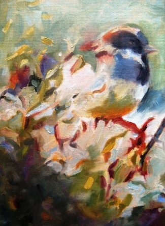
Since its award season I thought I’d post Part 1 of My Annual Best Art Studio Tools and Helpers. Here are my Top 5 2011 “Golden Mannequin” Awards...
Best Overall Studio Helper: My iPad
My big splurge item last year.  But, if you already have an iPad I probably don’t need to convince you how fabulous they are. At first I didn’t really think it would be a “must have” in the studio. Now, I use it everyday--it's always in reach of my easel. 
 
I also enjoy listening music and podcasts such as Artists Helping Artists. Since I tended to keep my larger laptop in my office, the iPad’s also a handy time saver for checking a website for show deadlines, check out a Youtube demo, the weather, my calendar, my mail etc. It’s also great for travel (plane sketching with the art apps!). I’m certain I’ll continue to find more art and studio uses for it. All around, an A+ artist tool.  
My studio mascot gray tabby Dash is also a wonderful muse and studio helper, but he's one of a kind.

Best Organizational Tool: The Wonder File!
OK, a bit embarrassing, but from the first time I saw the late night TV ad, I knew I had to have one. I have two (one red, one black) and could easily fill a third. Like a fold able scrapbook, I use it mostly for organizing those pesky reference photos into categories like: floral, horses, still lifes, abstracts, figures, landscapes, etc. As you may read in some reviews, it’s not perfect (the elastic straps kind of crunch thinner printer paper, pocket sizes a bit odd, etc.) but it works better than my loose file folders. Plus, if I need to take my reference photos with me, I can just grab it and go.

Best Storage Tool: Mayline Oak Flat Files
Many years ago I found a vintage 10 drawer Mayline oak flat file cabinet at an office liquidation center. It’s a giant oak whale and it cost more than my sofa, but I it's a must have for storage. It safely stores a ton of unwieldy materials such as full 22x30 watercolor sheets, mat board, random collage scraps, yupo paper, illustration boards, prints, large drawing pads, my art clear bags, etc. I must have over 100 items in there. The large flat top can also be used as a work surface and the drawers have handy changeable label tags.  Can’t imagine where in the world I stored all these items before “Moby” came into my art life.      

Best Painting Tool: Rubber Tipped Scrapers/Shapers
I’ve mentioned these tools before--I use them for both oil and acrylic painting particularly when I’m working on a firmer surfaces such as canvas board, Masonite, or illustration board. You can find these firm but flexible rubber tipped tools in a variety of shapes and sizes. They used to be hard to find but I just spotted some the other day at our local craft store near the painting knives. And of course you can order them on line. Runner up: Oil paint Sharpies for my line work--love the gold and silver!   

Best Green Tool: M. Graham Non Toxic Walnut Medium
Thank you, thank you Graham for making this. As I’ve mentioned before, the more I paint the more chemical sensitive I become so I don’t tend to use much medium anyway.
But when I do, it’s nice to have this option. Runner up:  I use Turpenoid Natural for all my clean up now. Pop up baby wipes are pretty nifty too.

I'll be back in a future post with the rest of my Top 5. In the meantime, have a great weekend and as always if you have any questions about art supplies, studio tips, or my classes please contact me.

Friday, February 11, 2011

The Night to the Owl

Happy Friday everyone! I'm thrilled to report the sun is out and we're warming up! My fingers can actually type again. Thanks again to my students who braved snow, freezing temps, and bad roads to keep on painting!

I thought if I posted another bird painting this week it should be at least my favorite bird, which is of course (big shock) an owl. This is mixed media on illustration board. Artistically, owls have a wonderful shape and they can symbolize so many things--wisdom, insights, mystery, intuition, longevity, bad omens, night, and even death. (My blog post title today is from Shakespeare's Cymbeline for my fellow English majors out there.)

Since I'm often asked about the origin of my studio name Scarlet Owl I thought this owl-themed post would be a good time to share the story. First, I probably should confess that one of my "other jobs" is a professional namer of products, brands, company, websites, etc. Have you ever eaten a Keebler Bistro Cracker? Yep, that was me. So as a "professional" brander I felt extra pressure to create an art studio name that I really loved and could live with for for a very long time.  

Basically, I knew I wanted a color or pigment name and an animal (or something natural) because I love to paint nature. So the brainstorming began: Mauve Moose, Cerulean Otter, Viridian Octopus, Cobalt Leopard, etc. But, believe it or not, this was during the dot com boom and many of these names were already business names or in one case, a Canadian rock band.

Finally, I thought I had a winner: Red Hawk Studio. I thought it had a sharp, robust, westerny sound. But the more I thought about it, it just wasn't unique enough. So I moved on to other reds and other fowl, and voila, there was like a red spotlight: Scarlet Owl. And a bit unusual but not too weird (at least I hope not) and for me at least it said: Creativity and Wisdom--a ying/yang balance that I thought was perfect for my panting and teaching philosophy. 

As always thanks for "giving a hoot" (sorry I couldn't resist) and stopping by. Have a great weekend and happy painting from my nest to yours!    


Thursday, February 3, 2011

Palomino Moon

The snowfall and cold temps continue (as I think it does for many of us) so I'm starting to get a bit restless, but there are certainly worse places to be on a snowy day then in the studio enjoying my jazz station and painting ponies. As I've mentioned before, I've always loved horses and in particular colorful patterned horses such as paints, appaloosas, and palominos. Earlier this week, I had such a great time playing with layering acrylics (tube and fluid) on illustration board that I wanted to try another piece but this time with horses, rather than birds.


My original plan here was to keep the overall palette very subdued and monotone--I was going to use mostly blue and green grays with maybe a pop of warmer color. Perhaps I'll try that again. But this time best laid painting plans went out the window. I found myself continuing to intensify the colors using quin magenta, transparent red oxide, thalo blue, and even adding a hint of metallic copper. I used soft gel medium to add texture to the "cliff."  

On a bit  of a side color note, I came across a fun color site the other day Colorstrology which basically assigns a personal "color sign" to your birthdate. My birthday color in May is Green Tea and my color attributes are: Unusual, artistic, spiritual. Hmm, I guess most of my family and friends would agree with those. And I just realized my home office is painted a Behr color called "Green Tea"...Interesting. 

Thanks again to my students braved the chilly weather to come paint this week. As always I find your company and artwork a continued inspiration. Am thinking it's time to head to the kitchen and make something super spicy. Stay warm and paint happy everyone!    

Tuesday, February 1, 2011

Nesting Time

Last Friday in Denver we were painting in the backyard, in tee shirts with high sixties temps and sunshine.  Yikes. Not today. Negative nine when I woke up this morning. Not good for running errands or working out but perfect excuse for staying in, "nesting" and painting in the cozy studio.

Last night, I demonstrated a multi layered mixed media technique using acrylics (both fluid and tube), gel medium, Frisket film ( inexpensive shelf paper also works), Crescent illustration board, and my secret weapon: a plastic fork. Thanks to my very patient and willing students whose "first time" paintings also turned out great! My palette was primarily crimson, turquoise, quin gold, white, thalo blue, and black. This somewhat limited palette still provides a luscious range of saturated and neutral colors.

These creative exploration paintings may take some patience--and a lot of loud hair dryer in between layers--but I find they are absolutely worth it.  Slowly, but surely, intriguing shapes emerge, symbolic themes are suggested (lots of birds for me lately...Hmm), etc. I find you have to nurture your painting along from start to finish all the while trusting your artistic self. Very different from painting an onion on a table.

For example, I rarely know what's going to happen next but it's this kind of mystery and surprise that keeps me coming back for more. Like solving an art puzzle, these type of paintings also help strengthen your design elements--colors, shapes, values, pattern. line, etc.whether you paint abstracts or representational subjects.


Quick thanks to all my visitors who helped make January 2011 my highest traffic month since I started blogging! I think it's going to be the one of the best art years I've ever. Namaste and happy nesting in your neck of the woods!