Showing posts with label oil painting tips. Show all posts

Monday, February 27, 2012

Pop of Color

"Positively Poppies" 8x8 Oil on Linen-SOLD
When I start getting impatient for spring I just have to paint flowers. I’ve also been thinking a lot lately (thanks to my students and recent workshops I’ve taken myself) about my visual approach to a painting. In this case, I wanted to explore with the translucent nature of the poppies and as well as a high, bright key. See my tips below on painting with bright, clean colors.

I’m continuing to play (sometimes it’s work!) with very intensely bright transparent oils (magenta, violet, crimson, Indian yellow, perm rose, sap green, etc.) for initial mass/shape block in. I think approach is a match made in painting heaven for high key florals like this.

New Favorite “All in One’ Tool: The Artist MVP
As I mentioned many times, I love my “red plastic sheet” in the studio to check my values. I also use grids and sometimes a small compact mirror for composition checks. Thankfully well known California oil painter Peggy Kroll Roberts (her work is gorgeous) offers a smart and handy combo of all three on her website. It comes on a cord that you can easily wear plein air as well. Just ordered one as a gift and now can’t wait to get another. Thanks Peggy for this great idea!     

More Bright Ideas
When painting a bright, high chroma painting like these poppies it can be tempting to get wrapped up in all that color. I know I do. But be careful not to jeopardize your initial value plan. Let’s see you set up a simple sunlit still life. Take a minute and note where the brightest color notes are (remember bright is not the same as lightest.) Usually you’ll find the most intense in between the light and the shadow.

Or maybe not. Painting is, after all, an observational science. In general though, the better we represent the correct values the more saturated color your painting can support. Have a wonderful rest of your day!

Monday, December 19, 2011

A Winter Demo with A Modern Oil Painting Master

Quang Ho Still Life Demo in progress (detail)
I rarely post a painting that's not mine but this is worth the exception. For months I’ve been looking forward to acclaimed Denver painter Quang Ho’s six hour long still life oil painting demo this past Saturday. I hate to gush but it was truly amazing. Honestly, I’m still exhausted just from observing and absorbing. (I want to quickly note that the room was lit for painting. I didn't want to use the flash so my photos really don't do his painting justice.)
Quang begins with a "loose" washy block in of shapes
After Quang introduced the session by explaining his light and shadow approach (you can learn more about this in his Nuts and Bolts DVD), he arranged a lovely still life that included red tulips, orange persimmons, a big green glass bottle, and some light greenish white lilies. He emphasized that he's looking for variety and color flow. Watching him arrange the objects was truly a treat. 
Quang's Still Life Setup

Quang started with orange/lilly area and moved on to adjacent shapes.
  Briefly, for those of you interested in Quang’s painting materials:
  • Support: Square-ish (around 30x 34?) double primed linen mounted on gator board so he can trim this easily if he needs to. Looked like a wonderful surface to paint on.
  • Brushes: Both bristle (mostly filberts and egberts—long tongue like filberts) and softer mongoose brushes. He mentioned the British Rosemary brand. He cleans his brushes with Turpenoid Natural.
  • Palette: Relatively large glass palette (with around 20 colors). He uses a variety of brands and noted he likes LeFranc white (something I will try). Medium: Odorless Turpenoid.
  • He’s right handed and stands when he paints (stepping back a lot) and keeps the palette on a table in front (not to the side) of his easel as you can see below. Note this is a "classroom" easel.
Quang's Palette--lots of color!
I couldn’t begin to touch on the depth of knowledge a master painter like Quang has but I wanted to share a few random notes I made during the demo that struck a chord.   
Getting to the final stages...Quang painted the table fabric last.
  1. He learns more about painting from philosophy and science books than he does from art books.  
  2. Be sure to consider the macro: What is the big picture—the  main story you are telling? What is the light doing?
  3. On the flip side you need to be conscious of the micro: Even in a large painting each brushstroke matters. There are no repeats in nature.
  4. Every piece is an important part to the whole. Carefully record unique and specific shapes.
  5. Take your time. Don't rush. Mix a new color for every brush stroke.
  6. Don’t be as concerned about having a single focal point as you are about how the eye travels through the painting.  
  7. Start with the area that you think you do the most correct and work off of that.
  8. Painting is a series of decisions so it’s important not to freeze—Make a decision!
  9. Focusing on value before color helps you color mix.
  10. When painting light and shadow approach classify your shapes into light OR shadow shapes. It's one or the other. 
  11. Note light and dark (a value range) is NOT the same—for example you might have a relatively light shadow.  
  12. As the object turns from the light and shadow the color intensity is at its greatest.
  13. Be very mindful recording the shape where the light and shadow meet.
  14. There’s no negative space—everything counts.
  15. Where can you merge your edges? Search and destroy...
  16. Start with your blueprint and don’t get lost in the detail.
  17. There’s no “mud” just bad shapes.
  18. Light is an organism that moves as one.
Thanks for stopping by and I hope you enjoyed the highlights from the demo. I also want to thank Quang for sharing his knowledge. One day, many years from now, I'll be telling my students about this demo. It's was like watching a magician who explains everything he's doing but in the end it's still magical.

Thursday, September 29, 2011

Easel Does It Apples

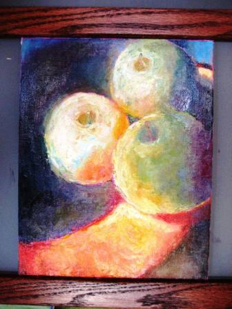
Sunlit Apples-8x10-oil on canvas
Yesterday, I was inspired to do a mostly knife color study from re-reading Arthur Stern's book How to See Color and Paint It,  This is older but excellent oil painting book with superb exercises to help train your color vision and ability to record what you see. Not what you think you see. My very quick tips for learning to paint this way are for each shape ask yourself 4 key questions:

1. What color family is it? Note the answer is one of these 6: Red, orange, yellow, blue, green, or violet. IN other words, there's no brown, gray, beige, etc. There is a dull very dark orange however. 
2. How relatively light or dark is it? I find it helpful to locate the darkest dark in your photo or set up and compare to that. A simple value range might be something like: Very light, light, medium, dark, very dark. 
3. How bright or dull is it? Another way to think of this is how close is the color to your color out of the tube (which is usually at a high intensity). There are several ways to dull or "kill the brightness" of your color such as adding the color complement or my favorite: palette mud (scraped together from your mixing),
4. How warm or cool is it? Most colors will have a tendency to lean toward their neighboring color such as red-orange, blue-green, red-violet, etc. I think you may find that some of your darks are actually quite warm.


For example, are sunlit Granny Smith apples in an orange-y teak wood really just green? Another way I approach these paintings is to consider that in most sunlight scenes you'll likely (after some observation) discover a full range of color and temperature as I did painting these apples.


Also, if you paint smaller studies (under 12") I highly recommend using some kind of canvas holder. I designed this handy small canvas holder (I'm calling it the Eeezle ) based on some I've seen other painters use. So I didn't invent this but I thought it would be nice to have a midtone gray as the backdrop so this is a 16x16 square piece of 1/4 inch MDF painted flat gray.  
I also chose a 16x16 since I often paint 12x12 panels. The adjustable bars (ledges) are stained and varnished oak (I guessed a hard wood would warp less). The bottom bar is actually stable and the top bar is adjustable with easy to use thumb screws in the back.
Here's the apple painting in progress with the magenta toned canvas (the same color I used for the raven in my previous post). The neon magenta is not the easiest background to paint on (ouch--my eyes!), but I love the contrast with the yellow greens and it motivates me to work quickly. Also, I've not forgotten my promise to include some "getting into art show" tips this week and so be sure to check back for those tips.
Have a great day at your easel!