Saturday, August 31, 2013

The Passion Sandwich

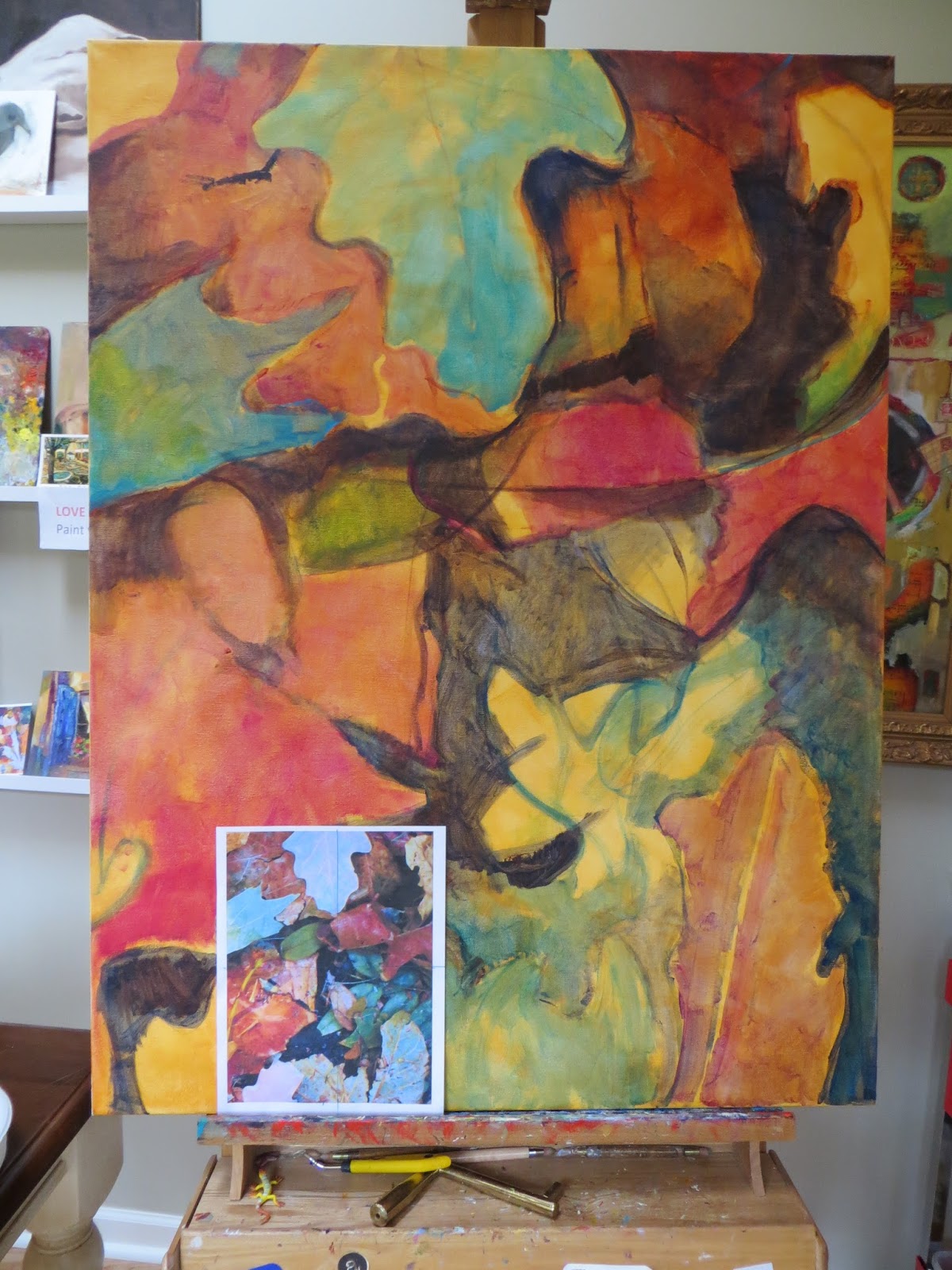
Autumn Oil Paining Commission in Progress (30x40)
One person with passion is better than forty people merely interested. (E. M. Forster) 

While I continue to paint this large autumn leaf inspired oil painting (in progress for a client) yesterday morning I was listening to the Artists Helping Artists interview with award-winning California plein air artist Ken Auster.

Ken offered many helpful insights but one really struck a chord. And that’s the importance of the “passion sandwich.”  In a nutshell, it’s the benefit of separating the intellectual aspect of painting with that pure joy and passion stage.  Perhaps summed up in a simpler 3 word motto (which I quickly taped up by my easel):

Think
Create with Passion & Joy!
Think

Or Plan. Paint. Fine Tune. You get the idea. This makes sense and should be relatively easy. But what I witness often for painters of all levels (myself included) is the tendency to rush to the painting process too quickly with little or no forethought or understanding.

Now, I’m all for unbridled enthusiasm in the studio. But what happens when we paint without some planning? And all the passion, excitement, and creative may come to a grinding halt.

Or maybe we did do some planning (like a value sketch) but while we are in the middle of the creation phase we are still "second guessing" ourselves. Each time we hit the pause button we have to ramp up again.

This “stop and go” pattern may work for some artists but I agree with Ken. I think we’ll have a more productive and pleasant painting experience if we try to protect our passion and joy by bookending our  planning and evaluation.

I can tell you I've tried to stick to the "passion sandwich" diet during this painting. And so far it’s worked really well. For example, in the first "think" step I painted an mostly transparent acrylic underpainting where I worked out some design issues before I switched to oil paint--making the create stage much easier and quicker. 

P.S. For those of you getting ready to join in Leslie's 30 in 30 challenge (see her tips for doing the challenge if this is your first time) tomorrow I want to wish you all happy and passionate month of painting!

Sunday, August 25, 2013

30 Days (and Paintings) Has September

Initial color washes for abstract leaf painting. 40x30 on gallery wrap canvas.
September is one of my favorite months here in colorful Colorado—turquoise skies and glowing golden aspens.  And it's also one of my busiest. As many of you may know California oil painter Leslie Saeta (host of Artists Helping Artists podcast) is kindly hosting another 30 in 30 day painting challenge in September—which is (yikes) only a week away!

It won't be easy (I guess that's why it's called a challenge!) but I’m looking forward to participating as much as possible. As of this AM there were already over 150 artists participating! A daily painting challenge like this is tremendous way to stay motivated, improve your painting skills, and share your art with a new audience almost every day.  So be sure to join in if you can! 

One of the series of paintings that I hope to share is an autumn leaf inspired triptych (three 30x40 vertical gallery wrapped canvases) which I started this week.  This is my initial value and color undertone block in with acrylics. I like to use mostly transparent higher chroma (usually out of the tube colors) on the undertone and then "calm" down the colors and use more opaques in the next layers for more interest. 

Ready to go big?
This painting is a commission for a wonderful client I met over the summer for her new home.  I’ve always enjoyed working on larger paintings when you've been working on smaller paintings for a while can be like writing a series of short poems and then switching to a longer more complex novel.

But for those of you who already “go big” in your paintings you know that bigger isn’t necessarily more difficult. It’s just different. I find I take a few more careful steps to prepare but then I’m off and enjoying all the extra canvas space.

When you scale up you’re using a photo reference be sure it’s cropped to the exact same size ratio of your rectangle canvas or support.  For a 40x30 painting like today, I cropped my photo to the same 4x3 proportion. This way when I do my sketch in/mass in of big shapes I’m comparing apples to apples. (Of course using a square photo and and a square canvas is even easier to scale.)

At first I found this method somewhat tricky but the more I scale up this way the quicker and easier it is. My other tip is to block in and connect your darkest value masses first. I find the dark masses easier to see and judge for scaling up. Once those dark masses are in, the other shapes tend to fall into place. Here you can see how I started (that warm wash is Golden Quin. Gold):


P.S. A warm “back to school” welcome to all my new fall students—another reason I love this time of year. Now let’s all get back to our studios—we’ve got some paintin' to do!

Wednesday, August 21, 2013

To Dream a New Dream

"Steppin' Out" 12x12 oil on canvas (collection artist)
You are never too old to set another goal or to dream a new dream. C. S. Lewis

I’ve always been fairly focused and goal oriented. This tendency served me well in a business or educational setting.  As you know, in the corporate world a typical goal goes something like this: Increase sales of the XYZ oil brush at the new Atlanta store by 10% by end of the year.  Here, the goal is both specific and measurable.  At the end of the year, the answer is either yes that happened or no we missed the boat.

However a typical artist goal might be:  I want to improve my plein air painting. (Yes, that’s one of my actual summer art goals.) Seems reasonable and true but kind of vague now that I see it in print.  This morning for example (photo evidence below) I actually ventured out of my studio (yay!) and painted in the park? So did I achieve my goal?
My Coulter plein air easel in Wash Park this AM. Whew hot but shady!
But aren’t we always hearing that art is a journey not a destination? Or maybe that’s not true anymore in today’s art market? No easy answers, right?  

Thankfully, I recently came across two timely goal themed posts (no pun intended). One from OPA artist Susan Blackwood who nicely summarized an OPA presentation by Joe Paquet. And the other from award winning Colorado landscape artist Stacey Peterson who writes about “keeping your eye on the trail.”  

I particularly enjoyed Joe’s theme of “knowing yourself” and “finding your own gifts." More specifically, he suggests you grade yourself on a scale of 1 to 10 on these key criteria:
  • Drawing (I think of this as interesting shape/mark making as well as accuracy/proportion)
  • Color
  • Harmonies
  • Design
  • Brush strokes (I think of this as edgework as well)
  • Values
To help evaluate my own skills I added 2 additional key criteria that I also feel are important to my growth as an artist:
  • Starting with clear purpose and intent
  • Finishing (actually finishing, detail work, or knowing when to stop)
Not only did I find it helpful to grade myself but I thought this would be a very useful list to take to a class or workshop to help you have a specific dialogue with an instructor.  Or to score yourself after a series of new paintings. Where was I at the start of the year, where am I now?

Goal making may not work for every artist but personally, I’ll always find this kind of “self diagnosis” helpful. One of my own goals will always be to "be a better artist"—but I think I understand now that how I define that is up to me. 

P.S. Thanks to Dan Oakleaf for sharing this "dreamy" snowy egret photo (taken along the So. Platte in north Denver) for today's egret painting to help me meet my "wildlife painting" goals.  

Monday, August 5, 2013

Nature is Imagination Itself

"Let's Twist Again" oil on 11x14 Raymar panel--collection artist
The tree which moves some to tears of joy is in the eyes of others only a green thing that stands in the way. Some see nature all ridicule and deformity... and some scarce see nature at all. But to the eyes of the man of imagination, nature is imagination itself.
William Blake

My primary inspiration is nature.  Even though I live in the heart of the city, one aspect that I think all Denverites love about our mile high city is that the "wild west" is just minutes from home. As Denver plein air artists will attest, you could be painting an urban landscape in the AM and then a more rugged sunlit western landscape in the PM. You simply head west into the foothills or south toward New Mexico.

In an attempt to explore my “region” this summer I bought a Colorado State Park Pass. Within about an hour or so of the city there over half a dozen state parks—each with its own wildlife and unique landscape. So my tip today is to paint a State Park in your area--FYI for more park inspiration check out Paint the Parks--a website devoted to park painting.

One state park I’d heard about many time from other painters was the Castlewood Canyon State Park about 30 miles southeast of the city. It’s a beautiful 2,300 acre park with colorful rock formations, a wide variety of wildlife, and a stunning Pike’s Peak view on a clear day (it’s about a mile higher than the city.)
Pike's Peak from Castlewood Canyon Trail

Because the park is also part of the Black Forest region there are some wonderful old pines and shrubs. This twisted wind worn tree caught my eye right away—it had such a distinct figural quality.  This painting took me a few sessions.

My thanks to one of my own painting mentors (yes, teachers have teachers!) Dan Oakleaf for his guidance on this. Particularly since I wanted a more natural palette for this.  Also, this painting was not a quick alla prima study-the drawing was more complicated but worth it. I'm really motivated now to visit all the parks in the area before winter in search of painting subjects.