|
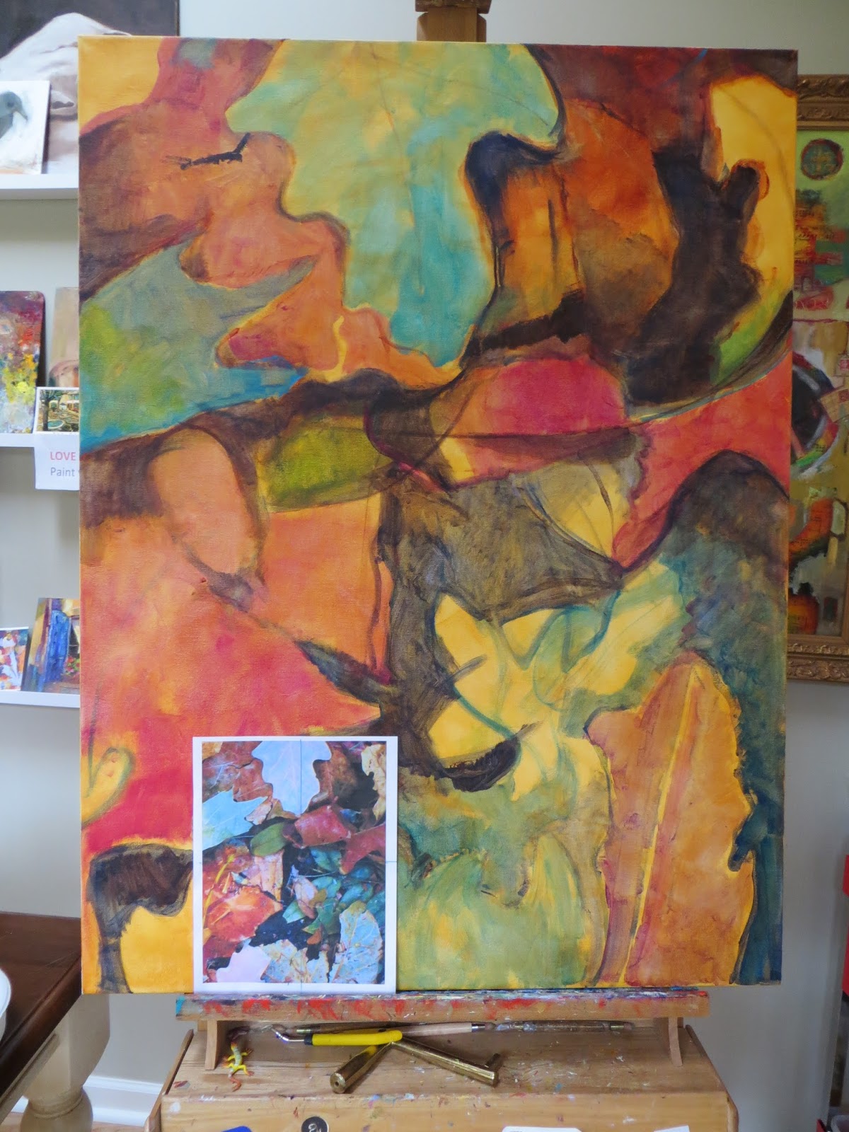
| Initial color washes for abstract leaf painting. 40x30 on gallery wrap canvas. |
September is one of my favorite months here in colorful Colorado—turquoise skies and glowing golden aspens. And it's also one of my busiest. As many of you may know California oil painter Leslie Saeta (host of
Artists Helping Artists podcast) is kindly hosting another
30 in 30 day painting challenge in September—which is (yikes) only a week away!
It won't be easy (I guess that's why it's called a challenge!) but I’m looking forward to participating as much as possible. As of this AM there were already over 150 artists participating! A daily painting challenge like this is tremendous way to stay motivated, improve your painting skills, and share your art with a new audience almost every day. So be sure to join in if you can!
One of the series of paintings that I hope to share is an autumn leaf inspired triptych (three 30x40 vertical gallery wrapped canvases) which I started this week. This is my initial value and color undertone block in with acrylics. I like to use mostly transparent higher chroma (usually out of the tube colors) on the undertone and then "calm" down the colors and use more opaques in the next layers for more interest.
Ready to go big?
This painting is a commission for a wonderful client I met over the summer for her new home. I’ve always enjoyed working on larger paintings when you've been working on smaller paintings for a while can be like writing a series of short poems and then switching to a longer more complex novel.
But for those of you who already “go big” in your paintings you know that bigger isn’t necessarily more difficult. It’s just different. I find I take a few more careful steps to prepare but then I’m off and enjoying all the extra canvas space.
When you scale up you’re using a photo reference be sure it’s cropped to the exact same size ratio of your rectangle canvas or support. For a 40x30 painting like today, I cropped my photo to the same 4x3 proportion. This way when I do my sketch in/mass in of big shapes I’m comparing apples to apples. (Of course using a square photo and and a square canvas is even easier to scale.)
At first I found this method somewhat tricky but the more I scale up this way the quicker and easier it is. My other tip is to block in and connect your darkest value masses first. I find the dark masses easier to see and judge for scaling up. Once those dark masses are in, the other shapes tend to fall into place. Here you can see how I started (that warm wash is Golden Quin. Gold):
P.S. A warm “back to school” welcome to all my new fall students—another reason I love this time of year. Now let’s all get back to our studios—we’ve got some paintin' to do!