Showing posts with label Denver painting teacher. Show all posts

Tuesday, September 26, 2017

Fall's Full of Color and Creativity!

"Enchanted Spot" 8x10 oil (on hold for show)
Happy fall all! As a painting instructor this is one of my busiest (and therefore favorite) months but because of that I haven't had that much time to participate Leslie's annual September "30 in 30" painting challenge.  But I still strongly believe that relatively small "almost" daily paintings are one of THE best ways to improve your painting skills so I hope you'll keep painting and growing!

In a previous post, I mentioned this is a sensible season to invest in both you and your creative tools. Unfortunately, I think many artists (and this is too bad) abandon art simply because they are using not the right materials. On the other end, I've had beginners spend thousands and that's not necessary either. Here are my thoughts on what you might want to upgrade or enhance in your studio or creative space:

  • Does your color seem dull, strange texture? A student brand or old tube may be the culprit. Superior quality (professional artist) paint or simply fresh paint. Maybe slowly start replacing your student paint for a few nicer tubes of paint? That being said, there are some “student” paint pigments I still use and like (thalo blue for example). 
  • Brushes seen better days? Better brushes or just new clean brushes with good edges, etc. I use mostly Silver Bristlons, Rosemary's and Winsor Newton Monarchs since I prefer synthetics. In general these are in the 10-25 dollar range for small/medium sizes online but they also last much longer than craft quality brushes. Tip: Winsor Newton Non Toxic Brush Wash--pricey but you don't need much and works better than anything I've ever found. 
  • Have you ever worked on the very best surface you can find? For oil painters this could be linen or Ampersand Gessobord.  And for really large paintings? I use one of the weekly coupons for one of the big craft stores or wait for a sale to buy their best gallery wrap canvas. 
  • Easel—I really like a crank easels—In a dry climate (where wood splits/loosens) that’s just worth the extra cost for me because I know they will last a long time. Tip you can often find good easels used and a little paint splatter won't effect the function--just be sure to test them.  
  • Tempered glass palettes are super easy to clean and strong--Haven't broken one yet! I buy mine online at Store Supply Warehouse. Be sure to cover your high quality paint and store in a cool place. 

I hope those tips make your fall painting adventure more enjoyable! P.S. There are a few spots left in my my next Denver oil painting class (6 weeks) starts on WED. October 26--Please visit the studio website for more info.


Sunday, August 27, 2017

Parade of Color and Thanks!

"Sea Treasures" For Sale at Parade of Homes Dream Home 
In my previous post I was sharing my thoughts about about how artists might want to consider  upgrading their studio/supplies this time of year.  Promise to return to that line of thought soon. But my art week was so robust I wanted to I wanted to send out a few "thank yous, thank yous" to the art universe...

First, a very special thanks to the lovely Foothills Art Center in Golden, CO and to my wonderful artists (several who came from far away which is always appreciated!) for a super enjoyable oil painting workshop--It was a pleasure meeting you and I look forward to returning to this inspirational venue next year!
Artists enjoy color at Foothills Art Center workshop!
I always learn something when I teach too. Some of the students where taking demo pics and writing notes along side with a cool iPad notebook app called "Bamboo" which some of you might enjoy/find helpful for classes. (Note to self--Time for a better stylus!)
"Summery Hen" oil painting workshop demo
Looking for an affordable weekend oil painting workshop? My next "Glowing Colors" transparent oil painting workshop will be one day Saturday October 28 at Curtis Art Center on October 28. You may find more info/registration links here.

Second, I'm honored to part of a special local artists show at one of the Dream Homes (not far from my studio on South Garfield) on the Denver Parade of Homes tour this year. The setting is a gorgeous contemporary home so it was a "joy and challenge" creating some contemporary abstracts that would be a good match in this special setting. (My post image today is one of these.) All the art in the house is for sale too and the show is Free so stop by if you get a chance!

Also, reminder my group Denver painting classes resume in just a few weeks on September 14--Registration is now open! The Thurs. AM class is Glowing Colors in Oil Painting (10 weeks) where I'll share my tips and techniques for working with transparent oil paints.

The PM class is "Show me the Colors" (5 weeks)--Which will be kind of "color bootcamp" with tips, theory and exercises for oil, acrylic, and watercolor painters. You can register/get more info on the Park Hill Art Club Website. 

You can win cool art books on the studio FB page this September!
Finally, be sure to follow/like my art studio news on Facebook--I'll be giving away some of my favorite art books in September--So stayed tuned for that. Thank you again everyone who supports me in my art adventures. Have a wonderful week!

Sunday, August 20, 2017

Brushing Up on Your Art

Just "some" of my studio brushes--The good, the bad, the old..
Happy late August! I love summer but as a painting teacher (and an artist who loves to also take classes myself) I always look forward to this time of year. Not only is it the perfect time of year to take a class or workshop, I think it’s great time review of your art and/or craft supplies.

As an instructor, I see some well-loved supplies (as in they haven’t made that brand in over 20 years). Some “antique” supplies may be just fine but others, well frankly, it may be time to just let go.

Nowadays we could include technology in that studio enhancement as well. Every time I upgrade my "older but still OK" laptop, tablet, website, camera, phone, etc. I think—Wow this is so much easier/better/faster...I should have done that sooner.

I’m really careful when it comes to studio expenses. But I also believe that if you invest in a class or workshop it’s worth having “up to date” fresh supplies that won’t hinder your experience. There’s a good reason for instructors to include a supply list. They want you to have the tools you need to get the job done.

Another thought:  What if you’re next painting is one of your favorites or even your “chef d’oeuvre?” You’ll want to be sure you’re using the best supplies you can practically afford.

Do you like art supply deals? This is a good time of year for that too. Often local art/office/craft supply stores or online art stores (i.e. Jerry’s, Blick) feature sales and/or special pricing, free shipping, coupons, etc. this time of year. (Tip: Google shipping coupon, etc.)

Personally, my art supply spending approach is “happy medium.” This means not “found in attic/garage” or “borrowed from my kids” but also not the break the bank either. And of course you don’t have to upgrade your studio all at once.

In my next post I’ll share my thoughts about what specific supplies you might want to shop for/replace and why. Until then, I hope you all enjoy getting ready for fall art or painting classes! You may find more info about my Denver area painting workshops and classes here.  

Friday, January 6, 2017

Fresh Year, Fresh Paint!

"Sagey Sorrel" 8x10 1oil on canvas 
Available at Framed Image Gallery in Denver.

A very Happy New Year everyone!  While I don't love the cold, I do relish the fresh start and clean slate we get every January. Before jumping into 2017 though I wanted to take just a quick minute to review what I realized in retrospect was a really exceptional art year...

My thanks to everyone for your support--especially all my students and fellow artists! Let's take a quick look back at some highlights as they say. 
  • Won an award at the Colorado Horse Expo which I plan to enter again this year. 
  • Attended PACE in sunny Tucson where I met hundreds of artists and saw many fantastic demos. Still thinking about San Diego PACE this year...We'll see..
  • Participated in my 15th Denver Summer Art Market--Always my fav art event of the year.
  • Enjoyed a really informative Derek Penix painting workshop
  • Met the painting legend Richard Schmid who also signed his books for me. Mr. Schmid was fortuitously here in Denver for a lovely retrospective show of his work at Gallery 1261. 
  • Met 100+ local artists teaching workshops and classes 
  • Refreshed my Scarlet Owl Studio website (where you can find info about my classes/ workshops)
Not bad for one year right? As I look forward now though I know I need to continue to balance all this exciting art activity with easel time. Got to put in the work for the reward as I tell my students.
Of course it's highly enjoyable "work" when it's a subject you love like my horse painting I did for my gallery's western/cowboy themed show this month. 

Until my next post, best wishes for a successful and rewarding year of creativity and color!

Tuesday, September 6, 2016

Building on Color (Jon Redmond Talk Notes)

Park Caretaker's House Study-9x12 oil on linen-SOLD
Happy Challenge Day 6: Isn’t it interesting to meet an artist you’ve admired “from a far?” Sunday I went to a fantastic talk by Pennsylvania painter  Jon Redmond who was in Boulder teaching a workshop (which I unfortunately couldn’t attend but am guessing students are greatly enjoying this week.)

Redmond’s oil paintings have a beautiful sense of light, simplicity and texture. If you have Al Gury’s  book “Alla Prima” you’ll find this beautiful minty green claw foot tub painting on the back cover.
Jon Redmond Tub Painting 

Redmond explained this tub was in an old building which had seen many renovations. While I enjoy organic subjects, I’m often intrigued by painting that explore the mystery of place like this. You can find some great examples his paintings (which include a variety of subjects) and a detailed interview with Redmond here.

Inspired by Redmond's sunlit building paintings, I decided to post one of my Hopper inspired paintings. I find light falling on structures like this gorgeous white house very captivating. Redmond said he enjoys painting windows especially bay windows. Speaking of white, he also mentioned he looks to black and white films for visual inspiration which makes perfect sense from a shape/value standpoint.
Redmond White House Oil Painting
I'm not a "light" traveler, so I’m always fascinated by compact lightweight painting kits. Redmond's fit into a small backpack (so he could easily bike to locations). It included: a compact camp chair (he paints seated), a trim folding panel holder/palette (think wooden laptop), his paints, (here’s his suggested color palette for another class), brushes with sharpened ends (so you can stick into the ground!) and an interesting pottery “scraping” rubber tool. 


Redmond also mentioned that he sometimes paints on frosted Mylar (in addition to a traditional gessoed panel) and I’m very interested to try this surface soon. 

Tuesday, August 23, 2016

Painting in Perfect Harmony


First my thanks to both Colorado's Louisville Art Association (LAA) as well as the Brighton Cultural Arts Commission for asking me to have a workshop and give a talk this past week. Both groups were so welcoming! One of the best parts of my "job" is meeting new artists, sharing tips and my personal art experience. Thank you again!
LAA painters enjoying some exercises at my Intro to Daily Painting Workshop

One of the aspects of daily painting that I discussed last week was working with a limited palette so I thought I'd share that info here with you. For example, with all those wonderful and tempting paint colors at the art store why work with a limited oil paint palette?

Quick note: “Limited” is a relative term. To some, less than 20 tubes may feel restricted but in general it’s 7 pigments or less. Here's a fairly versatile limited palette I've seen other daily painters use: Ultra. Blue, Aliz. Crimson, Cad. Yellow Light+ White


10 Benefits of a Limited Painting Palette

  1. Simplifies overall process of painting so you’ll likely paint more
  2. Mixed secondary colors and earth colors (greens, violets, oranges, browns, blacks) will often look more natural and interesting than a tube green for example (Tip: Pre mix your secondaries before painting if you feel your colors are limited.)
  3. Easier to achieve color harmonies (colors will naturally all relate to each other)
  4. Tends to look more natural for well natural and organic subjects
  5. Faster way to paint—less mixing choices means fewer decisions
  6. You can give more attention to your shapes and values
  7. Easier to get “cleaner” mixes (2 colors for example) if that’s what your after—you may be tempted to use “extra” colors that aren’t really necessary for your painting
  8. You’ll “get to know “ your pigments much faster (juggling just 3 balls vs. 12)
  9. You’ll likely start finding what colors you really need (for your style) and what you don’t
  10. Much less paint to buy, store, carry, etc.
When would you want to add extra pigments?
  • You need a specialty primary color such as “hot pink” Permanent Rose or Opera 
  • Time constraint—Where "convenience” colors (viridian outdoors) are handy
  • Your painting calls for lots of pure color notes and/or man made objects (lots of colored costumes for example)
  • You need a variety of transparent as well as opaque pigments for a particular painting technique (glazing for example)
  • You're stuck in a color formula rut for things like shadows, skies, etc.
If you love color like I do and want to learn more, I'm giving a mini workshop (color talk/demo) at Blackridge Artists School on Saturday, September 24.  You can find more info here.

Tuesday, June 21, 2016

Colors Dazzle in the Desert


My Colorful Tucson Arizona Collage: Spring Break 2016

Happy June everyone! Thanks to my friends and followers for being patient while I took a “spring break” from just about everything but art and painting. In fact, the past couple of months were jam packed with non-stop exciting art events….

  • Drove to the Plein Air Convention & Expo (PACE) as a first timer in beautiful Tucson
  • Taught a floral painting workshop
  • Took a floral painting class (yes I enjoy painting flowers!)
  • Taught 3 group classes a week until a few weeks ago
  • Painted over 50 daily paintings for two art market!

Thanks to all my art collectors too who purchased paintings at the Park Hill Art Club Spring Art Show as well as the Summer Art Market last weekend. It was a beautiful but plus 90 degree June weekend so I greatly appreciate if you came out to support the event and all the 250+ artists.  Thanks!

My photo collage today is my tribute to all the dazzling desert colors from Tucson. Truthfully, I didn’t get much time to paint at PACE but did take photos every day. Late April was the perfect time to enjoy bright desert blooms and spring wildlife. I even had a lovely view of the Catalina Mountains from my patio at the relaxing El Conquistador Resort. (FYI, next year PACE is another one of my favorite cities--San Diego!)
 
There's so much I could write about PACE--from the really cool "welcome goody bag" to dozens of amazing demos and art talks by artists I've previously only seen in books or magazines. As advertised, it's a jam packed agenda from breakfast to late night. There was even a nocturne painting session with PBS parks painter Stefan Baumann.  And of course every day at PACE you meet nice artists from all over the country--So a quick hello to any fellow PACE attendees!

As an art supply lover another highlight was shopping in the Expo hall--I bought some new Rosemary and Richeson brushes, some Shiva paint (which I can't get locally)and this handy easel brush clip. LOL--You can even see me rushing around the hall in a PACE video as I side step the camera crew!

It's good though to be be back home in the studio and have some these big events behind me so I can connect with all of you as well as enjoy summer in the Rockies. Happy summer painting everyone!

Wednesday, January 20, 2016

The Touchstone of Painting

"Melon Medley" 8x10 oil painting on archival canvas panel--SOLD
Bring a brioche, I want to see you paint one: still life is the touchstone of painting. Manet

Happy mid-January everyone! I love getting “back to work” after the holidays. I’m not really someone who enjoys longs breaks so I’m really enjoying teaching all my new winter session classes out and about and in my studio.

Each week I’m blessed to work more than 30 creative painting students! If you teach you know this can be a lot of energy output but it’s so rewarding and inspiring. (For more info about my classes please visit my Denver painting class/workshop page on my website.)

As a busy art instructor (thanks students!) I'm often asked how I make time for painting. It's not always easy but it helps to stay so motivated that it would be strange NOT to paint. Painting challenges like this month's "30 in 30" help as does teaching. Winter is also a great time of year to be inventory building for the spring and summer shows.

Speaking of summer, I know watermelon is more of a summery fruit but I've always loved the intense color pop that certain fruits can add to a still life (think of Cezanne's oranges.) Or just look at these two beautiful still life examples featuring watermelons from masters Peale and Bongart. Angus Wilson (a color contemporary still life painter) also includes melons in his works.
Sarah Peale

Sergei Bongart
Thanks for stopping by! I wish you a healthy creative week and continued happy painting to all the 30 in 30 challenge artists!

Friday, November 27, 2015

Happy Colorful Friday!

"Colorful Cadence" dressage horse painting 8x10 oil on Ampersand Panel
Are you online shopping for “black Friday” art supply deals like I am? (As a color sensitive artist I feel like Black Friday should be more positive like Fuschia Friday!) Color name aside, so far I've  stocked up on basics like Centurion linen and Ampersand panels as well as a Silver brand Bristlon brush to try since this is the one that Carol Marine says she uses.)

Today, while frosty cold am very relieved to see the sun's return after a rather gray Thanksgiving. In addition to running some errands (need more Fitbit steps after pie!) I’m heading out to take photos. Speaking of photos, if you're looking for painting subjects and art inspiration this is a good time to review and revisit your photo files. 

As you grow and evolve as a painter you may discover a photo gem that catches your eye on second go round. That was the case with this painting of a lovely silvery horse I’d taken a picture of at a dressage show in late summer.  As a casual rider I’ve always admired the movement and precision of dressage—both on the part of the horse and rider.  It’s like horse ballet! Also there's something energizing about painting a warm sunny day when the actual weather conditions are less than ideal.

Before I get back to surfing for bargains, just wanted to remind everyone of my winter 2016 painting classes. Starting first week of January, I'm offering three affordable weekly Denver painting group classes on Tues, Weds, and Thurs. (And my Tues. class is ongoing in December.)

So if you’re looking for a way to add color to your life and stay inspired during the long winter months be sure visit my classes/workshops page. In the meantime, happy painting and holiday shopping! 

Friday, November 20, 2015

Winter. Spring. Summer. Pumpkin....

Looking forward to painting these colorful farmer's market pumpkins...
Oh how we love pumpkin season. Winter, Spring, Summer, Pumpkin.... 
We anxiously anticipate it every year. Trader Joe’s Fearless Flyer

Happy Fall Friday! I too love the pumpkin season. Am often stocking up at TJ’s so I can enjoy gluten free pumpkin pancakes and muffins year round. Am also eagerly anticipating making my own favorite pie recipe next week: "Santa Fe" Pumpkin Chiffon: Chocolate crust, spicy pecan sprinkle and tequila cinnamon whipped cream...I know. Yum...

Now back to art. Thanks to all the talented artists who joined me for an adventurous mixed media workshop last Saturday! Also special thanks to everyone who supported local artists at the Park Hill Art Club Fall Show last weekend. I sold several recent posted paintings such as my sunlit horse and VW bug--Thank you very much buyers!

A busy art season continues tomorrow where I’m back at Curtis Art Center teaching a one day Artfully Autumn Painting workshop.  Am excited to help students with some of my favorite colorful subjects like owls, ravens, autumn leaves, pumpkins, gourds, vines, etc.

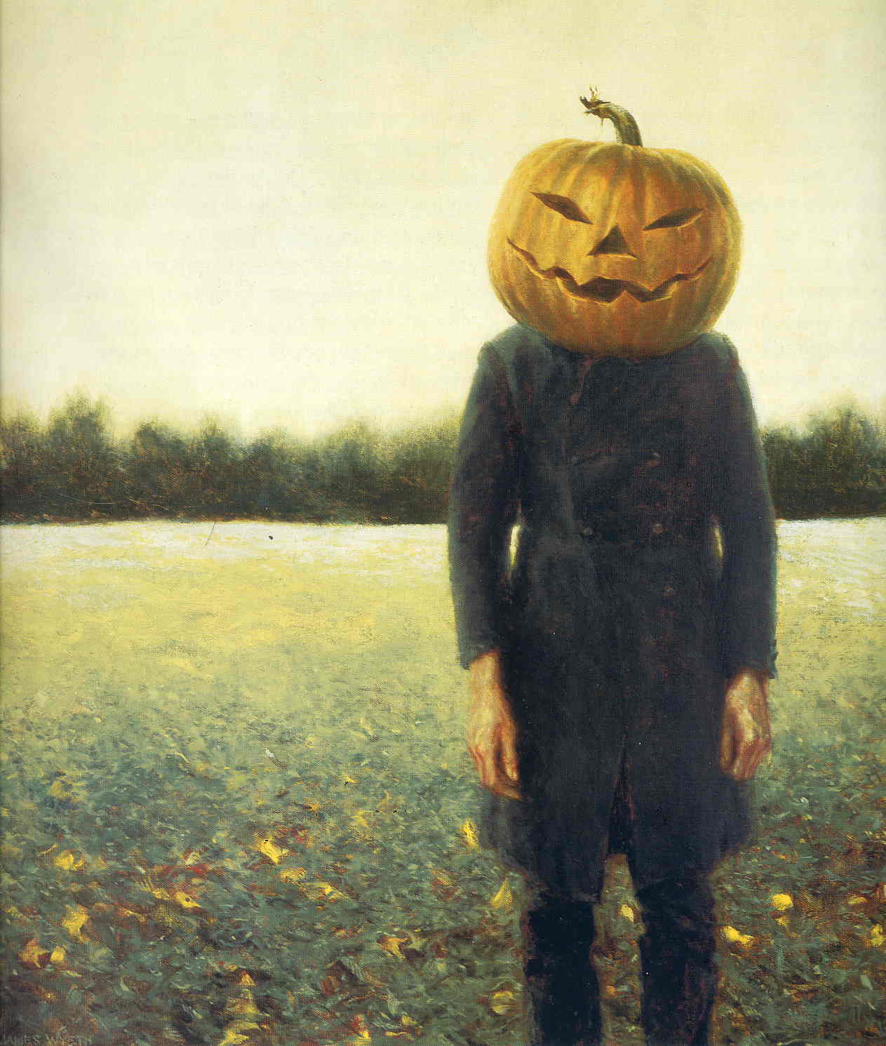
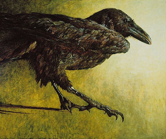
Last Friday I visited the fascinating Wyeth show at the DAM which featured the families' love of pumpkins, Halloween and other spooky subject matter.  
"Pumpkinhead" Self Portrait by Jamie Wyeth
 
Loved this giant looming raven painting by Jamie Wyeth.
As I look out the studio window today I can see winter looming. But that's OK. Colder weather means I can really get cozy and focus on studio or class painting and build my inventory for the warmer months. If you're looking to stay creatively active this winter come join me and my awesome students in one of my Denver painting group classes I offer on Tues, Wed, or Thurs mornings. We'd love to meet you! For more info please write to me or visit my classes page on my website. Thanks everyone!

Monday, March 30, 2015

March Monday Magenta Madness

"Alphabet Rooster" 16x16 mixed media on canvas panel
I am seeking.
I am striving.
I am in it with all my heart.
Vincent van Gogh

Happy Monday (and van Gogh's birthday) everyone! My trip around the color wheel continues with red violet (or magenta) as my color inspiration this morning.

At first I thought the red-violet color (magenta was my favorite childhood Crayola crayon) would work well as a spring floral subject such as tulips but pretty quickly this colorful rooster emerged. 
They say if you like red-violet that you are balanced (it’s a cool and warm) and like to surround yourself with creative stimulation.

Every time I paint a rooster or chicken for an art show or festival they are good sellers too. So I always paint one for good luck. Painting the tail is my favorite part!

FYI, typically for my oil paintings I prefer linen canvas. But for mixed media paintings I recommend working on a harder flat panel especially if you don’t need a really large stretched canvas.  I think it’s much easier to “attack” with collage, layer, glaze, stamp, stencil, draw, scrape, spray, drip, splatter, etc.

If this process sounds hands on and physical—it is. It’s one of reasons I still enjoy working with mixed media from time to time —it’s a very energizing painting work out!  (P.S. I often stand for hours so an anti-fatigue mats really helps the feet, back, etc. You can find just about any size mat at Uline.)

On a supply note, I’ve been using flat canvas panels (such as a Fredrix) but a gesso panel (such as Ampersand) or heavy illustration board with a few coats of gesso would work great too. And thank you Vincent for your continued color inspiration!

Saturday, September 6, 2014

Challenge Day 6: Ready for Red

"Wine Garden" 8x10 oil on linen (private collection)
If one says 'red' - the name of color - and there are fifty people listening, it can be expected that there will be fifty reds in their minds. And one can be sure that all these reds will be very different. (Josef Albers)

A few days ago I posted a blue/orange complementary painting. Today I’m working with red/green. This can be an awkward combo because it tends to have that holiday flare. I went with an obvious and easy choice here with a floral.

I also used a palette knife for most of this for some extra texture as well as to help keep the colors cleaners in an alla prima painting with lots of red.

These cheerful late summer flowers (some kind of petunia??) are from a neighbor who has one of the nicest private gardens I’ve ever seen. I tend to like more unusual colored flowers such as blue, green, blacks--so this rather unusual wine color caught my eye. I’m not a gardener so I really admire anyone who has a way with flowers and plants.

They say if you want to attract attention wear red. And I think this is true of red paintings as well. They tend to be really eye catchers at shows and festivals. There’s just something about red…Thanks and happy weekend painting to all my fellow challenge painters!

Thursday, September 4, 2014

Challenge Day 4: The Color of the My World

"Lovely Landmark" 8x10 oil on linen (private collection)
Green is the prime color of the world, and that from which its loveliness arises.” — Pedro Calderon de la Barca

Yes, painting greens can be perplexing at times but fortunately green is my favorite color. I've read that liking green means you enjoy nature (which makes sense), and that you tend to be sensible, practical, balanced, and love your freedom. So go GREEN! (If you love green too you may enjoy my Glorious Green Art Pinterest Board.)

My goal for Day 4 was to include a wide range of greens into this little study of one of our neighborhood landmarks--Denver's Washington Park Boathouse.

Recently, the 100 year old pavilion underwent a refurbishing. Unfortunately, they "updated" the bright white exterior to a kind of creamy beige. Now the water reflections and reflected light are not quite as clean and attractive (in my opinion).  So I took artistic license and kept the building the “original” white that I've always loved.

Green color mixing tip: For more natural greens I prefer to mix them "from scratch" with blue and yellow and then add a touch of red or orange. Also try black and yellow for an interesting earthy green.

Finally, quick welcome to all my new fall painting students. This is the perfect "back to school" time to take up a creative pursuit. I look forward to painting with you!

Monday, August 18, 2014

Getting Ready for the Big Three-Oh!

16 of my daily oil paintings from this year.
Unfortunately I don't mean a landmark upcoming birthday. No I'm taking about the upcoming 30 in 30 daily painting challenge which starts on September 1. Challenge hostess Leslie Saeta suggests choosing a theme for the month.

I think this is smart because I feel some limits and boundaries actually encourage more artistic and creative freedom. Plus an art challenge like this (or one you assign yourself) keeps you motivated as well as strengthen your personal style.

So what's my 30 in 30 theme? You'll have to check back to on Sept. 1 (You won’t be too surprised given my blog name.) In the meantime here are 30 painting ideas or art themes that I considered. Even if you don't want to paint for 30 days you could just give yourself a weekly or "every Friday" challenge or whatever works best for you! Cheers from Colorado and happy painting!

1.    Pets (ask friends, relatives, local shelter to send you pics.)
2.    Your hometown (or things associated with it)
3.    Weather or climate (stormy, rainy, sunny, tropical, etc.)
4.    Your favorite foods/beverages (hot cocoa for me)
5.    Alphabet (from A to Z) or all one letter (apple, antiques, aloe, etc.)
6.    Still life in natural (outdoor) light
7.    Your hobbies other than art (cooking, gardening, music, sailing, hiking,etc.)
8.    Things associated with your state/state symbols
9.    Ode to a season or month (October things)
10.    Same time of day: All morning, all night, etc.
11.    Things found on a farm or in a garden
12.    Toys, games, etc.
13.    Phobias (that would be insects for me!)
14.    Things from the farmer’s market or grocery store
15.    Shiny or reflective objects
16.    Lucky (or unlucky) items/symbols
17.    Beachy (lighthouse, shells, waves, seagulls, flip flops, etc.)
18.    Trees (there over 700 types in North America)
19.    White and black objects (which of course are rarely all white or black)
20.    Things you use in the studio/workshop
21.    Something you’ve never painted before (or were afraid to—i.e. a selfie)
22.    Textures—fur, metal, wood, rust, etc.
23.    All plein air in your backyard or neighborhood (to save time)
24.    Things with wheels (trucks, tractors, bicycles, etc.)
25.    Specific painting technique: All pointillism, expressionism, etc.
26.    Stuff from your closet or junk drawer(especially the not so neat one)
27.    Things with letters or writing in them (signage, mugs, etc.)
28.    Something in motion or moving (the still life opposite)
29.    Different painting tool each day so palette knife, big round brush, small flat brush, etc.
30.    Rock your boat. It's a challenge after all! Paint upside down, with your left hand, glasses off, etc.

Wednesday, April 9, 2014

The Simple Joy of Painting What You Know Best

"Gleaming Goose" 8x10 oil on professional cotton panel--For sale @ SAM in June
April is a promise that May is bound to keep.  Hal Borland

Happy Spring everyone! The first week of April always has a big red star on my studio calendar each year. It marks the 2 month point (or about 8 weeks) before my favorite annual Denver art event: SAM (Summer Art Market) which is June 7/8 this year.

When you need to fill a 10x10 tent with your best possible art eight weeks goes by in a flash. For the SAM I prefer to offer a wide variety of sizes and price points to meet the needs of a variety of collectors. So one day I’ll work on a smaller daily oil painting like this 8x10 sunlit goose and other days I’ll be tackling a much larger abstract. Let's just say I'll be happily in art creation mode for the next 8 weeks.

We've all heard the creative writing tip: Write what you know.  Along the same lines, I think it makes sense to paint what we know best. Just look at art history and see how the masters captured the intimate world around them.

One of the places I know best is Wash Park--my local city park where I often take at least 100 photos a week if not more. As a result I have hundreds of reference pics of the more common park flora and fauna such as this lovely young Canada goose. OK. Maybe not the most exotic bird, but they’re easy to photograph and I love the striking dark/light pattern on their heads especially in the warm sunlight. I certainly enjoyed painting this little study yesterday.

Speaking of spring, in my next post I'll share some of my ideas for those of you looking for seasonal spring painting subjects (as I did last fall.) Wishing you all a warm and colorful spring!

Thursday, January 23, 2014

Horsing Around: Soukup Demo

Art Jill Soukup demonstrates her approach to painting a buffalo in oil.
Thankfully, I’m back in the studio and feeling fantastic after some travel and being quite under the weather from said travel.  I always miss being away from my easel (it’s my anchor) jumping back in to studio work can be like diving into icy pond. 

This past weekend though I got an almost instant energy and inspiration boost from attending a demo by one of my all-time favorite painters.

If you’re lucky during your art life you discover other “aspiration artists.” These artists can really help keep you motivated. You just know this will be an artist you’ll happily follow for years to come. You can’t wait to see their next show and what they’re working on.

For me that artist is Denver representational oil painter Jill Soukup known for her fantastic equine paintings as well as her buffalos and urban scenes.  (I’ve been lucky enough to take a few classes with Jill and she’s also a talented and insightful instructor.)
Jill Soukup Equine Painting
Over this past weekend, I attended Jill’s demo at Saks Gallery in Denver where she currently has a nearly sold out one woman show.  (As nice as the paintings look on camera, they are even more impressive in person.)

Her demos are always fascinating--She often layers the paint (for example an earthy yellow green over a warm dull orange red) using a variety of tools including hefty well-worn brushes, large hardware style putty knives, etc. 
Jill "drags" a cooler cool blue over a warmer area with a putty knife.
Jill's brushes (many large or with very long handles) and other painting tools.

Interestingly, as you can see, Jill uses a variety of references for her paintings: A photo with more detail in the lights, one for the darks, a black/white value photo and sometimes several small color thumbnails where she tries different color options. In this case, she had decided to push the greens in the background of this wonderful buffalo portrait.

Detail of buffalo side of head--note the large textural planes of oil paint.
Jill Soukup oil painting palette--When asked she said her favorite color is that yellow green.
Finally, I'll be back soon with some abstracts I've been working on for Leslie's 30 in 30 January Challenge. Yes, I know only 7 days to go but better late than never!

Saturday, December 21, 2013

Passport to Winter

"Bear Creek Tree Study" oil on canvas 8x8

Click to Bid on DPW--Thanks!
I prefer winter and fall, when you feel the bone structure of the landscape. 
Something waits beneath it; the whole story doesn't show.

Andrew Wyeth

Happy Holidays and Winter Solstice Everyone!  Whew it’s been an exciting and hectic December which included completing and delivering a large commission (yay), a consulting project (yay again), and unfortunately a few days of being under the weather with a cold weather bug (which sounds a lot cuter than having it.)

This week though the sun returned (Wed. it was almost 70 degrees!) and that helped me quick recover and get back to teaching and painting—my two favorite things.

I also took some time out of holiday shopping to meet up with some fellow artists to see the beautiful “Passport to Paris” show at the Denver Art Museum which included 125 paintings from dozens of French masters painters.

The evolution of subject matter and style from pre French Revolution to the turn of the 20th Century was fascinating.  I particularly enjoyed the colors in these two works by Tissot and Sisley.
"The Fan" by James Tissot  1875

"The Pike" by Alfred Sisley 188
The show (as well as the Winter Solstice today) inspired me to paint a small snowscape study. After working on four 40x30 paintings I was really looking forward to painting a more manageable quick daily painting like my posting today. Looking for more winter art ideas and inspiration? Visit my Pinterest Winter's Wonderland board. Thanks and have a colorful first week of winter everyone!

Friday, September 27, 2013

Challenge Day 27: The Personal Nature of Color

"Coastal Tide" watercolor on YUPO (collection artist)
“Color may come purely from imagination and, so long as the value and relationship is good, may be even more beautiful than life. I do not consider that faking.  That is understanding color.”
Andrew Loomis

Since I’ve taken a bit of side trip into watercolor land during the 30 day challenge I’ve been re-reading some of my watercolor books. I have some wonderful books but over the years they've taken a bit of a "back shelf” to my oil painting books. (Which reminds me, if anyone has read the new Alla Prima II yet I’d love to hear your thoughts on it!)

Last night I was reading Watercolor Free & Easy by Washington based painter Eric Wiegardt. Since I love color I tend to skip to the color chapters read those first—like eating the cream in the Oreo!  In this book, I particularly liked the section about having a “Personal Color Sense” or “Color Instinct” if you will.
Along the way, you’ve likely heard from other artists that if you get the value relationships correct then you can paint that “super dark” any “super dark” hue of your choosing. But how do you decide exactly what that color will be? 
That’s a great question. Some of that answer for me is “intuition” and painting—a lot. But in addition, Wiegardt offers some helpful questions to help you select a color that works best for your painting and not necessarily the one you see in front of you:
  • What color best expresses the painting’s mood and/or emotion?
  • What temperature dominance makes sense (note the colors follow this choice)/
  • Could I use complements to add excitement and interest?
  • Are all my colors the right intensity? Should some be brighter or grayer?
  • Is there an overall “mother” color or tone that would work well? (Think of a night café scene.)
  • Is there some “bounced” color I could take advantage of?

So the rest of the week I plan to keep this idea of color choice in mind as I hope to finish out the challenge month with at least a few more posts.
P.S. Thanks Rick B. for lending me his lovely Oregon coast sketch/photo (as well as some salt!) for my YUPO landscape painting today!

Monday, August 5, 2013

Nature is Imagination Itself

"Let's Twist Again" oil on 11x14 Raymar panel--collection artist
The tree which moves some to tears of joy is in the eyes of others only a green thing that stands in the way. Some see nature all ridicule and deformity... and some scarce see nature at all. But to the eyes of the man of imagination, nature is imagination itself.
William Blake

My primary inspiration is nature.  Even though I live in the heart of the city, one aspect that I think all Denverites love about our mile high city is that the "wild west" is just minutes from home. As Denver plein air artists will attest, you could be painting an urban landscape in the AM and then a more rugged sunlit western landscape in the PM. You simply head west into the foothills or south toward New Mexico.

In an attempt to explore my “region” this summer I bought a Colorado State Park Pass. Within about an hour or so of the city there over half a dozen state parks—each with its own wildlife and unique landscape. So my tip today is to paint a State Park in your area--FYI for more park inspiration check out Paint the Parks--a website devoted to park painting.

One state park I’d heard about many time from other painters was the Castlewood Canyon State Park about 30 miles southeast of the city. It’s a beautiful 2,300 acre park with colorful rock formations, a wide variety of wildlife, and a stunning Pike’s Peak view on a clear day (it’s about a mile higher than the city.)
Pike's Peak from Castlewood Canyon Trail

Because the park is also part of the Black Forest region there are some wonderful old pines and shrubs. This twisted wind worn tree caught my eye right away—it had such a distinct figural quality.  This painting took me a few sessions.

My thanks to one of my own painting mentors (yes, teachers have teachers!) Dan Oakleaf for his guidance on this. Particularly since I wanted a more natural palette for this.  Also, this painting was not a quick alla prima study-the drawing was more complicated but worth it. I'm really motivated now to visit all the parks in the area before winter in search of painting subjects.

Thursday, October 4, 2012

When Every Leaf is a Flower

"October Road" 18x24 oil on canvas
Autumn is a second spring when every leaf is a flower.
Albert Camus

First  many thanks to all my painting students and friends for their patience, get well wishes and “medicinal” chocolate as my broken toe heals.  If any of you have broken or fractured a bone, you know it’s pretty uncomfortable. Plus, I’m a constant multitasker so having limited mobility is a well, also a different kind of pain.

But, the “silver lining” is that you’re pretty much stuck so that’s keeping me focused on the work at hand.  As I noted in my previous post, I’m currently working on some slightly larger oil paintings in anticipation of a group art show late in November at the 910 Arts Event Gallery. 
"Acorn Study" 8x8 oil on panel
The creation of a thousand forests is in one acorn.
Ralph Waldo Emerson

More specifically, I’ve been considering a series of paintings inspired by natural elements (fallen leaves, tree roots, river banks, gardens, etc.) based on photos I’ve taken in the past few months.  I recently went for a short hike (thankfully before the toe incident) along the Bear Creek near Evergreen, Colorado.
Walking along Bear Creek in late September near Evergreen, CO
The creek hiking trail is a favorite location for many local painters-In  fact there was a large plein air group setting up as I was walking around.  Although, I’ve heard there are indeed bear and rattlesnakes to be on the lookout for. 
Plein Air painters in Lair o Bear near Evergreen, Colorado
Also, before I forget I’m gradually closing in on my 250th blog post—Which I’m very excited about!  I’ll be doing something special for that post so be sure to check back. Thanks—wishing you as always a week of creativity and color!