Tuesday, May 22, 2012

Sante Fe Souvenirs

Colorful Casita-8x8 oil on linen panel-SOLD
First I'd like to welcome any visitors from the Summer Art Market website--I look forward to seeing you at the Market!

Coyote Cafe in Santa Fe
Like so many artists before me, New Mexico is one of my favorite places to visit. As an artist, you can't help but feel both welcomed and inspired by all the art, color, and creativity. I'm not much for long car rides but if I wanted to I could leave my front door around 11 AM, drive due south and be in beautiful Santa Fe just in time to have some veggie tacos and mango margs at the Coyote Cafe rooftop cantina at sunset.
Mm-chocolate pastries at the Maven
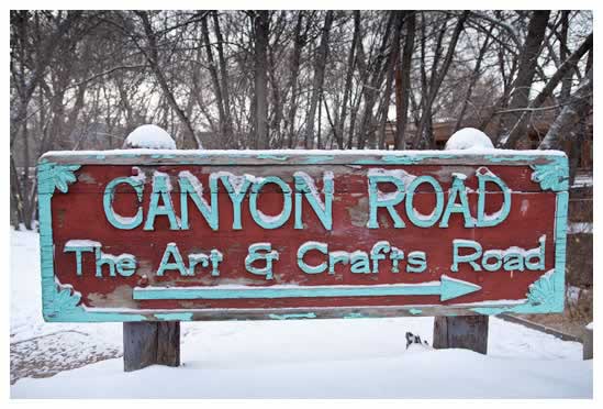
 In the morning before I head down Canyon Road to stroll through all the galleries I'd probably stop by the Chocolate Maven Bakery for some chilaquiles (my favorite breakfast of all) and some spicy Mexican hot chocolate. Sounds pretty good doesn't it?  As I recall, this little adobe home was either along Canyon Road or just off.  I'm hoping to visit Santa Fe again this fall again and I'm already looking forward to it.

Quick note about my recent posted smaller daily oil painting like today's posting. Typically, I'd be selling these on the Daily Paintworks site but I like to take as many paintings as I can to the Summer Art Market in a few weeks. But after June 10 I'll be uploading my paintings again on the DPW site for bidding. In the meantime, I wish everyone a colorful and creative May!

Sunday, May 20, 2012

Fine Feathers

"Fine Feathers" 8x8 oil on linen panel
Happy May everyone! I think one of the hardest tasks any busy artist has is prioritization. I'm taking a quick break from painting and getting ready for the upcoming Summer Art Market in just a few weeks on the weekend of June 9 and June 10 to post this new bird painting.

If you've prepared for a show or festival you know there's a lot of work that goes on behind the scenes in addition to painting--such as event paperwork, getting your tent ready, ordering post cards (love Vistaprint for those), etc. In other words, many tasks that tempt you outside of your main goal which is creating art.

Lately I've been trying some new colors on my palette. In this little bird oil painting it's Old Holland Caribbean Blue--which is a wonderful and not very common blue-green thalo turquoise pigment (PB16 for my fellow pigment enthusiasts).

Thanks for stopping by--be sure to check out the Scarlet Owl Pinterest boards for more art inspiration. I look forward to seeing you all at the Summer Art Market and for all my fellow artists in the show I hope you all have a super successful sunny show this year!

Wednesday, May 2, 2012

I Break For Irises

Blue Tongued Beauties 8x8 Oil on Linen
And anything else that I think might make an interesting photo that I could use for painting.  I’m loving Kevin Weckbach’s “Master Class” in oil painting but I've learned already that I need to keep taking a lot more photos.  He gives weekly “homework” and it’s nice to have a variety of subject and themes to choose from.

Photography is not my strong suit so I find I have to take dozens of photos to get just that right painting. Last Saturday morning (while visiting a neighborhood tag sale) I spotted these intense blue violet irises. 

In Kevin’s class we’ve been reviewing the importance of strong, unique, specific shapes as well as dark and light pattern in paintings. So I really tried to concentrate on achieving both in this study.  Speaking of Kevin there's a nice article about him in this month's Southwest Art Magazine previewing his one man show opening on May 11 (my birthday) at Gallery 1261 in downtown Denver. I can't wait to see this and Wicked for the first time that night.


The Summer Art Market is (yikes) only about 5 weeks away on June 9 so I’ll be concentrating most of the next month on painting for that. Most of the paintings I'm posting from now until then will be on sale at SAM-- Particularly since I have an entire booth to fill this year which is both daunting and exciting.

Quick thanks to all my Spring students--Hope you all have a wonderful May month of creativity, spring joy, and artistic discovery!

Monday, April 23, 2012

Amazing Glazing: A Rose In Progress

Transparent Oil Glazed Rose in Progress 9x12 Ampersand Panel

Happy Spring Monday! Last week a student asked if we could paint a photo realistic oil glazed flower.  While I greatly admire this glowing light and shadow style and technique, I tend to paint a bit more loosely and “painterly.”  So for added guidance we watched another Colorado artist Arleta Pech’s DVD –Transparent Oils The Basics, which I highly recommend for anyone interested in learning an easy method for transparent oil glazing.  If you’re a watercolor painter looking to try oils I think it would be an interesting way to start since the planning and thought process is much the same. 

Ms. Pech recommends a smooth surface for this type of painting—we used a 9x12 Ampersand gesso panel—it’s has a very nice velvety finish. Smooth but not too slippery.  Other key materials are all transparent oil paints, Walnut painting medium, synthetic brushes for thin (very thin) paint application and some softer sable brushes (or sable synthetic) for blending out.  If you enjoy blending your oils you’ll love this method. To clean up the edges we used the walnut medium and a clean bristle brush to “pull up” any unwanted color or to lighten areas.

There’s also very little direct mixing of color—mostly layering much like watercolor glazing if you’ve tried that. Give or take, this painting will eventually have 6-8 glazes. This is the first stage—starting with the lighter colors in the background (which will be much darker) and the lighter colors of the rose.  One of aspects of this particular technique that I like is that there is no under painting.  Another interesting feature is that the white in the painting is the white of the board much as you’d “save your whites” on your watercolor paper.  

For an “alla prima” painter like myself, this type of painting takes some patience but I think it will be worth the wait. Can’t wait to add the additional layers—particularly the dark background. As summer approaches I usually have some openings in my class schedule so please email for more info about my classes in oil, watercolor, or acrylic. Have a wonderful colorful week!

Saturday, April 14, 2012

Showers Bring Flowers

"Blue Butterflies in a Jar" oil on linen panel 8x8
Like many artists, I love to paint irises. Iris means "rainbow" the velvety petals have that wonderful flying butterfly shape so it's no surprise it's a favorite artistic subject. These irises were in my garden last spring and I took a few reference photos of them since they last so briefly.  For this oil floral study today I had two specific painting goals:
  • More impasto texture in the petals
  • Working with an intense red background (in this case I had used an old red abstract painting as a background)
American Museum of Western Art: The Anschutz Collection
If you have a passion for western art like I do, be sure to note that the Collection is going to begin regular public tours on Mondays and Wednesday starting next month (May 2012) in Downtown Denver.  This should be an amazing collection that includes Western greats like Georgia O’Keeffe and  I can’t wait to see it.
 

My Favorite Oil Painting Supplies
I’ve added a new page to my blog (see tabs above) about my “must have” oil painting supplies for those of you interested. I’ve started with the oil supplies (which is the media I’m currently painting with the most) but will also add favorite my watercolor and acrylic supplies.  Also if you’re interested in my favorite art books check out my Scarlet Owl  Pinterest boards.  Speaking of Pinterest (I'm up to 200 pins already) thanks to all who’ve pinned my art so far!
 

To end today’s posting I’d like to share a recent fortune cookie fortune that I thought was perfect for artists: Your genuine talent will find its way to success. Keep practicing….And so I'm back to the easel. Happy practicing in your studio!

Sunday, April 8, 2012

Spring Sprang Sprung


Purple Tulips 8x8 oil on panel
Art Lovers Mark Your Calendars: Summer Art Market June 9-10, 2012
I’m happy to announce that I’ll be at the Summer Art Market (SAM) again this year on the June 9-10 weekend on 200 Grant in central Denver.  It’s my favorite art festival—I always meet so many great folks who really enjoy art. I’m in lucky booth number nine.

I believe SAM (which is celebrating its 20th year) is one of the best quality art festivals in the region. The quality and prices for original fine art (no reproductions are allowed) can’t be beat in IMHO.  I’ve said it before but if you’re a savvy art shopper who hopes to discover talent this is the art festival for you. And for artists it offers a ton of inspiration and variety from regional artists.

Darn it Jim—I’m an Artist, Not a Mechanic
Nothing perks a studio up like a new easel. Several months ago I posted that I was planning to try a new counter balanced easel.  I’ve read many positive reviews and after some debate settled on this style. Unfortunately, while it was well packed, one of the supports was cracked (which could be glued) but another part just didn’t seem to work very well as you know these are not inexpensive easels. 

Now I'll admit I'm not terribly handy so I had a pretty handy neighbor trying troubleshoot it with me. But after several hours of assembly and then re-assembly we decided that it wasn’t meant to be. Long story short, that easel was returned to Jerry’s.  About a week ago though, spring serendipity brought a gently used Renaissance crank easel and I so far I love it.  The easel is super sturdy, the cranking is very smooth, and I love the warm wood tone.  If you’re ready for a larger easel I highly recommend this one.

Monday, April 2, 2012

Sign Me Up


"Sunseekers" oil on linen panel 8x8-SOLD

Happy April and Early Spring Everyone!

As a painting teacher, I’m often asked about signing a painting so here are 10 tips I’ve gathered to help you the next time you finish a painting and are ready to own up to it with you signature:
  1. It’s not a legal contract but do sign your work. Legibly and on the front.  Today, I think signatures are more important than ever with our artwork having potentially an international audience when it’s shared across the Internet on websites, social media, etc.  
  2. Your signature is a helpful design element. Along those lines, keep your signature in scale with your painting.  I’ve seen many petite paintings 10x10 or smaller with bold signatures that would be better suited on a 30x40.  A magnifying glass type signature on a wall size abstract is also unbalanced.
  3. Your signature should “blend” stylistically if possible. You might want to practice a few different styles with brush on paper before you decide on one. For example, some artist’s signatures look really nice in cursive and others in block letters. Think clean and pleasing. Lately, I’ve been scratching with my favorite rubber “wipe out” too into wet paint (as seen in today's painting). I like that look as long as it’s fairly readable.
  4. If you’re planning to frame or mat your painting, be sure to sign your piece after you’ve popped in a frame. I see many signatures that too close to an edge that end up getting covered by the frame or mat. Especially now that frame and mat styles today can be quite wide.
  5. When I paint a larger abstract for example I can use my signature to add interest to a corner. Usually it’s the lower right, but not always.  I had a student who cleverly integrated their name into the painting (in this case on a wine bottle tag).  You don’t want to get too gimmicky, be we are artists and so consider creative solution when the opportunity presents itself.
  6. Thankfully, I have a fairly unusual 8 letter last name so I sign only with my last name.  Many artists I know with short or very common names add initials. I think this is a good idea for more specific identification. Imagine trying to research a beautiful oil painting you find at a flea market signed “Jones” on the Internet.
  7. What if you have are blessed with an unusual first name or your last name is very long or hyphenated? Then I think signing with your first name on the front might be a good option. Then you can add your full name on the back.  Same with initials or a “symbol” type signature-I would add my current legal name to the back or at least on a certificate attached to the back.
  8. What about adding a date to your signature? I see this too quite a bit at galleries and festivals and personally, I’m not a fan. I think it’s OK on the back but I think the front of the painting begins to look cluttered with too much info. It’s a painting not your art CV.
  9. Again, this may take some practice but you may want to sign in the same media you created the art in.  I’ll be honest I don’t always follow this advice. For example, I sign watercolors with Sharpies or pen and ink sometimes. But in general, it’s wise to have the signature be consistent and cohesive with your work for posterity.
  10. I’ve read that Marilyn Monroe always signed her name using a red pen. Consider a way to make your signature unique. Ideally you want your body of work to have a fairly consistent signature that easy for collectors to identify you.  
Thanks for stopping by and happy spring painting everyone!