Showing posts with label abstract art class denver. Show all posts

Tuesday, March 24, 2015

Colors by the Dozen

"Lucky Me" 12x12 acrylic and mixed media on canvas panel

“Gather the best you have to offer and create a heartfelt, prosperous life full of purpose.”
Gail McMeekin

Happy first week of spring everyone! I was thinking about my upcoming color workshop this week and decided to try a series of 12 mixed media/abstract paintings that feature each hue on the standard color wheel. 

In honor of St. Patrick’s Day last week I began with green and green-blue. For more interest and challenge I also sprinkled in in some complementary colors and “spice” colors (as mixed media artist Robert Burridge calls them) rather than painting purely monochromatic.
"Look at Me" mixed media and acrylic on canvas panel
One hears all the time that you need a “play day” or if you have time “play week” in the studio. That sounds awesome but I often think I just can’t afford that kind of luxury...

But by working on a collection or themed body of work I stay focused and motivated from start to finish. And in the end actually have a lot of work to show for my time. I’m already looking forward to working my next set of colors (maybe orange or violet??) today.
I love audio books in the studio--nice purple too!
Coincidentally, while painting I was listening on audio book to 12 Secrets of Successful Women by Gail McMeekin (hence my quote choice today) a popular creativity coach. It was the perfect combination on a day devoted to color exploration. I've discovered listening to podcasts, audio books, etc. like this helps keep my busy left brain occupied while I work on more abstract paintings. Wishing you a prosperous week full of purpose!

P.S. As an artist I can’t image what it would be like to be color blind like many of the men in my life tell me they are. Have you seen these new EnChroma glasses designed to help the colorblind see colors they’ve never seen before? Check these out.

Tuesday, January 1, 2013

Art Gets a Fresh Start: Happy 2013!

"Discovery Chains" oil on canvas in progress 36x36
Happy New Year everyone!  I’m excited (and proud) to announce that today also happens to be my 250th blog post! In honor of that landmark I thought I’d leap into the year by posting my first “painting in progress” video. I look forward to creating more of these paintings in action videos (and fine tuning them) in the future.

Thank you to all my blog followers, art friends, and international visitors. It’s truly an honor to share my art each with all of you each week. For my first painting of the new year, I chose a large square (36 x36) oil abstract roughly inspired by the limited “Zorn” palette.  Anders Zorn (1860 to 1920) was a Swedish painter whose beautiful brushwork is often compared to Sorolla and Sargent. 

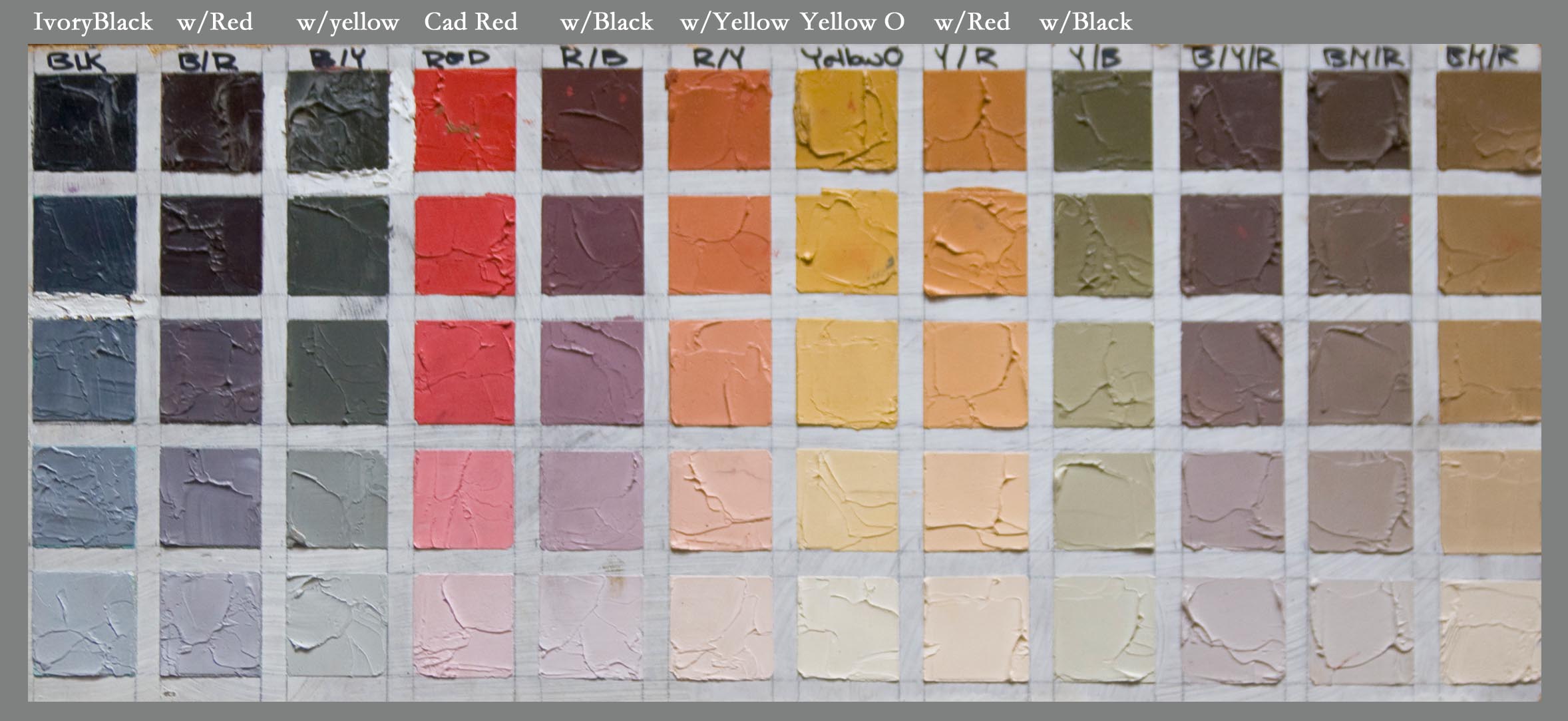
Zorn’s limited oil paint primary palette was: Black, White, Yellow Ochre and a warm red such as Vermillion or Cadmium Red.  There’s some doubt that he used these 4 pigments exclusively but in many cases his paintings (particularly his figures and portraits like the one above) appear to be “limited” to this range.

Example of Zorn Palette--from Westerberg Fine Art
I say “limited” because if you chart these colors out you’ll find these four pigments mix to create a lovely muted secondary color range. You'll also achieve a full value range obviously given the white and black as you can see from the above chart (Aaron Westerberg fyi is one of my favorite oil painting discoveries this year be sure to check out his stunning work.)  For this particular painting I wanted brighter cleaner violets so I chose ultramarine blue instead of ivory black though I definitely want to try another abstract using the black. 

For the red I used Grumbacher Red--napthol pigment is a nice substitute if you don’t want to use cadmiums.
I’ll be working on this painting more today so stay tuned for the finished painting. Speaking of color, last year I posted an abstract painting inspired by the Pantone Color of the Year (Tangerine Tango in 2012).  For 2013 the color of the year is Emerald (my birthstone) so that’s next on my abstract “to do” list. In the meantime I want to wish everyone a productive and creative year filled with color and painting joy!

P.S. For more info about my painting classes in 2013 please write to me or visit my painting class page. Thanks!

Friday, November 9, 2012

When Vincet met Eva: The Story of an Abstract Painting

"Your Gypsy Soul" 20 x 20 oil on gallery wrap canvas
This painting will be a the Spirits Bright Show: Nov. 30-Jan.5--SOLD

My life and art have not been separated. They have been together. Eva Hesse

Still, there is a calm, pure harmony, and music inside of me. Vincent van Gogh

Happy Friday! I’m sometimes asked by my representational artist friends and students what sparks an abstract painting like this one. It’s a good question. For me, the inspiration for an abstract work can come from just about anywhere—one interesting shape, a pattern, a texture, or maybe even a single color, etc.

In this case of this particular painting I’d been thinking about creating a non-representational painting inspired by two different artists. With the “Becoming Van Gogh” exhibit currently at the Denver Art Museum, Van Gogh was an obvious choice. Because I’d have the rare chance to study his paintings in detail for color, brushwork, etc.
Eva Hesse Sculpture
For the other painting, I recently came across the work of the late Eva Hesse. Some you may know her for her experimental sculptures. Sadly, she had a very brief art career and passed away in her early thirties in 1970. While Hesse’s body of work is not extensive I found myself drawn to several of her abstract expressionism paintings. One painting really resonated with me like a song stuck in my head.

Perhaps because I could relate to her square composition and organic shapes which is combination that I’ve often used. Though, Hesse’s palette is more earthy and muted than I would typically work with.

After seeing the incredible Van Gogh show a few weeks ago, I knew immediately which painting I’d use for inspiration—The Courtesan (after Eisen). This is one of Van Gogh’s graphic Japanese print inspired paintings from 1887.  You can see I “borrowed” several aspects for my abstract oil painting including Van Gogh’s particular color combinations (reds, greens, yellows, ochres, blacks, and turquoise).

You may also spot hints of the vertical bamboo shapes, the blush horizontal slashes of the pond, and a lily pad. By the way, the title “Your Gypsy Soul” is from Van Morrison’s Moondance which I realized as I was writing this was released in 1970 the year Eva Hesse died. Don’t you love art karma?

New Digital Art Magazine: Artists on Art
For those of you who enjoy reading magazines on your “digital devices” I just subscribed to this beautifully designed quarterly art magazine that I can’t wait to read this weekend.  Artists on Art is described as: Master Artists & connoisseurs share their ideas and techniques through in-depth, interactive articles.