 |
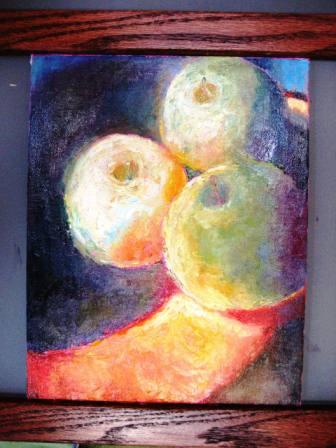
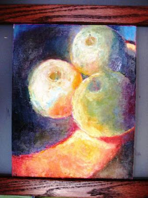
| Sunlit Apples-8x10-oil on canvas |
Yesterday, I was inspired to do a mostly knife color study from re-reading
Arthur
Stern's book How to See Color and Paint It, This is older but excellent oil painting book with superb exercises to help train your color vision and ability to record what you see. Not what you think you see. My very quick tips for learning to paint this way are for each shape ask yourself 4 key questions:
1. What color family is it? Note the answer is one of these 6: Red, orange, yellow, blue, green, or violet. IN other words, there's no brown, gray, beige, etc. There is a dull very dark orange however.
2. How relatively light or dark is it? I find it helpful to locate the darkest dark in your photo or set up and compare to that. A simple value range might be something like: Very light, light, medium, dark, very dark.
3. How bright or dull is it? Another way to think of this is how close is the color to your color out of the tube (which is usually at a high intensity). There are several ways to dull or "kill the brightness" of your color such as adding the color complement or my favorite: palette mud (scraped together from your mixing),
4. How warm or cool is it? Most colors will have a tendency to lean toward their neighboring color such as red-orange, blue-green, red-violet, etc. I think you may find that some of your darks are actually quite warm.
For example, are sunlit Granny Smith apples in an orange-y teak wood really just green? Another way I approach these paintings is to consider that in most sunlight scenes you'll likely (after some observation) discover a full range of color and temperature as I did painting these apples.
Also, if you paint smaller studies (under 12") I highly recommend using some kind of
canvas holder. I designed this handy small canvas holder (I'm calling it the Eeezle ) based on some I've seen other painters use. So I didn't invent this but I thought it would be nice to have a midtone gray as the backdrop so this is a 16x16 square piece of 1/4 inch MDF painted flat gray.
I also chose a 16x16 since I often paint 12x12 panels. The adjustable bars (ledges) are stained and varnished oak (I guessed a hard wood would warp less). The bottom bar is actually stable and the top bar is adjustable with easy to use thumb screws in the back.
Here's the apple painting in progress with the magenta toned canvas (the same color I used for the raven in my previous post). The neon magenta is not the easiest background to paint on (ouch--my eyes!), but I love the contrast with the yellow greens and it motivates me to work quickly. Also, I've not forgotten my promise to include some "getting into art show" tips this week and so be sure to check back for those tips.
Have a great day at your easel!