Showing posts with label Denver oil painting class. Show all posts

Friday, June 2, 2017

June Bugs and Art Markets

"Beach Bug" 8x10 oil painting on Gessoboard (on hold for SAM)
And what is so rare as a day in June? Then, if ever, come perfect days. James Russell Lowell

Happy June Everyone! Welcome to one of the most beautiful months in Colorado. I know I haven't been posting much this year. But only for good reasons--such as lots of teaching, painting, some travel (had a wonderful time as I always do recently in Santa Fe), and well thankfully that keeps my calendar pretty full. I hope this post finds you all well and enjoying the beginning a summer.

Summer Art Market: June 10 & June 11
For me, as many of you know, for 15+ years (give or take) that means getting ready for Denver's annual Summer Art Market--Weekend June 10 and June 11. Today's painting is a sneak peak of one of my paintings for the Market.

If you haven't been this is a fantastic art event with tons of original art by over 250 local artists. This year I'm looking forward to sharing a tent with a very nice Boulder artist (Ms. Lori Mattina). So come visit us on Grant Street (Booth 75--between 2nd and 3rd streets).  Yes outdoor art festivals can be a lot of work but I always look forward to shopping the festival myself as well as selling my own art.

New Summer Oil Painting Class: Starts June 14
For anyone looking to learn that very popular oil painting technique with a transparent underpainting that I love so much I'm teaching one group painting class this summer at the Goodson Rec Center. It's a really fun group of students and very affordable--so come join us if you'd like to learn this colorful fun method. Click here for more info and to register. Class starts WED June 14.

P.S. Many, many thanks to all my amazing and always hard working spring students at Park Hill Art Club and Curtis Art Center--I look forward to seeing you in the fall if we don't paint together this summer!


Tuesday, January 13, 2015

New Year, New Art

"Snow Dog" 8x10 oil on linen
I believe in living life the way that you want to live it every day, and if you do that, you don't really need to have New Year's resolutions.  American Designer Tom Ford

Happy New Year! My daily "resolution" is always to find more painting time. But with teaching, post holiday exercise, dinner with friends, daily errands, etc. I think a more realistic goal is to simply to paint as often as I can. That way the blank canvas feels more welcoming than foreboding...

Speaking of teaching, a big January thank you to all my ongoing and new students! You bring color, creativity and your unique spirits into my studio every week. I look forward to painting with all of you in the upcoming year and helping you achieve goals as well. Thanks too all my collectors for your support as well last year!

Quick note about my paintings for sale—If you see a painting that you’re interested in but that’s not for sale at my online DPW gallery I may be setting it aside for a gallery, show, festival, etc.  So it may be in a “holding” pattern but still available, so do feel free to contact me.

And if you’re interesting in my private painting and art classes in my Denver art studio (sorry for SE friendly sentence!) please check out my student testimonials and class info on the Scarlet Owl Studio website. 

Regarding today's post, I took this picture on very chilly New Year’s Eve in my beloved Washington Park. Initially I skipped over this photo but realized that honing in on the couple (as well as their shadows) created a much more dynamic and interesting design which I really enjoyed painting. Thanks all--I hope your New Year is filled with peace, creativity, color, and success!

Wednesday, September 10, 2014

Challenge Day 10: Keepin' it Cool

"Castlewood Shadows" 9x12 oil on linen
Woohoo! We've made it 10 days challenge artists! I've heard there are now more than 1,000 painters who've signed up! So far it's been very motivating and a great excuse to stay in the studio. Is it me or  does the day fly by when you're painting everyday? I feel like I need a few more hours at the end of everyday.

Today in Denver is my absolute favorite weather--It started out little rainy this morning but now it's the perfect late summer day. Sunny and cool. Always reminds me of that first week back on campus that was so exciting and the start of fall colors. So I'm going to make this post speedy so I can take a park break and take some more reference pics.

Yesterday, I posted a mostly warm painting so today I moving over to the cooler part of the wheel--the greens, teals, blues, violets. All my personal favorites. I love the mood that cool colors bring to a landscape. Just like yesterday I've added a few pops of warmer colors for balance and interest.

One of the parks I like to go birding is Castlewood Canyon and it has many enormous boulders and rocks like this. Like many Western painters I also love painting aspen trees since the silvery bark usually reflects the surrounding colors. Plus its fun to paint the unique dark patterns. 

Thanks again and have a wonderful colorful week! Only 20 more to go...

Wednesday, July 3, 2013

Just Like Vincent I'm Busy Painting These

"Flying Colors" 8x8 Oil on Ampersand Gesso Panel
SOLD--thank you!

I am working with the enthusiasm of a man from Marseilles eating bouillabaisse, which shouldn't come as a surprise to you because I am busy painting huge sunflowers. - Vincent Van Gogh in a letter to his brother


I don't always have the chance to do a painting specifically for the DPW weekly challenge. But this week Carol Marine offered up a subject I couldn’t resist—sunflowers.  (I you read m blog you know I’m particularly drawn to these red orange striped ones you often see at the grocery store.)


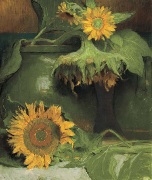
For me, the sunflower is the flower that I associate the most with creativity. And I'm often drawn to sunflower paintings such as this Charles Weed (above) and this glorious Klimt (below):

Looking for more sunflower art? Here's a Pinterest board dedicated to sunflower art or just type “sunflower art” in the Pinterest search window.

Speaking of Vincent, have you ever wondered why Vincent's sunflowers look a bit strange compared to sunflowers we typically see today? Here's an interesting article about why Vincent's sunflowers look the way they do. Thanks everyone--have a wonderful safe holiday week!

P.S.Did you know the world’s tallest sunflower (grown in Germany) was 27 feet tall? That’s 7 feet taller than the tallest giraffe!

Friday, February 22, 2013

When Art Goes to the Birds


"Jazzy Junco" 6x6 oil on linen panel

Please click here to bid.

I hope you love birds too. It is economical. It saves going to heaven.   Emily Dickinson

As many of you know birds are one of my favorite painting subjects. So last weekend I was thrilled to visit the Woodson Museum touring Birds in Art exhibition at the Colorado Wildlife Experience. The quality of the show was top notch and I had many favorites (I posted a few on my Feathered Friends bird art board on Pinterest.)

Sometimes wildlife art (for me) while technically amazing can be a bit stiff, but I was impressed by the variety of interpretations, styles, and media. If you love bird and/or wildlife art I can’t recommend the beautiful Birds in Art catalog enough. Also, if you enjoy bird art, I highly recommend Tim Wootton's Drawing and Painting Birds book.

After seeing such an inspirational show, I’m also very motivated to work on a larger scale bird painting this year so I can enter next year in the meantime today I posted a little alla prima study of what I think is an Oregon Junco in fresh snow--It’s a fairly unusual bird to land in my little city yard so I spotted it right away.

Speaking of websites I’m excited to announce that my new Scarlet Owl Studio website is just about ready to launch—in the meantime you can get a sneak preview here. My original art website has served me well for many, many years but it was time for a spring makeover. And next time I’ll return to my thoughts on color dominance. See you then!

Monday, January 21, 2013

Back from the Beach


"Sunny Dreams" 8x8 oil on linen (collection artist)
How I Spent My Winter Break
Have just returned (reluctantly) from my Dreama Tolle Perry oil painting workshop on sunny Marco Island where I happily traded my boots for sandals.  The beautiful Marco Island Art Center was the perfect place to begin a creative and color filled 2013. 

I don't travel that often out of state for workshops but I just had to take another Dream workshop. (Quick travel painting tip: I mailed most of my heavy and expensive supplies in an insured USPS "fits ships" box to myself and they were there waiting when I arrived.) Not to mention Florida in January was just too tempting. In fact, the day I left Denver it was about 60 degrees warmer there. 

Dreama is one of those artists that you could watch paint everyday. It's no wonder her workshops fill up so quickly. It’s mesmerizing watching her paint alla prima in her opaque over transparent oils method. It’s one of those magical painting approaches where the painting just seems to suddenly appear—and it’s gorgeous—full of luscious glowing color and flying brushstrokes.  It’s a painting method that I plan to continue to practice and incorporate into my own work. Here's a quick recap of the three days--which goes by much too fast...
Dreama starts with a loose energetic paint sketch in transparent oils
Dreama continues to cover her panel with clean transparent oils.

Dream's final painting--a pleasure to watch from start to finish.
Day 1 : Dreama demoed a sunlit sunflower and tulip still life (12x12) painting in three stages. I really enjoyed painting this painting (posted above) since I love florals so much, particularly sunflowers as many of you know. 
Day 2: Today's painting was a more complex shady French garden. This one was a bit trickier—lots going on but I enjoyed the “editing” and “simplification” challenge particularly since I was using an 8x8 linen panel.
Day 3: The morning brought the infamous “musical easel” exercise where all the artists rotate work stations and paint on many paintings in less than an hour. It’s both freeing and terrifying at the same time! Finally, we had the chance to work with our own photo reference.  Just like last year, I enjoyed every minute of it and the time just flies by. It’s also the type of workshop where you can’t wait to paint when you get home.
"Musical Easel" exercise painting 6x6 oil on panel
My thanks again to Dreama and all the talented ladies I met (a few who were also "repeat offenders" from last year as Dreama calls us) for helping to make my winter break so energizing, fun, and memorable. In my next post I’ll share some Florida photos including my first trip to Key West to see the famous 6-toed Hemingway cats and my first manatee sighting!

Tuesday, January 1, 2013

Art Gets a Fresh Start: Happy 2013!

"Discovery Chains" oil on canvas in progress 36x36
Happy New Year everyone!  I’m excited (and proud) to announce that today also happens to be my 250th blog post! In honor of that landmark I thought I’d leap into the year by posting my first “painting in progress” video. I look forward to creating more of these paintings in action videos (and fine tuning them) in the future.

Thank you to all my blog followers, art friends, and international visitors. It’s truly an honor to share my art each with all of you each week. For my first painting of the new year, I chose a large square (36 x36) oil abstract roughly inspired by the limited “Zorn” palette.  Anders Zorn (1860 to 1920) was a Swedish painter whose beautiful brushwork is often compared to Sorolla and Sargent. 

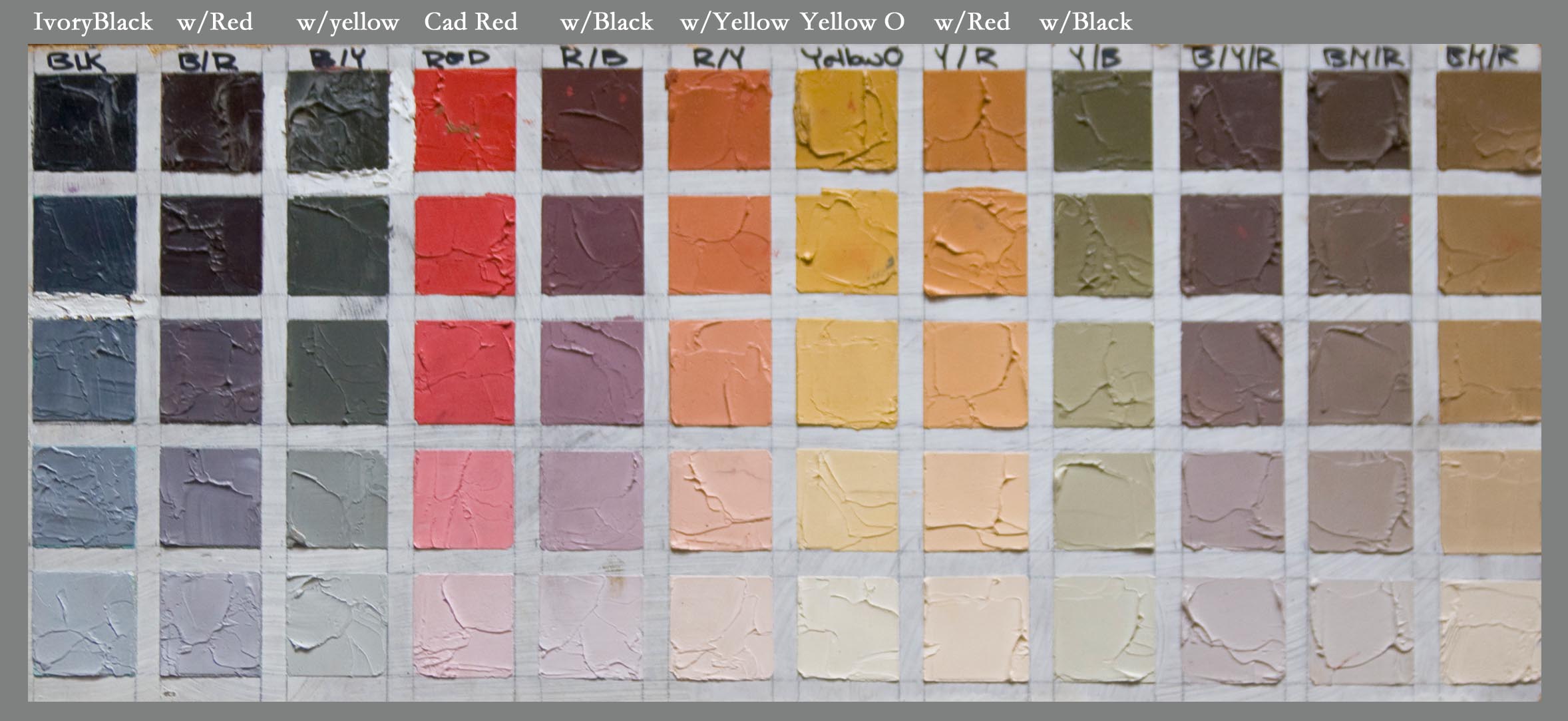
Zorn’s limited oil paint primary palette was: Black, White, Yellow Ochre and a warm red such as Vermillion or Cadmium Red.  There’s some doubt that he used these 4 pigments exclusively but in many cases his paintings (particularly his figures and portraits like the one above) appear to be “limited” to this range.

Example of Zorn Palette--from Westerberg Fine Art
I say “limited” because if you chart these colors out you’ll find these four pigments mix to create a lovely muted secondary color range. You'll also achieve a full value range obviously given the white and black as you can see from the above chart (Aaron Westerberg fyi is one of my favorite oil painting discoveries this year be sure to check out his stunning work.)  For this particular painting I wanted brighter cleaner violets so I chose ultramarine blue instead of ivory black though I definitely want to try another abstract using the black. 

For the red I used Grumbacher Red--napthol pigment is a nice substitute if you don’t want to use cadmiums.
I’ll be working on this painting more today so stay tuned for the finished painting. Speaking of color, last year I posted an abstract painting inspired by the Pantone Color of the Year (Tangerine Tango in 2012).  For 2013 the color of the year is Emerald (my birthstone) so that’s next on my abstract “to do” list. In the meantime I want to wish everyone a productive and creative year filled with color and painting joy!

P.S. For more info about my painting classes in 2013 please write to me or visit my painting class page. Thanks!

Friday, December 21, 2012

10 Best Painting Tips I Learned in 2012

"Winter Pause" 8x10 oil on canvas (currently at 910 Events Gallery)
Happy Holidays! With 2013 just two weeks away I wanted to share some painting tips and  suggestion that really hit home this past year.  I was lucky to kick off the last year early in January with a colorful and inspirational Dreama Tolle Perry oil painting workshop in Florida.  (I can’t wait to return to sunny Marco Island in a few weeks for another one.)

1.  If you enjoy painting from photos (or your subject matter requires it), always have a decent camera handy and take tons reference photos. If I visit a place like the Botanic Gardens or the Zoo I take 300+ shots. Also, take photos in a variety of weather conditions. You just don’t know what will make a great painting. On a rainy day, take a few minutes to organize your photos by subject, place, etc.
2.    If you have an older digital camera like I did consider upgrading. I can’t imagine not having a digital 20X zoom. First these "bridge" cameras have really come down in price. Places like Best Buy and QVC have them all the time for well under $300. One of the best "art" investments I made this year and I can't wait to travel with it.
3.    Prior to 2012 I usually printed out my reference photos, but now I paint mostly off my iPad--and I'm finding many artists work off monitors and laptops as well. Consider what you spend on printer ink each year. You may find that a tablet will save you money within the first year. 
4.    If you’re an oil painter who likes to work alla prima (or wet in wet) try using transparent oils pigments to quickly block in your major shapes. This takes a little practice but floral painters like Hedi Moran and Dreama Perry swear by this method.
5.    Interesting shapes are one of the key building blocks of a strong painting. How do you improve your shapes? Take a look at your most recent painting. Are your shapes  complete, specific, and unique?  This is one I find you have to work harder at than you think you would.
6.    A helpful way to start your painting is to establish the BIG shape and value relationships first. You want to nail down these proportions carefully before proceeding to the medium and smaller detailed shapes—as tempting as those can be.  Especially when you’re working on larger canvas.
7.    Like many painters, I’ve been a casual art history buff since I was a child. I may be dating myself but anyone remember Masterpiece--The Art Auction Game? It was the first time I saw a Pollock and I was fascinated. If there’s a painter you admire, take the time to really study them. Maybe read a bio about them. You'll likely learn something about them that you can apply to your own art. 
8.    Do some art related activity out of your comfort zone. Only you can define that. Work larger, faster, smaller, brighter, looser, tighter? And don't be too hard on yourself when you are in "experimental" mode.
9.    What about those times you just can’t paint? It’s OK to take creative breaks once in a while. Build your inspiration file—browse through magazines (they don’t need to be specifically art related), check out sites like Pinterest,  Google your favorite subject+ media. For example: Peacock watercolor.
10.    That being said there’s no substitute for easel time and brush mileage. I love thinking about painting but there’s nothing like doing it.  So sometimes it is better to push through tough days and grab a brush. It’s better to paint something and learn to enjoy your lifelong journey.  

Saturday, October 27, 2012

Fruits of My Labor

"Let's Make Pie" oil on gallery canvas
"Good apple pies are a considerable part of our domestic happiness." -- Jane Austen

Happy fall everyone! I've been painting almost everyday in prep for my gallery group show next month.  Much like changing your swing the week before a golf tournament, you wouldn't think this would be a good time to suddenly change the way you've painted for years.

But recently I decided to start painting directly from the photos on my iPad. (Note I also have a laptop that I manage my photos on so I take the photos with my 20x digital Canon and then email them to myself.)  Both these paintings were done from my iPad screen.

It took a few paintings to used to but so far I really prefer the color over my ink jet printer and of course it's great being able to "zoom in" on detail as needed. I don't think it will be long before I won't be able to paint without it. An added bonus is that with a tablet right there you can easily listen to music, podcasts, etc. at the same time. You could paint from your laptop screen as well--I just prefer a more compact tablet my easel. 

"Cherries--Sweet!" 8x8 oil on gallery canvas
I was born in Michigan—A state that takes great pride in their apples and cherries.  So these subjects were also a subtle nod to my childhood. More specifically, I selected these photos because I like the composition element and lighter value of the bags. Briefly, one  alla prima or “wet in wet” oil painting technique I’ve used here is painting the lighter value areas with a more textural impasto application of paint.

Often I use a knife (you could also use a cut credit card) directly on the canvas for this, but I also scrape up the paint from my palette and then scoop that paint off the knife with a brush. It may sound like extra work but you get a wonderful effect from this method. Thanks for stopping by--have a colorful weekend!

Tuesday, August 7, 2012

Anything But White

"Ivory Velvet" 8x8 oil on linen panel
Whether the flower or the color is the focus I do not know. I do know the flower is painted large to convey my experience with the flower - and what is my experience if it is not the color? 
Georgia O'Keeffe

I so enjoyed painted a rose study last week that I just had to paint another. This time I thought I’d tackle a very high key white or ivory rose—which you quickly discover of course is anything but white. In fact, Renoir is quoted as saying “white does not exist in nature.”

Lots of choices for the painter at the Little Flower Market in Denver
I didn’t have a whiteish rose handy so I picked up a few from  The Little Flower Market (which I think used to be an old gas station)  near my studio. I took a ton of reference photos with my new studio camera which I love already—a Canon Powershot SX 260 with 20x optical zoom.

"Red Waves" 
Here's one of my first rose photos taken with it. I can’t wait to try it out at the upcoming rose show at the Denver Botanic Garden. I’ll never be a professional shutterbug but the more I paint, the more I appreciate having lots of reference shots on hand.


I think you have to be careful not to overuse white to automatically lighten your colors, but at that same time it’s an essential component of my palette. For more info about whites, here’s an excellent article by Gamblin: Getting the White Right. Thanks for stopping--have a wonderful summer week!

Friday, August 3, 2012

Fuchsia Fandango

"Fuchsia Fandango" 8x8 oil on museum quality linen panel
Happy Friday all! I had a blast painting a Peace rose earlier this week for the DPW rose painting challenge-- and am already looking forward to my next rose--but in the meantime I wanted to try a a different type of flower.  

I spotted this vibrant fuchsia at my local nursery and loved the strong yellow-green leaves/cool pink complementary color combo along with the warmth of the clay pot. In this floral oil painting, I also set out to capture the unusual greenhouse light as well as harmonizing the powerful tropical colors. 


Today's Painting Tip: Use a Key Color for Stress Free Color Harmony
Whether you’re painting an abstract or a representational subject, a simple way to achieve better color harmony is to add one key “mother color” into ALL your color mixes. For example, if you’re painting pinkish flowers and using Permanent Rose or Quin Magenta add a tiny amount of it (think tip of knife) into all your oranges, violets, grays, browns, etc 

This “mother color” approach works particularly well for mixing your greens. Greens that have a touch of a warmer mother color will usually look a bit more natural and/or neutral which in turn will help support your higher intensity colors.

Working with a “mother color” as an approach is also a great way to become familiar with all the properties of that one particular pigment—how strong it is, how transparent it is, what kind of neutrals it makes, how it tints with white, etc.

Quick thanks again to all my new DPW collectors this month--I greatly appreciate your bids and the support of all the artists on DPW. Have a colorful and harmonious weekend.

Monday, July 30, 2012

Forget all the Roses


"Inner Peace" 8x8 oil on linen panel
 
There is nothing more difficult for a truly creative painter than to paint a rose, because before he can do so he has first to forget all the roses that were ever painted. - Henri Matisse

If you spend enough time at your easel you may find yourself dreaming about painting as I often do.  A few months ago I had a very specific dream that I was just finishing up a large scale (about 6 x 6 feet) oil painting of a pale yellow rose. (Supposedly yellow roses may symbolize new beginnings, happy occasions, and friendship.)

I could visualize the painting so vividly that for a foggy instant I was certain I’d find an enormous rose painting waiting in the studio. But no, it was just a dream…My easel sat empty in the morning sunshine waiting patiently for a new canvas. 

Detail of abstract oil panting of rose-in progress in the studio
I was working on some other projects but kept thinking about the giant rose painting and added it to my “future painting” studio to do list.  In preparation, I took a few rose photos and started an abstract study of a rose—on a smaller scale (24 x 24) as test painting for something much larger. Still working on that one…But here’s a sneak preview....

Then yesterday Carol Marine posted a rose painting challenge on Daily Paintworks.  Sometimes you just can’t ignore the loud creative voice of the universe so I quickly grabbed my brush and happily painted a Peace rose from my small rose bed. It felt great to get that rose image out of my head and onto the canvas. Plus, I love Peace roses— They smell like orange sherbet (really, they do) and they offer painters a prismatic array of delicate color shifts. 

Four Easy Rose Painting Tips:
  1. Note the overall cup shape and spiral structure of a rose. Hybrid roses are not as loose and floppy as many garden flowers. You can see this when you sketch them from life—which is helpful before you paint them from your reference photos.
  2. Roses not in bloom? Roses are one of the easiest flowers to find at grocery or even a convenience store year round. One of the best thing about being an artist is that it’s OK to buy yourself flowers just because it’s Tuesday!  
  3. Note the subtle value  and color shifts within the rose blossom—particularly in very dark or very light roses. Yellow roses, for example, may have touches of blue gray, peach, lime, lavender, lime, etc.
  4. Finally, simplify--Yes, roses have lots of layers—but they are delicate flowers so you don’t want them to look too labored or busy.

Monday, July 16, 2012

The Sunflower is Mine

"Sunny Side Up" 8x8 oil on Linen Panel--SOLD--Thank you!

The sunflower is mine, in a way.
Vincent van Gogh

Bon Lundi! Over the weekend I celebrated July 14 Bastille Day with a tasty "dejeuner" at one of my favorite French bistros in Denver--Le Central. Enjoyed a delicious sampling of chilled roses, a bistro salad, a crusty baguette and broccoli soup--yum. (FYI--Thursday is chocolate souffle night if you're in town!)

When I need a "French Fix" I head to Le Central
I'm not sure I believe in past lives per se, but I would not be surprised if I was ever told in lived in France once upon a time..

Le Chateau Frontenac in Quebec
It seems a bit odd to me now as a proud "Western" artist who loves open ranges, Georgia O'Keeffe, Maynard Dixon and spicy chile rellenos, but briefly Francais was my college major. My "big plan" was to move to Quebec where I could live a chic bilingual lifestyle. Le Chateau Frontenac in beautiful old Quebec with it's magical verdigris turrets is one of my favorite places to stay in the world.

Of course, that didn't happen and much like Georgia I headed West to find my artistic bearings but as an adult I've been lucky to paint in France a couple of times.  When I get a longing to visit France (as I often do in the summer) I sometimes and treat myself to an almond croissant, sunflowers (aptly named "tournesols" or "turn to the sun" in French), a fancy French lotion from L'Occitane, and an iced cafe au lait.

Quick "merci beaucoup" to my collectors at Daily Paintworks--I appreciate your bids and support! Thanks too to Carol and David for creating such a supportive art community and the best place to  buy high quality affordable art online.

Friday, June 29, 2012

Skulls and Roses: Sprick Demo Review

Daniel Sprick
Orchids and Human Head
Oil on Board- 22" x 18"  (from Salon d"Arts 2010)
  
Happy Summer All! I have been painting and having a great time with all my summer students but before too much time passed I wanted to post my quick review of the wonderful Daniel Sprick demo from a few weeks ago. Sprick is one of the most celebrated artists in my home state of Colorado and perhaps one of the most accomplished realist painters in the country.


He’s known for his oil paintings of  interiors reminiscent of the Dutch interior masters and beautifully rendered contemporary portraits and figures. Sprick's painting "worlds" are chock full of mind boggling painting challenges such mirrors, double window reflections, fabric folds, skulls, petals, flesh tones, self- portraits, and even insect parts.  Sprick’s an artist who has reached such a high level with his craft and technical skill that when I see his meticulous oil paintings I can’t help but wonder:  How in the world does he do that?
Daniel Sprick Still Life Setup--Love the wrapped skull!
To my knowledge Sprick doesn’t paint many demos or give workshops, though I do see him on the roster for this year's Weekend with the Masters which I bet would be amazing.  So after many years of admiration I was really looking forward to his still life demo earlier this month at Meininger’s Art Store in Denver.

Sprick began with an intimate still life arrangement (on top of a sculpture stand) that included several iconic Sprick items such as a skull (which he had wrapped in cellophane) and a single white rose.  (Note, shortly after he started painting a summer afternoon storm darkened the natural north light so my pictures are a bit murky.)

To start, he massed in his large shape relationships with a neutral tone relationships on a medium size (12x16 maybe) standard canvas board.  I loved his interesting U-shaped composition. And I have to say I was a bit relieved when Sprick noted he might spend several hours if not days fine tuning a single subject such as the skull even though he’s painted it many times. As “daily painter” I couldn’t help wonder what it would be like to concentrate on and perfect a single apple or lemon. Could be an interesting exercise...
Daniel Sprick Palette
Sprick’s painting surface quality is satiny smooth.  During the demo he often softened his edges with a fan brush as he worked along.  He has a quiet thoughtful approach—carefully mixing color piles on a large glass surface with a knife.  He didn’t list all his palette colors but I saw he premixed a nice warm white with what I think was Titanium White and Cad. Lemon.This is a great idea if you tend to overuse pure white to lighten colors.

I half expected a hyper realist painter to be detached, literal, and rigid but Sprick manner was warm, humble, and flexible.  At one point he joked that he didn’t care for a certain type of brush because they shed which makes him bristle. Get it? Bristle. Ahh artist humor.  At another point, he said he didn’t love the tall green bottle and would likely change the color of it. You can see it's bluer in his painting.

This demo was only a couple of hours so an artist with this attention to finishing detail can’t complete his work but it was still fascinating to observe a master craftsman like Sprick and gain insight into his process. If I ever have the opportunity to take a workshop from him I wouldn't hesitate. For more info about him I recommend this video interview conducted by the Denver Art Museum.

Sunday, May 20, 2012

Fine Feathers

"Fine Feathers" 8x8 oil on linen panel
Happy May everyone! I think one of the hardest tasks any busy artist has is prioritization. I'm taking a quick break from painting and getting ready for the upcoming Summer Art Market in just a few weeks on the weekend of June 9 and June 10 to post this new bird painting.

If you've prepared for a show or festival you know there's a lot of work that goes on behind the scenes in addition to painting--such as event paperwork, getting your tent ready, ordering post cards (love Vistaprint for those), etc. In other words, many tasks that tempt you outside of your main goal which is creating art.

Lately I've been trying some new colors on my palette. In this little bird oil painting it's Old Holland Caribbean Blue--which is a wonderful and not very common blue-green thalo turquoise pigment (PB16 for my fellow pigment enthusiasts).

Thanks for stopping by--be sure to check out the Scarlet Owl Pinterest boards for more art inspiration. I look forward to seeing you all at the Summer Art Market and for all my fellow artists in the show I hope you all have a super successful sunny show this year!

Wednesday, May 2, 2012

I Break For Irises

Blue Tongued Beauties 8x8 Oil on Linen
And anything else that I think might make an interesting photo that I could use for painting.  I’m loving Kevin Weckbach’s “Master Class” in oil painting but I've learned already that I need to keep taking a lot more photos.  He gives weekly “homework” and it’s nice to have a variety of subject and themes to choose from.

Photography is not my strong suit so I find I have to take dozens of photos to get just that right painting. Last Saturday morning (while visiting a neighborhood tag sale) I spotted these intense blue violet irises. 

In Kevin’s class we’ve been reviewing the importance of strong, unique, specific shapes as well as dark and light pattern in paintings. So I really tried to concentrate on achieving both in this study.  Speaking of Kevin there's a nice article about him in this month's Southwest Art Magazine previewing his one man show opening on May 11 (my birthday) at Gallery 1261 in downtown Denver. I can't wait to see this and Wicked for the first time that night.


The Summer Art Market is (yikes) only about 5 weeks away on June 9 so I’ll be concentrating most of the next month on painting for that. Most of the paintings I'm posting from now until then will be on sale at SAM-- Particularly since I have an entire booth to fill this year which is both daunting and exciting.

Quick thanks to all my Spring students--Hope you all have a wonderful May month of creativity, spring joy, and artistic discovery!

Monday, April 23, 2012

Amazing Glazing: A Rose In Progress

Transparent Oil Glazed Rose in Progress 9x12 Ampersand Panel

Happy Spring Monday! Last week a student asked if we could paint a photo realistic oil glazed flower.  While I greatly admire this glowing light and shadow style and technique, I tend to paint a bit more loosely and “painterly.”  So for added guidance we watched another Colorado artist Arleta Pech’s DVD –Transparent Oils The Basics, which I highly recommend for anyone interested in learning an easy method for transparent oil glazing.  If you’re a watercolor painter looking to try oils I think it would be an interesting way to start since the planning and thought process is much the same. 

Ms. Pech recommends a smooth surface for this type of painting—we used a 9x12 Ampersand gesso panel—it’s has a very nice velvety finish. Smooth but not too slippery.  Other key materials are all transparent oil paints, Walnut painting medium, synthetic brushes for thin (very thin) paint application and some softer sable brushes (or sable synthetic) for blending out.  If you enjoy blending your oils you’ll love this method. To clean up the edges we used the walnut medium and a clean bristle brush to “pull up” any unwanted color or to lighten areas.

There’s also very little direct mixing of color—mostly layering much like watercolor glazing if you’ve tried that. Give or take, this painting will eventually have 6-8 glazes. This is the first stage—starting with the lighter colors in the background (which will be much darker) and the lighter colors of the rose.  One of aspects of this particular technique that I like is that there is no under painting.  Another interesting feature is that the white in the painting is the white of the board much as you’d “save your whites” on your watercolor paper.  

For an “alla prima” painter like myself, this type of painting takes some patience but I think it will be worth the wait. Can’t wait to add the additional layers—particularly the dark background. As summer approaches I usually have some openings in my class schedule so please email for more info about my classes in oil, watercolor, or acrylic. Have a wonderful colorful week!