Showing posts with label botanic garden painting. Show all posts

Sunday, August 26, 2012

When Opposites Attract

"Botanic Beauty" 6x6 oil on panel

An artist finds his happiest combination in a play of complementary colors. They are direct contrasts yet do not jar; they awaken the beholder, but do not disturb him. Charles Burchfield

Last week’s painting challenge on DPW was an exciting complementary color (direct opposites on the color wheel) challenge posted by fellow DPW painter Layne Cook.

I choose the violet/yellow pair in this alla prima (wet in wet) oil study of an iris because I wanted to explore the full range of warm to cool violets—one of my favorite color ranges. Yellows not so much—but here sunny yellows (some pure notes along with neutral ones) are the perfect warm companion for the cool violets. 

As Burchfield notes above, complements are one of the easiest way to have a successful and exciting color strategy for your art. Here are some quick tips for working with your complementary color pairs:

Work with your color pairs in ranges than one “out of the tube" solid color. This gives you many more options. So violet range and yellow range, red range and green range, and blue range and orange range (or as I remind students in our hometown: Go Broncos!).


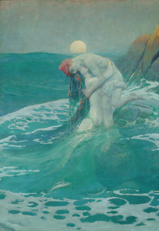
Your painting will likely work better if one of the color pair should dominates the other. So mostly blue range with some orange range for example. Here’s one of my favorite green blue dominant paintings (note the touch of red oranges) "The Mermaid" by American illustrator Howard Pyle. 

When you paint two complements side by side they really attract the eye. You can take advantage of this color power couple where you want to the viewer to focus.  On the flip side when you need to calm a color down, the complement can be a more interesting alternative for creating neutrals rather than a pre-mixed gray, black, umber, etc. Trouble with your highlights? Try a touch of complementary color in your white mixture. (So whitish green highlight on bright red tomato for example.)

For more discussion about exploring and balancing opposites in your painting check out one of my favorite oil painting books: The Yin Yang of Painting by Zhang.  Finally, a big thanks again to all my recent DPW buyers and my ongoing students for your support this summer!

Tuesday, June 19, 2012

It was SAMtastic!

Botanic Garden Hollyhocks-12x12Oil on Linen Panel

Click to Bid-Thank You!
Whew have just about recovered from SAM! I want to thank everyone—friends, fellow artists, art lovers, and my students for visiting me at the Summer Art Market a week before last.  Especially Saturday when the temp was pushing 100 by mid-day.  Sunday was a perfect plein air market day though—sunny,  gentle breezes…It was like being on vacation hanging out in my comfy red director’s chair.


Early AM setup on Grant Street--a beautiful summer morning.
So again, my thanks to my many students and their families who took time out of their buy summer weekend to support me and the Market.  It’s always nice to see familiar faces when your “on display” for a few days. (Best of all, this year, I did not slice a big piece my big off during set up--see last year’s show post if you want the gory details.)

I’ve participated in the SAM for over 11 years and am honored  to be a part of such an amazing group of artists all in one place.  It’s a lot of time and effort to get ready for any art festival or show but being part of this community makes it all worth it.

A special thanks to all my collectors at this show where there is so much gorgeous high quality artwork to choose from.  I sold several  my favorite paintings I’ve posted this year which is always exciting to some new collectors--which was fantastic. But I particularly want to acknowledge several repeat collectors and art lovers who visit me each year at this show. 

One buyer said she remembered buying from me over 10 years ago and still enjoys that landscape. 
Another buyer (who is a talented designer with Armigo Design Group here in Denver) told me that an alphabet abstract painting she bought a few years back can be seen in this Better Homes and Garden Decorating magazine article.

Now, ironically, if you read my post a a while back about the importance of a signing your work AND with clear signature somewhere on your painting (for example printed on the back if you have an artistic signature) you'll see that I'm not credited in the article. For which Beth kindly apologized (she'd purchased the piece several years before the article) and I know she did her best to find me. So note to self.  But I'm thrilled to see my work in place none the less so thanks so much Beth for this nice surprise.

Colorado Realism Master Daniel Sprick blocking in his still life.
June’s been a busy and exciting art month so better get back to my easel. In my next post I’ll share my experience at the Daniel Sprick demo I saw the first weekend in June at Meiningers art store. Simply amazing. I've wanted to see Sprick (one of the best realist painters in the country) paint in person for as long as I can remember so waiting in line for over an hour for front row "rock star" demo seats was worth it.