Showing posts with label iris oil painting. Show all posts

Monday, September 8, 2014

Challenge Day 8: Like a Good Neighbor

"Summer Star" 8x10 oil on canvas

Happy Monday everyone! In full disclosure I’m not in the studio today so I’m posting an available daily painting from my summer gallery show that incorporates today’s color theme: Analogous!

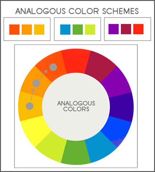
Analogous are simply groups of colors adjacent on the color wheel or as I like to call them color neighbors that get along. If complementary colors are passionate strangers, analogous colors are affable old pals.
Courtesy of Ultra Modern Style
Nature is full of examples of these pleasing color neighbors—think of a resplendent autumn maple with leaves that span from green to gold.  You'll also see this color grouping in flowers. Iris often span the color range from blue-green all the way to a reddish violet as you can see in my oil study. So the next time you need a successful color plan just look to nature. 

Thank you again for all my challenge visits and to everyone for your support during the challenge month.

Friday, April 18, 2014

The Creative Balancing Act

"Blissfully Blue" iris oil painting study 8x8 

Happy Spring Friday everyone! Many thanks to all my spring students for keeping me busy and inspired this time of  year. As a creative professional I’m so lucky to be a part of your many new and interesting art projects every week! Thanks again to each of you. (Also, my next post will be my 300th! So stay tuned for some special for that.)

In fact every week I study dozens (if not hundreds) of painting and photo references. Some online, in books, and in person. So much stimulating "eye candy" can be overwhelming at times. Even worse, this excitement can lead to jumping ahead and be tempted by the "next amazing painting" before I've really given enough time to the one at hand.

As with many creative endeavors, I was thinking this week (as sunnier weather calls to me outside the studio window) balancing hard work/discipline with boundless creative energy will likely be something I'll deal with the rest of my artistic life.

So what helps? A set schedule. Sort term and long term goals are extremely motivating. Taking breaks. Keeping an idea folder. Staying positive even when we fall short of goals. The balance is  likely a different approach for each of us.
"Singing for Spring" redwing blackbird oil painting study (on hold for SAM)
This week my short term goal was to complete at least 2 paintings and I'm happy to say that I finished both this  this iris and blackbird painting. My thanks to DPW for selecting my “Blissfully Blue” iris as one of their daily Facebook picks. I also started a larger landscape. As a reward I did take a few breaks. So here at the end of the week I feel like I accomplished a lot at the easel but I also feel ready to paint again next week. In the meantime, wishing you a warm and colorful spring weekend!

Sunday, June 30, 2013

Every Summer Has a Story

 
"Irresistible Iris" 8x10 oil on linen
I've been doing a lot of abstract painting lately ,extremely abstract.
No brush, no paint, no canvas, I just think about it
. ( Comedian Steven Wright)

Summer is such an amazing adventurous season to be an artist, isn’t it? First, I have to give a huge thanks to all my friends, students, and of course enthusiastic art buyers of all ages who stopped by to say hi and wish me well at the Summer Art Market (SAM) a few weeks ago. Everyone seemed to be enjoying the Market on a beautiful June weekend.

SAM was very successful and now I'm busy working on several commissioned paintings from the show as well which I love to do. Again thank you loyal Denver art patrons!
Early AM shoppers on Grant Street at the Summer Art Market
Tent all set up, art hung, and ready to go!
Whew—the SAM  is always an art whirlwind--both inspiring and exhausting.  Sometimes, it takes me a few weeks to get my groove back. But when I do I always feel like I’m at a new level of awareness since I’ve painted so much to get ready (including very late the night before!).

Speaking of re-energizing, summer is often a “hit the restart button” season for me. There’s something that just makes me braver and bolder in the summer.  Interestingly, I’ve talked with many other artists that feel the same. What works well for me is to explore a new path that feels both natural AND pushes me in a new direction. 

For example, if you love figure painting, maybe try a figure class but with a different medium than you’d typically use. In the summer, I like to work on both nature inspired oil paintings (such as my iris today) as well as abstract painting.  I’m currently in progress on a “master copy” of an Emily Mason color field oil abstract but in acrylic and mixed media.
Emily Mason "master copy" 24 x 24 in acrylic
As many of you who work in both oil and acrylic know, trying to "make" your acrylic paint “mimic” buttery oil paint can be an interesting challenge-- particularly in a warm arid climate. But it’s one of the best ways to really discover, push, explore, and learn new media techniques.

P.S. If you enjoy nature inspired art like I do check out my new Pinterest board this week dedicated to tree related art—it’s one of my favorite boards yet.  Summer cheers everyone!

Sunday, August 26, 2012

When Opposites Attract

"Botanic Beauty" 6x6 oil on panel

An artist finds his happiest combination in a play of complementary colors. They are direct contrasts yet do not jar; they awaken the beholder, but do not disturb him. Charles Burchfield

Last week’s painting challenge on DPW was an exciting complementary color (direct opposites on the color wheel) challenge posted by fellow DPW painter Layne Cook.

I choose the violet/yellow pair in this alla prima (wet in wet) oil study of an iris because I wanted to explore the full range of warm to cool violets—one of my favorite color ranges. Yellows not so much—but here sunny yellows (some pure notes along with neutral ones) are the perfect warm companion for the cool violets. 

As Burchfield notes above, complements are one of the easiest way to have a successful and exciting color strategy for your art. Here are some quick tips for working with your complementary color pairs:

Work with your color pairs in ranges than one “out of the tube" solid color. This gives you many more options. So violet range and yellow range, red range and green range, and blue range and orange range (or as I remind students in our hometown: Go Broncos!).


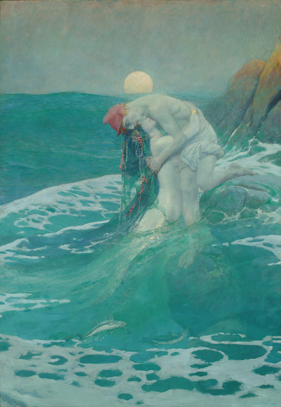
Your painting will likely work better if one of the color pair should dominates the other. So mostly blue range with some orange range for example. Here’s one of my favorite green blue dominant paintings (note the touch of red oranges) "The Mermaid" by American illustrator Howard Pyle. 

When you paint two complements side by side they really attract the eye. You can take advantage of this color power couple where you want to the viewer to focus.  On the flip side when you need to calm a color down, the complement can be a more interesting alternative for creating neutrals rather than a pre-mixed gray, black, umber, etc. Trouble with your highlights? Try a touch of complementary color in your white mixture. (So whitish green highlight on bright red tomato for example.)

For more discussion about exploring and balancing opposites in your painting check out one of my favorite oil painting books: The Yin Yang of Painting by Zhang.  Finally, a big thanks again to all my recent DPW buyers and my ongoing students for your support this summer!

Wednesday, May 2, 2012

I Break For Irises

Blue Tongued Beauties 8x8 Oil on Linen
And anything else that I think might make an interesting photo that I could use for painting.  I’m loving Kevin Weckbach’s “Master Class” in oil painting but I've learned already that I need to keep taking a lot more photos.  He gives weekly “homework” and it’s nice to have a variety of subject and themes to choose from.

Photography is not my strong suit so I find I have to take dozens of photos to get just that right painting. Last Saturday morning (while visiting a neighborhood tag sale) I spotted these intense blue violet irises. 

In Kevin’s class we’ve been reviewing the importance of strong, unique, specific shapes as well as dark and light pattern in paintings. So I really tried to concentrate on achieving both in this study.  Speaking of Kevin there's a nice article about him in this month's Southwest Art Magazine previewing his one man show opening on May 11 (my birthday) at Gallery 1261 in downtown Denver. I can't wait to see this and Wicked for the first time that night.


The Summer Art Market is (yikes) only about 5 weeks away on June 9 so I’ll be concentrating most of the next month on painting for that. Most of the paintings I'm posting from now until then will be on sale at SAM-- Particularly since I have an entire booth to fill this year which is both daunting and exciting.

Quick thanks to all my Spring students--Hope you all have a wonderful May month of creativity, spring joy, and artistic discovery!

Saturday, April 14, 2012

Showers Bring Flowers

"Blue Butterflies in a Jar" oil on linen panel 8x8
Like many artists, I love to paint irises. Iris means "rainbow" the velvety petals have that wonderful flying butterfly shape so it's no surprise it's a favorite artistic subject. These irises were in my garden last spring and I took a few reference photos of them since they last so briefly.  For this oil floral study today I had two specific painting goals:
  • More impasto texture in the petals
  • Working with an intense red background (in this case I had used an old red abstract painting as a background)
American Museum of Western Art: The Anschutz Collection
If you have a passion for western art like I do, be sure to note that the Collection is going to begin regular public tours on Mondays and Wednesday starting next month (May 2012) in Downtown Denver.  This should be an amazing collection that includes Western greats like Georgia O’Keeffe and  I can’t wait to see it.
 

My Favorite Oil Painting Supplies
I’ve added a new page to my blog (see tabs above) about my “must have” oil painting supplies for those of you interested. I’ve started with the oil supplies (which is the media I’m currently painting with the most) but will also add favorite my watercolor and acrylic supplies.  Also if you’re interested in my favorite art books check out my Scarlet Owl  Pinterest boards.  Speaking of Pinterest (I'm up to 200 pins already) thanks to all who’ve pinned my art so far!
 

To end today’s posting I’d like to share a recent fortune cookie fortune that I thought was perfect for artists: Your genuine talent will find its way to success. Keep practicing….And so I'm back to the easel. Happy practicing in your studio!