Thursday, September 18, 2014

Challenge Day 18: The Color of Peace & Joy

"Peaceful Petals" 8x10 oil on linen--in progress
Happy Thursday everyone! I’ve missed posting for a few days but have greatly enjoyed teaching this week, enjoying the gorgeous weather, and getting ready for the many fall art shows on the horizon in Denver.

(Speaking of shows, I’m very happy to report that my Day 1 challenge painting (my Blue River sparrow) was juried in the All Colorado Art Show.)

But today I’m back at the easel and my goal was high key ethereal colors. I’ve always loved this type of painting. (If you like really gentle light colors too you may enjoy my “High Key Heaven” art board on Pinterest.)

On a pigment note, I've been hearing a lot about Gamblin's warm white (which is a mixed white with a little hint of an yellow/orange) and thought it would be interesting to try in this. For those of you who feel your whites get too cool you may enjoy it.

I thought a sunlit peace rose would be a perfect high key subject. Originally cultivated in the 1930’s in France, the trade name "Peace" was publicly announced in the U.S. in April 1945. Later that year peace roses were given to each of the delegations at the UN inaugural meeting with this note: "We hope the 'Peace' rose will influence men’s thoughts for everlasting world peace".

Interestingly in Italy rose is known as “gioia” or joy—also an apt descriptor for such a blissful and colorful flower.  Wishing you all a peaceful and colorful week as fall approaches!

Sunday, September 14, 2014

Challenge Day 14: Reaching for the Sky

Rainy Sky Study--9x12 on linen (study for larger painting)
The sky is the soul of all scenery. It makes the earth lovely at sunrise and splendid at sunset. In the one it breathes over the earth a crystal-like ether, in the other a liquid gold.  American landscape painter Thomas Cole

Almost at the half way point in what feels like a painting marathon but in a good way...

Tomorrow AM I have to have a chipped tooth fixed. I'm lucky that I like my dentist but I’m already hoping I won’t be too uncomfortable to paint afterward.  I’ve already put the appointment off for a few weeks but felt it was time to just get it over with. Also, I didn’t think my dentist would quite understand about the 30 in 30 painting challenge.
Alaskan Sunset Study
In the meantime, I wanted to post a few sky color studies today. Why skies? If you enjoy painting landscapes I think the sky is one of the most interesting places to both study and inject color. On any given day, as Hudson River painter Thomas Cole points out, the sky can display a prism of painting challenges. Skies can be every color on the color wheel especially during unusual weather. So if you're working on a landscape that you feel needs some extra color interest look to the sky.
One of my fav sky photos this summer--double rainbow over Red Rocks
P.S. For all you sky, sunset, and cloud fans you may enjoy more colorful sky paintings on my Pinterest board: The Sky’s the Limit.

Saturday, September 13, 2014

Challenge Day 13: The Beauty of Black


"Wise Guy" 30x40 Acrylic on Canvas Private Collection

"Women think of all colors except the absence of color. I have said that black has it all. White too. Their beauty is absolute. It is the perfect harmony.” Coco Chanel

Happy September Saturday everyone! If there’s one really controversial pigment color for artists it might be black. It seems to be the one pigment artists either love or never use. Which brings me to the question I hear a lot: Is black even a color? 


It’s a good question..If you add white to your black pigment you’ll likely get some kind of gray that leans toward a hue such as blue. So in that case I use black a really dark neutral blue. Here’s an interesting post by the late RobertGenn about using black in art

In most cases, I mix a “chromatic” black meaning I create a really dark pigment that looks blackish. In oil for example, I might use ultramarine and transparent red oxide. This is a very nice dark neutral mix for landscapes or animals. 

In my contemporary owl acrylic painting today I just cut to the chase and used really opaque mars black (which also leans a little warmer). In a painting with more subtle natural colors the black helps add needed contrast especially to the focal area of the eyes. Thanks stopping by--have a wonderful rest of your weekend!

Friday, September 12, 2014

Challenge Day 12: Not So Mellow Yellow

"Sour Lemons" 8x8 oil on canvas (unfinished)
What a horrible thing yellow is. (Edgar Degas)

Happy Friday everyone! A few posts ago I honored my favorite color (green). So I thought it only fair to confess my least favorite color. My color “nemesis” if you will.

As a painter it's my "job" work with all the colors everyday. But if I'm being honest I’m with Monsieur Degas-- I just can’t seem to embrace yellow with same joie de vivre. 

My apologies to all you gold, honey, canary, marigold, butter, saffron, ochre, and lemon lovers out there. But I realized the other day I don’t own one piece of yellow clothing. (I think I'm still recovering my dreary mustard high school graduation robe--Not a flattering color on anyone.)
"Sweet Summer Honey" oil on canvas SOLD

Here I tried a an all yellow dominant painting in this little knife painting study of lemons in a plastic bag (unfinished) to help me understand my yellows a little better. When you spend a long time with someone you hopefully understand them a lot better. Still I would have preferred a lime study...

That being said my favorite flowers are sunflowers so of course they are typically yellow. And I enjoyed this study of honey jars in the sun. Some artists really know how to make yellow shine as you can see on my “You Had Me at Yellow” Pinterest board. Do you have a color that challenges you? 

Thanks for all your positive challenge comments--they are greatly appreciated and remembered as I head in to the studio everyday. Have a fantastic fall weekend everyone!

Thursday, September 11, 2014

Challenge Day 11: It's a Gray Area...

"Open Mind" 24 x 24 mixed media on canvas--Collection Artist
“The color of truth is gray.” Andre Gide

In a month of challenge painting devoted to color I felt I had to include my love of grays--particularly cool grays. This may seem a little strange coming from a self proclaimed "colorist" painter. But I'm sure you've heard if you really want your high chroma colors to "stay clean" it helps to balance them with some neutrals.

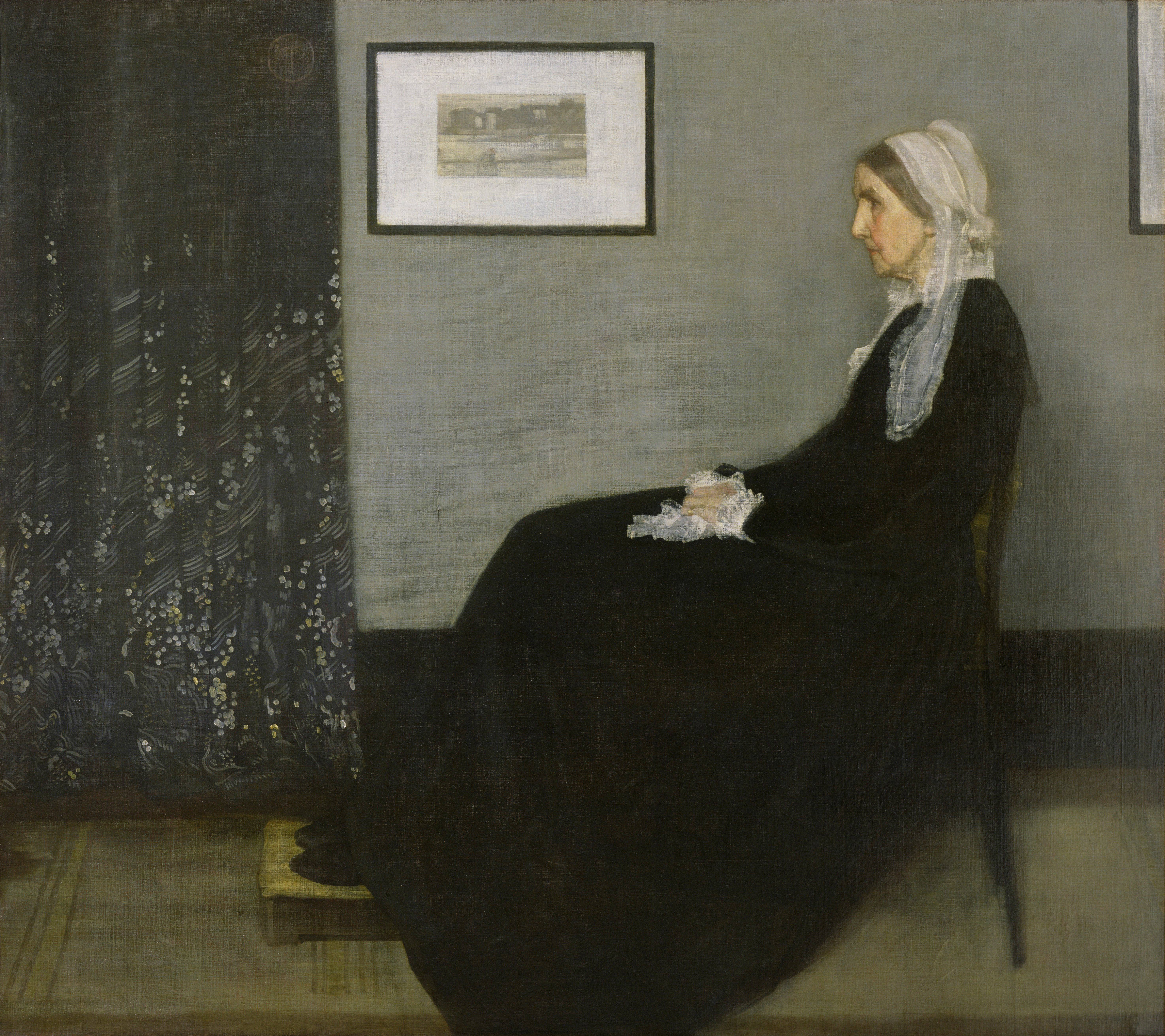
And for those of you who love neutrals (my Mom for example loves ivory) you already know that "gray" painting can be quite stunning and powerful as well--Just look at this iconic example from Whistler.
"Arrangement in Gray and Black No. 1" J. Whistler image from Wikipedia

 And of course we've all seen how beautiful art can look on rich charcoal gray gallery or museum walls. I don't have many grays in my house as a I look around but I do love to wear gray--especially in the fall. There's also some rumor that the Pantone color for 2015 (it was orchid this year) will be some kind of gray (I think it will be olive) but that would be an interesting choice.


Once in awhile I like to take break from traditional representational painting and just play. It's kind of like a yoga retreat for my art brain. It's both relaxing and rejuvenating at the same time.

In this mixed media abstract painting which I've been playing with for a while I knew I wanted to work with some variety of grays along with some high key (pastel) colors. So I used both graphite (a gray I particularly like), gray oil pastel and some metallic steel gray Golden acrylic paint. Thanks again for joining me on my art adventure. Have a wonderful rest of your week!

Wednesday, September 10, 2014

Challenge Day 10: Keepin' it Cool

"Castlewood Shadows" 9x12 oil on linen
Woohoo! We've made it 10 days challenge artists! I've heard there are now more than 1,000 painters who've signed up! So far it's been very motivating and a great excuse to stay in the studio. Is it me or  does the day fly by when you're painting everyday? I feel like I need a few more hours at the end of everyday.

Today in Denver is my absolute favorite weather--It started out little rainy this morning but now it's the perfect late summer day. Sunny and cool. Always reminds me of that first week back on campus that was so exciting and the start of fall colors. So I'm going to make this post speedy so I can take a park break and take some more reference pics.

Yesterday, I posted a mostly warm painting so today I moving over to the cooler part of the wheel--the greens, teals, blues, violets. All my personal favorites. I love the mood that cool colors bring to a landscape. Just like yesterday I've added a few pops of warmer colors for balance and interest.

One of the parks I like to go birding is Castlewood Canyon and it has many enormous boulders and rocks like this. Like many Western painters I also love painting aspen trees since the silvery bark usually reflects the surrounding colors. Plus its fun to paint the unique dark patterns. 

Thanks again and have a wonderful colorful week! Only 20 more to go...

Tuesday, September 9, 2014

Challenge Day 9: Me and My Shadows

"Vines on Vine St." 8x10 oil on linen
 
Shadows play an integral role in letting sunlight permeate the scene. They provide a 'setting' that compliments the sun-kissed lights. Often, shadows will have a golden tint, or even a rosy red color that conveys a unique atmospheric glow. (Watercolorist Jeanne Dobie)

That was a close one. Thankfully (and just in time) a giant box of linen canvas panels just landed on my porch from Jerry's--so no running out of panels before the end of the daily challenge! (Yes I do have several art stores close by but unfortunately none of them carry small linen panels like these.)

Now back to painting. There are a couple of color strategies going on in this little pumpkin oil study. One is overall color unity.  There are many ways to achieve color unity (limited palette, mother color, etc.) but one “short cut” method is toned support.

I simply give the canvas (or paper) a quick color “wash” before blocking in my drawing/shapes. In fact, I’ve used this approach for so long it’s almost strange for me to paint on a pure white canvas.

Today, I took my overall color cue from a sunny autumn late afternoon in my neighborhood and used a warm yellow-orange wash. The second goal was have a warmer color dominance (including the shadow patterns) with only a few cool notes. Thanks again for joining me during daily challenge month—I appreciate all your visits and kind comments! 

Monday, September 8, 2014

Challenge Day 8: Like a Good Neighbor

"Summer Star" 8x10 oil on canvas

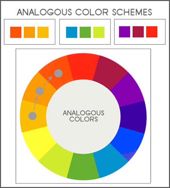
Happy Monday everyone! In full disclosure I’m not in the studio today so I’m posting an available daily painting from my summer gallery show that incorporates today’s color theme: Analogous!

Analogous are simply groups of colors adjacent on the color wheel or as I like to call them color neighbors that get along. If complementary colors are passionate strangers, analogous colors are affable old pals.
Courtesy of Ultra Modern Style
Nature is full of examples of these pleasing color neighbors—think of a resplendent autumn maple with leaves that span from green to gold.  You'll also see this color grouping in flowers. Iris often span the color range from blue-green all the way to a reddish violet as you can see in my oil study. So the next time you need a successful color plan just look to nature. 

Thank you again for all my challenge visits and to everyone for your support during the challenge month.

Sunday, September 7, 2014

Challenge Day 7: All Her Lovely Hues

"Fall Fillies" 8x10 oil on linen at Framed Image in Denver--SOLD
It was the rainbow gave thee birth, and left thee all her lovely hues.  (W. H. Davies)

I had so much fun last week painting my little horse painting (and it sold quickly) so I wanted to paint another one. This one my goal was to play with what I like to call prismatic color especially in the shadows.

I've always been attracted to paintings that use a lot of intense color but in a planned and thoughtful way. In this case, I'm trying to move the viewer's eye by color "steps" rather than value gradation.

This painting approach for me is all about color celebration and exploration. Here I've used at least seven or eight pigments plus white. This is a good time to get out that new or rarely used pigment and see how it plays with your regulars. Lately I've been seeing some "color buzz" about manganese violet and alizarin yellow--I don't have those (yet) but they would have been interesting to try in a painting like this.

This framed painting will be featured at the Framed Image Gallery's fall show in Denver through October 31. Update: Sold--thank you collector and fellow horse lover!

Saturday, September 6, 2014

Challenge Day 6: Ready for Red

"Wine Garden" 8x10 oil on linen (private collection)
If one says 'red' - the name of color - and there are fifty people listening, it can be expected that there will be fifty reds in their minds. And one can be sure that all these reds will be very different. (Josef Albers)

A few days ago I posted a blue/orange complementary painting. Today I’m working with red/green. This can be an awkward combo because it tends to have that holiday flare. I went with an obvious and easy choice here with a floral.

I also used a palette knife for most of this for some extra texture as well as to help keep the colors cleaners in an alla prima painting with lots of red.

These cheerful late summer flowers (some kind of petunia??) are from a neighbor who has one of the nicest private gardens I’ve ever seen. I tend to like more unusual colored flowers such as blue, green, blacks--so this rather unusual wine color caught my eye. I’m not a gardener so I really admire anyone who has a way with flowers and plants.

They say if you want to attract attention wear red. And I think this is true of red paintings as well. They tend to be really eye catchers at shows and festivals. There’s just something about red…Thanks and happy weekend painting to all my fellow challenge painters!

Friday, September 5, 2014

Challenge Day 5: Leave it to Nature

"Blue Maple, Red Oak" mixed media on gallery wrap 18x24
By all these lovely tokens September days are here, with summer's best of weather and autumn's best of cheer.  Helen Hunt Jackson

I’m always sad to see summer wind down. But as a nature painter, fall brings so many interesting and exciting painting subjects such as leaves, vines, gourds, apples, etc.  My color goal today in this contemporary large leaf painting was to incorporate all the "color wheel" primaries—blues, reds, and yellows.

My photo reference was from a large park where there are a variety of leaf species. I started with a strong black contour drawing of the leaves. I just used a large Sharpie but I think India ink and a brush would have been interesting as well. I also quickly washed in the initial colors with acrylic before applying my oils. This is great time saver if you need an oil painting to dry quickly. 

Am I done? I Maybe… I might add some more paint layers at some point. But for now I’m content to hang it up and move on to my next challenge painting. Thanks for stopping by and have a colorful week!

Thursday, September 4, 2014

Challenge Day 4: The Color of the My World

"Lovely Landmark" 8x10 oil on linen (private collection)
Green is the prime color of the world, and that from which its loveliness arises.” — Pedro Calderon de la Barca

Yes, painting greens can be perplexing at times but fortunately green is my favorite color. I've read that liking green means you enjoy nature (which makes sense), and that you tend to be sensible, practical, balanced, and love your freedom. So go GREEN! (If you love green too you may enjoy my Glorious Green Art Pinterest Board.)

My goal for Day 4 was to include a wide range of greens into this little study of one of our neighborhood landmarks--Denver's Washington Park Boathouse.

Recently, the 100 year old pavilion underwent a refurbishing. Unfortunately, they "updated" the bright white exterior to a kind of creamy beige. Now the water reflections and reflected light are not quite as clean and attractive (in my opinion).  So I took artistic license and kept the building the “original” white that I've always loved.

Green color mixing tip: For more natural greens I prefer to mix them "from scratch" with blue and yellow and then add a touch of red or orange. Also try black and yellow for an interesting earthy green.

Finally, quick welcome to all my new fall painting students. This is the perfect "back to school" time to take up a creative pursuit. I look forward to painting with you!

Wednesday, September 3, 2014

Challenge Day 3: The Charm of the Season


"Orange Pearl" 8x10 oil on linen 

 Available at Framed Image Gallery

The charm of the season – and the day in particular – is to be found in the union of the two complementaries:  blue and orange. (Charles Burchfield)

Welcome back fellow challenge painters and followers!  My color goal today was to make the most of a complementary pair such as red/green, blue/orange, orange-yellow/blue-violet, etc.   
Color Wheel Courtesy Cornell University
Using the contrast of two opposite colors helps create a vibrant energy in a painting. Including complementary colors is also an effective way to call attention to a focal area.  

While I think all complementary color pairs work well, I find the blue/orange combo is a personal favorite (maybe some of my Denver Broncos pride is showing!). What's your favorite pair?

An obvious subject choice for a seasonal blue/orange combo (other than Peyton Manning) was pumpkins. I’m happy to announce that this little pumpkin (which was at my local South Pearl St. farmer's market) will be featured at the fall show at Framed Image Gallery in Denver which is now through October 31. 

P.S. Speaking of blue and orange, have you seen a blue lobster? They are apparently extremely rare but I’d love to paint one!

Tuesday, September 2, 2014

Challenge Day 2: The Language of Dreams

"Summer Swish" 8x10 equine oil painting SOLD
Color! What a deep and mysterious language, the language of dreams. Paul Gauguin

Day 2 Goal: Capture a hot August day with a bright but limited palette

Hope everyone enjoyed a lovely sunny last August weekend like we had here.  Many thanks to all everyone who visited yesterday for painting challenge day 1! Did you see all the amazing Day 1 paintings? 

Since these will be almost daily postings I’m going to try to keep these postings short and sweet.  Plus, I need to spend as much time in the studio as possible. So today my “color” theme continues with different three pigment palette (plus white):
  • Cobalt blue
  • Permanent Rose
  • Indian Yellow
At first I wasn’t so sure about this combo, but I grew to love it. I don’t use cobalt that often (I tend to avoid the more toxic and pricey pigments). But it's a delicate transparent blue that makes luscious violets so I can see why it's on so many oil painters' palettes

I was actually birding in a park a few weeks ago when I saw these pair of horses grazing on a hillside. I'm a lifelong horse lover so I’m happy to report that this piece has already been sold to a neighbor who rides. The best part of a daily challenge? You get a fresh canvas in the morning! Happy late summer painting everyone!

Monday, September 1, 2014

Challenge Day 1: A Certain Blue

"Blue River Bird" 8x10 oil@ The All Colorado Show from 9/27 to 10/31--SOLD
A certain blue enters your soul. Matisse

Day 1: Limited Palette with Dominant Primary Color

Happy September everyone! And so it begins. After some debate, I’ve chosen “COLOR” (you saw that coming didn’t you?) as my 30 in 30 theme. Obviously COLOR is an enormous, almost overwhelming, subject so I’ve decided to narrow my focus each day to a specific color plan, strategy or approach. 

Today my goal was: Color harmony as well as dominance (in this case a rich sapphire blue).  This confident little sparrow caught my eye on an early AM stroll in Breckenridge, Colorado. He was hanging out on the sunny boulders near the beautiful Blue River.

This 8x10 oil study is just three pigments and white: Ultramarine blue (warm blue), alizarin crimson (cool red), and hansa yellow light (cool-ish yellow).  My white is mostly Permalba (titanium+zinc).  That’s it. Three primaries and white. I almost always find this to be a successful color approach to little paintings.

If you’re participating in the “30 in 30” thanks for stopping by and have a fantastic month of painting. My thanks to Leslie Saeta for creating this exciting community (are there really over 700?) of daily painters. I know this will be busy but motivating and inspirational month for all us!

Day 2: Another limited three color palette. Different pigments and warmer… Stay tuned.