Showing posts with label Denver Watercolor Classes. Show all posts

Wednesday, June 29, 2011

Let Them Paint Cake!

Buttercream Dreams--9x12--Acrylic on Canvas-SOLD
Today's Painting
Mmm...Cake. I've had some very positive feedback about my colorful red velvet cake piece  that I painted earlier this year with the slower drying Golden Open Acrylic paints. This painting is part of a set for a commission.  For me, if I had to pick a favorite dessert, it's probably cake so this is certainly a painless  subject to research. Plus, I find it very energizing to paint graphically with bold shapes and unusual color pairings like many of the contemporary pop artists such as Wayne Thiebaud.  

Colorful Connections Turns 2!
Before I forget, I wanted to quickly celebrate my 200th posting or what is basically my two year blogging anniversary.  Woohoo--Very exciting--So many thanks to all my visitors, students, and followers.I can honestly say that blogging about my teaching and painting has changed my art career as I'm sure it has for many artists. So again, my sincere thanks!

Cherry Creek Arts Festival This Weekend-July 2, 3, & 4, 2011
I feel very lucky to be able to walk to one of the premium art fairs in the country each 4th of July weekend. I don't think I've ever missed a year.  Each year the festival receives over 2,000 applications so as an artist it's fascinating to see the 230 artists selected. Like many artists in the Denver area, it's one of my top art goals to be in this show. Until then, I'm happy to be a spectator and speaking of food, be sure to check out the free culinary demos--it's one of my favorite breaks between art ogling.

Friday, May 6, 2011

Octopus Garden

Octopus Garden-22 x 30--Mixed Media/WC on paper

Featured Artwork
I'm posting a watercolor abstract today. I love working on roomy full sheet (22 x30) of watercolor paper. For my watercolor folks, this is Lana 140lb CP. My overall technique was to cover the entire sheet with shelf liner (big roll from Target). Then I cut out positive shapes into with a rolling cutter that one would use for sewing or quilting--another one of my favorite new tools.I saw a Discovery show a few weeks ago about exploring the ocean depths and that was my inspiration.   

Coming Soon: New Logo!
Quick welcome and thanks to the talented designers from all over the world at Logo Tournament who are working on my new Scarlet Owl Studio logo this week. It's been really exciting to review the designs and I can already tell it's going to be hard to pick a winner. I look forward to unveiling my winning logo to everyone within the next few weeks!

Show Announcement
In Denver First Friday is show opening and gallery hopping night so be sure to get out and enjoy the nice weather and great art. Tonight is the opening of the Art Student's League of Denver Eclectic and Inclusive (Part 1) Show (May 6-June 25, 2011). The exhibition highlights a wide variety of media and creative inspiration. One of my personal favorite large mixed media pieces is in the show, Imagine. (Think it's going to be hung by the bathroom which a gallery owner once told me is "an ideal" location!) 
2011 Summer Art Market (SAM): Save the DateJune 11-12 at 2nd & Grant. Over 300 artists--one of the best art festivals in the country! Paintings of all media and sizes, every subject imaginable, gorgeous ceramics, and best of all price ranges for every budget. On a personal art buying note, I can't tell you how many times I've seen very high end paintings at galleries around the country that I wished I'd bought years ago when the artist was less well known. So here's your chance to pick up that masterpiece. And be looking for my exclusive Colorful Connections Blog Readers SAM coupon!

Thanks for stopping by--have a wonderful, colorful weekend!

Wednesday, March 2, 2011

Sweet Sprouts

Happy March everyone! I'm back from my trip to beautiful, sun-kissed central Florida (I can see why so many painters live there) and eager to get back to painting and teaching this week. Before I left, I painted this quick oil painting study of a sprouting sweet onion.

I really wanted to paint a red onion for the red-purple/yellow-green complementary color scheme but I can't get the thing to sprout no matter what I try. (Feel free to email sprouting tips!) My favorite part was painting the semi-transparent onion skin.

Speaking of spring, I think this is a great time of year to start spring cleaning in your studio--weed out old brushes (they can still be used for texture but maybe not careful details), let go of that paint tube that's so old and dry it's become a mystery color, organize paintings by subject or size, and maybe donate rarely used supplies to a local art non-profit.  I don't know about you, but I feel much more productive and creative in a well-organized, well-stocked studio.

Finally, this week one of my students kindly gave me one of the Splash Watercolor Series books. If you paint in watercolor, you may already be familiar with these, but this consistently high quality series (currently their are 11 books in the series) is a marvelous resource if you work watermedia. Have a great week and happy painting!

Wednesday, January 19, 2011

Rosy Winter

Hi Everyone--happy Wednesday! This little 8 x10 oil painting fresh off the easel was inspired by a snowy day and having "paint a floral in oils" on my studio to do list for the week. These are my roses and a few marigolds for pops of cadmium yellow. I'd like to take credit for growing them but frankly, as I think I've noted before,  I'm not much of a gardener. I just love to paint flowers. Thankfully, the previous home owner had a small rose garden that continues to flourish despite my thorny inheritance. 

The dark vase has an almost metallic navy glaze which was a fun challenge to capture in paint and was created by a wonderful potter in my neighborhood. I snapped this picture back in early October and put it away for a snowy, less colorful day just like today.

This painting was also inspired by watching and episode of Passport and Palette on Create TV the other day with Kevin MacPherson. If you enjoy plein air painting, or just want to get a sense of it while staying warm on your sofa, I highly recommend the program. 

In this particular episode, Kevin painted a wonderful landscape study of a snowy river bank near Taos over an older canvas he'd previously employed as a palette. In the process, he let the old, scraped off colors work for him in the new painting as interesting and unexpected pops of color. I've used this "method" before, but not recently, so this morning thought it would be a perfect technique for a floral study like this one.

Hi to all my fantastic new January students--It's been great to meet you and see what you're working on and what you aspire to. I hope you will all enjoy painting for the rest of your life as I do. And many thanks to everyone who has contacted me recently about classes--I know my teaching schedule is getting very full this time of year, so I appreciate your patience and I promise we'll get you in the studio soon!

Finally, as many of you know, this is also the time of year that the blog community likes to share goals for the upcoming year. So, speaking of plein air painting, one of my 2011 art goals is to paint at least once a month outside. Can't promise I'll venture out in January, but hopefully we'll have a more temperate day before the end of the month. And if not, I will at least head out with my camera for lots of snowy landscape reference photos when I'm painting this July.


Wednesday, November 17, 2010

Portrait of Moi (the Artist)

I haven't done a self portrait in at least several years since I was assigned one in an oil figure class, one 2010 goal was to paint a self-portrait.  So far, I've yet to tackle this but I've been at least thinking about it.

Today, I'm cheating a bit with this post as this "portrait' of yours truly painted by a fellow artist Terrey, who I shared a workshop with several years ago. She created this with Sharpie, yupo (one of my favorite surfaces) and watercolor. I've always loved paintings of artists at work and so I'm thrilled that Terrey captured me hard at work.   

If you paint or draw, I think painting a something that you'll find both enjoyable and challenging. Here's a short article I found called 6 Reasons to Paint a Self Portrait

If you are in the Denver area, I wanted to give a quick shout out for First Friday Art Walks. These fun, informal walks are a great way to spend a Friday night out with family or friends. While the Santa Fe Arts District is probably the best known art walk in Denver there are more "intimate" neighborhood art walks such as Old South Pearl Street.  I'm happy to say I have a few small paintings (as well as some of my friends and students) hanging at the always lively and bohemian Stella's Coffehaus so be sure to stop by if you are in the area.

Also, although I'm proud to say I've been in shows since I was a teen, receptions never get old so I'm greatly 
ooking forward to the Littleton Own An Original Show opening reception tomorrow night. Congratulations to my fellow artists in the show, I look forward to seeing you there! 

Monday, November 15, 2010

Lismore Lillies


Happy Monday everyone! As I've mentioned before, I love sketching quickly and freely with a contour line using a fine tip Sharpie (or other waterproof black felt tip pen) on watercolor paper (cold or hot press, I think, works best). Then adding bold washes using a limited palette such as Winsor Blue (Thalo), Permanent Rose, and Lemon Yellow. Here's a more detailed view:

You can find some relatively affordable seasonal bouquets that a really quite nice nowadays at your local grocery store. I was drawn to the purple/red/oranges of the lilies, daisies, and carnations (as well as their varied shapes and sizes) balanced with dark warm greens of the leaves and cooler blue green eucalyptus.  Plus, I find it really uplifting to paint bright, colorful flowers on some of these gloomier autumn days.

To add more pattern to the painting, I chose my clear Lismore pattern Waterford vase which has a big chip in the rim. Which brings me to why I don't paint more florals. Because my handsome gray tabby Dashiell  boldly attacks any type of botanical matter. It's really only his bad habit. Since he's an otherwise excellent studio muse, I find I have to paint fresh flowers very quickly. Otherwise, it only seems to take an instant before all the flowers are shredded and the vase is rolling away on the floor...Anyway, I still enjoyed working on a watercolor that has so many colors and shape varieties.

It's a cool, dreary Monday here so before I get back to painting, I also need to start my big pot of Alton Brown's lentil soup--if you like lentil soup I highly recommend it.  As always, if you have any painting questions, would like a quick online critique, or want info about my classes, please email me. Enjoy the rest of your week! P.S. Mom if you're reading this, I'm saving this one for you! :)

Saturday, November 6, 2010

Celebrating Denver Arts Week!

The best time about this year in Denver is that the arts are thriving and events are everywhere! First, am happy to report that I had 2 small oil paintings accepted into the 45th Annual Own an Original Show in Littleton judged this year by landscape painter Susie Hyer. It's always an enjoyable show at the Littleton Museum Fine Arts Gallery and usually features a great mix of media and subject matter from local fine artists. The show runs from November 19 through January 16. (Quick shout out to my neighbor Mark for letting me borrow his much nicer camera for the entry photos.)

Second, I'm doing a demo, which is always flattering and exciting, for the Denver Art Club up in the Highlands Neighborhood next Saturday. While I'm still deciding exactly what to do, I'm leaning toward a large (full sheet of CP Lana here) nature inspired watercolor like the canna flower garden painting I've been working on this week. As I've mentioned in the past, natural subjects in watercolor are one of my all time favorite painting challenges.

I'm also honored be a part of the 7th Annual Art for Love Art Auction Fundraiser tonight in downtown Denver. I think buying art, which is often quite affordable at these events, is a wonderful way to support a local non profit in your area this time of year.

Finally, am looking forward to checking out a variety of events that take place this week in association with Denver Arts Week, I'm grateful to work and live a metro area that supports our creative business culture. As always if you have questions or would like more information about my classes please visit me on TeachStreet (just click on button on right) or email me. Have a great art filled weekend!    


Friday, October 15, 2010

Late Bloomer

Happy Fall Friday everyone! Before I forget a quick thanks again to my students who endured my month long master suite renovation. Particularly shaky moments like tub no. 1 not fitting, running out of paint (Mythic brand Misty Windowpane FYI), and the brief but nonetheless troubling power outage. Anyway, I'm happy to say it's over now. (If I get brave enough, I'll post the makeover but the "before" is rather scary. Maybe closer to Halloween!)

When someone asks me about the benefits of painting with watercolor, for me I say it's the most relaxing and zen like media, despite it's willful tendencies. Add flowers as a subject matter and it's one of my favorite, go to art recipes. Not only is each species of flower unique, but flowers naturally embody a wealth of design elements such repetition, gradation, dominance, etc. And of course floral subjects are the perfect excuse to use some of those really intense pigments. As much as I love red obviously, pink roses from almost silver pale to deep magenta are my favorite so that's what I decided to paint this week and also in honor of October.

For more fall paintings, visit the October painting challenge on the Artists Helping Artists Blog. I sent my community garden green tomato painting post from yesterday. Thanks again Leslie and Dreama for hosting this! Your weekly Blog Talk Radio show helps keep me motivated in the studio every week. I'm really looking forward to the Kevin MacPherson interview next week. Have a great weekend everyone, happy fall painting!

Thursday, September 30, 2010

Kimono Thursday

Taking a brief break from my daily apples to post this fun Japanese kimono watercolor I painted in this week's Monday group class. I was inspired to paint a colorful kimono with a dark background for a variety of reasons.

First, at the gym a few weeks ago (note this is my excuse for watching daytime TV) I saw an interview on Oprah about the "secret world" of the geisha. I was surprised to hear that a high quality formal kimono can exceed $20,000. So I started thinking a kimono would be a fun painting subject. A few days later I was reading about was reading about the Japanese design concept of  notan which involves the interplay of dark and light shapes or what we likely think of as the relationship of positive and negative space.

For reference for this watercolor/Sharpie piece, I used a vintage Japanese print that I found online and then gave it my own "over the top"color flair using a full spectrum of hues.. I wanted a nice matte black background so I simply used black acrylic paint rather than watercolor. The support is Arches 140lb CP paper.  

Thanks for stopping by--please feel free to drop me a note or comment if you have any painting questions or would like more info about my watercolor, oil, or acrylic painting classes. Domo arigato!

Friday, August 13, 2010

Sunflower Power

"Sunflower Power"
Transparent Watercolor on Arches 140 CP
12 x 12 

Is it really Friday already? While I paint mostly in oils now, particularly since I joined the daily painting movement, I still like to splatter colors, layer rich glazes, and "wipe out" out interesting shapes. Push pull, push pull...And it's also a glorious way to wind down from a busy week.


Last weekend, I was reading several watercolor books including artists Jane Hofstetter's excellent 7 Keys to Great Painting. One of her 7 keys is "Pattern" so I was really pushing myself during this painting to focus first and foremost on the BIG light and dark patterns (letting your  midtones find their own way). I think this is especially important with complex florals and/or nature scenes.

This reminds me of one of my favorite studio tips (which originated from one of my favorite watercolor teachers--Ms. Jackie McFarland) and those are red colored glasses.  You can also use a sheet of red acetate of course, but red glasses are usually easy to find online and any style will do. Anyway, pop on a pair and you can instantly see and compare your values. 

Finally, thanks to my eBay painting collector for your purchase! Here's this week's eBay painting--an 8x8 original oil Daily Painting of a pear. I'll be donating one of my larger mixed media collage pieces (which I'll post soon) to the Core New Art Space "PINK" show in Denver where a portion of the proceeds will go to the local Susan G. Komen Foundation.  The show runs September 9-26, 2010.

Wednesday, August 11, 2010

Clementine, Darling?

"Clementine, Darling?"
6x6 oil on linen panel
Price: $60 + shipping

After teaching a morning oil class (great job Bob!), I was in the grocery store looking around the produce section for some daily painting inspiration (and healthy snacks!) when I spotted a big bag of Florida clementines. The warm orange hue was so vibrant and juicy I had to get them as models. 

This was also my first painting on my new RayMar linen museum quality panels and they are a really lovely painting surface--a little tooth but not too much. To use a cooking term, I'll say the panels were al dente! In this particular case, I toned the canvas first with a nice rich quin gold.

For fellow painters, my tip today is next time you want to lighten an area, try the "friendly neighbor" --a lighter hue on the color wheel before using our "go to" white, so yellow-green for a green subject, red-violet for a dark violet subject, etc. You may even want to take white off your palette altogether for a while as an experiment in maintaining bolder, cleaner colors.

For more information about my work or classes, please feel free to email me anytime or visit me on TeachStreet. Thank you!

Friday, August 6, 2010

Friday Sale: Horse Code

"Horse Code" 
8x8 oil on panel equine abstract painting
SOLD

Thanks again to the Artists Helping Artists for their fantastic blog tips show yesterday. Based on Leslie and Dreama's helpful comments, starting today in my blog, I'm going to try to have at least Friday as a featured Daily Painting sale day for all my blog readers.Also, starting this week I'll be selling a few of my older (but still good!) Daily Paintings on eBay all starting at under $50.

Finally, welcome to all my new summer students this week and next, I look forward to painting some masterpieces with all you! Have a great weekend!

Thursday, August 5, 2010

French Lipstick

Happy Thursday everyone, as always thanks for stopping by! For my quick 6 x 6 Daily Painting this morning, I wanted to paint a reflective object. So I choose this lipstick tube (which also had a funky tapered shape) with shiny black and golden surfaces. As a painter, I'm always interested to see how other artists render different (and sometimes challenging) textures and surfaces such as glass, metal, fur, leather, wood, etc.

That being said, even though I have a more "painterly" approach, my goal is still to accurately record the shape, value, and color. The key, I find, is to have faith and confidence that by doing this you will achieve a happy result in the end.

Today's Studio Tip: The more thickly I paint in oils (which I'm really beginning to enjoy in these little paintings) the more I use my handy and affordable Kemper wipe out tool to help with correcting areas that get a bit too heavy. I think this tool was designed originally for ceramics, but it works great canvas and Masonite  panels.  

Speaking of supplies, like many oil painters, I love to paint on linen but it can be expensive and hard to find. So am really looking forward to receiving my new linen panels from RayMarArt. I've noticed that they are the "panel of choice" for many daily painters and conveniently are available in the 6 x 6 "daily" size.  


Looking for texture painting examples? I can't help but admire contemporary Colorado realism painters Daniel Sprick and Scott Fraser for their amazing mastery of textures and reflections. For more interesting examples of textures, visit the Daily Painters site and type in the search box terms like gold, silver, glass, etc.

And since it's Thursday, I'm also looking forward to listening later to the Artist Helping Artists show where artists Leslie and Dreama (and often a guest) share helpful information and tips. Next week's show "Studio Secrets" sounds particularly intriguing--I can't wait!

OK, back to the studio for some more practice...have a great day!

Monday, May 3, 2010

Monday Morning Chickens

Well, today is "the big day"--I'm just about to pack up to head off to my new group class at the Curtice Street Art Studio in Littleton.  As much as I love teaching in my home studio one on one most of the week, I'm really looking forward to to teaching a new group.

For those of you who've been lucky enough to be in a painting, art, or creative group you know it can be a great place to find new ideas, support, and personal growth. I can't recommend it enough. At first you may feel a bit "exposed" painting in a group (I sure did) but I quickly got used to it and in fact came to love the instant comments and feedback from other artists. Painting with dozens of artists each week also gave me the opportunity to learn a wide variety of techniques that would have taken me years to learn otherwise. Or have never tried on my own.


This is one of my favorite watercolors (it's a collection of one my watercolor mentor's wooden chickens) from that time. Like many artists, I've often struggled with keeping the act of creating art enjoyable with my desire to excel at and grow my craft.  So this painting also reminds me not to take art too seriously and to have no fear.  Plus, it's always a fun challenge to paint a collection of things. I'm certain viewers and buyers sense too when you've enjoyed yourself during the painting process.  

So on that note, whatever you paint this week, be be bold, be yourself, be creative, and have fun! See you in the studio...P.S. I'll be sparticipating in the Harvard Gulch Community Center Art Festival on Saturday, May 15. There will be about 30-40 local Denver artists selling affordable arts and crafts from 9AM to 2PM. Be sure to check it out if you are in the area!

Wednesday, April 28, 2010

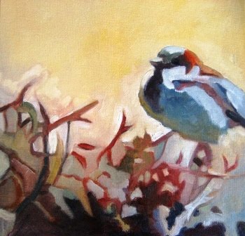
April Sparrow


April Sparrow, 8x8, oil painting on canvas panel.

I had such a fantastic time painting a sparrow yesterday that I'd thought I'd do another but this time challenging myself to change the composition (to a square), keep a higher and warmer key, use Gamblin's "environmentally friendly" Torrit Gray, and switch to a new (and better) brush cleaning method (baby wipes as recommended by oil painter Kevin MacPherson.)  I thought that was enough for one afternoon.

I did a much more careful drawing (I think of it more as a design or organization of shapes) than I normally would, but I find that helps for then in turn having more freedom with the colors. As I tell my students, when you paint think values, shapes, then color--even if that's what really inspired you in the first place.

Next week I'm hoping to branch out (no pun intended) to some other birds. I'm determined to take as many of my own photo references as possible to work on this series, so I'm planning to head up to Barr Lake State Park in Brighton where hopefully I'll find some willing feathered models.  I see the Barr Lake Bird List is quite extensive! And I also see where our Denver Zoo has some special days where you can arrive early just to take photos. 

While I'm not a very strong photographer, I think this would be great way to get some wildlife photo references, which is never easy living in the city as I do. Also, if you enjoy animal oil paintings be sure to check out Maryland artist Mark Adams work. His cats are wonderful and I love his oysters too!

As always, thanks for visiting! Please don't hesitate to email me if you have any questions about my art, private classes, or Monday group workshop which starts on Monday, May 3.

Tuesday, April 27, 2010

Firethorn Sparrow

Bon jour everyone! I hope everyone is having a great spring week! As many of you know I've always painted (for better or for worse) in a variety of styles, but if I could paint in just one style for the rest of my life it would be abstracted nature. The other day I was struck by the interesting pattern of this little fluffed up sparrow perched on my thorny and unruly pyracantha (fire thorn) bush and took a quick reference photo out the window.

The small birds love it but it has taken over our side yard and I fear it may be it's last spring as we look to do some fresh landscaping. I knew it would be an interesting challenge to paint the red and greens as well as the abstract pattern of the leaves in shadow and sunlight.

I almost always mix my greens, oranges, and violets but here I decided to add a green to my palette for additional color mixing challenge. I chose Gamblin's Viridian--a beautiful cool (bluish) green a more controllable than Pthalo Green. I had a wonderful mixing a range of cool and warm greens here.

Before I go, quick welcome to all my summer students--it's great to have you and I look forward to painting with you throughout in my favorite season. For more information about my summer painting classes and "Colorful Connection" Monday group workshop please visit my Classes & Workshop Page. 

Thursday, April 15, 2010

Red Bird Wednesday

It's a beautiful sunny spring day in Denver so a wintery cardinal study might be a bit of an odd choice for a painting today. But I really wanted to paint something bright red and I had the studio doors open to the backyard and could hear the vociferous songbirds (cardinals have about 12 songs, I read). 

And while owls (obviously!) are my personal favorite bird, my grandmother always loved cardinals and red, as I do, so that was additional inspiration for this little 8x10 cardinal oil painting study.  Did you know seven states have cardinals as the state bird? And this is a male of course because of the showy plumage.

I also knew it would be fun to play with the green complement as well as the red hue temperatures--balancing the warm and cool reds in this case. This study was painted with a limited oil palette of: Titanium White, Ultra Blue, Cerulean Blue (which I don't often use but thought I would use for my cool blue today since Thalo is sooo strong), Cad Red Light, Permanent Rose, and some Cad Yellow Medium.

To soften the edges I used a flat sable brush (rather than a stiffer oil bristle brush) which I don't always use either because I tend to loose some of my edges, but it's the perfect tool for for feathers and fur.

For more information about my classes and NEW Colorful Connections workshop please click on the Classes link on the top right. Have a wonderfully creative day!

Friday, April 2, 2010

Yupo Friday

 
Happy Friday everyone! I'm thrilled to post these inspiring and exciting Yupo floral paintings today painted by Richard K., one of my watermedia students.  Thank you Richard for letting me sharing these with all the Yupo fans out there. While Yupo can be a challenging surface especially if you are used to a "toothier" paper,  I think these paintings are wonderful examples of how well Yupo works for painting organic subjects such as flowers.

Richard also used the Golden Fluid Acrylics to help him achieve these tropical saturated hues and amazing textures.  Check out some of the "bubbly" texture in the spiky leaves of the bird of paradise. I just don't think you could mimic that on paper, even with hot press. And Richard makes an excellent  point when he told me that after painting on Yupo for a while he had a new found "respect" for painting on watercolor paper.

It's true, at least for me, that trying new media, surfaces, subject matter etc. is a very helpful way to strengthen your overall creative skills.  For example, if I'm having less than a stellar day with a difficult oil  painting (yes, it happens even after 25 years), I switch to watercolor the next day or do a layered acrylic abstract. Speaking of moving between styles I noticed in the March issue of Southwest Art (one of my favorite art magazines) the beautiful and angular oil landscapes of Arizona painter Ed Mell and his quote about how "moving between abstraction and realism" also helps keep him fresh.

Friday is usually my own studio day so I better get to work. I'm planning on a representational oil still life painting, but we'll see what happens...Also, if you are in the Denver area quick reminder that it's First Friday today so go out and support your local neighborhood galleries and artists and have a great time!

Thursday, April 1, 2010

What's the temperature?


For those of you with an iPhone, don't you love happy yellow sun weather app? For some reason, I love to look at the weather all over the world and compare it to chez moi. Today, I'm happy to report my iPhone says i's a beautiful spring day in Denver and so I'm going to try to paint without a quin pigment on my palette...LOL. No, that's not going to happen. Sorry some weak art humor for April Fool's...

But it is Thursday, often my watercolor day, so I decided to do a quick pair of paintings. A warm and cool watercolor roughly the same subject matter for fun. I recalled I'd seen an exercise like this in artist Mark Mehaffey's book Creative Watercolor Workshop and so that's where this particular painting comes from.

For the first higher key warmer version here I used a primary triad of Cobalt-Quin Rose-and maybe Gamboge? (Normally, of course, I'd know what I'm using but I say maybe because I'm using a very nice, but "inherited" Pike palette from another artist.) Just as Mark suggests in his book, I started the painting by with a warm "wet in wet" wash, let that dry and then directly painted over that using a variety of flats and rounds. Speaking of flats, I love the short handled red synthetic Cosmotop Spin DaVinci flats--these are some of my all time favorite watercolor brushes. It always amazes me how much variation you can get in watercolor with just three pigments like this. Also this was painted on a CP Quiller block.  


In the darker and cooler painting, I had as you can quite likely see a bit of an "uh oh" moment when I applied too much yellow and even worse an more staining cool Hansa Lemon instead of the Gamboge...Oh well, this happens in watercolor especially when you've got some nice jazz on and are painting away. The brush has a mind of it's own. To get to the darker values you see, I added Thalo Blue and very small amount of Permanent Green (I think) to the same Cobalt, Rose, and Mystery Yellow palette. This was painted on a CP Arches block.

I tried every trick in the book to soften this yellow streak (it looks worse in the photo, but I still don't like it).  At some point, I may just take this painting even darker and see where that leads but for now I'll let it dry completely and sleep on it. That's sometimes best when you want to "fix" or should I say "creatively adjust" a painting.

Before I go, quick shout out to my new student Ruth from Wyoming--have fun exploring liquid acrylics! I can't wait to see where they take you.  Enjoy the journey!  For more information about my ongoing watercolor, acrylic, or oil painting classes please visit me on TeachStreet or send me an email

P.S. I've just added an Etsy store for my smaller available paintings for sale--mostly oil paintings under $100 with Free Shipping.

Friday, March 26, 2010

It's a Dog Day Friday!

Happy Friday everyone! I always love posting my student's work when they are nice enough to let me do so. This fabulous and heart-warming pet portrait is courtesy of one my highly talented watercolor students, Shawn M.  He was kind enough to let me share his dachshund watercolor painting with everyone today. Shawn is quickly gaining quite the reputation among his friends and family as a pet portrait artist! 

Animals and pets will always be my favorite subject matter, but for those of you who also paint beloved animal companions know just how emotional and challenging it can be. You really want to capture each pet's unique charm and personality (especially for their proud parents) as Shawn has done so wonderfully here. FYI, for my watercolor fans, Shawn painted this on his CP 140lb Arches Block using a limited color palette of warm and cool neutrals which I think really helps to keep the focus on this lovely dog's face.
 
Another challenge I find painting animals and pets is fur. Fur is a particularly interesting texture to paint, but can also be a challenge. The other day I saw some quick tips for painting black fur for those of you interested in painting black dogs or cats. And here's a step by step oil pastel demo of a lovely, furry Himalayan cat.

Also, for more dog paintings, check out the William Secord Gallery in NYC--they specialize in wonderful 19th Century dog and animal paintings.  If I ever have my own gallery, I would love to have an all animal gallery. And for more contemporary dog paintings and animal painting inspiration, see the Daily Painters variety of dog painters on their blog.

Friday PM is my personal studio time so it's time to go but I want to wish everyone a wonderful and creative 
spring weekend. Looking for a fun and relaxing painting class this sprint? I'd love to work with you. For more info, please visit me on TeachStreet (search ScarletOwl) or see my new listing on The Arts Map or feel free to email me anytime.