Showing posts with label Denver daily painter. Show all posts

Tuesday, February 19, 2013

Brazen Brushwork and Paint Parsimony

10 Brushstroke Pear Exercise--6x6 oil (collection of the artist)
One of my 2013 goals to enhance my painterly brushwork. Another is not to be such a paint miser. If you have this tendency you know how hard it is to squeeze out several inches (gulp) of fresh paint all the time. And I'm surrounded by a dozens of paint tubes so there's really no excuse.
10 Brushstroke Bluebird Figurine 6x6 oil on panel (collection artist)
The further irony is that I’ve always personally preferred oil paintings with bold expressive brushwork and “chunky” generous paint.  The good news is that there’s a very helpful exercise to that will help you with both brazen brush work and paint parsimony. It’s what’s typically called the “limited stroke” or “limited brushwork” exercise.

I painted three 6x6 inch panels with simple subjects (these aren’t the Grand Canyon but they could be) and a 10 stroke limit or par for any of you golfers out there. After just three small paintings I was already thinking about my brushwork in a very different way. What else did I learn?

  1. Remember Jaws?  Well, for this, we’re gonna need a bigger brush! And more paint. Bigger Brush. More Paint. Just keep saying it…
  2. Use the canvas (in this case I toned with a warm quin gold acrylic wash) to your advantage. Consider what canvas shapes might stay “unpainted” and work as part of your overall composition. (Master paintings like Richard Schmid, CW Mundy, etc. will often use the "raw" canvas in their overall design.\)
  3. Find the 10 most important shapes and paint those. What details can you leave out?
  4. Paint rather than draw (or outline) your shapes. Feel the form with your brush.
  5. Vary your brushwork—push, pull, twist, stab, etc. to get the most out of your brush.
For more info practicing your brushwork check out this previous DPW “limited stroke” challenge.  Popular teacher Peggi Kroll Roberts also offers a DVD demonstrating limited brushwork and I hear  this is a student favorite exercise in her workshops.  In my next post we'll chat about the power of color dominance as well as the Woodson Art Musuem  Birds in Art touring show which came to town.

Tuesday, May 22, 2012

Sante Fe Souvenirs

Colorful Casita-8x8 oil on linen panel-SOLD
First I'd like to welcome any visitors from the Summer Art Market website--I look forward to seeing you at the Market!

Coyote Cafe in Santa Fe
Like so many artists before me, New Mexico is one of my favorite places to visit. As an artist, you can't help but feel both welcomed and inspired by all the art, color, and creativity. I'm not much for long car rides but if I wanted to I could leave my front door around 11 AM, drive due south and be in beautiful Santa Fe just in time to have some veggie tacos and mango margs at the Coyote Cafe rooftop cantina at sunset.
Mm-chocolate pastries at the Maven
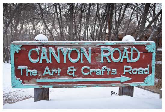
 In the morning before I head down Canyon Road to stroll through all the galleries I'd probably stop by the Chocolate Maven Bakery for some chilaquiles (my favorite breakfast of all) and some spicy Mexican hot chocolate. Sounds pretty good doesn't it?  As I recall, this little adobe home was either along Canyon Road or just off.  I'm hoping to visit Santa Fe again this fall again and I'm already looking forward to it.

Quick note about my recent posted smaller daily oil painting like today's posting. Typically, I'd be selling these on the Daily Paintworks site but I like to take as many paintings as I can to the Summer Art Market in a few weeks. But after June 10 I'll be uploading my paintings again on the DPW site for bidding. In the meantime, I wish everyone a colorful and creative May!

Sunday, May 20, 2012

Fine Feathers

"Fine Feathers" 8x8 oil on linen panel
Happy May everyone! I think one of the hardest tasks any busy artist has is prioritization. I'm taking a quick break from painting and getting ready for the upcoming Summer Art Market in just a few weeks on the weekend of June 9 and June 10 to post this new bird painting.

If you've prepared for a show or festival you know there's a lot of work that goes on behind the scenes in addition to painting--such as event paperwork, getting your tent ready, ordering post cards (love Vistaprint for those), etc. In other words, many tasks that tempt you outside of your main goal which is creating art.

Lately I've been trying some new colors on my palette. In this little bird oil painting it's Old Holland Caribbean Blue--which is a wonderful and not very common blue-green thalo turquoise pigment (PB16 for my fellow pigment enthusiasts).

Thanks for stopping by--be sure to check out the Scarlet Owl Pinterest boards for more art inspiration. I look forward to seeing you all at the Summer Art Market and for all my fellow artists in the show I hope you all have a super successful sunny show this year!

Tuesday, November 9, 2010

Ode to the Original Daily Painter

In the last 70 days of his life, it's believed Vincent Van Gogh painted every day, despite his declining mental and physical condition. Thanks to my talented painting mother/daughter duo Anita and Amber for bringing me this wonderful painting inspiration this week.  Van Gogh painted this Mulberry Tree near St. Remy in the fall of 1889, less than a year before his death in the summer of 1890.

As I've mentioned before, master copies (even loose interpretations) are a tried and true learning tool for learn new painting techniques. I promise they will also give you a new appreciate for their work, color sense, and vision.

This painting was no exception. Following in Vincent's brush steps, so to speak, I was constantly reminded to change the direction of my brush strokes and keep my thick, impasto oil colors clean and high energy at every turn. I also took note his use of signature dark lines and mastery of complementary colors. Every time I take the time to examine a Van Gogh at length, I can't help but feel he's left them behind as some kind of urgent yet timeless message to all the painters who dare follow him. 

Before painting, I considered some of the 19th century pigments (many of course now considered fugitive or poisonous or both) Vincent would have had on his little wooden palette such as emerald or Paris green, lamp black, yellow ochre, lead white, chrome yellow, Prussian blue, etc. 

For color history geeks like me, here's an  interesting article regarding master painter palettes.  For this little 9 x 12 oil study (the original is approx. 21 x 25),  I chose a more contemporary palette of Ultramarine, Thalo Blue, Burnt Sienna, Indian Yellow, Lemon Yellow, Cad. Red Light, and Permalba White--which I thought was a fantastic autumn palette. I also used relatively small brushes to help imitate the undulating texture.

Thanks again to all my students (and Vincent!) who continue to inspire me with their work! See you in the studio!

Sunday, August 22, 2010

Passport to Pink

 "Passport to Pink
24 x 24
Mixed Media Collage on Panel
Price: $495 Framed
Hope everyone is enjoying a great summer weekend. I'm getting ready this morning to drop off my very rosy mixed media collage to Core New Art Space (a great contemporary co-op gallery located in the Art District on Santa Fe here in Denver) for their PINK show which starts on September 9 where a portion of the proceeds will go our local Susan G. Komen For the Cure chapter.  Inspired by passports and travel, this particular piece includes old text (both Western & Eastern), stamps (both postage and painted), and words in French and English.    

Core New Art Space holds a special place in my heart because it was one of my first major sales and I've also won an award there as well. So if you are in the Denver metro area, and especially if you like pink and want to support a wonderful non-profit please be sure to check out the show. I'm really looking forward myself to seeing how other artists interpret the pink theme.

This week I've also been working on a larger piece (about 3ft x 4ft) on an older stretched canvas I came across at a local tag sale. As much as I love painting small daily studies, working on a more expansive scale can be very rewarding and has really inspired me to continue paint some larger pieces in late summer/early fall. So be looking for those...

Finally, quick kudos to all my ongoing students this season for all your hard work! I do have a few slots open for fall students so please drop me a note if you want to join the Monday painting group in Littleton or take a private/semi-private session in Denver. My fall class special is 20% discount for any new students who sign up for a minimum of 4 sessions.

Wednesday, August 11, 2010

Clementine, Darling?

"Clementine, Darling?"
6x6 oil on linen panel
Price: $60 + shipping

After teaching a morning oil class (great job Bob!), I was in the grocery store looking around the produce section for some daily painting inspiration (and healthy snacks!) when I spotted a big bag of Florida clementines. The warm orange hue was so vibrant and juicy I had to get them as models. 

This was also my first painting on my new RayMar linen museum quality panels and they are a really lovely painting surface--a little tooth but not too much. To use a cooking term, I'll say the panels were al dente! In this particular case, I toned the canvas first with a nice rich quin gold.

For fellow painters, my tip today is next time you want to lighten an area, try the "friendly neighbor" --a lighter hue on the color wheel before using our "go to" white, so yellow-green for a green subject, red-violet for a dark violet subject, etc. You may even want to take white off your palette altogether for a while as an experiment in maintaining bolder, cleaner colors.

For more information about my work or classes, please feel free to email me anytime or visit me on TeachStreet. Thank you!

Saturday, February 13, 2010

North by Northwest Still Life

Happy Weekend everyone! In honor the Olympic Winter Games in Vancouver, I'm posting a rather "moody, muted" still life oil painting that was inspired by the Canadian post impressionist painter and writer Emily Carr.

I first discovered Ms. Carr's work on a trip to Victoria and Vancouver a few years ago. It was also my first time on a sea plane and I can't wait to return one day.  The combination of water, mist, dark forests, and mountains is a landscape painters dream. 
As some of you may know she is known for her paintings of symbolic totems and the moody and mystical landscape of Victoria Island (where Carr was born) and British Columbia.  
I find her trees paintings (like this one) have amazing personality and always inspire me. Carr was also associated with the Canadian Seven, a group of primarily landscape painters who worked around the 1920's.
 
I'm not sure where this odd wooden yoke (if that's what it is) came from--I think it may have been from the collection of a former instructor, but I do know I enjoyed painting the combination of weathered wood and rusty metal.  The next time you paint a still life you may want to include an unexpected item like this, I promise you it will become one of your favorites.  
 
Quick welcome to all my new February students, I look forward to working with you on your art goals and will see you in the studio soon.  This upcoming week some out of town business takes me to Indianapolis and am hoping the weather will be good enough to take some decent landscape photos. Have a great weekend--enjoy the Olympics!

Tuesday, January 12, 2010

Interior Motives


Happy Tuesday everyone! I've always admired artists who paint beautiful buildings and interior spaces (Hopper is one of my favorite painters).  And, I'm a bit of a "foodie" and so I particularly love restaurant, cafe, and food paintings. 

I'm not as good as I should be about taking my sketchbook or camera with me when I'm out an about. Painting a restaurant interior is on my "to do" for 2010.  So, about a week ago, while I was enjoying a delicious wood-fired pizza margherita and refreshing goat cheese & pear salad (OK, I'm hungry now) at a new restaurant, I stopped to take a few quick shots with my iPhone  for reference back in the studio.

Since I was planning to do an abstracted version of the scene anyway the photos were perfectly suitable. This is a study for a larger piece and I can tell I'm going to have to fix a few things already (the color key is clearly off), but I think it has some potential with the shapes, patterns, etc.

If you want to see some simply amazing restaurant paintings, check out Quang Ho's kitchen paintings which were part of his solo show at local Gallery 1261

Also, for those of you who love figure painting, I finally received a painting book I've wanted for several years, Art Students League of New York teacher Mary Beth McKenzie's Painterly Approach.  I think it's out of print, but not too hard to find used. I love her self-portraits and I can't wait to try a an oil monotype painting.  Am sure I'll be posting more on this book as I have time to read it in-depth.