Showing posts with label painting class Denver. Show all posts

Thursday, August 4, 2016

Brushing Up on Birds

Some of my favorite daily bird paintings
No bird soars to high if he soars with his own wings. William Blake

Happy August everyone! I wanted to share that my friend and neighbor is hosting a wonderful fundraising event on Saturday, August 27. The art themed garden party will benefit two great Denver bird rescue and education non profit organizations. You can get more info on tickets here.

Along with several Denver painters, I’ve been kindly invited to include at least one bird painting in the silent auction. So I’ve been brushing up on my birds—no pun intended. Am hoping to include at least one small owl painting in the silent auction.

So early Sat. I went on a very educational bird walk along the South Platte River. If you’ve never been on a "official" bird walk with an experienced guide I can almost guarantee you’ll find more birds than you would on your own. This also makes taking reference photos like this hummingbird much easier. 
Broad tailed hummingbird at Hudson Gardens
The rest of this month is going to be a very eventful! In addition to the bird art event, I’m teaching a sold out “Intro to Daily Painting” workshop for the Louisville Art Association .

On eve of Aug. 18 I’ll be in Brighton for another daily painting presentation to another wonderful group of artists. My sincere thanks again to both these groups or inviting me to share my art journey with them. OK time to trade the laptop for the easel. Have a wonderful weekend.

Saturday, September 19, 2015

Seeking Autumn Colors


"Rainbow Rooster" 8x10 oil on gessoboard--SOLD--Thank you!

Delicious autumn!

My very soul is wedded to it, and if I were a bird I would fly about the earth seeking the successive autumns. George Eliot

Happy weekend everyone! Gorgeous early fall weather in Denver and having a wonderful time teaching two new painting classes in Denver at Blackridge ArtistsSchool (check out their fantastic "big names" workshop schedule) and Park Hill Art Club.

I also attended several art events this week which means I’ve had the pleasure of meeting at least 30 new artists! (Denver is an amazingly creative area!) Thank you again new and continuing students for your support and interest this fall!

Speaking of being "out and about" next Tues. morning on Sept. 22 I’ll be doing a demo at Blackridge of one of my favorite “layered” oil painting techniques which I employed in this colorful rooster daily painting today. That’s the “wet in wet” opaque pigments over the transparent block in. For more info about this demo please feel free to email me. I think I'll paint something with feathers...but we'll see!

This painting process may not sound that interesting on paper but it’s what creates the glowing color and often pleasant surprises.  It's a great match for florals and feathers! As many of you may know this is the approach used by artists such as Dreama Tolle Perry, Nancy Medina, Hedi  Moran, and Mary Maxam just to name a few. 

Thanks--Enjoy the rest of your weekend and all the deliciousness that is early autumn!

Friday, April 17, 2015

Where Creativity is Contagious


"Enchanted Adobe" 8x10 oil on gesso panel


“Creativity is contagious, pass it on!” – Albert Einstein

Happy Friday everyone! Despite today's gloomy Rocky Mountain spring forecast, I think of Spring as the perfect time for renewal, growth, and creativity. An ideal time to learn something new just for yourself…

Speaking of creativity thanks to all my spring students! Some of you are new and some are “old” friends. To each of you, thanks again sharing your creative time with me through all the seasons. 

Since it's almost May I started to make some summer travel plans this week. Each year I try to visit to a place I've never been before (more on the place I've picked this year in an upcoming post.)

But it's also nice to return to places that you've grown fond. That welcome you back. For me (like many artists) that's always been New Mexico. Which is thankfully just a state away...

Santa Fe is a special place where I've always felt the creativity is highly contagious.  This cute adobe home is just off windy arty Canyon Road. (I'm told only low level traditional adobe structures are allowed in this area.) 

Better stop day dreaming and get back to painting. Wishing you a wonderful spring weekend! For more info about my painting classes or upcoming workshops please email me or visit the studio website

P.S. Love New Mexico? Check out my Land of Enchantment board on Pinterest.

Monday, March 16, 2015

Painting the Spirit of Nature


“Don’t believe what your eyes are telling you. All they show is limitation. Look with your understanding. Find out what you already know and you will see the way to fly.”
― Richard Bach, Jonathan Livingston Seagull

Happy Monday everyone! Yesterday, it felt like summer. I finally turned off the studio heat, opened all the windows and enjoyed an iced coffee instead of a winter cappuccino. Not quite spring break in Cabo but still pretty relaxing for mid March.

Prior to this weekend though, I’ve been getting more than a little anxious waiting for spring. But of course, as many winter plein air painters know nature is still all around us. You just might have to look a little more closely (and be willing to brave the cold.) 
"Crow on Ice" 8x10 oil on linen
As I’ve noted before I get my daily winter nature fix at my nearby park where several large ponds attract plenty of usual aviary suspects even on the coldest days such as crows, gulls, geese, starlings, pigeons, flickers and ducks. .  
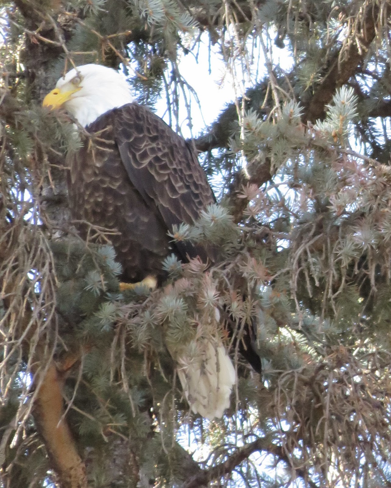
Washington Park bald eagle (hanging out in evergreens)
This year we also had some eagle and hawk sightings (as you can see) which was exciting but truthfully I enjoy painting the “everyday” birds like my high key gull and snowbound crow today. It was a happy coincidence that a recent  DPW weekly painting challenge a couple of weeks ago was bird themed. The challenge inspired by this wonderful Robert Henri (his book The Art Spirit is one of my favorites) quote:

Paint the flying SPIRIT of the bird 
rather than its FEATHERS.

It's another gorgeous day so time to get back to the easel and find out what I already know....Have a colorful week! P.S. For more info about my upcoming spring and summer workshops please visit my website.

Wednesday, September 3, 2014

Challenge Day 3: The Charm of the Season


"Orange Pearl" 8x10 oil on linen 

 Available at Framed Image Gallery

The charm of the season – and the day in particular – is to be found in the union of the two complementaries:  blue and orange. (Charles Burchfield)

Welcome back fellow challenge painters and followers!  My color goal today was to make the most of a complementary pair such as red/green, blue/orange, orange-yellow/blue-violet, etc.   
Color Wheel Courtesy Cornell University
Using the contrast of two opposite colors helps create a vibrant energy in a painting. Including complementary colors is also an effective way to call attention to a focal area.  

While I think all complementary color pairs work well, I find the blue/orange combo is a personal favorite (maybe some of my Denver Broncos pride is showing!). What's your favorite pair?

An obvious subject choice for a seasonal blue/orange combo (other than Peyton Manning) was pumpkins. I’m happy to announce that this little pumpkin (which was at my local South Pearl St. farmer's market) will be featured at the fall show at Framed Image Gallery in Denver which is now through October 31. 

P.S. Speaking of blue and orange, have you seen a blue lobster? They are apparently extremely rare but I’d love to paint one!

Friday, November 22, 2013

20 "Gotta Have It" Art Studio Tools

Got tabby? Always.
Happy Friday everyone! Recently AHA featured a podcast about "favorite artists products”—(I don’t know about you but I really love these “checklist”shows.) This show inspired me to look around the studio and share my own “must have” studio stuff.

These are “tried and true” tools (rather than brushes, knives, and paint) I keep near my easel and use almost every day. Most are fairly inexpensive and low tech. With a few exceptions...

My iPad is a splurge but honestly, it’s changed my art life. So here are 20 items that I at least for me make my creative life a little easier and more enjoyable--hope they help make your art life a breeze too!
  1. iPad—holds my reference photos, paint from it, crop, watch art demos...
  2. Joby iPad holder (Note this one is for original iPad)
  3. Crank easels (old, new—Don’t get me started on the ratchet or sliding kind.)
  4. Gray palette paper (like the mid tone and don’t care for glass)
  5. Mini plastic spring clamps (assorted sizes)
  6. Green Frog tape (varies widths—it’s a ruler on a roll!)
  7. Large and small T-Square and rulers (great for quick canvas or paper gridding)
  8. Saral transfer paper—especially the white/yellow—Just comes in handy
  9. Big Sharpie and Post it Note Pad (good for supply notes, title ideas, etc.)
  10. Rolling red taboret cart from Harbor Freight (see my post on taborets)
  11. Red plastic value sheets (red acetate from art store)
  12. Foam plates and foam brushes
  13. Good old Kemper Wipe Out Tool (or similar)
  14. Round grippy rubber jar opener (from dollar store, hardware, etc.)
  15. Adjustable height rolling drafting chair (no arms)
  16. Paper towels: Bounty (watermedia) and Viva (oil media)
  17. Hand creams (Aveda, Skin Safer, and my new fav: Desert Essence Vanilla Chai--yummy!)
  18. Winsor Newton Brush Cleaner (non toxic but powerful)
  19. Old mats/frames for checking composition
  20. And most importantly...A studio manager/muse. Mine are always striped and furry. 
Thanks to everyone who stopped by to check out the paintings from my YUPO workshop--Plan to post more YUPO paintings soon but this week I'm working on a large 3 panel oil painting commission. So I better grab some of these tools and get back to work!

Tuesday, September 3, 2013

Keeping the Light in the Light: Challenge Day 3

"Broken Light" 10x10 study in progress oil on panel
The sky is the source of light in Nature and it governs everything. (John Constable)

OK. Challenge Day 3. Only 27 to go….Whew, even when you love painting it can be a challenge to complete a painting every day. Big kudos to all of you in the 30in30 challenge!

Since it’s OK to post a painting in progress (thank goodness) I got a pretty good start on this 10x10 oil tree/landscape study this morning. As with most of my recent paintings, I painted this from my iPad. I saw this beautiful old cottonwood along the Bear Creek Trail in Lakewood, CO late last spring. My three painting goals today: 
  1. Good value organization before getting too wrapped p in the color. 
  2. Paint each value group at the same time--So darks, then mediums, then lights. 
  3. Keep the lights in the light and the darks in the darks.
If you’re interested in strengthening your compositions through value simplification check out this excellent post by Michigan artist Sharon Tarr regarding notans—or the placement of your darks and lights.

Monday, July 23, 2012

Primarily Color

"Primarily Petals" 8x8 oil on Linen- SOLD
Happy Monday everyone! As an artist who loves to explore color theory, harmony, and strategy I was very excited to to participate in this week’s Daily Paintworks Challenge which is a painting that uses all primary colors—red, yellow, and blue.

I'm a colorist (rather than a tonalist) so I can appreciate the power and energy of the bold primary triad—particularly reds. However, I more naturally gravitate toward the secondary triad (orange, green, and violet) probably because I love greens so much.  So this was an interesting challenge for me.

Quick reminder that you can use a wide range of reds, blues, yellow pigments for a primary triad painting. I’ve noted a few of these “winning combos” before, but here are just a few ideas (plus white of course to help stretch your value range) that would work in your favorite painting medium. 
  • Permanent Rose, Lemon Yellow, Cobalt Blue
  • Cad Red Light, Cad Yellow Light, Ultramarine Blue
  • Alizarin Crimson, Yellow Ochre, Cerulean Blue
  • Indian Red, Indian Yellow, Ivory Black
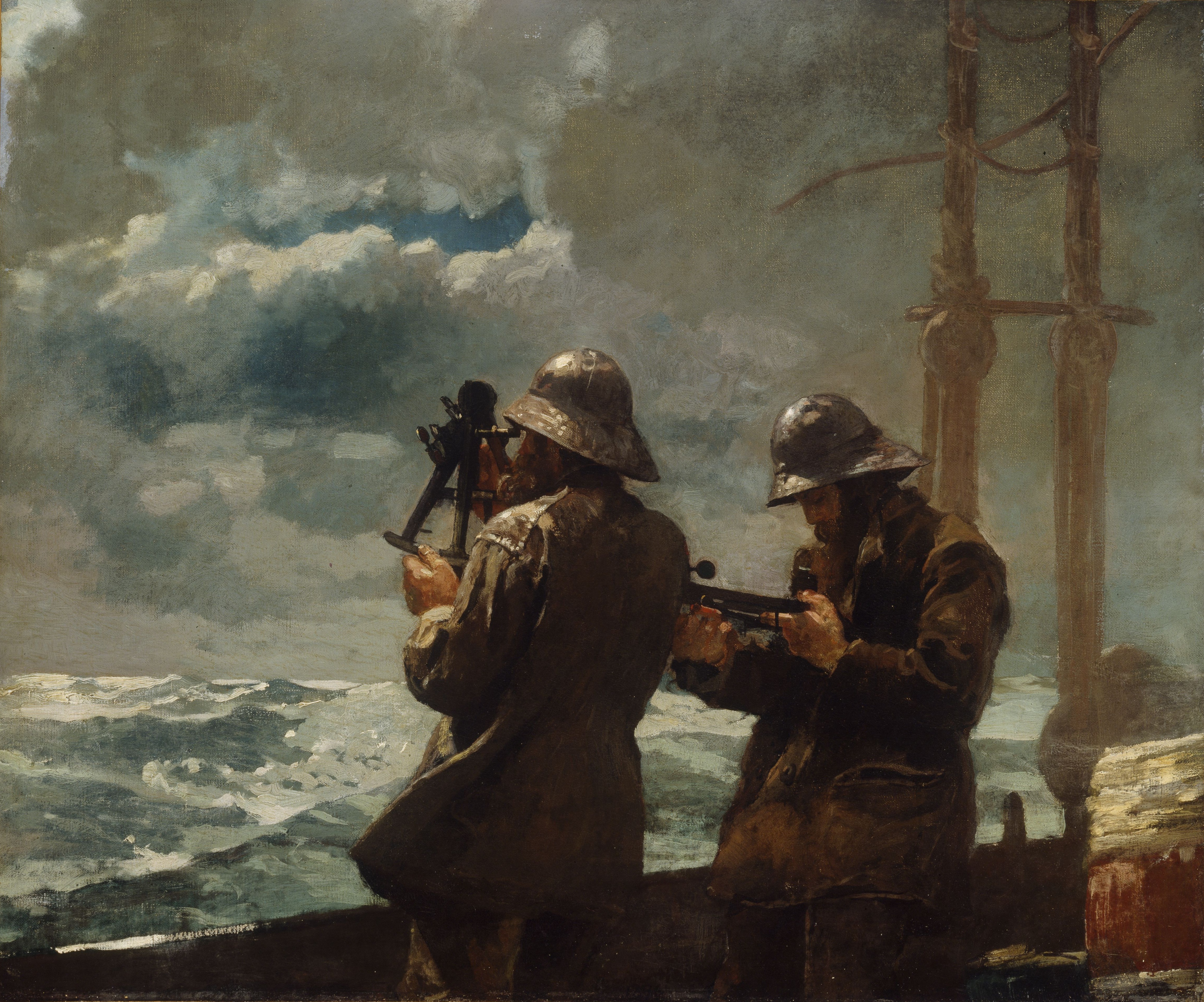
Consider the masterful use of the earthy reds, blues, and yellows in Winslow Homer's masterpiece  Eight Bells.
This image (or other media file) is in the public domain because its copyright has expired.

 Versus the high intensity primary triad Franz Marc's Red Horses.

This is a file from the Wikimedia Commons.
When planning your the color for a more successful painting, I also find it helpful to follow the general composition rule outlined in Greg Albert’s book: The simple secret to better painting.  And that is simply:  Never make any two intervals the same.

For this week's challenge, I bought intense red-orange sunflowers at the grocery store (one of my favorite spots to shop for affordable still life subjects). So I knew red would be my dominant color. Then blue followed by a few notes yellow (which is such a strong color that you often don’t need much to make an impact. ) Looking for more primary triad inspiration for your art? Just type “primary triad” or “red, yellow, blue color” into Pinterest and you’ll discover dozens of interesting combinations. Happy (primary) painting!