Showing posts with label red sunflower painting. Show all posts

Saturday, February 8, 2014

Fauving in February

"Big Red" 16 x 16 oil on panel (work in progress)
“From the moment I held the box of colors in my hands, I knew this was my life. I threw myself into it like a beast that plunges towards the thing it loves.”
― Henri Matisse

After working on a few snowscapes earlier this week, I took a short break to start this high chroma fauvist inspired still life. I enjoy working from life but this was from a photo from a previous still life I'd set up. I knew painting with intense warm colors would provide some immediate winter relief--and it did.

A still life painting like this reminds me that I could spend hours carefully staging and arranging a strong still life. Typically though I just grab some things based on color and see what happens. That being said it is kind of fun to look around your surroundings for intriguing objects.

Could be an interesting "creative jump start" the next time you just don’t feel like painting. After rall, if you have to craft a successful still life you’re still working with colors, design, composition, etc. FYI, here’s a blog post I found with some helpful still life staging tips.

One painter who’s not in winter denial is talented Colorado landscape painter Marc Hanson. He’s been outside since February 1 painting four--yes 4--daily snowscapes.  I’ve really enjoyed watching his daily posts from the comfort of my studio.

Tomorrow I’m really looking forward to Quang Ho’s oil painting demo. It’s all day so I plan to have lots of notes and photos to share.  While I’ll be happy to watch him paint anything, I’ve got my fingers crossed for a snowscape. In the meantime, have a colorful weekend everyone!
P.S. For more still life ideas and inspiration you can check out my Pinterest “Not so Still Life” board.

Wednesday, July 3, 2013

Just Like Vincent I'm Busy Painting These

"Flying Colors" 8x8 Oil on Ampersand Gesso Panel
SOLD--thank you!

I am working with the enthusiasm of a man from Marseilles eating bouillabaisse, which shouldn't come as a surprise to you because I am busy painting huge sunflowers. - Vincent Van Gogh in a letter to his brother


I don't always have the chance to do a painting specifically for the DPW weekly challenge. But this week Carol Marine offered up a subject I couldn’t resist—sunflowers.  (I you read m blog you know I’m particularly drawn to these red orange striped ones you often see at the grocery store.)


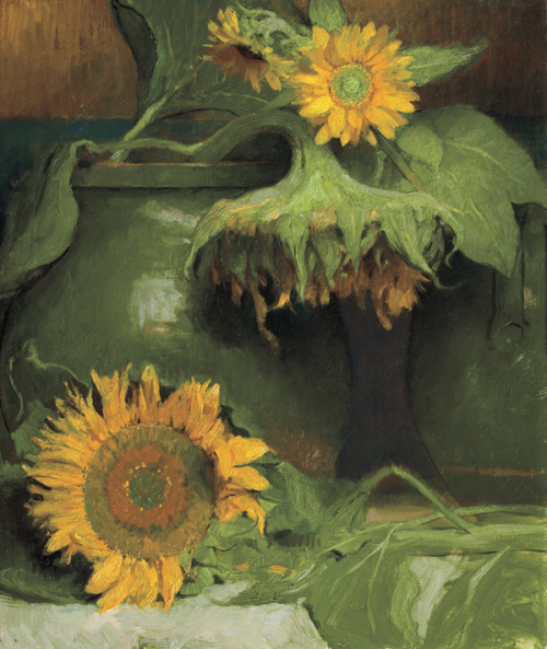
For me, the sunflower is the flower that I associate the most with creativity. And I'm often drawn to sunflower paintings such as this Charles Weed (above) and this glorious Klimt (below):

Looking for more sunflower art? Here's a Pinterest board dedicated to sunflower art or just type “sunflower art” in the Pinterest search window.

Speaking of Vincent, have you ever wondered why Vincent's sunflowers look a bit strange compared to sunflowers we typically see today? Here's an interesting article about why Vincent's sunflowers look the way they do. Thanks everyone--have a wonderful safe holiday week!

P.S.Did you know the world’s tallest sunflower (grown in Germany) was 27 feet tall? That’s 7 feet taller than the tallest giraffe!

Thursday, February 14, 2013

New Colors are Like a Box of Chocolates

"My Sunny Valentine" 8x8 oil on archival Ampersand baord

Happy Valentine’s Day everyone and a special birthday shout out to anyone with a Val Day birthday like my Dad!

Ever since I’ve returned from the beach I’ve needed a “mid-winter” color pick me up.  So I treated myself to some fresh oil paints—which is almost as exciting as a box of dark chocolate.  Almost.
After shopping around online for a bit (budget: $100) and finding a “discount shipping” code I chose an special promo Daniel Smith Quinacridone oil paint set. The 11 juicy colors span the warmer side of the color wheel from the deep yellow orange Quin Gold (a rather hard to find pigment) to a new violet Quin Purple.

I like “quins” because they’re powerful, non-toxic, and highly transparent which means they mix cleanly and glaze well.  Quin Gold, Quin Rose, and Quin Magenta are some of my pet pigments for floral painting.  And I love using Quin Gold to mix interesting greens. (I tried the Quin Red in today’s sunflower painting.)

In my next post I’ll show you my results of a very challenging “limited brushstroke” painting exercise…Stay tuned.

Monday, July 23, 2012

Primarily Color

"Primarily Petals" 8x8 oil on Linen- SOLD
Happy Monday everyone! As an artist who loves to explore color theory, harmony, and strategy I was very excited to to participate in this week’s Daily Paintworks Challenge which is a painting that uses all primary colors—red, yellow, and blue.

I'm a colorist (rather than a tonalist) so I can appreciate the power and energy of the bold primary triad—particularly reds. However, I more naturally gravitate toward the secondary triad (orange, green, and violet) probably because I love greens so much.  So this was an interesting challenge for me.

Quick reminder that you can use a wide range of reds, blues, yellow pigments for a primary triad painting. I’ve noted a few of these “winning combos” before, but here are just a few ideas (plus white of course to help stretch your value range) that would work in your favorite painting medium. 
  • Permanent Rose, Lemon Yellow, Cobalt Blue
  • Cad Red Light, Cad Yellow Light, Ultramarine Blue
  • Alizarin Crimson, Yellow Ochre, Cerulean Blue
  • Indian Red, Indian Yellow, Ivory Black
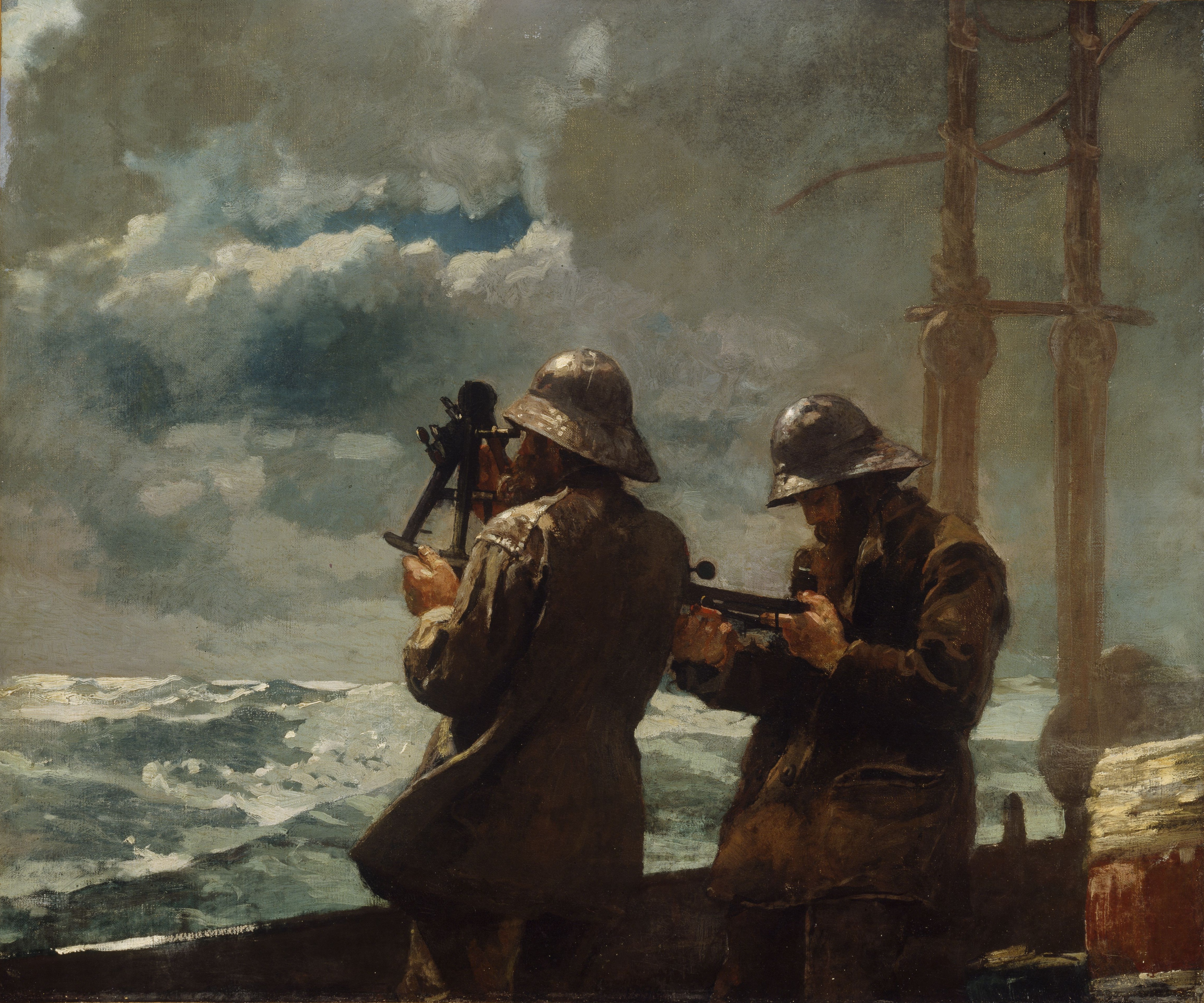
Consider the masterful use of the earthy reds, blues, and yellows in Winslow Homer's masterpiece  Eight Bells.
This image (or other media file) is in the public domain because its copyright has expired.

 Versus the high intensity primary triad Franz Marc's Red Horses.

This is a file from the Wikimedia Commons.
When planning your the color for a more successful painting, I also find it helpful to follow the general composition rule outlined in Greg Albert’s book: The simple secret to better painting.  And that is simply:  Never make any two intervals the same.

For this week's challenge, I bought intense red-orange sunflowers at the grocery store (one of my favorite spots to shop for affordable still life subjects). So I knew red would be my dominant color. Then blue followed by a few notes yellow (which is such a strong color that you often don’t need much to make an impact. ) Looking for more primary triad inspiration for your art? Just type “primary triad” or “red, yellow, blue color” into Pinterest and you’ll discover dozens of interesting combinations. Happy (primary) painting!