Showing posts with label oil painting class Denver. Show all posts

Friday, June 23, 2017

Goin' for the Gold-Finch!

"Goldfinch Blossoms" SOLD--thank you!
Happy Summer everyone! First a giant thank you to everyone who helped and supported me during my busiest event of the year--the Denver Summer Art Market a few weeks ago.

Any outdoor event in Colorado is always a bit of surprise but it was gorgeous dry sunny weekend. Almost 100 on Saturday but thankfully my tent partner had a portable bucket misting fan (from Home Depot) which was very popular! I also tried a "gel cool pad" for my chair which I threw in the freezer the night before. Highly recommend for any warm weather event for a quick cool down!

And of course thanks to Denver's best art shoppers for stopping by and collecting my art for yikes almost 20 years! (Started very, very young..;). Sold many of my favorite recent paintings like this cheerful goldfinch painting posted today.

It's a lot of work getting ready for an art event like this but it's so rewarding. You get some time out of your studio, you meet and connect with many new people, you get a ton of painting practice and build your inventory--I painted over 50 new paintings.

With the Market behind me though I'm getting ready for some exciting new art events including...
My NEW 2 Day Glowing Colors Oil Painting Workshop: August 23& 24
Location: Foothills Art Center in Golden, Colorado
Click here for more info or to register.
Foothills Art Center Golden, CO
In the workshop I'll be sharing my tips for using transparent colors to create an exciting under painting which the method I use for many of my animals, including the goldfinch here. I don't often offer a 2 day intensive workshop so this is a good opportunity if you've been looking for an in person painting experience to learn this very popular method.

And finally thanks to all my current summer students for taking time out of their busy summers to paint with me! See you at the easel soon!


Monday, January 23, 2017

The Start of Something Colorful

"Purple Paint" 8x10 oil on archival gesso panel
This pinto horse painting is available at Framed Image Gallery in Denver

Beginning with audacity is a very great part of the art of painting. -Winston Churchill


Happy Monday everyone! As a painting teacher many new or "rusty" artists often ask (and rightly so) about the process of painting. More specifically, I'm asked: How do you start a painting? or What exactly do I do first?The truth is a variety of "starts" get the job done. That being said, here are four "sound beginnings" (for wet in wet oils) I find most helpful:  

1.Time for Toning?
I don't always "tone" or color wash my white canvas first but if you're the kind of artist who likes to leap and "just get going" this can be a good first warmup step. I say "wash" meaning a thin layer of acrylic (needs to dry) or "watery" oil paint (using Gamsol or other non toxic thinner.) 
I like warmer toning but you could tone in any color including black. You could also mix color into some white gesso and use that to tone--especially if you desire more tooth/texture on your surface.
2. Thin Darks to Thick Lights
Tried and true for most most occasions. Block in your darkest darks (thinly), then medium values and finally your lightest values (and thicker paint) at the end. I find the "darks first" reveal a light/dark design (i.e. notan) you can easily see from the get go. I find this is a safe, organized approach--also keeps me from using too much white too soon.   
3.Bright Color to Dull
Do you have a lot of "islands" or "spots" of bright color in your painting? If you've read Carol Marine's Daily Painting then you know she suggests starting with intense colors--imagine a bright pink bloom in a sea of dull green leaves. This approach helps keep your color notes cleaner as you work quickly with wet in wet oil paint--some might say a more "painterly" style.  
4. Colorful Under Painting
One of my favorites--But more time consuming because it can take some planning. Imagine a light blue sky painted over a peachy or magenta underpainting. Note this can be done wet in wet or over dry paint on a white (not toned) surface. Great if you like color surprises and "vibrating broken" color you seen in pastels.

In today's horse oil painting I combined darks first with bold color under painting. I hope that overview of "good starts" was helpful. How do you like to start your painting?

P.S. Speaking of new starts, I FINALLY created a studio page on Facebook so please feel free to follow me/friend me there as well. Thanks for your support!


Wednesday, October 21, 2015

Painting the Light: Tim Horn Workshop Review


"Light Gray Steps" horse painting 8x10 oil on gesso board--SOLD--Thank you!

Happy October! In the past 2 months, I "invested in me" and took 3 wonderful painting workshops here in Denver at Blackridge Artists School (where I currently offer a Tues. morning open studio class).

Quick shout out to all the artists I met at the workshops who took time to offer support, kind comments and much inspiration! Hope to cross painting paths with you in the future.

But with nine intensive days of learning and painting as well as teaching my own classes (thanks fall students!) I’m running a little behind posting. In no way does this reflect my enthusiasm for the workshops and my eagerness to share them with you.

Known for his rosy golden California landscapes Tim Horn’s fantastic 3 day workshop focused on seeing and painting light and shadow. I loved Tim’s straightforward exercises such as black/white notan sketches which helped to simplify and organize busy landscapes (buildings, cars, boats, telephone poles, etc.). FYI, here's an excellent article by Tim about Sketching for Painting.
Tim demonstrates an example of a light and shadow notan from his photo reference.
Exercise: Small light and shadow studies--super helpful!
Close up of Tim's light and shadow thumbnail example (note the warm peachy tone)
Tim also had the class study and paint the effects of sunlight using colored blocks which you can see here. An excellent exercise to try if you're new to outdoor painting! Notice how much these blocks resemble the planes of a building...
Colored blocks on sunlit table to help study light shadow planes
Tim blocking in shadow shapes of blocks (note his colors are on side panel away from mixing area)
 find one of the benefits of a decisive "yes/no" light/shadow approach is the painting often falls into place after you block in your cooler dark shadow shapes. Then the warmer thicker light passages act as the icing on the cake or canvas if you will.

Tim shares his sketch book (he likes Moleskine and a Monolith 4B pencil)
You can see (hopefully) my application of this exciting approach in my horse painting today. (Thanks Miss Jenny for letting me take pics of your lovely horse.) Before we ventured outdoors Tim had us work on simple limited palette mini landscapes (above) as well as a larger light and shadow practice painting which you can see here. 
My 9x12 light and shadow exercise from Tim's photo of a Maine harbor.
Tim painting a bungalow across the street late PM Day 1

Here are some more workshop pics including Tim's informative and enjoyable demos--even when the light didn't quite cooperate or someone drove off in the car Tim was painting!

Tim starts another demo on Day 2 with simple big shapes
The workshop class enjoying Tim's demo--even though it was a little overcast.
Who knew a garage and an an alley could make such a nice painting?
Thanks again Tim for visiting Denver and for such an informative and enjoyable workshop. I'm already reaping rewards back in the studio. Next up: Painting with Peggi! In the meantime happy fall painting!

Thursday, February 26, 2015

Painting Paints and Thinking Twice

"Painted Pony" oil on gesso panel 8x10 (on hold for future show)
A horse is worth more than riches.  Spanish Proverb

Brr…Our warm weather streak came to abrupt end this week. Today, I woke up to several inches of snow which is pretty from a landscape painting perspective but not enjoyable to drive in. 

It’s not going to be easy to get out and about today (I adore my old car Maxine but she’s not very snow worthy) so planning to work on finishing some paintings I started a while back. Do you have a stack of those in your studio? Mine's getting pretty high...

So yesterday I finally put the finishing touches on these daily oil horse painting studies. As a lifelong horse lover and painter, of course I love “paint” horses—How can you resist a horse splashed with color by Mother Nature?  Paint horses are not only valued for their fancy patterns but I’m told are also smart, friendly and wonderful equine companions. I'm always on the lookout for them when I'm out taking photos.
"Sweeter Grass" 8x10 oil  on gesso panel (on hold for future show)
Last week at Jay Moore’s color workshop I took a couple of dozen of pages of notes. A few key guidelines have come to mind while painting this week. One that’s really helped is: 
Think twice, paint once
Kind of simple right? But it’s true and it works. The more time you invest up front in a painting the less time you’ll spend correcting, scraping, etc. You’ll absolutely save time in the long run. Plus, you’ll likely craft better brush marks and shapes along the way.

Thanks everyone—I hope you have a safe, colorful and cozy winter week! P.S. You can find out more about my new upcoming painting workshops here.

Tuesday, May 6, 2014

The "Keys" to a Still Life Painting: Daniel Keys Demo

Daniel Keys alla prima still life painting demo @ Gallery 1261
Happy May everyone! My artist demos are popular posts, so I hope you’ll enjoy these photos from the Daniel J. Keys alla prima still life oil painting demo a few weekends ago. Daniel was visiting Denver as one of the featured artists  at Gallery 1261 this month.
Daniel Keys at work at Gallery 1261
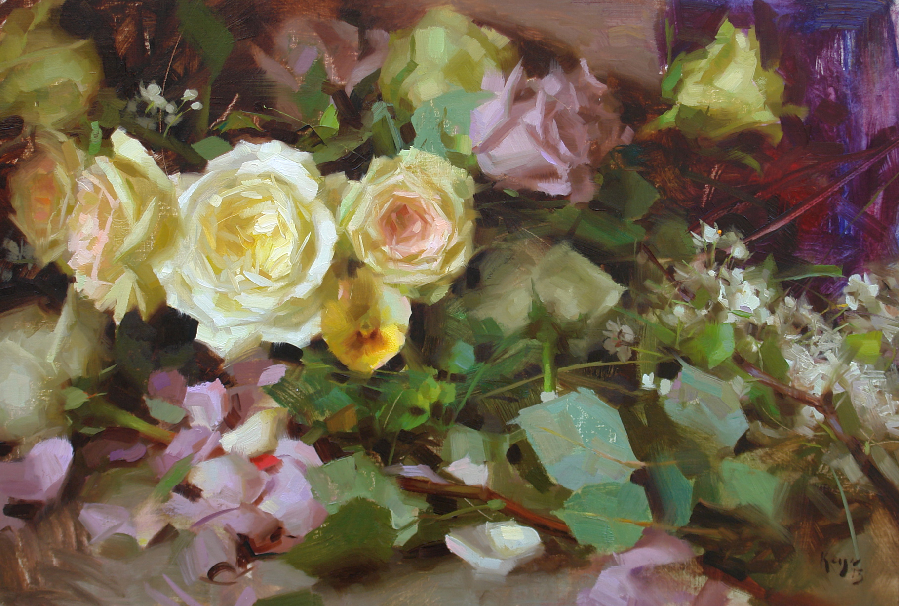
Even those he’s relatively young Daniel’s a seasoned painter (who has studied with Richard Schmid) and popular workshop instructor who work I’ve admired for years. I particularly enjoy his gorgeous  floral paintings (such as this one) and was really looking forward to seeing him paint in person.
Daniel Keys Still Life Oil Painting (those roses are amazing.)
For those of you who enjoy still life painting you probably know that arranging your still life items for a successful painting can be half the battle.  When I asked Daniel about this he said he may take an entire day back in his studio to arrange his objects.

I'm always interested to see how other painters start a painting As you can see, Daniel begins with a quick tonal wash.  After a fairly quick sketch in of the subject he made note of his darkest darks and lightest lights which provides a helpful value range for the painting. FYI, here’s a link to his palette colors and favorite materials.
 
Daniel Keys Palette (he noted that he usually paints on gray rather than white)


Did notice that Daniel changed the green lid of the jar to a more “harmonious” gold? I love seeing artistic license at work! Daniel also offers several DVDs that take you step by step through his still life process. And here’s a very interesting article about his time management tips and studio habits

P.S. Looking for more still life painting ideas and inspiration? Check out my Pinterest board “Not so Still Life.

Thursday, January 24, 2013

10 Postcards from Southwest Florida

No. 10: Crescent Beach Shells--I never get tired of shells!
Have you ever noticed if you paint how you start to crave and seek out color? So this time of year at home, like many artists, I’m often drawn to beachy or tropical destinations when I do leave the studio. Looking for sunny workshop? At ArtShow.com you can search for workshops by locale.
No. 9: Early AM skimmer parade on Crescent Beach--love the 2 color beaks!
No. 8 A Rainbow Sherbert Array of Boats at the Rose Marina
Near water you’ll find a full spectrum of subject matter : Sunsets, boats, waves, shoreline, fish, reflections, umbrellas, lighthouses, beach goers, etc. Given that here are my Top 10 favorite pics from trip last week to the Naples, Marco Island, and Key West in Southwest Florida. I can't wait to start working on some Florida inspired paintings in the meantime...Wish you were there!

No.7: My first manatee (near Goodland)--not easy to find and photo but so exciting!
No. 6: Everglades gator--taken with my zoom of course.
No.5: One of the famous (and sleepy) 6 toed Hemingway cats on Key West

Boats are also a rare site in a land locked state where I live so harbors are one of my favorite places to take pictures on trips. It's no wonder so many artists love to paint boats and their reflections.
No. 4: Gorgeous red yacht in Marco Island Marina 
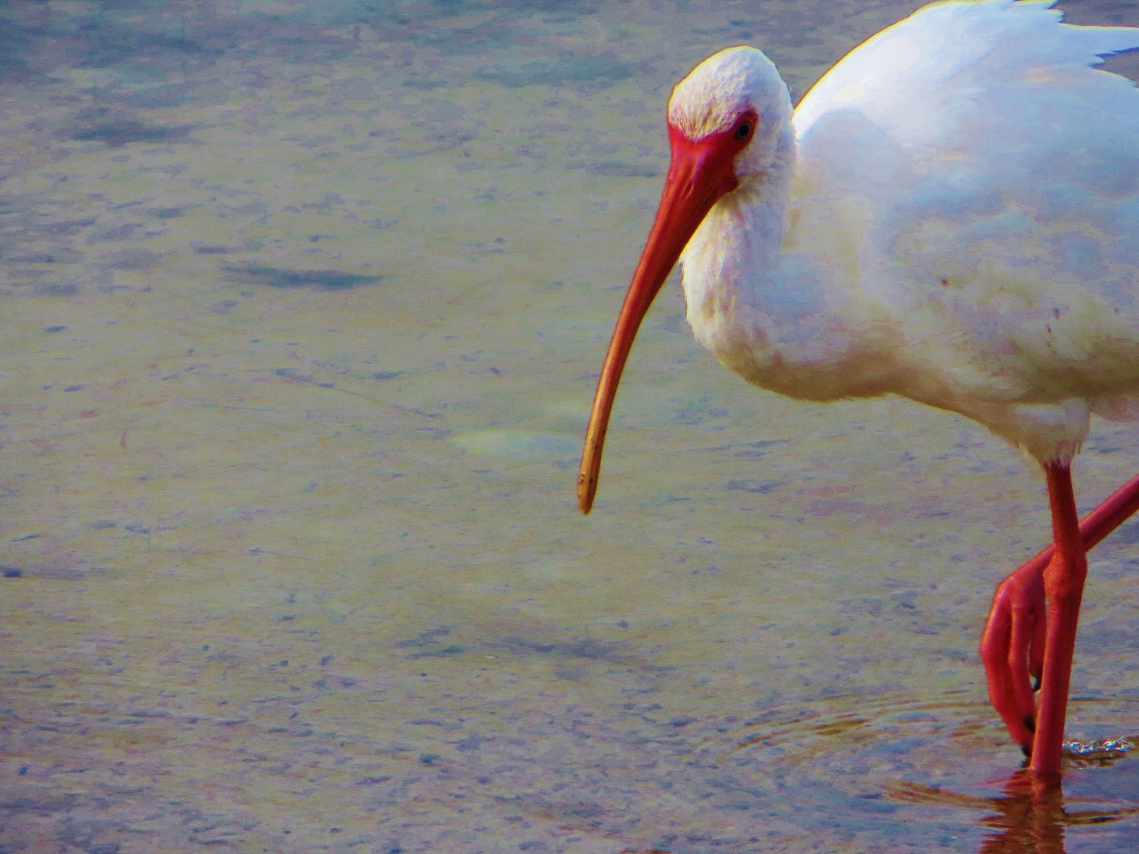
No pink flamingos but I did see many striking shore and seabirds including this great blue heron and a white ibis.

No. 3: Boldly plumed heron in the Everglades


No: 2: Wonderful bright red bill and fee on this pretty white ibis on Marco Island

Burrowing owls are endangered here in Colorado and I've never seen one. Since owls are my favorite bird it was a special treat to spot a few in an open lot (in a roped off protected area) on Marco Island. Unlike most owls burrowing owls are active during the day. Which of course is great for photo opportunities.
No. 1: Florida Burrowing Owl--love the intense yellow eyes. 


Wednesday, October 10, 2012

Look on the Bright Side

"Look on the Bright Side" 8x8 oil on canvas  

 (On hold for gallery event in November.)

Imagine all the people living life in peace.
You may say I'm a dreamer, but I'm not the only one.
I hope someday you'll join us, and the world will be as one. 

As some of you know, I sometimes look to Beatles lyrics for my paintings titles and inspiration so I wanted to note John Lennon’s birthday yesterday. Also the most enjoyable art event I've ever took part in was a John Lennon birthday gathering so October 9 holds a special place for me. 

Because I’ve been so busy painting for an upcoming show and nursing my foot injury that I’ve missed the last few DPW painting challenges which I love to do.  But, I couldn’t pass up this week’s challenge posted by one of my favorite DPW artists talented watercolorist Jo Mackenzie—Emotion was the theme. If you check out Jo's blog you'll see she was kind enough to answer my "what's on your palette" question for all my watercolor students and fans out there.

I started a mostly green abstract (since that’s probably my favorite color family) with the idea of envy—which I think is a fairly common emotion in the art world.  But then I remembered this strong light and shadow sunflower I had in my paintings “to do” queue which I’d really been looking forward to since sunflowers always cheer me.

Also, since my last painting had more of an autumn palette it was fun to return to some brighter, more summery hues.  Quick color tip: You know how you change out your wardrobe colors when the seasons change? I tend to do the same with my pigments. For example, my “fall” palette tends to have more earthy richer pigments like ochres (yellow and red), indian yellow and red, crimson, violet, etc. 

Last Saturday, I managed to hobble on downtown and got to see an amazing line up of three master oil painting demos at Gallery 1261 which is currently hosting a gorgeous Western Regional OPA show. Jeff Legg, Theresa Vito, and Quang Ho demoed a still life, portrait, and figure respectively.  It made for a long day (almost 8 hours) but  it was highly informative and enjoyable. Plus, I had the pleasure of meeting several of the artists in the show. I’ll have some pics and thoughts on that to post soon.  In the meantime, time for some hot cocoa and more painting.  In the meantime keep imagining!

Wednesday, September 5, 2012

Days Like This

"Good Day Sunshine" 8x8 oil on linen panel

You can't use up creativity.
The more you use, the more you have.
Maya Angelou

Happy September all!  One of my favorite Van Morrison’s songs is “Days Like This.” I couldn’t help but think of this song while painting this sunflower.  Particularly the lines: When everything falls into place like the flick of a switch. And: When all the parts of the puzzle start to look like they fit--Then I must remember there’ll be days like this…

It’s not uncommon to have a frustrating creative slump—it’s part of being an artist. But on the flip side, it sure is a blessing to have a day when everything just seems to go your way in the studio.

The light in the studio is perfection. There’s no noisy neighbor mowing.  The oil paint is just right—not too thick, not too thin. You don't need to correct your drawing.  You mix that strange violet in the very first try.  Ahh, you’re in the ZONE…

There’s only one tiny problem with the ZONE. It never seems to last as long as we’d like. Why can’t every painting day be like this? What’s the secret? The answer is likely different for all of us since the ZONE is so personal. But, in general, I think of the ZONE as a numbers game--You can’t win if you don’t play. The more I “train” as a painter, for example, the more likely I’ll find myself in this sweet spot of creative energy.

Also, I think we are more in control of our creative environment than we think we are. I’ve read successful athletes employ a variety of techniques to help keep them sharp. One should be pretty easy for all us painters and that’s visualization—What does your perfect painting day look like?

Another is taking proactive steps to control any behaviors that may keep you outside of the ZONE. Such as negative thinking, fear, anxiety, etc.  Thankfully, I’m at the stage in my art career where I don’t have much fear, but I do tend to juggle many projects. I like to remind myself I’m not alone trying to balance my creative life. Just Google “Art and Fear” and you’ll find dozens of books, articles, etc.on the topic.

Finally, there’s a reason the Nike slogan Just do it is so powerful. It works. When it comes to finding your ZONE I think it’s better to be doing rather than thinking about doing. And I promise the more you do the more you’ll have days like this.

Monday, July 23, 2012

Primarily Color

"Primarily Petals" 8x8 oil on Linen- SOLD
Happy Monday everyone! As an artist who loves to explore color theory, harmony, and strategy I was very excited to to participate in this week’s Daily Paintworks Challenge which is a painting that uses all primary colors—red, yellow, and blue.

I'm a colorist (rather than a tonalist) so I can appreciate the power and energy of the bold primary triad—particularly reds. However, I more naturally gravitate toward the secondary triad (orange, green, and violet) probably because I love greens so much.  So this was an interesting challenge for me.

Quick reminder that you can use a wide range of reds, blues, yellow pigments for a primary triad painting. I’ve noted a few of these “winning combos” before, but here are just a few ideas (plus white of course to help stretch your value range) that would work in your favorite painting medium. 
  • Permanent Rose, Lemon Yellow, Cobalt Blue
  • Cad Red Light, Cad Yellow Light, Ultramarine Blue
  • Alizarin Crimson, Yellow Ochre, Cerulean Blue
  • Indian Red, Indian Yellow, Ivory Black
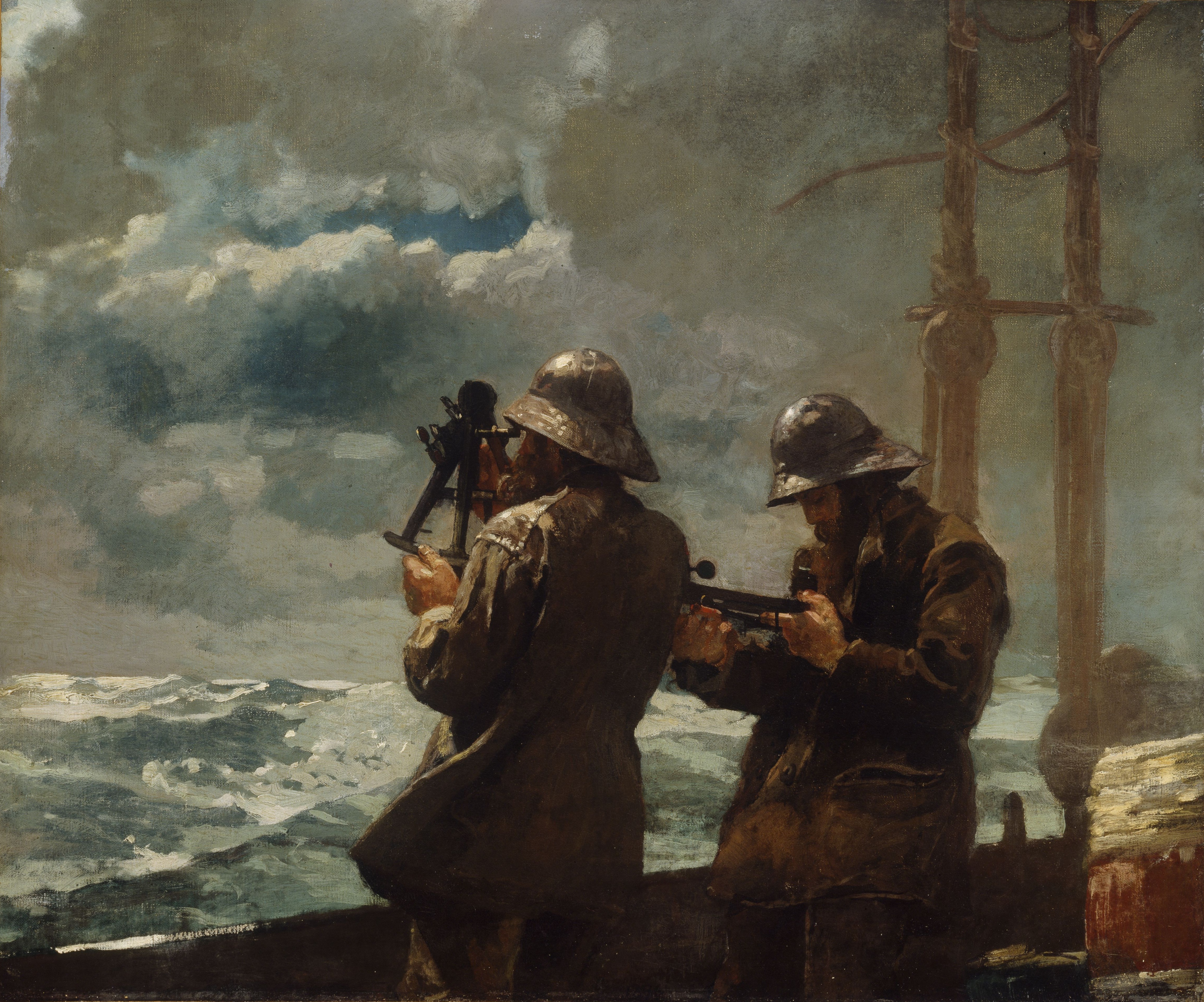
Consider the masterful use of the earthy reds, blues, and yellows in Winslow Homer's masterpiece  Eight Bells.
This image (or other media file) is in the public domain because its copyright has expired.

 Versus the high intensity primary triad Franz Marc's Red Horses.

This is a file from the Wikimedia Commons.
When planning your the color for a more successful painting, I also find it helpful to follow the general composition rule outlined in Greg Albert’s book: The simple secret to better painting.  And that is simply:  Never make any two intervals the same.

For this week's challenge, I bought intense red-orange sunflowers at the grocery store (one of my favorite spots to shop for affordable still life subjects). So I knew red would be my dominant color. Then blue followed by a few notes yellow (which is such a strong color that you often don’t need much to make an impact. ) Looking for more primary triad inspiration for your art? Just type “primary triad” or “red, yellow, blue color” into Pinterest and you’ll discover dozens of interesting combinations. Happy (primary) painting!

Wednesday, November 23, 2011

A Not So Still Life

Still of the Night-Oil on Canvas-16x16
"I never wanted color to be color. I never wanted texture to be texture, or images to become shapes. I wanted them all to fuse together into a living spirit."  Clyfford Still

Happy Thanksgiving everyone! Last Friday marked the long-awaited opening of the Clyfford Still Museum. As some of you may know, Still was an American Abstract Expressionist whose contemporaries included Pollock, Motherwell, and DeKooning.
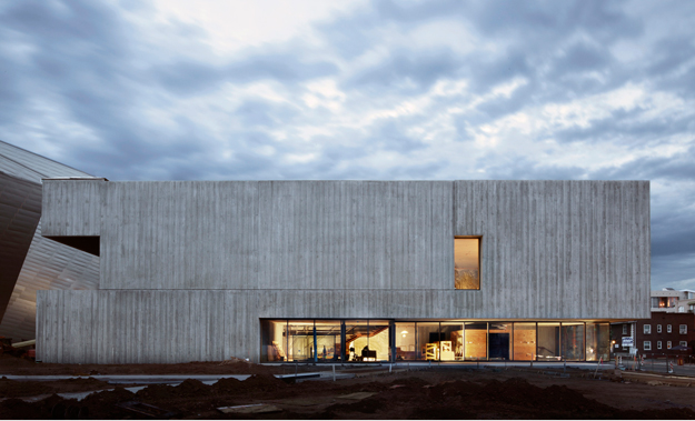
Clyfford Still Museum-Denver, CO
Still is also classified as a “color field” painter as many of his works contain impasto (thickly painted) bold shapes of blacks, yellows, reds, and whites. Whether you are fan of this movement or not, I think it would be hard to ignore its influence on many contemporary American artists and collectors.

When Still died in 1980 he left over 2,400 works (many of which were never seen in public) to a city willing to create a museum dedicated solely to the artist. In 2004, Denver won the bid for the museum. Like many art lovers in town, I’ve been looking forward to the museum unveiling ever since. I hope to have time this holiday week to visit the collection. In the meantime I’m posting an oil abstract that I painted in honor of such an important part of American art history taking place right in my backyard.  

Finally, big congratulations to my students who were juried into some of our local fall art exhibits--One of whom won not only their first show ribbon but the Commissioner's Choice for a lovely landscape. I’m so proud!  Also, there's still time to win a free fine art print (see previous posting for details)--just comment on any post to be entered until November 30. (I've only got 2 entrants so far, so your odds of winning are pretty good!)

Wednesday, November 2, 2011

Blue Pumpkin Pie?

"Ghostly Gourd" 8x10 oil on panel--SOLD
Brr...The best thing about a snow day is that it’s the perfect excuse for hot chocolate and staying warm and dry in the studio. Today, I painted this blue-ish pumpkin for this week’s pumpkin themed DPW Painting Challenge.  I spotted this interesting “non orange” pumpkin "alternative" at our local Pearl Street Farmer’s Market just a couple of weeks ago.

I was particularly drawn to the contradictory sage green-blue color. My favorite pie is pumpkin chiffon so I kept thinking about the color of the insides and how cool it would be if it were blue inside as well. 

Speaking of snow and cold as a winter gift to myself, about a week ago, I signed up for Dreama Tolle Perry’s painting workshop in Florida in January 2012. I’ve admired Ms. Perry’s work for a long time and I’m really looking forward to it. January is often our chilliest month in Colorado so the warmer Florida Gulf will be a nice break. I’m also looking forward to meeting new artists in a different part of the country.

Anyway, if you seen Dreama’s work you know she loves an abundance of color. Her workshop supply list has a few more colors than I would normally use since I usually prefer a limited palette. So I’m trying some of the new colors well in advance.

This may seem a bit over zealous but a several years ago, I took a plein air workshop where I spent days trying to juggle a unfamiliar neon bright orange. In this pumpkin oil painting, I tried out Dreama's suggested Rembrandt Transparent Red Medium. Intense, but rendered very pleasant range of red violets, red oranges, and a really clean pink. Time for some more hot chocolate--Thanks for stopping by. Have a colorful and creative day!

Sunday, July 24, 2011

Summer Temptations

Happy Very Warm Summer Everyone! Thanks for your patience as summer has lured me out of the studio for the past week or so. While I've been teaching (thanks again summer students for all your hard work), I've also been distracted to several summer activities that have (unfortunately) not involved painting. But I promise to be back to the easel soon.

One of my favorite places to find a colorful inspiration are farmer's markets. Here are a few photos from the South Pearl Street Farmer's Market here in Denver, Colorado. One of my favorite things to buy are the amazing High Desert Peppers (hot of course!) and the Front Range Basil Tomatoes from the MMLocal booth. I love the colors of the rainbow beets as well.


For those of you who have been patiently following my Still Life 101 tips, here's Step 3 or How to Get Your Sketch onto the Canvas after you've toned your canvas. I feel there two basic rough in options, one is a bit more "devil may care" while the other your left brain will love.

Option 1:  Assuming I warmed up with a planning sketch (as described in previous post) I "just do it." I lightly sketch my subject (from careful observation) directly onto the canvas. Focus on the big shapes again using a dry brush. (I usually use a round or small filbert.) Just enough paint to see the lines on a toned canvas. I prefer a brush rather than pencil or charcoal which I find smudgy. 

This next part is very important because I think the key to success for moving from your simple big shapes to painting is creating believable 3D objects. On the Compose it Grid tool I was using big, simple flat shapes—more of an outline to get started. But when I switch to the canvas I’m now adding dimension to the shapes. For example the onion that was a rough circle becomes a sphere, the stems become slender cylinders, the table top a giant cube, etc. 

Tone on tone sketch in using Option 2 (lines not visible in photo)
Option 2: Left brain spoiler alert! Sometimes, it's helpful to ensure that your overall shapes and proportions are relatively accurate. Otherwise you’ll find you need to correct later while painting. This means lots of scraping, etc. which in turn breaks your rhythm. So I’d rather move objects now rather than later.

Therefore a more careful way to transfer your composition what is often called the grid transfer method. This classic method can get quite complicated (I’ve seen some artists use hundreds of transfer squares) depending on your subject, size of canvas, and level of detail. But especially for smaller paintings (under 12x16 or so), I find I only need a simple “4 box” grid. I create this by marking the half way point on each side of the canvas.

For example, for my onions on a 9x12 vertical canvas I marked 4.5 inches (top and bottom) and 6 inches on the sides. With a very light pencil line I then draw a connecting line to create 4 quadrants (in this case 4 rectangles). Next, make a corresponding grid over your planning sketch or reference photo with pen or pencil. If you have a color printer photo you may want to print out a low res black/white version to grid. Or if you used a tool like a Compose It Grid obviously the space is already divided for you.

Another benefit from locating these “north/south” and “east/west” dividing lines is you can improve your composition greatly by avoiding the placement of any strong lines or shapes directly on them. Hopefully one of those 2 methods will work for you and help get you going. If we can make that an almost ritual like habit daily painting becomes that much easier.

P.S Quick thanks to Cindy and the nice folks at Compose It Grid for the blog link on their Reviews Page. I promise I have no affiliation with them--I just really, really love these easy to use grids.

Sunday, April 17, 2011

Primarily Birding

"Primary Sparrow" 6x6 oil on panel
Happy Weekend all! Yesterday Carol posted a wonderful color painting challenge on DPW. I decided I would try a bird study with the three primaries and white. So for this sparrow painting, I used Ultramarine Blue, Alizarin Crimson, Cad. Yellow Light and Permalba for my white. (This little guy was outside my kitchen window earlier this week in my thorny pyracanthus.) FYI, here's my limited primary palette which I set out roughly as a color wheel which was very helpful for mixing, as is the gray palette paper.
Oil Palette with 3 Primaries + White
I always enjoy bird watching in my own backyard, but early this morning I joined a small group of fellow bird watchers in Washington Park in Central Denver near my home in hopes of spotting something a bit more exotic. Am happy to report with the help of Candice from the Wild Bird Center of Denver, I saw my first downy woodpecker pair, a golden rumped warbler (awesome name), and what I believe is an American Wigeon (seen below). Not that I don't like mallards and Canadian geese, but was very excited to see a different water fowl by the boathouse. 
My first wigeon!
Quick reminder that you can still bid on hundreds of gorgeous paintings DPW Help Japan Auction. Many paintings (including my own "Colorful Kimono" watercolor) have very reasonable starting bids with all the proceeds going to help organizations like the Red Cross. Many, many thanks to my current high bidder for your support!