Showing posts with label Denver oil painting teacher. Show all posts

Friday, June 23, 2017

Goin' for the Gold-Finch!

"Goldfinch Blossoms" SOLD--thank you!
Happy Summer everyone! First a giant thank you to everyone who helped and supported me during my busiest event of the year--the Denver Summer Art Market a few weeks ago.

Any outdoor event in Colorado is always a bit of surprise but it was gorgeous dry sunny weekend. Almost 100 on Saturday but thankfully my tent partner had a portable bucket misting fan (from Home Depot) which was very popular! I also tried a "gel cool pad" for my chair which I threw in the freezer the night before. Highly recommend for any warm weather event for a quick cool down!

And of course thanks to Denver's best art shoppers for stopping by and collecting my art for yikes almost 20 years! (Started very, very young..;). Sold many of my favorite recent paintings like this cheerful goldfinch painting posted today.

It's a lot of work getting ready for an art event like this but it's so rewarding. You get some time out of your studio, you meet and connect with many new people, you get a ton of painting practice and build your inventory--I painted over 50 new paintings.

With the Market behind me though I'm getting ready for some exciting new art events including...
My NEW 2 Day Glowing Colors Oil Painting Workshop: August 23& 24
Location: Foothills Art Center in Golden, Colorado
Click here for more info or to register.
Foothills Art Center Golden, CO
In the workshop I'll be sharing my tips for using transparent colors to create an exciting under painting which the method I use for many of my animals, including the goldfinch here. I don't often offer a 2 day intensive workshop so this is a good opportunity if you've been looking for an in person painting experience to learn this very popular method.

And finally thanks to all my current summer students for taking time out of their busy summers to paint with me! See you at the easel soon!


Tuesday, February 19, 2013

Brazen Brushwork and Paint Parsimony

10 Brushstroke Pear Exercise--6x6 oil (collection of the artist)
One of my 2013 goals to enhance my painterly brushwork. Another is not to be such a paint miser. If you have this tendency you know how hard it is to squeeze out several inches (gulp) of fresh paint all the time. And I'm surrounded by a dozens of paint tubes so there's really no excuse.
10 Brushstroke Bluebird Figurine 6x6 oil on panel (collection artist)
The further irony is that I’ve always personally preferred oil paintings with bold expressive brushwork and “chunky” generous paint.  The good news is that there’s a very helpful exercise to that will help you with both brazen brush work and paint parsimony. It’s what’s typically called the “limited stroke” or “limited brushwork” exercise.

I painted three 6x6 inch panels with simple subjects (these aren’t the Grand Canyon but they could be) and a 10 stroke limit or par for any of you golfers out there. After just three small paintings I was already thinking about my brushwork in a very different way. What else did I learn?

  1. Remember Jaws?  Well, for this, we’re gonna need a bigger brush! And more paint. Bigger Brush. More Paint. Just keep saying it…
  2. Use the canvas (in this case I toned with a warm quin gold acrylic wash) to your advantage. Consider what canvas shapes might stay “unpainted” and work as part of your overall composition. (Master paintings like Richard Schmid, CW Mundy, etc. will often use the "raw" canvas in their overall design.\)
  3. Find the 10 most important shapes and paint those. What details can you leave out?
  4. Paint rather than draw (or outline) your shapes. Feel the form with your brush.
  5. Vary your brushwork—push, pull, twist, stab, etc. to get the most out of your brush.
For more info practicing your brushwork check out this previous DPW “limited stroke” challenge.  Popular teacher Peggi Kroll Roberts also offers a DVD demonstrating limited brushwork and I hear  this is a student favorite exercise in her workshops.  In my next post we'll chat about the power of color dominance as well as the Woodson Art Musuem  Birds in Art touring show which came to town.

Monday, January 21, 2013

Back from the Beach


"Sunny Dreams" 8x8 oil on linen (collection artist)
How I Spent My Winter Break
Have just returned (reluctantly) from my Dreama Tolle Perry oil painting workshop on sunny Marco Island where I happily traded my boots for sandals.  The beautiful Marco Island Art Center was the perfect place to begin a creative and color filled 2013. 

I don't travel that often out of state for workshops but I just had to take another Dream workshop. (Quick travel painting tip: I mailed most of my heavy and expensive supplies in an insured USPS "fits ships" box to myself and they were there waiting when I arrived.) Not to mention Florida in January was just too tempting. In fact, the day I left Denver it was about 60 degrees warmer there. 

Dreama is one of those artists that you could watch paint everyday. It's no wonder her workshops fill up so quickly. It’s mesmerizing watching her paint alla prima in her opaque over transparent oils method. It’s one of those magical painting approaches where the painting just seems to suddenly appear—and it’s gorgeous—full of luscious glowing color and flying brushstrokes.  It’s a painting method that I plan to continue to practice and incorporate into my own work. Here's a quick recap of the three days--which goes by much too fast...
Dreama starts with a loose energetic paint sketch in transparent oils
Dreama continues to cover her panel with clean transparent oils.

Dream's final painting--a pleasure to watch from start to finish.
Day 1 : Dreama demoed a sunlit sunflower and tulip still life (12x12) painting in three stages. I really enjoyed painting this painting (posted above) since I love florals so much, particularly sunflowers as many of you know. 
Day 2: Today's painting was a more complex shady French garden. This one was a bit trickier—lots going on but I enjoyed the “editing” and “simplification” challenge particularly since I was using an 8x8 linen panel.
Day 3: The morning brought the infamous “musical easel” exercise where all the artists rotate work stations and paint on many paintings in less than an hour. It’s both freeing and terrifying at the same time! Finally, we had the chance to work with our own photo reference.  Just like last year, I enjoyed every minute of it and the time just flies by. It’s also the type of workshop where you can’t wait to paint when you get home.
"Musical Easel" exercise painting 6x6 oil on panel
My thanks again to Dreama and all the talented ladies I met (a few who were also "repeat offenders" from last year as Dreama calls us) for helping to make my winter break so energizing, fun, and memorable. In my next post I’ll share some Florida photos including my first trip to Key West to see the famous 6-toed Hemingway cats and my first manatee sighting!

Wednesday, September 5, 2012

Days Like This

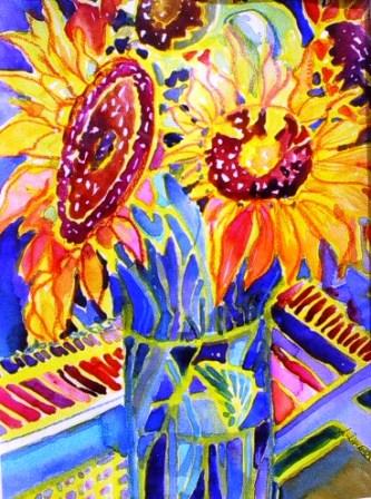
"Good Day Sunshine" 8x8 oil on linen panel

You can't use up creativity.
The more you use, the more you have.
Maya Angelou

Happy September all!  One of my favorite Van Morrison’s songs is “Days Like This.” I couldn’t help but think of this song while painting this sunflower.  Particularly the lines: When everything falls into place like the flick of a switch. And: When all the parts of the puzzle start to look like they fit--Then I must remember there’ll be days like this…

It’s not uncommon to have a frustrating creative slump—it’s part of being an artist. But on the flip side, it sure is a blessing to have a day when everything just seems to go your way in the studio.

The light in the studio is perfection. There’s no noisy neighbor mowing.  The oil paint is just right—not too thick, not too thin. You don't need to correct your drawing.  You mix that strange violet in the very first try.  Ahh, you’re in the ZONE…

There’s only one tiny problem with the ZONE. It never seems to last as long as we’d like. Why can’t every painting day be like this? What’s the secret? The answer is likely different for all of us since the ZONE is so personal. But, in general, I think of the ZONE as a numbers game--You can’t win if you don’t play. The more I “train” as a painter, for example, the more likely I’ll find myself in this sweet spot of creative energy.

Also, I think we are more in control of our creative environment than we think we are. I’ve read successful athletes employ a variety of techniques to help keep them sharp. One should be pretty easy for all us painters and that’s visualization—What does your perfect painting day look like?

Another is taking proactive steps to control any behaviors that may keep you outside of the ZONE. Such as negative thinking, fear, anxiety, etc.  Thankfully, I’m at the stage in my art career where I don’t have much fear, but I do tend to juggle many projects. I like to remind myself I’m not alone trying to balance my creative life. Just Google “Art and Fear” and you’ll find dozens of books, articles, etc.on the topic.

Finally, there’s a reason the Nike slogan Just do it is so powerful. It works. When it comes to finding your ZONE I think it’s better to be doing rather than thinking about doing. And I promise the more you do the more you’ll have days like this.

Tuesday, August 7, 2012

Anything But White

"Ivory Velvet" 8x8 oil on linen panel
Whether the flower or the color is the focus I do not know. I do know the flower is painted large to convey my experience with the flower - and what is my experience if it is not the color? 
Georgia O'Keeffe

I so enjoyed painted a rose study last week that I just had to paint another. This time I thought I’d tackle a very high key white or ivory rose—which you quickly discover of course is anything but white. In fact, Renoir is quoted as saying “white does not exist in nature.”

Lots of choices for the painter at the Little Flower Market in Denver
I didn’t have a whiteish rose handy so I picked up a few from  The Little Flower Market (which I think used to be an old gas station)  near my studio. I took a ton of reference photos with my new studio camera which I love already—a Canon Powershot SX 260 with 20x optical zoom.

"Red Waves" 
Here's one of my first rose photos taken with it. I can’t wait to try it out at the upcoming rose show at the Denver Botanic Garden. I’ll never be a professional shutterbug but the more I paint, the more I appreciate having lots of reference shots on hand.


I think you have to be careful not to overuse white to automatically lighten your colors, but at that same time it’s an essential component of my palette. For more info about whites, here’s an excellent article by Gamblin: Getting the White Right. Thanks for stopping--have a wonderful summer week!

Monday, July 9, 2012

Let's Just Wing It...

Washington Park Raven 8x8 oil on linen panel
Click to Bid--SOLD--Thank you!
The worse my drawings were, the more beautiful did the originals appear.
John James Audubon

Painting lots of birds lately…I’ve read that focusing on birds, dreaming of birds, etc. may symbolize hope, intuition and freedom from boundaries and constraints.  I love the idea that specifically as artists birds could represent our personal quest for creative freedom and our boundless imaginations.  Birds and creativity seem to go hand in hand. We even say we are “spreading our wings” when we grow artistically or “leaving the nest” when we move on to new endeavors.

"High Key" Aspen Robin Study 8x8 oil on linen panel
"Negative Space" Robin Study 8x8 oil on linen panel
I've also been working on smaller paintings as a "first step" to a larger work so looking for a successful 8x8 that will translate well into a 24x24 or even larger. Trying to figure out how to make a 3 foot tall robin look natural and interesting...

Speaking of birds, I particularly enjoy casual birding around my older Denver city neighborhood. Unfortunately, I probably won’t spot too many exotic birds nearby (how I’d love to paint a colorful resplendent quetzal!) but I still enjoy painting robins, sparrows, crows, mallards, etc.

Want to see more bird inspired art and design? Check out my “Feathered Friends” board on Pinterest. Or just type “birds” (or your favorite bird) into the Pinterest home page search. Also here's a short "how to article" for painting small feathers in acrylic. Questions about my art or Denver based art classes please feel free to email in the studio. Happy painting (and bird watching)!

Saturday, April 14, 2012

Showers Bring Flowers

"Blue Butterflies in a Jar" oil on linen panel 8x8
Like many artists, I love to paint irises. Iris means "rainbow" the velvety petals have that wonderful flying butterfly shape so it's no surprise it's a favorite artistic subject. These irises were in my garden last spring and I took a few reference photos of them since they last so briefly.  For this oil floral study today I had two specific painting goals:
  • More impasto texture in the petals
  • Working with an intense red background (in this case I had used an old red abstract painting as a background)
American Museum of Western Art: The Anschutz Collection
If you have a passion for western art like I do, be sure to note that the Collection is going to begin regular public tours on Mondays and Wednesday starting next month (May 2012) in Downtown Denver.  This should be an amazing collection that includes Western greats like Georgia O’Keeffe and  I can’t wait to see it.
 

My Favorite Oil Painting Supplies
I’ve added a new page to my blog (see tabs above) about my “must have” oil painting supplies for those of you interested. I’ve started with the oil supplies (which is the media I’m currently painting with the most) but will also add favorite my watercolor and acrylic supplies.  Also if you’re interested in my favorite art books check out my Scarlet Owl  Pinterest boards.  Speaking of Pinterest (I'm up to 200 pins already) thanks to all who’ve pinned my art so far!
 

To end today’s posting I’d like to share a recent fortune cookie fortune that I thought was perfect for artists: Your genuine talent will find its way to success. Keep practicing….And so I'm back to the easel. Happy practicing in your studio!

Monday, April 2, 2012

Sign Me Up


"Sunseekers" oil on linen panel 8x8-SOLD

Happy April and Early Spring Everyone!

As a painting teacher, I’m often asked about signing a painting so here are 10 tips I’ve gathered to help you the next time you finish a painting and are ready to own up to it with you signature:
  1. It’s not a legal contract but do sign your work. Legibly and on the front.  Today, I think signatures are more important than ever with our artwork having potentially an international audience when it’s shared across the Internet on websites, social media, etc.  
  2. Your signature is a helpful design element. Along those lines, keep your signature in scale with your painting.  I’ve seen many petite paintings 10x10 or smaller with bold signatures that would be better suited on a 30x40.  A magnifying glass type signature on a wall size abstract is also unbalanced.
  3. Your signature should “blend” stylistically if possible. You might want to practice a few different styles with brush on paper before you decide on one. For example, some artist’s signatures look really nice in cursive and others in block letters. Think clean and pleasing. Lately, I’ve been scratching with my favorite rubber “wipe out” too into wet paint (as seen in today's painting). I like that look as long as it’s fairly readable.
  4. If you’re planning to frame or mat your painting, be sure to sign your piece after you’ve popped in a frame. I see many signatures that too close to an edge that end up getting covered by the frame or mat. Especially now that frame and mat styles today can be quite wide.
  5. When I paint a larger abstract for example I can use my signature to add interest to a corner. Usually it’s the lower right, but not always.  I had a student who cleverly integrated their name into the painting (in this case on a wine bottle tag).  You don’t want to get too gimmicky, be we are artists and so consider creative solution when the opportunity presents itself.
  6. Thankfully, I have a fairly unusual 8 letter last name so I sign only with my last name.  Many artists I know with short or very common names add initials. I think this is a good idea for more specific identification. Imagine trying to research a beautiful oil painting you find at a flea market signed “Jones” on the Internet.
  7. What if you have are blessed with an unusual first name or your last name is very long or hyphenated? Then I think signing with your first name on the front might be a good option. Then you can add your full name on the back.  Same with initials or a “symbol” type signature-I would add my current legal name to the back or at least on a certificate attached to the back.
  8. What about adding a date to your signature? I see this too quite a bit at galleries and festivals and personally, I’m not a fan. I think it’s OK on the back but I think the front of the painting begins to look cluttered with too much info. It’s a painting not your art CV.
  9. Again, this may take some practice but you may want to sign in the same media you created the art in.  I’ll be honest I don’t always follow this advice. For example, I sign watercolors with Sharpies or pen and ink sometimes. But in general, it’s wise to have the signature be consistent and cohesive with your work for posterity.
  10. I’ve read that Marilyn Monroe always signed her name using a red pen. Consider a way to make your signature unique. Ideally you want your body of work to have a fairly consistent signature that easy for collectors to identify you.  
Thanks for stopping by and happy spring painting everyone!

Saturday, February 25, 2012

Wind in the Willows

"Wash Park Willow" 8x8 oil on linen
Click Here to Bid
February is flying by. Lots of teaching, consulting (yes my left brain is still hanging in there), and taking workshops. So thank you students and clients for keeping me busy and on my toes! But I can't help but miss some of my “paint what I want to paint” studio time that I think all artists crave. I did have a chance to paint this small oil study of one of the willows in Washington Park by my house. I took this photo last August.

In this painting, I’m continuing to work with the transparent pigments first layer and then working into them with more opaque pigments. I haven’t mastered this quite yet but I absolutely love it. Speaking of workshops I’m really looking forward to starting Kevin Weckbach’s master oil painting class next week. This 6 month (yes, half a year!) class (and approach) has been recommended to me by some of the best painters I know. I look forward to sharing what I learn.

Reading this Week in the Studio: Traditional Oil Painting by Virgil Elliot
Thanks to a student who lent me this very detailed and informative book on classical oil painting. While I don’t usually paint in a “traditional” oil painting style, like many painters I can’t help but be fascinated by the techniques and materials of Master’s like Vermeer and Rembrandt. I always enjoy learning more about pigments, mediums, and other materials and Mr. Elliot discusses these at length. If you’re an artist who’s always been curious about the “fat over lean” oil painting mantra, for example, this book is for you. The reproduction quality (essential for a good art book) is also excellent.   

As I mentioned in a few posts ago, I was sad to see TeachStreet close but you can now find me (and other teachers) on Betterfly and Skillshare. If you know of another TeachStreet alternative for class listings, particularly for art, please email, I’d greatly appreciate it. Thanks for stopping by and have a wonderfully creative week!

Sunday, January 29, 2012

Painting Little Treasures in Paradise

"Sunshine in a Jar" 8x8 oil on linen
Florida--I miss you!! Back home today in my studio after a truly wonderful week of painting, beach combing, key lime tarts, and dolphin watching (sounds terrible doesn't it??) in beautiful Marco Island Florida. Can't begin to express what a great time I had in Dreama Tolle Perry's "Petite Treasures" oil painting workshop at the Marco Island Art Center for the Arts-- An ideal painting location--bright, open, modern with palm trees swaying outside the window. I could paint there every week!
Marco Island Center for the Arts
Painting in an all day workshop (especially one you've traveled a ways to get to) is exhilarating but can it also be exhausting as some of you may know so a big added bonus was getting to chill out after class just blocks away (thanks Jimmy!) in a lovely high rise condo overlooking Crescent Beach on the Gulf of Mexico.   
Crescent Beach (Marco Florida) from the balcony
It was truly one of the best painting workshops I've ever attended. My sincere thanks to Dreama and all the fantastic group of talented, friendly, and generous painting ladies for making my trip so enjoyable and memorable. I miss all your warm and sunny Southern accents already! It was a pleasure meeting all of you. I wish you all a very happy and colorful year of painting!
Marco Island Shells from AM jog (OK stroll)
I've admired Dream'as gorgeous oil paintings for a long time so getting to meet her in person and watch her demo several beautiful paintings just a few feet away (which you can see on her blog this week) was amazing. She makes you feel immediately at ease and her advice really does make a difference. I also want to thank Dreama for encouraging us to try lots of new colors that I wouldn't normally use like Cad Orange,  Sap Green (yes I used green from a tube!), Diox Purple, and Caribbean Blue--All in today's painting and I love them!   
Marco Workshop Painters--Working hard but having fun!
This was also one of the few workshops I've ever left with paintings I was honestly happy with. My painting today (photo courtesy of Dreama) was painted on the third and last day after the "musical easel" exercise. I can see why so many artists return to her workshops. If you have a Dreama workshop in your future you will learn lots and have a blast! 

I returned with a ton of photos and notes to sift through and I'll be posting more about the workshop this week. Quick thanks too to my students for letting me take a week break from the studio. I missed you all and look forward to seeing you all back in the studio in the upcoming weeks. Finally, my favorite advice from Dreama: Paint what you love. Now that's a souvenir. Happy painting y'all.  

Monday, November 14, 2011

There's No Place Like Home

"Ruby Slippers" Oil on Canvas 8x10
This week's painting challenge on Daily Paintworks is (as you may have guessed) shoes. Initially, I was planning to paint my favorite black velvet pumps but I couldn't find them. Then I remembered this ruby patent leather pair. Like many "fancy shoes" they aren't super comfy. I thought it was interesting that several of the DPW challenge painters noted a strong emotional connection to their shoes. 

For me it was a crystal clear memory of more than a year ago...I was in Santa Fe. After a long day of strolling Canyon Road galleries and boutiques along the Plaza, I'm at the Coyote Cafe Rooftop Bar--One of my favorite stops. Probably about to order a mango margarita and some veggie tacos. In other words, a heavenly artist day...

But I'm with friends (and some folks I don't know that well). We've been out a while and moods are turning as the weather chills. The place is packed and loud and service grinds to a halt. I'm starving, tired, and my feet are beginning to burn. Am less than thrilled with my less than practical footwear choice. And then a waiter (or perhaps another customer trying to cheer me up) catches a flash of red as I cross my tired legs and I get a "cute shoes."

And for a moment, I'm glad I didn't just throw on my scratched and faded practical Merrills. The searing pain is briefly tolerable. But a few minutes later I'm cold, fighting a headache, and trying to follow a heated discussion out about some sushi dinner reservations gone bad. And as wonderful as my day has been in one of my  favorite places to visit been I find myself wishing I could click my sore heels and be magically back at  home in my quiet and calming studio. Because there's simply no place like it.

Wednesday, April 27, 2011

Tres Peras

Happy Wednesday readers! Posting a small quick oil study of three pears on a wrinkled paper bag with some high key impasto colors. Speaking of small oil studies, wanted to remind everyone if you haven't already to be sure to check out the dazzling collection of 6x6 paintings in the Randy Higbee Gallery Spring 6x6 Show.

You can find over 100 paintings that are still available including my own little watermelon painting in Randy Higbee's Facebook Photo Gallery. You can also see the many great paintings that have SOLD (which is wonderfully encouraging). Plus, be sure to check out the award winners. If you enjoy intimate representational art, particularly landscape paintings, I promise you'll like this collection. I really feel the art bar has been raised on these little paintings. I can't wait to work on the next show.

Speaking of shows, if you are in the Denver area and enjoy contemporary art be sure to stop by William Havu Gallery in the Golden Triangle District. My new abstract teacher, Homare Ikeda, has a fantastic one man show called Time is Floating.

Editorial correction: A blog follower and fellow bird aficionado (let's call him "Dad") reminded me the correct term is  "Canada Goose" not "Canadian Goose" as I recently posted. (And yet it's Canadian Bacon not Canada Bacon?) Anyway, here's a link that goes into more detail about the "Branta Canadensis" and it's proper nomenclature should you want to further explore the controversy. In the meantime, back to the easel--Happy painting and see you in the studio!

Friday, April 1, 2011

Shell Game & Summer Market

Shell Game-6x6 oil on panel
Happy April 1 everyone! I'm happy to report that it's a sunny and warm day here in Colorado. I decided to paint this 6 x6 oil study of small shells yesterday for two reasons. One is that I wanted to paint a high key subject using my new tube of Williamsburg Handmade Paint Titanium White (which after one painting I'm giving a big white thumbs up!) and the other is I wanted a very summery subject. 


I also have a few quick announcements. First, for those of you in the Denver metro area, I'm thrilled to announce my participation in the Summer Art Market (SAM) on June 11-12 Weekend.  So be sure to save the date. If you're looking for wonderful art at with a wide range of prices (many of them super reasonable) this is an art festival you won't want to miss. I know it's one of my favorite festivals to hunt for amazing art bargains. 

Last year, my schedule did not allow me to be in the SAM so I'm really looking forward to seeing many of my friends, collectors, and students this year. Most of the paintings I've been posting all year on my blog will be at SAM for purchase. I'll be posting more updates about the SAM as we get closer.

Also, I'm putting up for bid my "Colorful Kimono" watercolor that I painted last fall on the Daily Paintworks Help Japan Challenge. I'm donating all proceeds for the sale of this painting to the Japanese Red Cross. Anyone can bid and any artist can submit paintings to the Help Japan Challenge. Thanks Daily Paintworks for hosting such a cool way to help through art.

Tuesday, January 11, 2011

Happy New Year!

"Eleven Eleven"
20 x 24 oil on panel
I hope everyone enjoyed a happy and creative holiday season. It was nice to take a painting break, spend time with my family, do some shopping, etc. but I'm thrilled to back in the studio painting, reading my new art books, and working with my students this week.

Before I look ahead to 2011, I want to send a sincere thanks out to all my art supporters last year including my friends and family, of course, but most of all my students. I can't believe only a year ago I did not know many of you and today I have an almost a full teaching calendar. I'm honored to work with all of you and watch you grow. 

Everyday you inspire and motivate me with your variety of fun and challenging subject matter--from napping bulldogs to towering Masai warriors!  But I also enjoy our exchange of art information whether it's a favorite book, new art tool, great website, etc. Students really help expand my own art knowledge well beyond the studio and so again, I thank you all!

In fact, today's painting (which is still wet and not quite done, but almost) was in part inspired by three of my talented oil students (thanks Dallas, Mike and Deb S.) who love oil painting, particularly landscapes, as much as I do. I met lots of new faces and am so excited to continue to work with you in  2011.

Speaking of landscapes, today's artist to check out (sent to me by one of my students--thanks Dallas) is contemporary British painter James Naughton. On a recent snowy day, I watched a remake of Wuthering Heights and was immediately reminded of these sweeping and haunting landscapes. 

While today's "favorite art tool" comes from Ron, one of my watercolor students. I noticed while he had a wealth of very nice supplies, he tended (as we often do) to favor a particular black and red round brush for most of his work. It's a wonderful (and very reasonable) synthetic brush--the Loew Cornell Ultra Round Series 7020. I ordered and tried the #12 over the holiday season and it's a treat to paint with.   

Finally, for those of you who paint small studies, you may want to try out this "Leslie and Dreama" Artist's Helping Artists special deal at King of Frame. As I've mentioned before, I love the front load floater frame for my 6x6 studies. I can't wait to meet the over dozen new students who are starting their lessons and have made painting and art a resolution for the upcoming year. See you soon in the studio!

Sunday, September 19, 2010

An Apple a Day?

"Darker at the Core"
8 x 8 oil on linen panel
Price posted when dry! :)

As many of you know, I typically tend toward overall high key paintings, but ever since I painted an almost black plum last week I've been thinking about balancing darker colors. Here, for the background and foreground I've mixed what I like to call "bright black" meaning a very dark value comprised of saturated relatively darker pigments like Thalo Blue, French Ultramarine Blue, Alizarin, Cad Red Light, etc.

Also I had not painted a knife painting a while, so I wanted to work with that as well. For added sparks of color and interest, I also toned the linen canvas panel with a thin but bright wash of Golden Acrylic Pyrrole Red. I noticed on another painter's blog a beautiful series of 31 daily plum paintings which I found very inspiring so perhaps I'll do the same with apples. Not only are apples an appropriate daily subject for September, I think they will be an extra challenge.  We see apples almost everyday and there are many fine paintings of them so how do we make them more intriguing on canvas?  We'll have to wait and see...

In the meantime, I hope everyone is enjoying a beautiful, sunny fall weekend. See you in the studio!

Sunday, August 1, 2010

Little Green Apple Holder

On Daily Painter Carol Marine's website she generously and openly shares a lot of info in her FAQ section that I don't always see artists willing to share--particularly what I call the mechanics of painting. Type of brush, panel, easel, paint, lighting issues, etc. For those of us who paint frequently, it's these kind of tips that can really make a difference.

For those of you who paint on small canvases (such as the 6x6 or 8x8 sizes that are now so commonly seen for Daily Painters) you'll likely understand that I was particularly interested to see how she, er, wrangled them.  Online I've seen a variety of methods for handling these little gems (which tend to be unstable on big wooden easel), but thankfully she shared an example of her little panel holder which you can order through her site. Basically it's a square with top and then a wedge piece that you can slide in from the bottom to hold the panel in place.

I was going to order the one from her site but I realized I had lots of extra Masonite in the garage to first give it a try on my own. I spray painted mine a flat black because I thought it would be helpful to have that value judgment as well.  A dark gray would work well too I think, but I happened to have a nice flat black spray on hand.  


What I really love about this "method" is that the panel holder acts as seamless frame so you can easily brush off the sides and edges of the canvas panel and not have your brush stroke interrupted. Anyway, here you can see my 30 minute "quick paint" test of half a Granny Smith apple where I'm playing with primary colors around the yellow-green apple. (I was also testing out a new Liquitex flat synthetic brush which was, for me, a bit too soft and floppy for oil, so I'll just save it for acrylic.)  A big thumbs up though on the panel holder, though, so again my thanks to Ms. Marine for sharing.

Speaking of thumbs up, earlier today I watched the documentary Art of the Steal, about the controversy surrounding the incredible Barnes Foundation, an unsurpassed collection of post-impressionistic paintings, many iconic, now worth billions. If you're interested in art history and the politics of art, I highly recommend it. The award-winning film raises compelling questions about private collections, museums, and the role art plays in our overall society, as well as our economy. 

To all my students, I look forward to seeing you in the studio this week! In the meantime, enjoy your easel time!

Friday, July 23, 2010

The Trip to Bountiful

Usually, I tell my students that you can't go too wrong if you keep things simple while painting. And normally, I try to adhere to my own advice but once in a while I don't get that message. This multi-layered oil painting on panel took me a few weeks from start to finish. It contains a kitchen sink of techniques--some new and some tried and true.

Just a few include painting the first layer with Golden Acrylics an old gift card (Victoria Secret BTW for those of you who like details) and scraping the paint over the gessoed Masonite board (18 x 18). (This idea came from an online demo I saw a while ago of an artist creating an entire painting with plastic cards as brushes.)

I also built up additional texture with a thick gesso using a variety of tools such as palette knife, stamping, and some stencils. Lately, I've been really drawn to waxy encaustic paintings and so I glazed some of the shapes back with milky opaque colors. This piece started out as a purely abstract color study demo for one of my abstract students with reds and golds. When a figure and face began to emerge I decided to work with that imagery. I added the dream catcher at the bottom just for "good luck" and because I love circles.

Quick thanks to all my students who continue to work hard and paint during the summer--I know it's a season with many other temptations. I love seeing each week what you are working on from dogs to pheasants, from florals to seascapes to aspens. Speaking of aspens, this weekend I'm off to Aspen and can't wait to take some photos up there. Have a great weekend everyone!

Wednesday, April 14, 2010

New Monday Painting Workhop for the Summer!

Van Gogh once said: 
You can't be at the pole and the equator at the same time. You must choose your own line, as I hope to do, and it will probably be color.

And on that note I'm very happy to announce that starting in May I will be teaching a Monday painting workshop in Downtown Littleton focused on color--since that's my driving passion as a artist and has been since I opened the lid of the Crayola 64 pack way back when...Ahh magenta, periwinkle, chartreuse, copper..Just some of my favorites!

Anyway, my plan is to have an "open studio" group class where we have an assignment but also enjoy painting with each other, sharing ideas, etc. If any of you have had the opportunity to be part of an ongoing group like this you know it's a fantastic way to grow as an artist.

For more information about my New Colorful Connections Workshop or Magenta Mondays (as I may call it) please email me ASAP if you are interested.. The room is wonderful and will hold about 8-10 painters  comfortably, but these groups tend to fill up fast. Also, I welcome all levels, if you are more advanced I hope you will enjoy the weekly assignments and if you are beginner I think you will enjoy learning in a relaxed and supportive environment.

Also, I'm proud to say that this morning I "graduated" from this year's CBCA Leadership Arts Class--for any of you in the Denver metro area interested in learning more about how you (or your business) can get involved in the Denver non-profit arts community it's a wonderful and unique program. 

Happy Painting Everyone!

Sunday, April 4, 2010

Bon Painting!

As I may have mentioned before, in addition to painting, I love to cook and try new recipes for relaxation. I've always admired small, fresh still life oil paintings of fruits, vegetables, desserts, etc. There are some amazing daily painters out there who do marvelous things with simple, edible subjects.

Inspired by these painters, I was planning to set up a small scene of wine and cheese in my studio. But I decided I wanted to paint a much larger piece of Swiss cheese (I really wanted to paint the holes) than I had on hand. Quite frankly, I thought a photo would have less caloric impact as well and summer is just around the corner... 

So I'll confess here that I reluctantly used an online photo reference for this study. I try to "borrow" as little as possible and certainly I would never do so for any art competition. But there are times when I really want to paint  a particular subject matter that I just don't have easy access to such as a charging African elephant, a spewing Fiji volcano, or the Helsinki skyline.

Let's face it, most artists today are busy multi-taskers and I'll take some help where I can get it especially if it saves me time. While I do utilize online photos as learning and teaching tool, I do feel strongly about indicating when I'm NOT using my own photo, set up, etc.

And when I do work from these helpful reference photos I also prefer to print them out in black and white so I'm at least applying my own color sense. In this particular case, I immediately knew I wanted to work with a lively, mostly high key yellow green/red violet complementary palette--one of my favorites. I have to say though while this piece is not quite complete, I loved playing with the colors and textures (i.e. glass vs. grapes vs. cheese).

Call it artistic karma, but I also can't help but notice without my own reference material, as much as I enjoy the process these paintings always lack a certain spark and charm. Still any dedicated painting time in the studio is a pure luxury and learning experience.

This week I'm looking forward to several new students (Welcome all!) as well as hopefully taking some time to take a painting class myself. 

I'm also working on an abstract for the annual WOW (which stands for Wide Open Whatever--and trust me, they mean it) Art Show at Core New Art Space. The show has a special place in my heart because it was one of my first large oil painting sales almost 20 years ago.  I'll never forget when the collector invited me to her home to help her decide where to hang it in her home. And on that very positive art note, I'll wish everyone a creative and happy week!       

Saturday, March 27, 2010

Sparkling Vine

Last October on one of the last really nice, warm autumn days I went looking for abstract oil painting inspiration in our local park. In the planted formal garden, most of the flora was already dead or dying, but I noticed that with the leaves withering one could more clearly see the "skeleton" of  the bare plants which was perfect for organic abstracts. And in this particular case it was also casting an interesting and tangled shadow against a wall and some steps.

Ever since I was quite young, I've loved to paint interwoven organic shapes. My brain finds it very soothing, like a giant puzzle--maybe it's the organizing of nature's chaos. It's the kind of painting where I just let my "art brain" take over and I'm just along for the ride. So these nature-inspired abstract paintings are always a bit of surprise even to me when I'm done.  Because of the linear nature inherent in vines, twigs, branches, etc. like to start these paintings with a very gestural drawing sometimes with a brush but this time I used a dark blue oil pastel on a 18 x 18 canvas panel.

Speaking of panels, I'm hoping tomorrow will be warm enough to start making some GM (gessoed masonite) panels. While these can be a bit of a pain to make--run to Home Depot, cut them, gesso, dry, gesso, dry, etc.  But, if you tend to be a frugal artiste as I am, these "homemade" panels are a fantastic deal (a 24 x 48 board is less than $4).  GM panels are one of my favorite painting surfaces for oils and acrylics, particularly for abstracts and mixed media where you need a sturdy smooth surface that stands up to stamping, glazing, stenciling, leafing, collage, etc. 

Perhaps best of all, one can cut these panels to any size you desire. Which is perfect for those bizarre, non standard frames that always seem to be lurking in studio corners. Yes, you can buy these gesso panels online or at most arts stores now--but they are relatively expensive and for me I find the surface is too slick and smooth.

For the rest of your weekend I'll leave you with one of my favorite art quotes--it's actually from architect Frank Lloyd Wright--but I think it absolutely applies to learning and teaching art as I do:  Talent is good, practice is better, passion is best.