Monday, July 30, 2012

Forget all the Roses


"Inner Peace" 8x8 oil on linen panel
 
There is nothing more difficult for a truly creative painter than to paint a rose, because before he can do so he has first to forget all the roses that were ever painted. - Henri Matisse

If you spend enough time at your easel you may find yourself dreaming about painting as I often do.  A few months ago I had a very specific dream that I was just finishing up a large scale (about 6 x 6 feet) oil painting of a pale yellow rose. (Supposedly yellow roses may symbolize new beginnings, happy occasions, and friendship.)

I could visualize the painting so vividly that for a foggy instant I was certain I’d find an enormous rose painting waiting in the studio. But no, it was just a dream…My easel sat empty in the morning sunshine waiting patiently for a new canvas. 

Detail of abstract oil panting of rose-in progress in the studio
I was working on some other projects but kept thinking about the giant rose painting and added it to my “future painting” studio to do list.  In preparation, I took a few rose photos and started an abstract study of a rose—on a smaller scale (24 x 24) as test painting for something much larger. Still working on that one…But here’s a sneak preview....

Then yesterday Carol Marine posted a rose painting challenge on Daily Paintworks.  Sometimes you just can’t ignore the loud creative voice of the universe so I quickly grabbed my brush and happily painted a Peace rose from my small rose bed. It felt great to get that rose image out of my head and onto the canvas. Plus, I love Peace roses— They smell like orange sherbet (really, they do) and they offer painters a prismatic array of delicate color shifts. 

Four Easy Rose Painting Tips:
  1. Note the overall cup shape and spiral structure of a rose. Hybrid roses are not as loose and floppy as many garden flowers. You can see this when you sketch them from life—which is helpful before you paint them from your reference photos.
  2. Roses not in bloom? Roses are one of the easiest flowers to find at grocery or even a convenience store year round. One of the best thing about being an artist is that it’s OK to buy yourself flowers just because it’s Tuesday!  
  3. Note the subtle value  and color shifts within the rose blossom—particularly in very dark or very light roses. Yellow roses, for example, may have touches of blue gray, peach, lime, lavender, lime, etc.
  4. Finally, simplify--Yes, roses have lots of layers—but they are delicate flowers so you don’t want them to look too labored or busy.

Monday, July 23, 2012

Primarily Color

"Primarily Petals" 8x8 oil on Linen- SOLD
Happy Monday everyone! As an artist who loves to explore color theory, harmony, and strategy I was very excited to to participate in this week’s Daily Paintworks Challenge which is a painting that uses all primary colors—red, yellow, and blue.

I'm a colorist (rather than a tonalist) so I can appreciate the power and energy of the bold primary triad—particularly reds. However, I more naturally gravitate toward the secondary triad (orange, green, and violet) probably because I love greens so much.  So this was an interesting challenge for me.

Quick reminder that you can use a wide range of reds, blues, yellow pigments for a primary triad painting. I’ve noted a few of these “winning combos” before, but here are just a few ideas (plus white of course to help stretch your value range) that would work in your favorite painting medium. 
  • Permanent Rose, Lemon Yellow, Cobalt Blue
  • Cad Red Light, Cad Yellow Light, Ultramarine Blue
  • Alizarin Crimson, Yellow Ochre, Cerulean Blue
  • Indian Red, Indian Yellow, Ivory Black
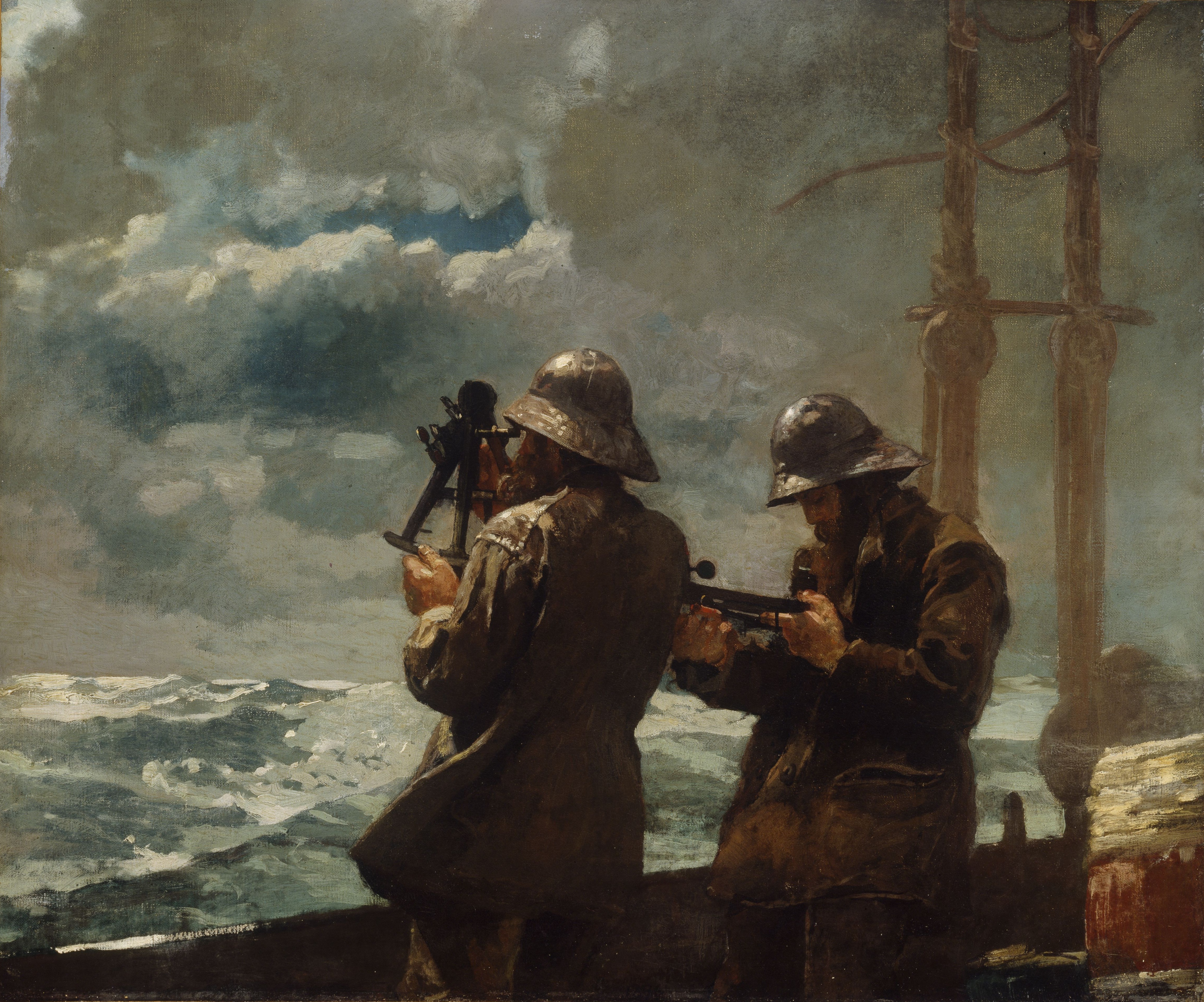
Consider the masterful use of the earthy reds, blues, and yellows in Winslow Homer's masterpiece  Eight Bells.
This image (or other media file) is in the public domain because its copyright has expired.

 Versus the high intensity primary triad Franz Marc's Red Horses.

This is a file from the Wikimedia Commons.
When planning your the color for a more successful painting, I also find it helpful to follow the general composition rule outlined in Greg Albert’s book: The simple secret to better painting.  And that is simply:  Never make any two intervals the same.

For this week's challenge, I bought intense red-orange sunflowers at the grocery store (one of my favorite spots to shop for affordable still life subjects). So I knew red would be my dominant color. Then blue followed by a few notes yellow (which is such a strong color that you often don’t need much to make an impact. ) Looking for more primary triad inspiration for your art? Just type “primary triad” or “red, yellow, blue color” into Pinterest and you’ll discover dozens of interesting combinations. Happy (primary) painting!

Monday, July 16, 2012

The Sunflower is Mine

"Sunny Side Up" 8x8 oil on Linen Panel--SOLD--Thank you!

The sunflower is mine, in a way.
Vincent van Gogh

Bon Lundi! Over the weekend I celebrated July 14 Bastille Day with a tasty "dejeuner" at one of my favorite French bistros in Denver--Le Central. Enjoyed a delicious sampling of chilled roses, a bistro salad, a crusty baguette and broccoli soup--yum. (FYI--Thursday is chocolate souffle night if you're in town!)

When I need a "French Fix" I head to Le Central
I'm not sure I believe in past lives per se, but I would not be surprised if I was ever told in lived in France once upon a time..

Le Chateau Frontenac in Quebec
It seems a bit odd to me now as a proud "Western" artist who loves open ranges, Georgia O'Keeffe, Maynard Dixon and spicy chile rellenos, but briefly Francais was my college major. My "big plan" was to move to Quebec where I could live a chic bilingual lifestyle. Le Chateau Frontenac in beautiful old Quebec with it's magical verdigris turrets is one of my favorite places to stay in the world.

Of course, that didn't happen and much like Georgia I headed West to find my artistic bearings but as an adult I've been lucky to paint in France a couple of times.  When I get a longing to visit France (as I often do in the summer) I sometimes and treat myself to an almond croissant, sunflowers (aptly named "tournesols" or "turn to the sun" in French), a fancy French lotion from L'Occitane, and an iced cafe au lait.

Quick "merci beaucoup" to my collectors at Daily Paintworks--I appreciate your bids and support! Thanks too to Carol and David for creating such a supportive art community and the best place to  buy high quality affordable art online.

Monday, July 9, 2012

Let's Just Wing It...

Washington Park Raven 8x8 oil on linen panel
Click to Bid--SOLD--Thank you!
The worse my drawings were, the more beautiful did the originals appear.
John James Audubon

Painting lots of birds lately…I’ve read that focusing on birds, dreaming of birds, etc. may symbolize hope, intuition and freedom from boundaries and constraints.  I love the idea that specifically as artists birds could represent our personal quest for creative freedom and our boundless imaginations.  Birds and creativity seem to go hand in hand. We even say we are “spreading our wings” when we grow artistically or “leaving the nest” when we move on to new endeavors.

"High Key" Aspen Robin Study 8x8 oil on linen panel
"Negative Space" Robin Study 8x8 oil on linen panel
I've also been working on smaller paintings as a "first step" to a larger work so looking for a successful 8x8 that will translate well into a 24x24 or even larger. Trying to figure out how to make a 3 foot tall robin look natural and interesting...

Speaking of birds, I particularly enjoy casual birding around my older Denver city neighborhood. Unfortunately, I probably won’t spot too many exotic birds nearby (how I’d love to paint a colorful resplendent quetzal!) but I still enjoy painting robins, sparrows, crows, mallards, etc.

Want to see more bird inspired art and design? Check out my “Feathered Friends” board on Pinterest. Or just type “birds” (or your favorite bird) into the Pinterest home page search. Also here's a short "how to article" for painting small feathers in acrylic. Questions about my art or Denver based art classes please feel free to email in the studio. Happy painting (and bird watching)!

Tuesday, July 3, 2012

What's Red, White, and Rolls?

My New Favorite Studio Accessory! Happy Independence Week everyone! I spend a lot of time in the studio and am always on the hunt for better taborets.  Which is just a fancy artist term for some kind of rolling stand, utility cart, or table you set up by your ease to hold your palette, brushes, etc. 

Over the years, in my quest for the perfect easel sidekick, I’ve tried everything from the dining room table, an old drafting table, a microwave/kitchen cart, a small Target folding side table, and a stout silver vintage metal cabinet reminiscent of R2D2 that was affectionately known as “The Robot.”

My most recent taboret was a rolling vintage black metal typewriter (remember those?) table just like this one that I um “rescued” from an alley.  You can often find a variety of vintage of rolling carts online. Here's some examples of rolling carts on Pinterest that could easily work as taborets.

Of course you can also find a variety of fine art taborets on line like this “Rolls Royce” of custom made wood taborets which cost more than (and is almost as as my large as) my old VW Rabbit. 
While I was dreaming about this $3,000 taboret a few weeks ago I spotted a bright cadmium red  tool cart in Better Homes and Garden. The cart had been repurposed as an attractive beverage cart for decks, summer parties, etc.  Then I realized that this shiny cart would be a perfect new taboret. 
Luckily the cart was available at Harbor Freight (also available online) but we had a store not too far so I was able to buy in person.  And did I mention the cart’s on sale for under $75?

Once assembled (it does require a socket wrench set which I had to borrow) I was in taboret heaven. As you can see the tool cart has sturdy locking wheels, a roomy locking drawer (to help keep your sable brushes and that new tube of cobalt violet safe), additional storage on the open bottom shelf, and plenty of room for my covered palette holder and brushes on the top.  Plus the side handles make moving it a breeze. Ahh…I love it when things work make your artist life easier. Welcome to my new summer students and next time my 250th post! Stay tuned...

Friday, June 29, 2012

Skulls and Roses: Sprick Demo Review

Daniel Sprick
Orchids and Human Head
Oil on Board- 22" x 18"  (from Salon d"Arts 2010)
  
Happy Summer All! I have been painting and having a great time with all my summer students but before too much time passed I wanted to post my quick review of the wonderful Daniel Sprick demo from a few weeks ago. Sprick is one of the most celebrated artists in my home state of Colorado and perhaps one of the most accomplished realist painters in the country.


He’s known for his oil paintings of  interiors reminiscent of the Dutch interior masters and beautifully rendered contemporary portraits and figures. Sprick's painting "worlds" are chock full of mind boggling painting challenges such mirrors, double window reflections, fabric folds, skulls, petals, flesh tones, self- portraits, and even insect parts.  Sprick’s an artist who has reached such a high level with his craft and technical skill that when I see his meticulous oil paintings I can’t help but wonder:  How in the world does he do that?
Daniel Sprick Still Life Setup--Love the wrapped skull!
To my knowledge Sprick doesn’t paint many demos or give workshops, though I do see him on the roster for this year's Weekend with the Masters which I bet would be amazing.  So after many years of admiration I was really looking forward to his still life demo earlier this month at Meininger’s Art Store in Denver.

Sprick began with an intimate still life arrangement (on top of a sculpture stand) that included several iconic Sprick items such as a skull (which he had wrapped in cellophane) and a single white rose.  (Note, shortly after he started painting a summer afternoon storm darkened the natural north light so my pictures are a bit murky.)

To start, he massed in his large shape relationships with a neutral tone relationships on a medium size (12x16 maybe) standard canvas board.  I loved his interesting U-shaped composition. And I have to say I was a bit relieved when Sprick noted he might spend several hours if not days fine tuning a single subject such as the skull even though he’s painted it many times. As “daily painter” I couldn’t help wonder what it would be like to concentrate on and perfect a single apple or lemon. Could be an interesting exercise...
Daniel Sprick Palette
Sprick’s painting surface quality is satiny smooth.  During the demo he often softened his edges with a fan brush as he worked along.  He has a quiet thoughtful approach—carefully mixing color piles on a large glass surface with a knife.  He didn’t list all his palette colors but I saw he premixed a nice warm white with what I think was Titanium White and Cad. Lemon.This is a great idea if you tend to overuse pure white to lighten colors.

I half expected a hyper realist painter to be detached, literal, and rigid but Sprick manner was warm, humble, and flexible.  At one point he joked that he didn’t care for a certain type of brush because they shed which makes him bristle. Get it? Bristle. Ahh artist humor.  At another point, he said he didn’t love the tall green bottle and would likely change the color of it. You can see it's bluer in his painting.

This demo was only a couple of hours so an artist with this attention to finishing detail can’t complete his work but it was still fascinating to observe a master craftsman like Sprick and gain insight into his process. If I ever have the opportunity to take a workshop from him I wouldn't hesitate. For more info about him I recommend this video interview conducted by the Denver Art Museum.

Tuesday, June 19, 2012

It was SAMtastic!

Botanic Garden Hollyhocks-12x12Oil on Linen Panel

Click to Bid-Thank You!
Whew have just about recovered from SAM! I want to thank everyone—friends, fellow artists, art lovers, and my students for visiting me at the Summer Art Market a week before last.  Especially Saturday when the temp was pushing 100 by mid-day.  Sunday was a perfect plein air market day though—sunny,  gentle breezes…It was like being on vacation hanging out in my comfy red director’s chair.


Early AM setup on Grant Street--a beautiful summer morning.
So again, my thanks to my many students and their families who took time out of their buy summer weekend to support me and the Market.  It’s always nice to see familiar faces when your “on display” for a few days. (Best of all, this year, I did not slice a big piece my big off during set up--see last year’s show post if you want the gory details.)

I’ve participated in the SAM for over 11 years and am honored  to be a part of such an amazing group of artists all in one place.  It’s a lot of time and effort to get ready for any art festival or show but being part of this community makes it all worth it.

A special thanks to all my collectors at this show where there is so much gorgeous high quality artwork to choose from.  I sold several  my favorite paintings I’ve posted this year which is always exciting to some new collectors--which was fantastic. But I particularly want to acknowledge several repeat collectors and art lovers who visit me each year at this show. 

One buyer said she remembered buying from me over 10 years ago and still enjoys that landscape. 
Another buyer (who is a talented designer with Armigo Design Group here in Denver) told me that an alphabet abstract painting she bought a few years back can be seen in this Better Homes and Garden Decorating magazine article.

Now, ironically, if you read my post a a while back about the importance of a signing your work AND with clear signature somewhere on your painting (for example printed on the back if you have an artistic signature) you'll see that I'm not credited in the article. For which Beth kindly apologized (she'd purchased the piece several years before the article) and I know she did her best to find me. So note to self.  But I'm thrilled to see my work in place none the less so thanks so much Beth for this nice surprise.

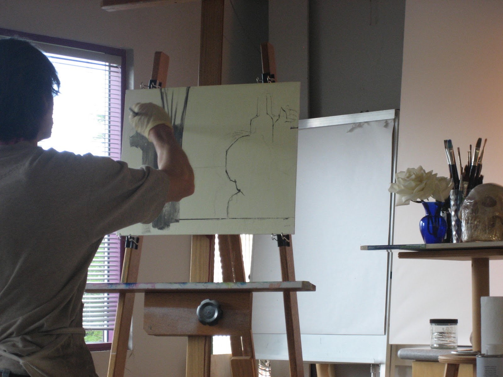
Colorado Realism Master Daniel Sprick blocking in his still life.
June’s been a busy and exciting art month so better get back to my easel. In my next post I’ll share my experience at the Daniel Sprick demo I saw the first weekend in June at Meiningers art store. Simply amazing. I've wanted to see Sprick (one of the best realist painters in the country) paint in person for as long as I can remember so waiting in line for over an hour for front row "rock star" demo seats was worth it.