Sunday, August 26, 2012

When Opposites Attract

"Botanic Beauty" 6x6 oil on panel

An artist finds his happiest combination in a play of complementary colors. They are direct contrasts yet do not jar; they awaken the beholder, but do not disturb him. Charles Burchfield

Last week’s painting challenge on DPW was an exciting complementary color (direct opposites on the color wheel) challenge posted by fellow DPW painter Layne Cook.

I choose the violet/yellow pair in this alla prima (wet in wet) oil study of an iris because I wanted to explore the full range of warm to cool violets—one of my favorite color ranges. Yellows not so much—but here sunny yellows (some pure notes along with neutral ones) are the perfect warm companion for the cool violets. 

As Burchfield notes above, complements are one of the easiest way to have a successful and exciting color strategy for your art. Here are some quick tips for working with your complementary color pairs:

Work with your color pairs in ranges than one “out of the tube" solid color. This gives you many more options. So violet range and yellow range, red range and green range, and blue range and orange range (or as I remind students in our hometown: Go Broncos!).
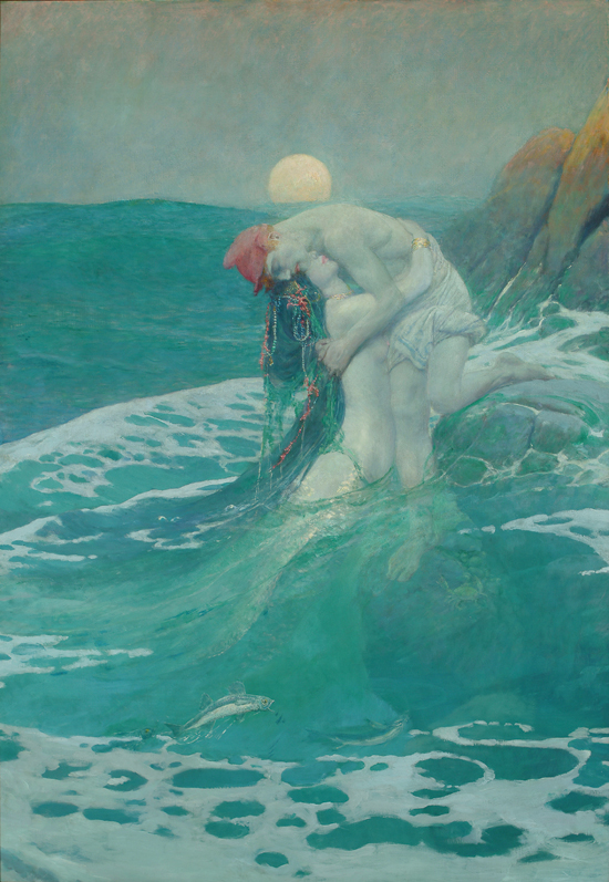

Your painting will likely work better if one of the color pair should dominates the other. So mostly blue range with some orange range for example. Here’s one of my favorite green blue dominant paintings (note the touch of red oranges) "The Mermaid" by American illustrator Howard Pyle. 

When you paint two complements side by side they really attract the eye. You can take advantage of this color power couple where you want to the viewer to focus.  On the flip side when you need to calm a color down, the complement can be a more interesting alternative for creating neutrals rather than a pre-mixed gray, black, umber, etc. Trouble with your highlights? Try a touch of complementary color in your white mixture. (So whitish green highlight on bright red tomato for example.)

For more discussion about exploring and balancing opposites in your painting check out one of my favorite oil painting books: The Yin Yang of Painting by Zhang.  Finally, a big thanks again to all my recent DPW buyers and my ongoing students for your support this summer!

Tuesday, August 14, 2012

Good Things Come in Small Paintings

"Pink in the Park" 6x6 oil study
Sold-thank you!
Creativity is allowing yourself to make mistakes. 
Art is knowing which ones to keep. 
Scott Adams

There's so much to paint in the summer it's almost overwhelming. Painting smaller studies (like these 6x6 squares) remind me why “almost daily” painting can be so rewarding. Finding the time to paint every single day might just not be realistic in your world right now. But if you want to grow your artistic vision and skills, I think it’s extremely helpful to paint MORE than you are now.  Whatever that may be for you. 

I promise you’ll find this extra time at the easel beneficial in the long run. Here are three key reasons I think “almost daily” painting is a great goal for any artist who wants to improve:
"Redbud Rester" 6x6 oil study

I love the creative process but the reality is you’re not always going to have a stellar painting day.  In fact, you may have a disappointing painting day when you least expect it.

This can really catch you off guard.  But when this happens to me I have some sense of comfort and hope that a more successful painting may be just be around the corner--rather than weeks or months away.

Also, many artists at one time or another are challenged either by time or budget or both. Small-ish (under 8x10 let's say) paintings are not typically a significant time or monetary investment.  This doesn’t mean you have to use cheap materials for daily painting. On the contrary I prefer linen panels (Raymar), professional paints, decent brushes, etc.  I feel like I can "splurge" because I'm not using so many supplies at once. Plus, if you paint a "keeper" you'll be happy you used nicer materials.

With regard to time, it may take a few tries, but I find I can paint a 6x6 in under 120 minutes give or take. Check out Craig Nelson's excellent book: 60 minutes to Better Painting for more ideas regarding quick studies.

If you enjoy painting on a larger scale, smaller studies are also a wonderful way to “brainstorm” and have fun with paint. For example, in my light and shadow rose study today I tried some some "looser" dragged edges which I thought worked pretty well. Thanks DPW for featuring my little rose on the DPW Facebook page!

In the sparrow study, I tried a strong orange toned canvas to help give a sense of the warm August sunshine. Some of the orange bits work and some I'm not as crazy about. Still worth the test. 

I often compare painting to puzzle solving.  Painting more often allows to test a variety of solutions before you commit to a bigger canvas. For example, you could try different color strategies, take a new color for a test run, change your value key, experiment with your brushwork etc.  It’s also fun to do quick small abstracts and then scale them up--particularly small squares because they scale so easily. Happy summer painting everyone!

Tuesday, August 7, 2012

Anything But White

"Ivory Velvet" 8x8 oil on linen panel
Whether the flower or the color is the focus I do not know. I do know the flower is painted large to convey my experience with the flower - and what is my experience if it is not the color? 
Georgia O'Keeffe

I so enjoyed painted a rose study last week that I just had to paint another. This time I thought I’d tackle a very high key white or ivory rose—which you quickly discover of course is anything but white. In fact, Renoir is quoted as saying “white does not exist in nature.”

Lots of choices for the painter at the Little Flower Market in Denver
I didn’t have a whiteish rose handy so I picked up a few from  The Little Flower Market (which I think used to be an old gas station)  near my studio. I took a ton of reference photos with my new studio camera which I love already—a Canon Powershot SX 260 with 20x optical zoom.

"Red Waves" 
Here's one of my first rose photos taken with it. I can’t wait to try it out at the upcoming rose show at the Denver Botanic Garden. I’ll never be a professional shutterbug but the more I paint, the more I appreciate having lots of reference shots on hand.


I think you have to be careful not to overuse white to automatically lighten your colors, but at that same time it’s an essential component of my palette. For more info about whites, here’s an excellent article by Gamblin: Getting the White Right. Thanks for stopping--have a wonderful summer week!

Friday, August 3, 2012

Fuchsia Fandango

"Fuchsia Fandango" 8x8 oil on museum quality linen panel
Happy Friday all! I had a blast painting a Peace rose earlier this week for the DPW rose painting challenge-- and am already looking forward to my next rose--but in the meantime I wanted to try a a different type of flower.  

I spotted this vibrant fuchsia at my local nursery and loved the strong yellow-green leaves/cool pink complementary color combo along with the warmth of the clay pot. In this floral oil painting, I also set out to capture the unusual greenhouse light as well as harmonizing the powerful tropical colors. 


Today's Painting Tip: Use a Key Color for Stress Free Color Harmony
Whether you’re painting an abstract or a representational subject, a simple way to achieve better color harmony is to add one key “mother color” into ALL your color mixes. For example, if you’re painting pinkish flowers and using Permanent Rose or Quin Magenta add a tiny amount of it (think tip of knife) into all your oranges, violets, grays, browns, etc 

This “mother color” approach works particularly well for mixing your greens. Greens that have a touch of a warmer mother color will usually look a bit more natural and/or neutral which in turn will help support your higher intensity colors.

Working with a “mother color” as an approach is also a great way to become familiar with all the properties of that one particular pigment—how strong it is, how transparent it is, what kind of neutrals it makes, how it tints with white, etc.

Quick thanks again to all my new DPW collectors this month--I greatly appreciate your bids and the support of all the artists on DPW. Have a colorful and harmonious weekend.

Monday, July 30, 2012

Forget all the Roses


"Inner Peace" 8x8 oil on linen panel
 
There is nothing more difficult for a truly creative painter than to paint a rose, because before he can do so he has first to forget all the roses that were ever painted. - Henri Matisse

If you spend enough time at your easel you may find yourself dreaming about painting as I often do.  A few months ago I had a very specific dream that I was just finishing up a large scale (about 6 x 6 feet) oil painting of a pale yellow rose. (Supposedly yellow roses may symbolize new beginnings, happy occasions, and friendship.)

I could visualize the painting so vividly that for a foggy instant I was certain I’d find an enormous rose painting waiting in the studio. But no, it was just a dream…My easel sat empty in the morning sunshine waiting patiently for a new canvas. 

Detail of abstract oil panting of rose-in progress in the studio
I was working on some other projects but kept thinking about the giant rose painting and added it to my “future painting” studio to do list.  In preparation, I took a few rose photos and started an abstract study of a rose—on a smaller scale (24 x 24) as test painting for something much larger. Still working on that one…But here’s a sneak preview....

Then yesterday Carol Marine posted a rose painting challenge on Daily Paintworks.  Sometimes you just can’t ignore the loud creative voice of the universe so I quickly grabbed my brush and happily painted a Peace rose from my small rose bed. It felt great to get that rose image out of my head and onto the canvas. Plus, I love Peace roses— They smell like orange sherbet (really, they do) and they offer painters a prismatic array of delicate color shifts. 

Four Easy Rose Painting Tips:
  1. Note the overall cup shape and spiral structure of a rose. Hybrid roses are not as loose and floppy as many garden flowers. You can see this when you sketch them from life—which is helpful before you paint them from your reference photos.
  2. Roses not in bloom? Roses are one of the easiest flowers to find at grocery or even a convenience store year round. One of the best thing about being an artist is that it’s OK to buy yourself flowers just because it’s Tuesday!  
  3. Note the subtle value  and color shifts within the rose blossom—particularly in very dark or very light roses. Yellow roses, for example, may have touches of blue gray, peach, lime, lavender, lime, etc.
  4. Finally, simplify--Yes, roses have lots of layers—but they are delicate flowers so you don’t want them to look too labored or busy.

Monday, July 23, 2012

Primarily Color

"Primarily Petals" 8x8 oil on Linen- SOLD
Happy Monday everyone! As an artist who loves to explore color theory, harmony, and strategy I was very excited to to participate in this week’s Daily Paintworks Challenge which is a painting that uses all primary colors—red, yellow, and blue.

I'm a colorist (rather than a tonalist) so I can appreciate the power and energy of the bold primary triad—particularly reds. However, I more naturally gravitate toward the secondary triad (orange, green, and violet) probably because I love greens so much.  So this was an interesting challenge for me.

Quick reminder that you can use a wide range of reds, blues, yellow pigments for a primary triad painting. I’ve noted a few of these “winning combos” before, but here are just a few ideas (plus white of course to help stretch your value range) that would work in your favorite painting medium. 
  • Permanent Rose, Lemon Yellow, Cobalt Blue
  • Cad Red Light, Cad Yellow Light, Ultramarine Blue
  • Alizarin Crimson, Yellow Ochre, Cerulean Blue
  • Indian Red, Indian Yellow, Ivory Black
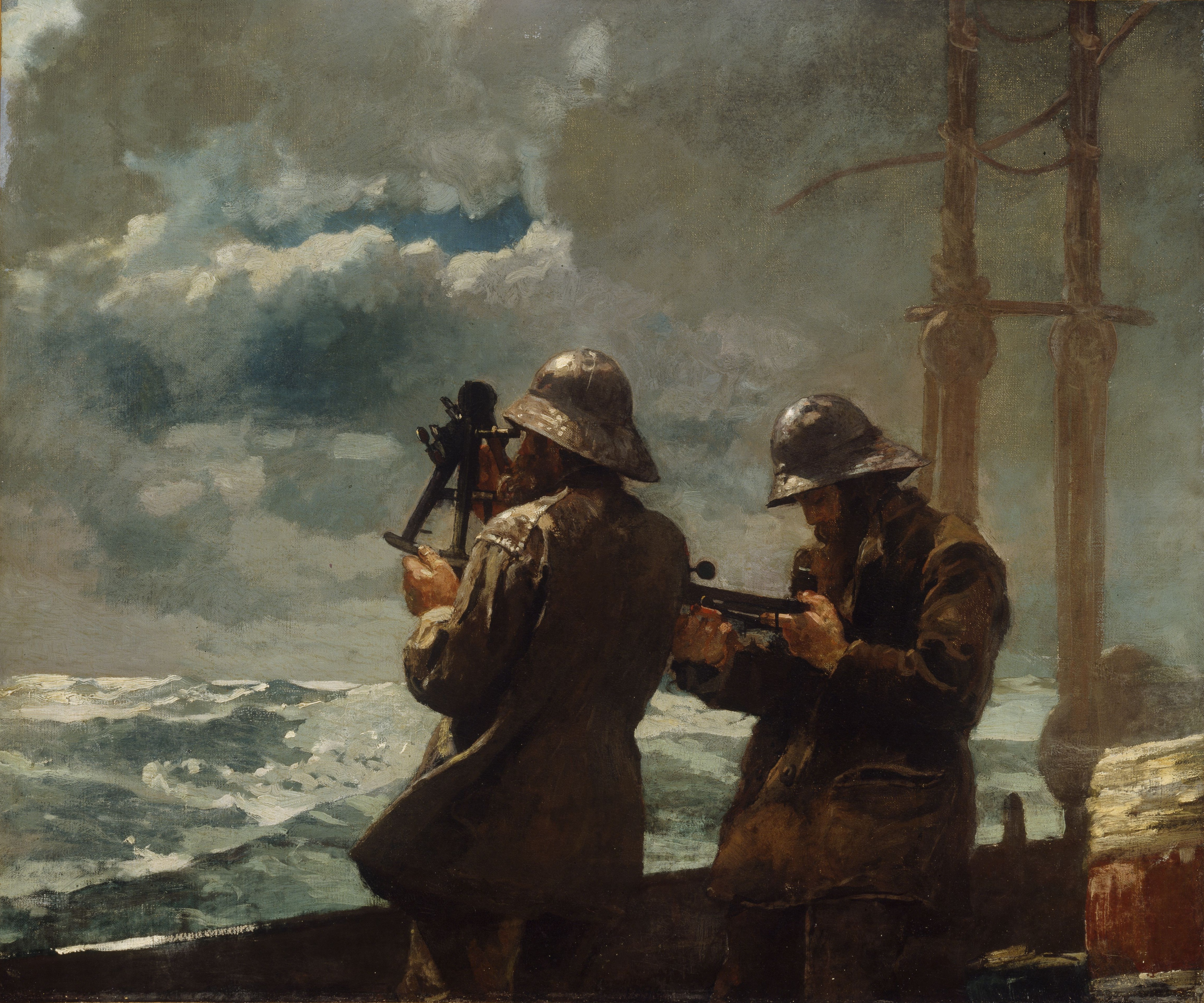
Consider the masterful use of the earthy reds, blues, and yellows in Winslow Homer's masterpiece  Eight Bells.
This image (or other media file) is in the public domain because its copyright has expired.

 Versus the high intensity primary triad Franz Marc's Red Horses.

This is a file from the Wikimedia Commons.
When planning your the color for a more successful painting, I also find it helpful to follow the general composition rule outlined in Greg Albert’s book: The simple secret to better painting.  And that is simply:  Never make any two intervals the same.

For this week's challenge, I bought intense red-orange sunflowers at the grocery store (one of my favorite spots to shop for affordable still life subjects). So I knew red would be my dominant color. Then blue followed by a few notes yellow (which is such a strong color that you often don’t need much to make an impact. ) Looking for more primary triad inspiration for your art? Just type “primary triad” or “red, yellow, blue color” into Pinterest and you’ll discover dozens of interesting combinations. Happy (primary) painting!

Monday, July 16, 2012

The Sunflower is Mine

"Sunny Side Up" 8x8 oil on Linen Panel--SOLD--Thank you!

The sunflower is mine, in a way.
Vincent van Gogh

Bon Lundi! Over the weekend I celebrated July 14 Bastille Day with a tasty "dejeuner" at one of my favorite French bistros in Denver--Le Central. Enjoyed a delicious sampling of chilled roses, a bistro salad, a crusty baguette and broccoli soup--yum. (FYI--Thursday is chocolate souffle night if you're in town!)

When I need a "French Fix" I head to Le Central
I'm not sure I believe in past lives per se, but I would not be surprised if I was ever told in lived in France once upon a time..

Le Chateau Frontenac in Quebec
It seems a bit odd to me now as a proud "Western" artist who loves open ranges, Georgia O'Keeffe, Maynard Dixon and spicy chile rellenos, but briefly Francais was my college major. My "big plan" was to move to Quebec where I could live a chic bilingual lifestyle. Le Chateau Frontenac in beautiful old Quebec with it's magical verdigris turrets is one of my favorite places to stay in the world.

Of course, that didn't happen and much like Georgia I headed West to find my artistic bearings but as an adult I've been lucky to paint in France a couple of times.  When I get a longing to visit France (as I often do in the summer) I sometimes and treat myself to an almond croissant, sunflowers (aptly named "tournesols" or "turn to the sun" in French), a fancy French lotion from L'Occitane, and an iced cafe au lait.

Quick "merci beaucoup" to my collectors at Daily Paintworks--I appreciate your bids and support! Thanks too to Carol and David for creating such a supportive art community and the best place to  buy high quality affordable art online.